All articles with 'Highlight' Tag
How-to highlight maximum value in Excel charts? [Quick tip]
![How-to highlight maximum value in Excel charts? [Quick tip]](https://chandoo.org/wp/wp-content/uploads/2019/08/highlight-maximum-value-in-excel-charts-m.png)
Ever wanted to highlight maximum value in charts? Then this tip is for you.
Continue »Fish Eye Effect for highlighting selection – Is it effective? [Advanced Charting]
![Fish Eye Effect for highlighting selection – Is it effective? [Advanced Charting]](https://chandoo.org/wp/wp-content/uploads/2016/05/fish-eye-effect-thumb.png)
A few days back, WSJ ran a visualization titled “What’s your pay gap?” It depicts median pay gap between female & male workers in 422 different professions in USA. The chart uses fish eye effect to highlight the selected profession. See below demo to understand the effect.
Continue »Compare 2 sets of data by letter or word & highlight mismatches [vba]
![Compare 2 sets of data by letter or word & highlight mismatches [vba]](https://img.chandoo.org/vba/compare-2-texts-by-letter-word-demo.gif)
We analysts like to compare. If you ever want to keep an analyst busy, just give her 2-3 options. She won’t return to your desk until the cows come home. My wife uses this trick all the time. Picture this:
[In late 2013]
Me: I want to buy a new phone
She: Do you want Nexus 5 or Galaxy S5 or iPhone 5s?
Its late 2014 and I am not done comparing.
So today, let’s talk about an interesting comparison scenario.
Comparing by letter or word
See above demo to understand the concept. Read more to learn how to do this.
Continue »Highlight best week & month in a trend chart [tutorials]
![Highlight best week & month in a trend chart [tutorials]](https://img.chandoo.org/c/highlight-best-week-month-in-trend-charts-excel-howtos.png)
When analyzing business data like sales, shop visits or productivity, one of the questions managers always ask is,
What is the best month / week for this data?
To answer this question, we need to make a chart that looks like above. Today, lets learn how to highlight portions of such charts that correspond to best week or best month.
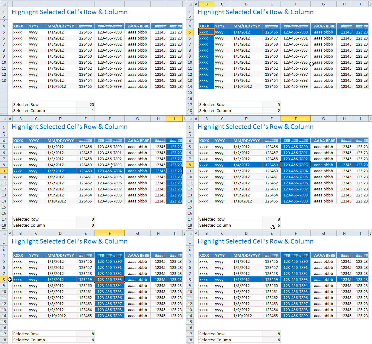
Continue »Highlight Row & Column of Selected Cell using VBA

When looking at a big table of analysis (or data), it would make our life simpler if the selected cell’s column and row are highlighted, so that we can instantly compare and get a sense of things. Like above.
Who doesn’t like a little highlighting. So lets learn how to do highlighting today.
Continue »
Introducing a method of allowing data points to be interactively highlighted in Excel Scatter / X-Y Charts and Line Charts.
You will see a lot of these style charts in various places where you want to highlight various aspects of the chart to your audience. It is a great technique for complex scientific and engineering charts where you may have hundreds or thousands of points.


