All articles with 'economist charts' Tag
Correlation vs. Causation [Charting Chatter]
![Correlation vs. Causation [Charting Chatter]](https://chandoo.org/wp/wp-content/uploads/2016/08/correlation-causation-confusion.png)
Here is a trap that is easy to fall in to. Confusing correlation as causation. As analysts, it is our job to see the data as it is rather than imply causation that doesn’t exist.
Let’s sample a chart, recently featured in Economist’s graphic detail under the title Measuring well-being.
Continue »Tell all versions of truth [Dashboard Best Practice]
Here is a simple but effective rule for your next dashboard. Tell all versions of truth. All versions? But there is only one version no? Of course, there is only one version of truth (or data), but you can present that in different ways, thus creating different perspectives, offering different insights. By using an interactive element (slicers […]
Continue »How countries spend their money – chart alternatives
Econimist’s daily chart is a one of my daily data porn stops. They take interesting data sets and visualize in compelling ways. While the daily chart page is insightful, sometimes they make poor charting choices. For example, this recent chart visualizing how countries spend their money uses a variation of notorious bubble chart. Click on the chart to enlarge.
What is wrong with this chart?
Bubble charts force us to measure and compare areas of circles. Unless you have a measuring tape somehow embedded in your eyes and you are a walking human scientific calculator, you would find this task impossible.
So when you look at the chart and want to find out what percentage Japanese spend on restaurants or how much Americans pay for housing, your guesses will have large error margins.
Not only bubble charts are difficult to read, they are very hard to align. So when you have a bunch of bubbles, no matter how hard you try, your chart looks clumsy (see how the Russian food bubble eats in to Mexico’s bubble, as if it is too hungry 😉 )
Let’s check out a few alternatives to this chart. Read on…
Continue »42% of the world goes to polls around a pie chart – Like it or hate it?

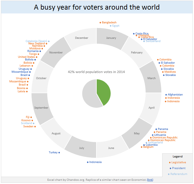
Today lets have a poll. Lets debate if this pie chart about world elections in 2014 is good or bad.
First lets take a look at the chart
This chart, published by The Economist talks about how 42% of the world population is going to vote this year. Take a look and read on to learn how you can re-create this in Excel.
Continue »


