All articles with 'column chart' Tag
{ 31 Comments }
Beautiful Budget vs. Actual chart to make your boss love you
Published on May 16, 2018 in Charts and Graphs

Call them by any name – Budget vs. Actual, Target vs. Actual, Goal vs. Progress, KPIs, Performance charts, but they are the bread and butter of business charting. So how about a drop dead gorgeous and insightful chart for your next meeting with the folks upstairs? Something like above.
Read on to learn how to create this chart in Excel.
Continue »{ 32 Comments }
Introduction to Panel Charts using Excel – Tutorial & Template
Published on May 12, 2010 in Charts and Graphs, Featured
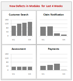
In this article we will learn what a Panel Chart is and how you can construct a panel chart in Excel.
What is a Panel Chart?
A panel chart is a set of similar charts neatly aligned in panels to help us understand some data which has multiple variables in it. Panel charts are also called by names “trellis displays” or “small multiples”. They are an effective way to display multi-variable data.
Here is an example panel chart showing the total defects per module over the last 4 weeks.
Continue »
