All articles with 'Charts and Graphs' Tag

With each passing day the amount of information contained in a single spreadsheet, slide, document is growing. Thanks to demanding bosses, clients and colleagues, we are now supposed to provide all the relevant information in as much less space as possible. This is where micro charting or light weight data exploration has become a rage. […]
Continue »Creating KPI Dashboards in Microsoft Excel is a series of 6 posts by Robert from Munich, Germany. This 6 Part Tutorial on KPI Dashboards Teaches YOU: Creating a Scrollable List View in Dashboard Add Ability to Sort on Any KPI to the Dashboard Highlight KPIs Based on Percentile Add Microcharts to KPI Dashboards Compare 2 […]
Continue »![Creating KPI Dashboards in Microsoft Excel [Part 1 of 6]](https://chandoo.org/wp/wp-content/uploads/2008/08/kpi-dashboard-scroll-excel-thumb.png)
Creating KPI Dashboards in Microsoft Excel is a series of 6 posts by Robert. This 6 Part Tutorial on KPI Dashboards Teaches YOU: Creating a Scrollable List View in Dashboard Add Ability to Sort on Any KPI to the Dashboard Highlight KPIs Based on Percentile Add Microcharts to KPI Dashboards Compare 2 KPIs in the […]
Continue »Use min-max charts to show the spread of data – Charting Best Practice
Next time you want to make a chart to tell how your sales (defects, customer calls, page views, number of clicks, walk-ins etc.) are doing over a period of time, consider showing them in a min-max chart. For eg. a min-max sales chart for the last 12 months tells average, minimum and maximum sales per […]
Continue »Excel Bullet Graphs

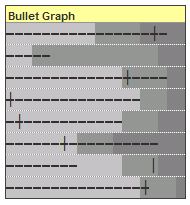
Bullet graphs provide an effective way to dashboard target vs. actual performance data, the bread and butter of corporate analytics. Howmuchever effective they are, the sad truth is there is no one easy way to do them in excel. I have prepared a short tutorial that can make you a dashboard ninja without writing extensive […]
Continue »
I can never get tired of in-cell charts, whenever I get sometime, I try to experiment something on them. Here is an idea to design true incell column charts without using any add-ins or installing fonts. These charts can be fun to have on your project report or annual news letter or memos, they take […]
Continue »
Excel conditional formatting is a hidden and powerful gem that when used well, can change the outlook of your project report / sales budget / project plan or analytical outputs from bunch of raw data in default fonts to something truly professional and good looking. Better still, you dont even need to be a guru […]
Continue »

