All articles with 'bullet charts' Tag

Lets take last weeks Stacked Bar/Column Chart and add some high-performance steroids.
Continue »First some personal matters. Today I am celebrating my 28th birthday. The last one year has been very good for us. We have been very busy parenting 2 hilarious and naughty twins, I moved back to India, quit my job and started a company. My business became a mild success crossing $100k revenues in 12 […]
Continue »{ 39 Comments }
How Francis Landed on Chandoo.org, Become Awesome and Made a Superb Dashboard, all in ONE Weekend
As part of our Reader Awesomeness Week, Francis shares with us a travel site dashboard he made for his company. Francis took just two days to prepare this awesome dashboard which uses concepts like bullet charts, sortable KPI grid, Date based filtering, dynamic charts and more. I was really moved by Francis’ gesture in sharing his work with us, so much that, I did a video review of his work. You can see it in the embedded youtube video to the left.
Read the rest of the article to know how this dashboard is made and get a copy of the file.
Continue »{ 33 Comments }
What new chart types you want to see in Excel? [poll]
Published on Jun 18, 2010 in Charts and Graphs
![What new chart types you want to see in Excel? [poll]](http://chandoo.org/img/polls/what-new-chart-in-excel.png)
Hui, one of our in-house excel ninjas at Chandoo.org Forums, has asked an interesting question. Microsoft is already planning the next version of Excel and is looking for our feedback into what extra chart types it should offer/include. [more] It is an interesting question, so lets have a poll. What new chart types you prefer […]
Continue »![Making a Dynamic Dashboard in Excel [Part 1 of 4]](http://chandoo.org/img/ed/excel-dynamic-dashboard-final-th.png)
In this and next 3 posts, we will learn how to make a Dynamic Dashboard using Microsoft Excel.
At the end of this tutorial, you will learn how easy it is to set up a dynamic dashboard using excel formulas and simple VBA macros.
Continue »{ 18 Comments }
Best Charts to Compare Actual Values with Targets – What is your take?
Published on Dec 18, 2009 in Charts and Graphs, Featured
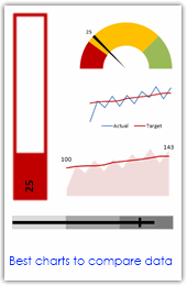
Comparing values is one of the main reasons we make charts. Yesterday we have a post on using thermometer charts to quickly compare actual values with targets. Today we follow up the post with 10 charting ideas you can use to compare actual values with targets. Check out how bullet charts, thermometer charts, traffic lights, gauges, column charts, area charts can help you compare targets with actual performances. A review of best charting options when you need to compare.
Read the rest of the post to see the options and participate in poll.
Continue »
