All articles with 'axis' Tag

A few weeks back, John asked a post question, “ How can I add a £ to the 80 on a Chart axis and leave the rest of the numbers plain numbers ? ”
Custom Number Formats, That’s How.
Continue »Introduction to Panel Charts using Excel – Tutorial & Template

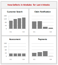
In this article we will learn what a Panel Chart is and how you can construct a panel chart in Excel.
What is a Panel Chart?
A panel chart is a set of similar charts neatly aligned in panels to help us understand some data which has multiple variables in it. Panel charts are also called by names “trellis displays” or “small multiples”. They are an effective way to display multi-variable data.
Here is an example panel chart showing the total defects per module over the last 4 weeks.
Continue »How to hide “0” in chart axis [quick tip]
![How to hide “0” in chart axis [quick tip]](https://chandoo.org/wp/wp-content/uploads/2009/12/hide-zero-chart-axis.png)
Have you ever wondered how you can hide that 0 (zero) at axis bottom? Like shown beside. You can use custom cell formatting codes (or custom number formatting codes) to do just that. Just go to axis formatting and from the number tab set the axis number format to something like #,##0;-#,##0;; Read the rest of the post to learn more.
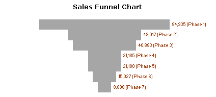
Sales Funnel Charts in Excel – Tutorial

Sales funnel is a very common business chart. Here is a simple bar chart based trick you can use to generate a good funnel chart to be included in that project report.
Continue »

