
Over at PTS Blog, my dear friend & charting guru, Jon Peltier has an interesting post on using dot plots to visualize Murders & Suicides data by US States. Here is a sample of the charts he recommends for such data.
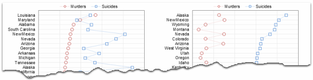
If you are curious how he made these charts, well, he used dot plot chart utility to create them.
Not that murders & suicides fascinate me, but I wanted to play with this data myself and see how we can visualize it. So I emailed Jon and asked him to share the raw data. Being a lovely chap Jon is, he immediately sent me the data. So here we are, playing with gory data on a Friday.
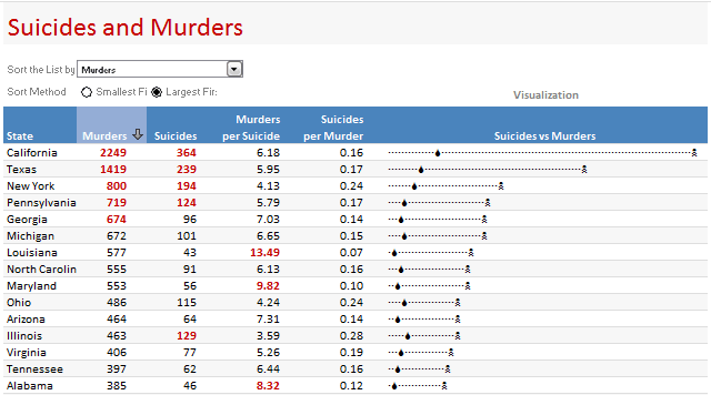
Suicides & Murders by US States – An Interactive Excel Chart
Here is a demo of the chart I came up with.
Thinking behind this chart
We see this type of data all the time. 2 or more metrics by a dimension like State, Product group, Country, Web Page or Customer. In this case, as you can guess, there is very little co-relation between murders and suicides by state. While we want to visualize them separately, we also want to keep the overall context together.
Since Jon already provided a lot of interesting options, I went with the interactive charts so that you can sort and view the data in any way you want.
How is this chart constructed?
Lets only look at the most important bits of the construction here. It is your homework to breakdown this file and understand how it works.
1. Arranging the data
The data is arranged by states in rows and murders & suicides in columns. I have added few extra columns to calculate murders per suicide and suicides per murder.

2. Sorting the data on-demand
This is the tricky part. I have used COUNTIF formula to sort the list. Learn how to sort a list of values using formulas [More on sorting values].
3. Visualizing the sorted data
I have used in-cell charts for this. Read more about in-cell dot plots and how to develop them in Excel.
4. Other nice stuff that you see in the chart
I used conditional formatting icons to highlight the column & show sort direction. Also, I used conditional formatting top 10 rule to highlight top 5 items in each column.

Download this chart & play with it
Click here to download the Suicides & Murders by US States – Interactive Excel Workbook and play with it. Examine the formulas in “suicides vs. murders” sheet to understand how the workbook is put-together.
How would you have visualized this information?
I am more interested in knowing how you would have visualized this data. Go ahead and share your views & ideas with us using comments. If you feel adventurous, go ahead and make a chart and email me at chandoo.d @ gmail.com. I will be glad to learn from you.
Go ahead and share.
More Excel Charting Tutorials
- Visualizing Survey Results with In-cell Panel Charts
- 50 Best Cities for Finding a Job – Excel Chart
- Understanding Flu Trends with an Interactive Excel Chart
- The Effect of Grammy on Sales of Music Albums – Interactive Excel Chart
- More on Conditional Formatting, In-cell Charting
Note: All the data in this charts is gathered from the sources mentioned here. Thanks to Jon for sharing the data with me.


