
In the 11th session of Chandoo.org podcast, lets puts on a magic show for your boss

What is in this session?
We all want to impress our bosses, create awesome experiences for our users and become enviable in workplace with our Excel skills. In this session, lets explore 5 very powerful, magical features of Excel that can help you create that jaw-dropping effect.
In this podcast, you will learn,
- Announcements
- Why magic
- 5 Excel Magic Tricks
- 1: Conditional formatting
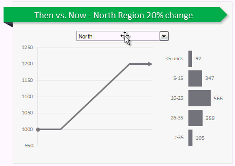
- 2: Form controls + Charts
- 3: Pivot tables + Slicers
- 4: Macros + Automation
- 5: Using right feature @ right time
- How to learn these magic tricks
- Conclusions
Go ahead and listen to the show
Podcast: Play in new window | Download
Subscribe: RSS
Links & Resources mentioned in this session:
Conditional Formatting
- Basics of conditional formatting
- Magical uses – example 1, example 2 & more
Form controls + Charts
- Introduction to form controls (or listen to the podcast)
- Magical uses – example 1, example 2 & more
Pivot Tables + Slicers
Macros & VBA
- Introduction to VBA
- Magical uses – example 1, example 2 & more
Transcript of this session:
Download this podcast transcript [PDF].
What are your favorite Excel magic tricks?
My favorites are conditional formatting, slicers, form controls + charts in that order.
What about you? What features of Excel are most impressive and mesmerizing? Please share your thoughts using comments.
Subscribe to Chandoo.org Podcast


5 Responses to “Preparing Profit / Loss Pivot Reports [Part 2 of 6]”
[...] Preparing Pivot Table P&L using Data sheet [...]
[...] Preparing Pivot Table P&L using Data sheet [...]
[...] Preparing Pivot Table P&L using Data sheet [...]
I am not getting sound from the videos. I have checked all the settings and spent several hours searching the Internet to no avail.
Has anyone else had this problem?
Is there anyway to get the Grand Total to be broken out in the same fashion as the items above it? For instance, if you have in column 1, widget a, widget b, and have their sales by month in column 2, I'd like to see the grand total also be by month, for widget a & b combined.
I can't get anything other than a single line for the grand total, rather than the same format as the data above.
Widget A Month Sales
Jan 100
Feb 200
Widget B
Jan 150
Feb 250
Grand total - here I would also like to have Jan, Feb.
Jan 250
Feb 450