
We all know about the MAX formula. But do you know about 3D Max?
Sounds intriguing? Read on.
Lets say you are the sales analyst at ACME Inc. Your job involves drinking copious amounts of coffee, creating awesome reports & helping ACME Inc. beat competition.
For one of the reports, you need to find out the maximum transactions by any customer across months.
But there is a twist in the story.
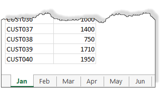
Your data is not in one sheet. It is in multiple sheets, one per month.
Like this:
How to get the max value for all months?
Using 3D MAX formula
We can use 3D formulas in such cases. 3D formula?!?
Lets say our transaction data is in column C, in range C5:C44 in all sheets (same cells in all sheets)
To calculate the max of all the transactions, we simply write:
=MAX(Jan:Jun!C5:C44)
Notice the blue text? That is what makes our references 3D.
Aside: If row & columns make Excel 2D, sheets in a workbook act as 3rd dimension. Hence the name 3D reference.
This formula will go and fetch all the C5:C44 data from sheets Jan thru Jun and gives us the desired answer.
Related: Consolidating data from multiple sheets using 3D references.
What if you want to consider only specific months
The 3D formula approach is simple & powerful. But what if you want to consider data only in a specific list of sheets (or months in our case)?
For example, what formula would work if we want to calculate maximum transactions in months Jan, Mar, Apr & Jun alone?
Lets say the names of the sheets we want to consider is listed in a range called sheet.names

Also, keep in mind that the data is in range C5:C44 in all the sheets.
Then the below formula gives us maximum value from the selected sheets.
{=MAX(N(INDIRECT(ADDRESS(ROW(A5:A44),3,1,1, TRANSPOSE(sheet.names)))))}
It is an array formula. So you must press CTRL+Shift+Enter to get the correct result.
PS: Thanks to Pranay Shah, whose question inspired me to write this formula.
How does it work?
First lets figure out the logic we need to use.
- We have a list of sheet names in the range sheet.names
- For each sheet, get the data from cells C5:C44
- Calculate the max of all this data
Now, lets take a look at the formula, inside out.
ROW(A5:A44) portion: This generates an array for numbers from 5 to 44 – {5;6;7;…;42;43;44}
Transpose(sheet.names) portion: This transposes the vertical sheet names array to horizontal. So {“Jan”;”Mar”;”Apr”;”Jun”} becomes {“Jan”,”Mar”,”Apr”,”Jun”}
ADDRESS(ROW(),3,1,1,TRANSPOSE()): This generates an array of cell addresses from rows 5 to 44, column 3 and sheets in sheet.names range. The result looks like this:
{“Jan!$C$5″,”Mar!$C$5″,”Apr!$C$5″,”Jun!$C$5”; “Jan!$C$6″,”Mar!$C$6″,”Apr!$C$6″,”Jun!$C$6”;
“Jan!$C$7″,”Mar!$C$7″,”Apr!$C$7″,”Jun!$C$7”; “Jan!$C$8″,”Mar!$C$8″,”Apr!$C$8″,”Jun!$C$8”;
“Jan!$C$9″,”Mar!$C$9″,”Apr!$C$9″,”Jun!$C$9”; “Jan!$C$10″,”Mar!$C$10″,”Apr!$C$10″,”Jun!$C$10”;
…
“Jan!$C$41″,”Mar!$C$41″,”Apr!$C$41″,”Jun!$C$41”; “Jan!$C$42″,”Mar!$C$42″,”Apr!$C$42″,”Jun!$C$42”;
“Jan!$C$43″,”Mar!$C$43″,”Apr!$C$43″,”Jun!$C$43”; “Jan!$C$44″,”Mar!$C$44″,”Apr!$C$44″,”Jun!$C$44”}
Why TRANSPOSE()?
If we have not TRANSPOSE()ed either sheet.names or row numbers, we will not get full list of addresses. TRANSPOSE forces Excel to generate all combinations of addresses from given row numbers & sheet names.
For example, here is the result of the formula
ADDRESS(ROW(A5:A44),3,1,1, sheet.names)
Notice the missing TRANSPOSE()
{“Jan!$C$5″;”Mar!$C$6″;”Apr!$C$7″;”Jun!$C$8”;#N/A;#N/A;#N/A;#N/A;#N/A;#N/A; #N/A;#N/A;#N/A;#N/A;#N/A;#N/A;#N/A;#N/A; #N/A;#N/A;#N/A;#N/A;#N/A;#N/A;#N/A;#N/A;#N/A;#N/A;#N/A;#N/A; #N/A;#N/A;#N/A;#N/A;#N/A;#N/A;#N/A;#N/A;#N/A;#N/A}
INDIRECT(ADDRESS()) portion: We have the addresses and we need values. This is exactly the purpose of INDIRECT formula. So we pass the list of addresses to INDIRECT to get the cell values.
This results in an array of numbers like this:
{1400,900,1225,1440; 1035,1300,850,1850; 990,2000,1140,775; 1520,870,1225,650; 1300,1000,1800,875; 1305,980,1085,1215; 750,1350,1000,1330; 1050,600,1125,1755; 990,735,1350,1600; 1215,1750,770,625; 1600,735,1305,1300; 960,1950,1480,1800; 1215,1365,1110,1395; 1320,910,750,1560; 1700,975,1125,1480; 900,1400,780,1300; 1485,1440,960,1300; 825,2125,1110,1215; 1000,945,810,1120; 1650,500,1170,990; 1440,1080,1110,840; 1035,840,1300,800; 1225,1330,1020,1560; 1100,690,1170,780; 600,700,1280,990; 1000,1000,1400,700; 1260,1520,875,1305; 1360,1260,925,1320; 810,1100,2000,1800; 825,690,750,1215; 1575,1560,1000,1900; 1190,1080,960,1400; 1200,1200,1160,980; 900,1665,575,500; 880,1000,1200,1550; 1000,950,1440,550; 1400,900,1000,1190; 750,1190,1110,700; 1710,805,800,1755; 1950,1365,660,1150}
Now, notice the 2 dimensional nature of this array. It has 4 items per row.
N(INDIRECT()) portion:
We just pass the array of numbers to N() so that they are force converted to numbers. This step ensures that we get correct results with MAX.
Note: Even without N() your array formula shows a result, but often this will be incorrect. I assume it is one of the quirks of Excel and we just have to use N().
Related: See how N() plays a vital role in situations like – dynamic charts from non-contiguous data & String parsing.
MAX(N()) portion:
This will just tell us what the maximum number in that array. Make sure you press CTRL+Shift+Enter to get the correct result.
Download Example Workbook
If all these MAX formulas are confusing, check out the example workbook. It shows all these. Play with the formulas and examine the results to learn more.
Do you use 3D references?
I rarely use them. This is because, most of the times, my data is in one place. If is it scattered across multiple sheets, I usually spend time writing a macro (or using Power Query) to consolidate the data to one place before attacking the analysis problems.
But I find 3D references & formulas a powerful way to answer questions like this.
What about you? Do you use 3D references in your formulas? When do you use them? Please share your thoughts & experiences using comments.
Learn more
If this technique sounds interesting, check out below tutorials to learn more.
- MaxIF formula in Excel
- Using INDEX formula in Excel
- Calculate maximum change – problem & Solution
- Calculating all-time high & trailing 12 months high values


4 Responses
Huh. Today I learned something new about 3D refrences. Didn’t even know this existed and it is very useful to what I’m currently working on.
Thanks Chandoo!
I use INDIRECT function to consolidate monthly reports from our branches (name of the list is code of the branch). Nice characteristic is that if you delete the list/row with data and put there a new, that function INDIRECT do not fail with ERROR.
that looks cool, just need a use case for it now.
How do you get all these values in excel? I can only get “Jan!$C$5” to show up but i wanna see all the values like you have
For example, here is the result of the formula
ADDRESS(ROW(A5:A44),3,1,1, sheet.names)
Notice the missing TRANSPOSE()
{“Jan!$C$5?;”Mar!$C$6?;”Apr!$C$7?;”Jun!$C$8?;#N/A;#N/A;#N/A;#N/A;#N/A;#N/A; #N/A;#N/A;#N/A;#N/A;#N/A;#N/A;#N/A;#N/A; #N/A;#N/A;#N/A;#N/A;#N/A;#N/A;#N/A;#N/A;#N/A;#N/A;#N/A;#N/A; #N/A;#N/A;#N/A;#N/A;#N/A;#N/A;#N/A;#N/A;#N/A;#N/A}
drag the formula to the right if your are using transpose or vertically downwards if you are not using transpose.
then select all the cells with the formula , press F2 followed by Ctrl+shift+enter (its an array formula)