
HR managers & department heads always ask, “So what is the vacation pattern of our employees? What is our average absent rate?”
Today lets tackle that question and learn how to create a dashboard to monitor employee vacations.
What do HR Managers need? (end user needs)
There are 2 aspects tracking vacations.
- Data entry for vacations taken by employees
- Status dashboard to summarize vacation data
Based on my interaction with few HR managers, the below questions are asked most often when it comes to vacation tracking:
- What is the absent rate of our employees (in any year or latest 3 month period)
- What are the vacation patterns for individual employees (or teams)
- On which dates most employees are absent?
- Who is taking most (or least) vacation days?
A look at the completed Vacation Dashboard
Take a look at the completed dashboard (click to enlarge).

Constructing Employee Vacation Dashboard
The construction process can be broken in to 3 steps:
- Vacation tracker for entering dates & types of vacations.
- Calculation engine
- Dashboard design & formatting
Step 1: Creating a tracker for vacations
The best way to create a tracker is to use Excel tables. Set up one with 4 columns – Employee name, vacation type, start date & end date, like below:
![]()
By using tables, we can continue to add more vacation data (or remove older data) and all our formulas continue to work seamlessly.
Additional tables required…
Apart from the main vacations table, we need below tables:
- Employees table – to keep the names of employees
- Vacation types table – to keep the type of vacations
- Holidays table – with official holiday dates
Step 2: Calculation engine
There are 3 portions in our dashboard and each of them requires certain calculations.
- Date logic
- Employee view
- Calendar view
For all the views, the main driver is latest date, which is the maximum value of end date column in vacations table (=MAX(Vacations[End Date]))
Tip: Use Max to find latest date
Although the calculations are not very complex, explaining each of them can be very tedious. So let me summarize them with a diagram.
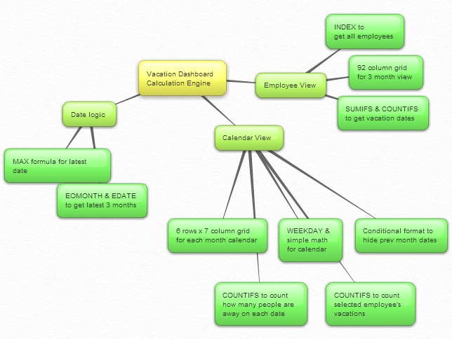
Important formulas used in the calculations:
The key formulas & ideas used are,
- Range lookup formula
- SUMIFS formula
- Calendar formulas
- EDATE, EOMONTH, WEEKDAY, NETWORKDAYS Formulas
- The lovely INDEX formula
Step 3: Dashboard design & formatting
This dashboard is an excellent example of synthesis – combination of multiple Excel features to create something very simple and easy to use.
Excel features & ideas used:
There are many Excel features & ideas used in this dashboard. First take a look at the illustration below.
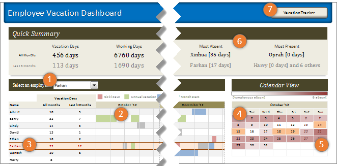
- Combo box form control to select an employee to highlight their vacations
- Conditional formatting & cell grid to show vacations in a gantt chart like view.
- Highlighting selected employee’s vacations again using conditional formatting.
- Calendar view created by picture links
- Heat map of number of people away on each date using conditional formatting (similar example).
- Header section with references to calculations & cell formatting.
- Hyperlink on a rounded rectangle shape to link to tracker sheet.
Formatting the dashboard:
The basic layout of dashboard is just 3 boxes – a big summary box on top, a large employee view box (70%) and a small calendar view box (30%).
The fonts are Calibri & Cambria default fonts in Excel 2007 or above.
I used variations of Tan color in most areas of dashboard (headers, box backgrounds, buttons etc.) and shades of pink, blue, green & gray for marking the vacations. Orange is used to highlight selected employee’s vacations.
Although there is a lot of data, I designed this dashboard with minimal clutter. It is very easy to use (there is only one input control).
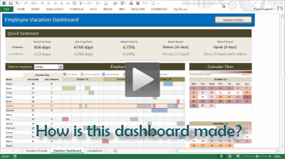
Download Employee Vacation Dashboard
Click here to download the employee vacation tracker & dashboard workbook. Play with it to learn more.
How do you like this dashboard?
I have thoroughly enjoyed the process of building this dashboard. I especially loved how picture links, conditional formatting heat maps (color scales) & simple calendar logic all have blended in to create a stunning calendar view.
What about you? Do you like this dashboard? How would you have designed it? Go ahead and share your feedback, ideas & suggestions for improvements in comments. I am eager to learn from you.
Want to learn more about this dashboard?
If you want to learn how this dashboard is constructed in a detailed fashion (along with 6 other dashboards & ton of material on dashboard design process) then please consider joining in our Excel School Dashboards program. Just today, I have uploaded a lesson (35 mins) on Employee Vacation dashboard to our Excel School website. You can use it and 32 hours more of video instruction to become awesome in Excel.


17 Responses to “Budget vs. Actual Profit Loss Report using Pivot Tables”
Good Work, Yogesh & Chandoo! Thanks.
Hi everybody,
first sorry I am late to say something about this topic;actually I was waiting last part
second I am not accountant I am an Engineer
third """"Very Important""" the idea is not about Loss but I am sure it is profit
Based on third it shows:
1- How to use EXCEL
2- How to use pivot TABLES
3- How to collect and arrange DATA
4- How to make reports
Many Thanks
Hi Yogesh and Chandoo,
Thank you for sharing your knowledge!
You guys are great!
thanks chandoo and yogesh, thanks for you lessons, are great!....i have a idea for a budget. I try to do it..... thanks for all
Thanks a lot for sharing the most powerful tool worldwide "knowledge"
Warm greetings from Peru
Hi -
This is a really great article because it's a simple and common thing you'd want to do with a pivot table but not at all obvious how to do it! So - muchas gracias to Chandoo and Yogesh!
One thing - I couldn't get past the group error in the sample file. I would click on ungroup but it didn't seem to have any effect. I'd appreciate it if anybody has any pointers here.
-Juanito
Hi Chandoo
I am also having the group error. Can't seem to ungroup? Appreciate if you explain further on the steps required in order to get to calculated items.
Many thanks and keep up the great work.
Cheers
Adam
Hi Chandoo,
I'm struggling resolving the problem depicted below:
I have a set of data, with (among others) a "Region" field (can be APJ, EMEA, or AMS), and a "Country" field.
Unfortunately, I need to group data by the following 4 Regions: APeJ, Japan, EMEA and AMS.
I first tried to make a pivot with Region and Country in the rows (or columns), and then group Country data as per the above.
Alas, as soon as I have a new Country that appear in my data set, my groupings are broken, and I have to redo the job of ungrouping, grouping etc.
I thought I could try to use calculated item, by adding first a new column to my dataset concatenating Region_Country, and create an "APeJ" calculated item that would sum all the "APJ_*" and substract the "APJ_Japan", but again, no clue, as I can't find a way to use any wild card in those formulas.
Given that I already found extremely helpful tips and tricks in your site that helped me manage that bunch of data, I'm pretty sure you'll have a bright idea on how I can solve that one!
Thanks in advance for your lights!
Hi Catherine...
In such cases, I advice using an additional column in the data itself. You can set-up a grouping table else where with country in first column, region in second column. And then in the data, you can add an extra column and use VLOOKUP to fetch the region based on the country.
Then feed this entire data (with extra column) to pivot table and use the extra column to group the data.
Hi Chandoo,
Thank you for your prompt answer.
I finally came to the same conclusion - after a rest 🙂 . I was probably too tired Friday evening (it was rather late), having spent hours in manipulating all my surveys data so as to pull rolling averages, make nice graphs and so on, and was trying to find a complex solution when there was a simple one.
Thanks again,
Catherine
Hey,
Great post!
I for example have different database structure with the following fields :
Date, Expense, Income, Sum (Income - Expense), Category (Sales, Cost of Goods and etc).
Creating a P&L report for the whole year works great. Including gross margin % and etc.
Though, creating P&L report by QTR/Month is becoming impossible since i get the following error : “This PivotTable report field is grouped. You cannot add calculated item to grouped filed.”
Is there a solution for this kind of problem?
Like Adam and Juanito, I also cannot ungroup.
Would appreciate it if you can add a few more lines and a screenshot or two on where to put the mouse cursor to ungroup.
Hi, I have figured out the ungrouping problem. One of the earlier steps was to group by month, if you pull the month back down to the column then right click and then select ungroup, then pull the month back up so you end up with just data source and budget/actual as the headings, then you can continue on.
To solve the ungroup problem, my method is:
Copy the "data" sheet to a whole new Excel workbook
and directly work on Part 6.
And since it is a fresh copy, Excel don't show me the "can't ungroup" problem. Hope this help.
Thank you Yogesh for this wonderful tutorial.
Kent, Malaysia
Just when i thought pivots were awesome i learn about inserting the calculated fields and that makes them more awesome. chandoo where have you been all my life.
Hello - your P&L pivot version has really impressed my boss and would like to use it. I have applied it for a actual vs budget vs forecast model I have created. One problem. In your variance above the operating profit percent % variance shows 33.8% but I want it to show (0.01) point or the true diff from prior budget.
I know I can add calculation to the side but boss would like to see it in pivot table.
Please help
Thanks
I have a further query which may solve my above dilemma. Is it possible to add a column that calculates percent increase. So in the example above a new column would be added to show variance %.
Any help would be appreciated.
Thanks