
Sales Funnel or Sales Process refers to a systematic approach to selling a product or service. [more on sales process]
Whether you run a small business or part of a large corporation, chances are, you heard about Sale Funnel. Understanding & analyzing your sales performance from a Funnel point of view is a great way to learn more about your sales processes.
About 2.5 years, we published an article on how to create Sales Funnel Charts using Excel. It shows, how you can tweak regular Excel bar chart to create a funnel chart.
Today, I want to show you a dead-simple way to create funnel charts using In-cell Charting Technique.
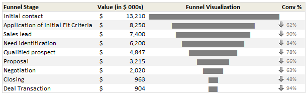
Take a look at the in-cell sales funnel chart:
Ready to make your own sales funnel chart? Well, lets get started then.
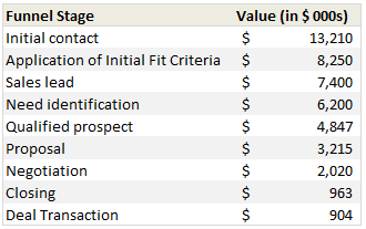
Step 1: Arrange your Sales Data
This is the easy part. Just arrange your sales process data in this fashion.
Step 2: Use an empty cell to define re-sizing factor
Since sales funnel numbers can be quite large, we need a way to reduce the numbers to meaningful size. I used 50 as my resizing factor (and entered this in cell C17). You can use 100 or 10 depending on your values.
Step 3: Generate In-cell Charts
In the column next to sales process numbers, we use REPT formula to generate In-cell charts. We will print | symbol ‘n’ number of times, where ‘n’ is sales process value / re-sizing factor.
For ex. this is the formula for first row:

Step 4: Change the font for In-cell Charts to “Playbill” size 11
The default Excel font (Calibri or Arial) produces an ugly looking in-cell chart. To fix this, we just need to change the font of in-cell chart cells to Playbill, size 11. (You can also use Script font, size 8 with Bold).
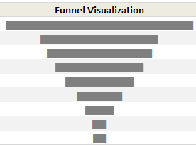
At this point, our funnel chart looks like a skewed funnel:

Step 5: Align Center to make the funnel chart
Now, just select all the in-cell chart cells & align to center. That is all. Our funnel chart is ready.
Download Sales Funnel Chart Template
Click here to download the sales funnel chart template & play with it. Go nuts analyzing your funnel or wowing at the simplicity of this technique.
How do you analyze your Sales Funnel?
Since I run a small business, understanding how my sales process works is important for me. However, since my sales process has only a few steps, I use ad-hoc funnel analysis. For example, I have these stages for my sales process:
- You visit Chandoo.org (casual visitor, possible thru search)
- You become a lover of Chandoo.org (loyal visitor, spends more than 15 mins per visit)
- You visit one of the product pages (designated sales pages)
- You click on purchase button (measured by the number of sales)
I do not track these at individual level, instead, I only measure the numbers at monthly aggregates and then do simple analysis like measuring conversion %s to see if everything is alright. Also, quite often, regular visitors of Chandoo.org convert to customers only after visiting us for a few months.
What about you? How do you analyze your sales funnel. What kind of charting techniques you use? Please share using comments.


10 Responses
Nice and easy way of doing it!
Great post! After reading the post thought that alternative way could be to use conditional formatting celss with data bars:
– fill two columns next to each other with the “funnel values”
– format both of them conditionally with data bars
– and finally change the bar direction of the leftmost column from right-to-left
Just that it leaves a “white axis” in between the cells
http://dl.dropbox.com/u/14207795/databars_funnelanalysis.png
Very impressed with this technique and visualisation !
What about the last colunm…”conv”? How do you do that arrow part? I see that in a lot of your dashboards/etc. LOVE this visualization though!!!
Thanks!
3G
3G: Check out the conditional formatting rules. thats how the arrows are done =] took me a while to find.
3G: For the purpose of this tutorial, the arrows are done using conditional formatting. But if you’re using Excel 2003 (or otherwise if you simply want to use a different arrow format) you could try doing the arrows using the character map. In a nutshell: open the character map (Start-All Programs-Accessories-System Tools-Character map), change font to Wingdings3 (or other font like that), copy the arrow formats that you want and paste them in Excel. Then, write an IF formula in the cell where you want your arrows to appear, something like =IF(value1>value2, [down_arrow_cell), IF(value1<value2, [up_arrow_cell],IF(value1=value2,[equal_arrow_cell],""))). Change the font to Wingdings3 (or the font that you have used for the arrows) and you're done.
There was a post in which Chandoo explained in detail the way to do this, but I can't seem to find it right now :).
Wonderfull IF formula for inserting arrows.
If I need to change the color depending upon the arrow, i.e. if down arrow, then the arrow color should be red, if up arrow the arrow color should be green and so or – kindly advise.
Nice charting method. One more tip if you can add it to the post, is that the resizing factor which you have kept fixed can be made dynamic to suit varying values in your chart. I created a similar chart for our sales funnel, and kept the resizing factor as 1% of the top of the sales funnel.
This ensures that the funnel visualization does not go awry even if there is huge variation in the sales data.
Chandoo, I have been frequently hearing about charting tools like Mini tab/in cell chart(not using REPT() ), can you share some advanced techniques mirroring the same in to excel(using some formulae). I guess Mini tab is compatible only with Excel 2010.
Thanks.
Chandoo – love your work. Keep it up. This template was a God send