
Excel table is a series of rows and columns with related data that is managed independently. Excel tables, (known as lists in Excel 2003) is a very powerful and super-cool feature that you must learn if your work involves handling tables of data.
What is an Excel table?
![]() Table is your way of telling excel, “look, all this data from A1 to E25 is related. The row 1 has table headers. Right now we just have 24 rows of data. But I can add more later!”
Table is your way of telling excel, “look, all this data from A1 to E25 is related. The row 1 has table headers. Right now we just have 24 rows of data. But I can add more later!”
When you make a table (more on this in a sec) you can easily add more rows to it without worrying about updating formula references, formatting options, filter settings etc. Excel will take care of everything thus making you a data guru.
How to create table from a bunch of data?
To create an excel table, all you have to do is select a range of cells and press the table button from Insert ribbon in Excel (or use the shortcut CTRL+T).
See this simple tutorial:

Today we will learn 10 excel data table tricks that will make you a data guru, no let’s make that DATA GURU.
The most important thing after you create a table – Give it a name
Once you have a table, go to design ribbon and give your table a name. If you don’t name it, Excel will call it Table2 or whatever. But once you name it, you can write meaningful formulas thru sweet sweet structural references feature. So name your tables.
1. Change table formatting without lifting a finger
Excel has some great predefined table formatting options. Just select any cell in your table and change the table formatting by going to “format as table” button in the home ribbon.

If you are bored with the predefined formats, you can easily define your own table formatting color schemes and apply them.
2. Add Zebra Lines to Tables without doing Donkey Work
When you create a table, zebra lines come as a bonus. And when you add new rows to the table, excel takes care of zebra lining or banding automatically. You can turn on / off the banded rows feature from “design ribbon tab” as well.

That means you don’t need to use conditional formatting or manually format alternative rows in different color.
3. Tables come with Data Filters and Sort Options by default
Each data table comes with filters and sorting options so that you can filter and sort the data in that table independently. That also means, if a worksheet has 2 tables, they each get their own data filters (usually excel wont allow you to add more than one set of filters per sheet, but when it comes to tables, all exceptions are made, just for you)

4. You can also Slice your tables with slicers
![]() That is right. When you have a table of data, you can insert a slicer (either from design ribbon or insert ribbon) and use that to filter your table data intuitively.
That is right. When you have a table of data, you can insert a slicer (either from design ribbon or insert ribbon) and use that to filter your table data intuitively.
Learn all about Excel Slicers.
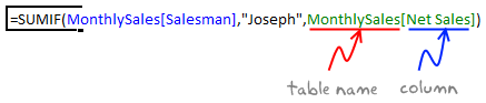
5. Bye, bye cell references, welcome structured references
The most important advantage of tables is that, you can write meaningful looking formulas instead of using cell references. When you create and name the table (you can name the table from design tab), you can write formulas that look like this:
The beauty of structured references is that, when you add or remove rows, you don’t need to worry about updating the references.
Learn all about structural references in Excel.
6. Make Calculated Columns with ease
Any tabular data will have its share of calculated columns. Excel tables make having calculated columns very easy. With structured references, all you need to know is English to make a calculated column. The beauty of calculated columns in table is that, when you write formula in one cell, excel automatically fills the formula in the rest of cells in that column. That would make you an instant data guru.

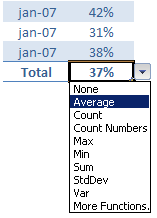
7. Total your Tables without writing one formula
 The ability to summarize data with pivot tables is extended to excel tables as well. You can add total row to your table with just a click.
What more, you can easily change the summary type from “sum” to say “average”.
8. Convert table back to a range, if you ever need to
If you ever wanted to go back to a normal range of data, you can easily convert the tables back to named ranges.
Excel will take care of the formulas and change the references to cell references.
9. Export Tables to Pivot Tables, Woohoo
What good is a bunch of data when you can’t analyze it? That is where Pivot tables come in to picture [pivot table tutorial]. Thankfully, you don’t need to do much. Just click a button and your table goes to pivot table.

10. Push the table data to Sharepoint Intranet Site
If you have a corporate intranet Sharepoint portal, you can easily publish the excel tables as share-point lists. This can be handy if you want to publish, say the top 10 sales persons of the quarter on the intranet.

11. Print Tables Alone, with out all the other stuff around

Select the table, hit CTRL+P and in settings area, select “Print Selected Table” option to print your beautifully formatted Excel table.
12. Change, reshape or clean your table data with Power Query
When you have data in a table, you can easily load it to Power Query (Get & Transform Data) using the “From Table” button.

Here is an an example of what Power Query can do for you.
13. Got multiple tables? Connect them to make a multi-table pivot

When you have more than one table, you can also connect them using Excel’s relationship feature. This way, you can build multi-table pivots to create powerful analysis of your data.
Learn all about Excel Table Relationships.
So, What do you think about Excel tables?
I say, give them a try. They have been around for more than a decade, but I still see people not using them. Setting up your data as a table is the easiest and most awesome thing you can do it. You can find some cool uses for tables in your day to day work. They are intuitive, easy to use and provide great power without added complexity.
Related Material
- Beginner:
- Advanced:
- More sources about tables:


19 Responses to “How to Distribute Players Between Teams – Evenly”
An excellent solution, especially for large data sets.
Another solution without using solver would be to assign the player with the highest score to Team 1, the 2nd to team 2, 3rd to team 3, 4th to team 3, 5th to team 2, 6th to team 1, 7th to team 1 and it continues. This method would end up with a Std Dev of 0.001247219. This works best with a distribution with lower Std Dev for the dataset.
Full Disclosure: this is not my idea, remember reading something a few years ago. Think it may have been Ozgrid
thinking back I now remember why I read about it. About 10 years back I had to distribute around 300 team members into 25-30 odd teams. Used this method based on their performance scores. I used the method I described to do this and the distribution was pretty fair.
Solver would have saved me a ton of time though 🙂
I think the issue with you first Solver approach was that you took the absolute value of the sum of team deviations (which should always be zero except for rounding) instead of the sum of the absolute values (which is a reasonable measure of how unbalanced the teams are).
Here's another simple algorithm you could use: you start from the top (with players sorted from high to low), and at each step allocate the next player to whichever team has the smallest total so far. You can implement it dynamically with some formulas so it will update automatically when the data changes.
If the scores were more widely distributed (so that this might end up with not all teams the same size), you could add a constraint to only pick among the teams which currently have fewest players at each step, or just stop adding to any team when it hits its quota.
When I tried it on the sample, I got the three teams below, with a STDEV of 0.000942809 (i.e. about half of what Solver got to).
Team 1: John, Hugo, Tom, Josh, Eric, Zane, Charles, Andrew
Team 2: Barry, Michael, Kenny, Joe, Xavier, Patrick, Oliver, William
Team 3: Henry, Steven, Ben, Frank, Kyle, Edward, Cameron, Lachlan
Thanks for sharing!
Hi,
I was looking at all the solutions and this is closest to what I intended to do. I am dividing a bunch of players into 3 soccer teams. Players availability is also a factor while deciding the teams.
So the steps the excel needs to do is as follows:
1) In availability column if "yes" go to next
2) Equally divide 'Goalkeepers', 'Strikers', 'Defenders' basis their quality
So the end result gives each 3 teams a balance of players playing at different positions.
Can this be done on Google spreadsheet with only availability as an input from the user and rest calculates by itself.
Sorry for asking such a pointed question, but I have been struggling to find a solution for it for sometime now!
Hi Ishaan,
I am working on a similar problem at the moment, so I am wondering if you ever found a solution and if you are willing to share what you did.
Hi everyone, this is a variation of the famous Knapsack Problem https://en.wikipedia.org/wiki/Knapsack_problem.
I had to use a VBA implementation recently as part of a problem, where we ar trying to allocate teams of an organization into different locations (we are a large company with many different team). The goal was to optimally allocate teams to individual buildings without putting too many teams into one building and not splitting teams apart.
As we had around 400 teams of different sizes, solver couldn't handle it anymore. Luckily there is a Knapsack algorithm implementation in VBA readily available on the internet :).
I also went with a heuristic approach first!
An interesting mathematical solution but what if Eric and Xavier can't stand each other or Patrick is best friends with Steven - the real life problems that effect "even" teams.
@Joe
You can add more criteria like
If Eric and Xavier can't stand each other
=OR(AND(E15=1,E16=1),AND(F15=1,F16=1),AND(G15=1,G16=1))
It must be False
If Patrick is best friends with Steven
=OR(AND(E5=1,E17=1),AND(F5=1,F17=1),AND(G5=1,G17=1))
It must be True
Note that the 2 formulas above are exactly the same
except for the ranges
One must be True = Friends
One must be False = Not Friends
Nice Post!
Just one question What if number of players are not even or equally divisible.
Nice post Hui!
I download your workbook and just try to change in options the Precision Restriction from 10E-6 to 10-8 and the Convergence from 10E-4 to 10E-10. The process take almost the same time, but the results was great.
The standard deviation I got was 0,000471.
Team 1: John, Tom, Kenny, Frank, Eric, Xavier, Edward, Zane
Team 2: Steven, Hugo, Ben, Joe, Josh, Oliver, Cameron, William
Team 3: Barry, Henry, Michael, Kyle, Patrick, Charles, Andrew, Lachlan
Great application of Solver! Thanks for the link!
Great explanation. Well done... However, I tried with 6 teams of 4 players and solver never did finish.
How about vba code for the same data set.
I have 3 column A B C wherein A has text and B has number Wherein C is blank. And in C1 been the header C2 where I want the name to come evenly distributed the number which is in Column B.
My Lastcolumn is 1000.
Sorry if I'm being slow here, but how is 'Team Score' calculated? I've gone through the explanation several times but it seems to just appear.
@Hrmft
This process uses the Solver Excel addin
Solver is effectively taking the model and trying different solutions until it gets a solution that meets all the criteria
Then solver puts the solution into the cell and moves to the next cell
So yes it appears to "just appear"
Hi ! Thank you so much ! Works great 🙂
I cannot get the fourth Equation to work in my excel spreadsheet
You have =($E$2:$G$25=0)+($E$2:$G$25=1)=1 as a SUMIF solution, I have, =($F$2:$H$13=0)+($F$2:$H$13=1)=1 as my solution but it does not work. The only thing I changed is the ranges. Any suggestions?
Thank you.
Jim
I cannot get the fourth Equation of TURE or FALSE statements to work in my excel spreadsheet You have =($E$2:$G$25=0)+($E$2:$G$25=1)=1 as a SUMIF solution, I have, =($F$2:$H$13=0)+($F$2:$H$13=1)=1 as my solution but it does not work. The only thing I changed is the ranges. Any suggestions?
Sorry I left some of it out in the previous question,
Thank you. Jim