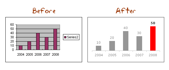
This weekend, let us talk … umm… charts. I want to know if you absolutely make sure your charts look good everytime you sent them out to someone. I do this most of the time.

My usual chart sex up routine is,
- Remove the background
- Add labels and remove grid lines and legend
- Highlight necessary data and set some dull color to the rest (if needed)
- Change fonts, most often change them to Verdana
- Format axis and axis labels
Of course, I don’t do this every time. Instead I use some user defined charts and save tons of time.
How do you sex up your charts? or you say “not tonight honey” to them.
Learn 2 more charting principles in naughty but totally fun way: Is your chart’s underwear showing? | Are you making blow charts?


4 Responses to “[Weekend Poll] How do you Sex up your Charts?”
You might consider removing the category axis labels
Andreas
I can just imagine the SPAM you're getting with this post.
@Andreas: I doubt if that would lead to information loss as there is no way to know what we have plotted here then.
@Tony: yeah... but askimet does the dirty job
Are these the only tips you have, these are extremely basic and frankly i was expecting a lot more. The chart is very unclear, not titles are axis headings! Disappointed!