
 Today, lets tackle an interesting problem.
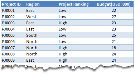
Lets say you are looking at some data as shown aside and wondering what is the sum of budgets for top 3 projects in East region with Low priority. How would you do that with formulas?
This article is inspired from a question asked by acpt22 in our forums.
Sum of top 3 values based on filtered criteria
Watch below video to understand how to find sum of top 3 values using formulas & pivot tables.
Watch this video on our YouTube channel.
Download Example Workbook
Click here to download example file and play with it. Examine the formulas & pivot table settings to learn this technique better.
Do you calculate sum of top ‘n’ values often?
Often, I have to calculate sum of top ‘n’ values and I use SUMPRODUCT + LARGE combination. SUMPRODUCT (or simply SUM) is such a versatile formula that you could almost use it when your car breaks down on a free way.
What about you? Do you calculate sum of top ‘n’ values? Which techniques do you use? Please share using comments.
Learn more
If you sum & count for your living, then you are going to love below tips.


28 Responses
How come in pivot tables you cannot calculate the median?
I’m blocked from seeing the video. Is there a text explanation anywhere?
You can do something like =SUM(large(range,1),large(range,2),large(range,3)
or =SUMIF(range,”>=”&LARGE(range,3))
or as an array formula =SUM(IF(range>=LARGE(range,3),range))
You could also use RANK in place of LARGE with the order descending.
Or use RANK and go in descending order.
PPH, I can see how your formulas get the largest 3 in the range, but the formula in the workbook does that within the criteria “East” and “Low”. How does that formula work? I’m not familiar with “Slicer” named ranges, which it appears to use.
Not really sure because I haven’t touched slicers yet. But in array formulas you can nest ifs to filter for criteria.
So it’d be like:
=SUM(IF(range2=”East”,if(range3=”Low”,if(range>=LARGE(range,3),range)))
Having trouble getting this formula to work:
=SUM(IF(range2=”East”,if(range3=”Low”,if(range>=LARGE(range,3),range)))
I appears to be missing a close parentheses. When I add one to the end, and use it in Chandoo’s workbook, the formula is:
=SUM(IF(projects[Region]=”East”,IF(projects[Project Ranking]=”Low”,IF(projects[Budget(USD ”000)]>=LARGE(projects[Budget(USD ”000)],3),projects[Budget(USD ”000)])))). The result is 0.
Oh you know what… we need to array the large formula by those criteria. It’s ridiculously complex but enter this with CTRL+SHIFT+ENTER
=SUM(IF(projects[Region]=”East”,IF(projects[Project Ranking]=”Low”,IF(projects[Budget(USD ”000)]>=LARGE(IF(projects[Region]=”East”,IF(projects[Project Ranking]=”Low”,projects[Budget(USD ”000)])),3),projects[Budget(USD ”000)]))))
You’ll notice the answer is 95 and not 72, because numerically there are two that are tied as the 3rd largest values, so it’s adding both. Even with Chandoo’s formula you may need to define which you want, or both, or whatever.
Unable to watch the Video. If it’s uploaded on YOUTUBE than it’s still blocked in Pakistan.
Top 3 is simple enough once you get a hang of it, it’s the bottom 3, which causes an issue, what with zero’s representing no match.
Also, similarly,consider if all values were negative, the formula fails to get top 3!
@Vaibhav
Chandoo.org is a Moderated Forum
So it doesn’t show up until someone like me or Chandoo approves it
I Have deleted the second post
Hi Vaibhav ,
Try these :
TOP 3 : =SUM(LARGE(IF((Regions=”ME”)*(Project_Rankings=”High”)=0,-10*SIGN(Budgets),(Regions=”ME”)*(Project_Rankings=”High”))*(Budgets),ROW($1:$3)))
BOTTOM 3 : =SUM(SMALL(IF((Regions=”ME”)*(Project_Rankings=”High”)=0,10*SIGN(Budgets),(Regions=”ME”)*(Project_Rankings=”High”))*(Budgets),ROW($1:$3)))
Both formulae refer to the original question for their named ranges , and criteria ; both are entered as array formulae , using CTRL SHIFT ENTER.
How about using this array formula (works on a filtered table)?
=SUM(AGGREGATE(14,1,filtered_col,ROW(1:3)))
Now we can do by formula SMALL and SUM
SUM(SMALL(RANGE, {1, 2,3}))
thanks for the tutorial !
Really Helpful!! Thanks
really knowlegeable…. Thanks Chandoo….
Good one
This is really amazing, thanks a ton Mr. Chandoo
Hi, why doesn’t this formula work?
=SUMIFS(LARGE(budget_range,{1,2,3}),region_range,”East”,ranking_range,”High”)
@Amit
Did you enter it as an Array Formula?
Press Ctrl+Shift+Enter instead of Enter when entering the formula
@Hui yes I tried that but it still does not work. Any other ideas? Thanks.
Nevermind I got it!
I used =SUM(LARGE(IF(Region = “East”, IF(Ranking = “High”, Budget)),{1,2,3})) and entered it as an array formula
to make it more flexible for TOP N:
{=SUM(LARGE((Region=”East”) * (Ranking=”High”)*(Budget), ROW(INDIRECT(“1:3”))))}
Here replace 3 with top N you want to get.
Thanks for the helpful tip, however I have similar problem in finding the latest date for example of first array – company1, device1, Preventive Maintenance date, How do I find the latest date into a second array, while the second array contains the company1, device1 & I need to track the latest PM Date from the first array using the similar formula – Nagesh
Thanks for the tutorial. it was really helpful.
Thanks for video Chandoo,Its really helpful.But what about when we have same value like as your in example PJ001 & PJ004 have same value 22.