
HR managers & department heads always ask, “So what is the vacation pattern of our employees? What is our average absent rate?”
Today lets tackle that question and learn how to create a dashboard to monitor employee vacations.
What do HR Managers need? (end user needs)
There are 2 aspects tracking vacations.
- Data entry for vacations taken by employees
- Status dashboard to summarize vacation data
Based on my interaction with few HR managers, the below questions are asked most often when it comes to vacation tracking:
- What is the absent rate of our employees (in any year or latest 3 month period)
- What are the vacation patterns for individual employees (or teams)
- On which dates most employees are absent?
- Who is taking most (or least) vacation days?
A look at the completed Vacation Dashboard
Take a look at the completed dashboard (click to enlarge).

Constructing Employee Vacation Dashboard
The construction process can be broken in to 3 steps:
- Vacation tracker for entering dates & types of vacations.
- Calculation engine
- Dashboard design & formatting
Step 1: Creating a tracker for vacations
The best way to create a tracker is to use Excel tables. Set up one with 4 columns – Employee name, vacation type, start date & end date, like below:
![]()
By using tables, we can continue to add more vacation data (or remove older data) and all our formulas continue to work seamlessly.
Additional tables required…
Apart from the main vacations table, we need below tables:
- Employees table – to keep the names of employees
- Vacation types table – to keep the type of vacations
- Holidays table – with official holiday dates
Step 2: Calculation engine
There are 3 portions in our dashboard and each of them requires certain calculations.
- Date logic
- Employee view
- Calendar view
For all the views, the main driver is latest date, which is the maximum value of end date column in vacations table (=MAX(Vacations[End Date]))
Tip: Use Max to find latest date
Although the calculations are not very complex, explaining each of them can be very tedious. So let me summarize them with a diagram.
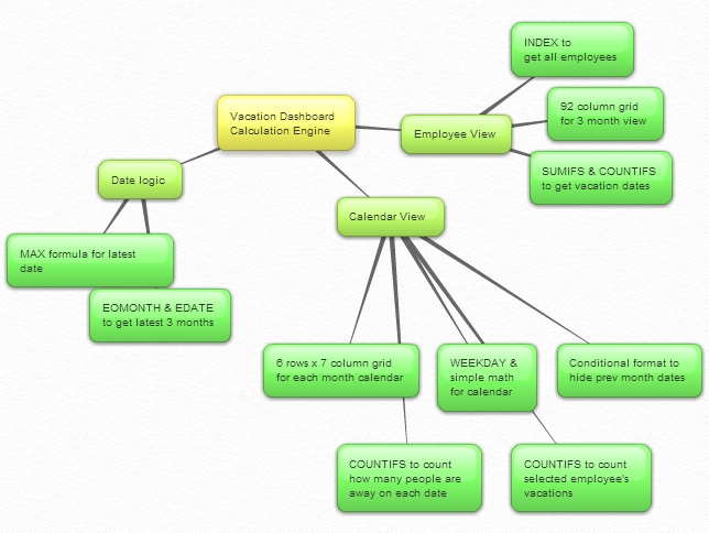
Important formulas used in the calculations:
The key formulas & ideas used are,
- Range lookup formula
- SUMIFS formula
- Calendar formulas
- EDATE, EOMONTH, WEEKDAY, NETWORKDAYS Formulas
- The lovely INDEX formula
Step 3: Dashboard design & formatting
This dashboard is an excellent example of synthesis – combination of multiple Excel features to create something very simple and easy to use.
Excel features & ideas used:
There are many Excel features & ideas used in this dashboard. First take a look at the illustration below.
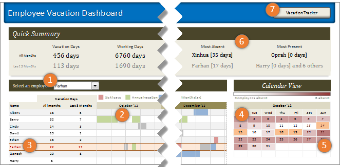
- Combo box form control to select an employee to highlight their vacations
- Conditional formatting & cell grid to show vacations in a gantt chart like view.
- Highlighting selected employee’s vacations again using conditional formatting.
- Calendar view created by picture links
- Heat map of number of people away on each date using conditional formatting (similar example).
- Header section with references to calculations & cell formatting.
- Hyperlink on a rounded rectangle shape to link to tracker sheet.
Formatting the dashboard:
The basic layout of dashboard is just 3 boxes – a big summary box on top, a large employee view box (70%) and a small calendar view box (30%).
The fonts are Calibri & Cambria default fonts in Excel 2007 or above.
I used variations of Tan color in most areas of dashboard (headers, box backgrounds, buttons etc.) and shades of pink, blue, green & gray for marking the vacations. Orange is used to highlight selected employee’s vacations.
Although there is a lot of data, I designed this dashboard with minimal clutter. It is very easy to use (there is only one input control).
Download Employee Vacation Dashboard
Click here to download the employee vacation tracker & dashboard workbook. Play with it to learn more.
How do you like this dashboard?
I have thoroughly enjoyed the process of building this dashboard. I especially loved how picture links, conditional formatting heat maps (color scales) & simple calendar logic all have blended in to create a stunning calendar view.
What about you? Do you like this dashboard? How would you have designed it? Go ahead and share your feedback, ideas & suggestions for improvements in comments. I am eager to learn from you.
Want to learn more about this dashboard?
If you want to learn how this dashboard is constructed in a detailed fashion (along with 6 other dashboards & ton of material on dashboard design process) then please consider joining in our Excel School Dashboards program. Just today, I have uploaded a lesson (35 mins) on Employee Vacation dashboard to our Excel School website. You can use it and 32 hours more of video instruction to become awesome in Excel.


25 Responses to “Display Alerts in Dashboards to Grab User Attention [Quick Tip]”
I prefer the red,grey,light grey,black icon set. I've also used in-cell pie charts from Fabrice's Sparklines for Excel as an alert which could also provide another piece of information.
I prefer the red,grey,light grey,black icon set. I've also used in-cell pie charts from Fabrice's Sparklines for Excel as an alert which can also provide another piece of information.
For Excel 2007, your formula should do the same as the Excel 2003 version, so that non-alert rows are blank - if they are 0, the unnecessary green icon will show
Hi Chandoo,
Nice Post !! just to add something for EXL 2003, we can also 4 Ifs and link to the alert data
For Ex: If we have alert data in Cell A2 and want to split in 4 orders namely <25%, 25-50%, 50-75% and 75%< then we can following formula and put fonts as you have suggested :
=IF(A2<0.25,CHAR(153),IF(A2<=0.5,CHAR(155),IF(A2=0.76,CHAR(152)))))
And then using Conditional Formating we can dashboard reflected on different COLOURS as per their respective alert.
Best Regards
Rohit1409
Hi Chandoo,
Nice Post !!! just to add something for EXL 2003, we can also 4 Ifs and link to the alert data
For Ex: If we have alert data in Cell A2 and want to split in 4 orders namely <25%, 25-50%, 50-75% and 75%< then we can following formula and put fonts as you have suggested :
=IF(A2<0.25,CHAR(153),IF(A2<=0.5,CHAR(155),IF(A2=0.76,CHAR(152)))))
And then using Conditional Formating we can dashboard reflected on different COLOURS as per their respective alert.
Best Regards
Rohit1409
The Complete formula [Don't Know how it got cut ]
=IF(A2<0.25,CHAR(153),IF(A2<=0.5,CHAR(155),IF(A2=0.76,CHAR(152)))))
PS : Use in single line [I have split it to avoid cuts 😉 ]
Hi Chandoo..
why it is not displaying the complete formula..
anyways here is the balance
"=IF(A2<0.25,CHAR(153), IF(A2<=0.5,CHAR(155), IF(A2=0.76,CHAR(152)))))"
@Rohit... your formulas are fine. Just that the width of comment area is fixed and hence my website is cropping it at 640pixels. I just edited your formula and added few white spaces so that it wraps nicely.
Very good idea btw.. kudos!
Hi,
Maybe just go for 'bold' ; 'underline' or 'italic' to draw the users attention? Those methods (if those can be called methods) are used cross media type (books, journals, blogs, billboards, ...) to guide the readers eye to valuable information.
Just a basic thought
@Tom.. good idea..
[...] has a very nice writeup on how to add such alerts to dashboard sheets. Possibly related posts: (automatically generated)Divide your data set into workbooksHow to enforce [...]
Hi Chandoo,
You certainly grabbed my attention! although I wasn't sure what my brother (Suresh) and cousin (Shyam) were doing right, and I was doing wrong? 😉
I love your blog btw - Many thanks for all your hard work in unravelling the secrets and mysteries of Excel!
Best regards
Ramesh
I thought I saw an advertisment for a book about learning excel called excel himalaya or something. It cost about 35.00 us money but seemed to have the things I need to have my admin assistant to start to use. I was hoping to start with this book and then send her to school if she shows some interest and aptitude. Any help on this would be appreciated. Thanks
Great web site and information!!!!
@Jeff... checkout http://chandoo.org/wp/2010/08/25/excel-everest-review/
thanks, your website is awesome!
[...] Alerts to highlight focus areas [...]
[...] There are lots of numbers in this dashboard. I would suggest adding few more visualizations like showing indicators or applying conditional formatting or replacing a table with a chart. This would reduce the [...]
[...] is the same technique as alert icons in dashboard. Just that I also showed green [...]
[...] is the same technique as alert icons in dashboard. Just that I also showed green [...]
Hi Chandoo
Firstly thanks for all the cool tips on how to use Excel better.
I am new to the site and have a question which you may be able to assist with but dont know if these comment boxes are the best way of asking ?
I am looking at assets and trying to calculate the depreciation total by taking a year (say 2010) adding the expected life of the asset (say 10 years) then comparing that to a future date (say 2015) using an IF statement. The calculation in normal is - IF((year in col B (2010) plus 10years)>year 2015, add a years depreciation, otherwise leave blank). The converted date value does not appear able to add 10 years in order to compare it to 2015. Am I missing something ?
I use the “IF” Statement in conjunction with Conditional Formatting in MS Excel to give verbiage to alert one of a required action, dependant on a review date. This makes a visual stimulus, plus it clues one as to what the conditional format is trying to warn you about and what follow-up actions are required.
Wow, I'm really impressed with dashboards. I had no idea this stuff was even possible with excel. I'd like to offer an interactive dashboard to my customers, showing analytics of their data. I have a .pdf file with the datapoints. I'd like them to enter the data on my website, and be able to see their data. Is something like that possible.
Hi Chandoo,
I've recently purchased the package for both templates.
In the portfolio dashboard,under the calculations worksheet, I'm attempting to change the date range in the gantt chart to show only the range of the project that starts in late 2013. How do I do this?
Thanks
Adam
[...] is the same technique as alert icons in dashboard. Just that I also showed green [...]
Hi Chandoo,
I'm new at Excel Dashboard and found your blog really useful and helpful! It's very nice of you that you dedicate your time to do this.
Could you please explain how can I use Alerts based on dates on a Dashboar?
For example, if a target date is coming closer to the actual date, the alert is yellow or red.
I'd really appreciate some help!
Thank you
Where can I download the file Excel of Averall Statistics ???
Thanks a lot.