Comparing Sales of One Product with Another [Excel Techniques]

Share

Facebook
Twitter
LinkedIn

This is a guest article by Theodor on how to Compare Sales of One Product with Another

Ok, now here’s one for you.

Suppose you’d like to come up with a sales report on different products, comparing their evolution on the same period of different years (say Jan ’09 vs. Jan Jan ’10). At the same time, you’d like to keep an eye on their yearly trend (entire 2009 vs. entire 2010).

No big deal, you’ll say, but here’s the twist: the products have not been available for the entire time span taken into consideration. Let’s say you’ve only had Product 1 available for sale for Feb ’09 onwards, while it had been discontinued from October ’10. If you’re really looking for a Like-For-Like (LFL) comparison, you’d only want to compare the months where you have data for both years. It’s false to claim you’ve had a sales boost of 300% when you entered the market with Product X in October 2009, selling 1000 units over 3 months and compare that to the full results of 2010, when you’ve sold 3000 units. In the first scenario you were averaging some 333 units/month, while later you’ve dropped to a mere 250/month. Nothing to brag about there, is it?

Ah, but we also have different product classes. One is aimed for the high-profile buyer (A-Class products), the second for the middle level (B-Class) and so on. Given that different products were added to each class’s portfolio and then later discontinued, we should see the total LFL development of each product class in the same graphical representation.

Hold on another second. One country is defining its quarters as Jan-Mar, Apr-Jun etc, while other might relate a quarterly result to a specific day in the company history (such as the company launch date, or since the new CEO took over or whatever). Wouldn’t it be nice to be able to compare equivalent datasets in any user-defined time span?

So how do you compare sales of one product with another?

Now I’ve always said that the second hardest thing mankind has ever done was to send men on the Moon and safely return them home. That’s only because the MOST difficult thing in the world has become to compare apples with apples. There are so many subtle differences between one dataset and the other (even though they both relate to the same source), that if one reporting template is to have a long life, it should first and foremost come with the built-in ability to allow the end user to drill down through the data and change criteria in order to get relevant results for today’s issue. And all that will change tomorrow, as there will lay a new and unexpected issue on the table.

With that in mind, when I create my templates I follow the self-made golden rule (which later I found many others have applied for themselves long before I knew Excel ever existed) – keep the raw data in one sheet, preferably hidden; use a second sheet for calculation, ALWAYS hidden, and provide a simple and useful graphical interface for the end-user in the third sheet. This will avoid any mishaps such as “Could you please put your formulas back in, I donno which button I pressed and….!!”

Comparing Sales of One Product with Another – Demo:

First see the demo of this technique. Then, we can learn how I created it.

Comparing Sales of One product with Another - Demo

Coming to the attached example – which only works in Excel 2007 and later, by the way:

  • Your data is in sheet ‘data’, ordered by product and timeline (Jan-Dec, 2009 and 2010). I’ve created the values using the =randbetween() formula, and then copy-pasted the values only so they will not change anymore.
  • To keep things more clear, I’ve placed the calculation formulas in the same sheet as that with the graph, just so you can compare values and figure out formulas more quickly, without having to switch between sheets all the time.

Comparing Sales - Data

How the Sales Comparison Chart is made?

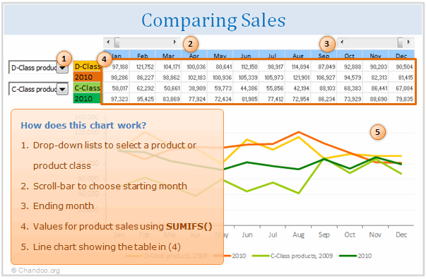
Now, to bring up values of a particular product, I’ve created a list in C44:C70 (values in column B are just for guidance). We can compare two products, which can be chosen from a couple of drop-down boxes linked to cells B6 and B8. Here’s where the values in column B help: basically, they tell me which item index from the drop-down corresponds to a product. I then placed the same item indexes in data!A7:A46. This is all because I am lazy and I find the sumifs() formula a blessing: all I have to do now is to add up the results that correspond to (1) the chosen Product in the drop-down, which is looked up by the index, and (2) the year, which is in data!E6:E45. [More on INDEX Formula]

How does the sales comparison chart work

An alternative in Excel 2003 would have been to concatenate the value of “Product 1″&”2009” for example, to get a unique identifier and not return the sales value of 2010 by mistake. Then vlookup() after the concatenated value. [Related: How to lookup based on multiple conditions]

These calculations are placed in ‘Yr sls’!F51:Q54. Note there’s an initial IF() there, to only display the values if the respective month is selected. There are two sliders up in the second row, which can help you ‘cut’ your desired portion of the year for comparison.

‘Yr sls’!F61:Q68, using sumifs() again, I added the sales values for each product class. Finally, in ‘Yr sls’!F45:Q48 are the final calculation, where if an item index lower than 8 (corresponding to Product 1) is selected, the values in F61:Q68 are brought up, else the values in F51:Q54.

So now we see our resulting values above the chart, in cells F6:Q9. The deviation is calculated in F5:Q5. But for the yearly totals, I only want to compare apples with apples, i.e. months in which sales have been recorded in both years. For that I used cells U6:AF9. The totals in R6:R9 are based on these isnumber() results. This allows you to have the exact deviation between similar months over an user-defined time span.

Ok, time to close. But not before your boss knows the exact portfolio of each product class! Look shortly in data!B6:B45. This is where, using countif(), we have the number of occurrences for each product class. Knowing that product class “A” will be repeated say 3 times, we’ll use this knowledge to look up the third occurrence of “A” and bring up the product next to it. Now take a peak in sheet “Legend”. Knowing we have to lookup for A 1, that’s how I wrote the formula. But also knowing that “A” will be repeated twice for each product (once for 2009, another for 2010) and not wanting to see duplicates in my product list, there’s a very simple solution: just use odd numbers!! This will only bring up every 2nd occurrence of a product. As I said, I like it simple 🙂 I just left the numbers in C5:C15 visible so you don’t have to fish around for them, the rest are simply I the same color as the background. A bit of conditional formatting does the rest.

Of course, before presenting this to any decision maker, you’d hide the rows and columns they’re not supposed to touch and present them with a clean looking table.

Download the Excel Workbook:

Click here to download the workbook with this example. Examine the formulas and chart in “Yr Sls” worksheet to understand how this is weaved together.

[Added by Chandoo]

Thank you Theodor

Thank you so much Theodor for teaching us some valuable techniques on how to compare apples with apples. I am sure our readers will find these ideas very useful.

If you like this post, say thanks to Theodor.

Do you compare & analyze sales data?

I do this all the time. As part of running my small business, every couple of months, I would take up sales data and see if something odd is going on. I make line charts comparing sales of this year with previous year, understanding the overall trend and compare one product with another.

What about you? Do you analyze sales data? What techniques do you use use? Please share using comments.

Learn more from these pages:

If you work a lot with data & do similar work as above, go thru these articles to learn more.

Facebook
Twitter
LinkedIn

Share this tip with your colleagues

Excel and Power BI tips - Chandoo.org Newsletter

Get FREE Excel + Power BI Tips

Simple, fun and useful emails, once per week.

Learn & be awesome.

Welcome to Chandoo.org

Thank you so much for visiting. My aim is to make you awesome in Excel & Power BI. I do this by sharing videos, tips, examples and downloads on this website. There are more than 1,000 pages with all things Excel, Power BI, Dashboards & VBA here. Go ahead and spend few minutes to be AWESOME.

Read my storyFREE Excel tips book

Overall I learned a lot and I thought you did a great job of explaining how to do things. This will definitely elevate my reporting in the future.
Rebekah S
Reporting Analyst
Excel formula list - 100+ examples and howto guide for you

From simple to complex, there is a formula for every occasion. Check out the list now.

Calendars, invoices, trackers and much more. All free, fun and fantastic.

Advanced Pivot Table tricks

Power Query, Data model, DAX, Filters, Slicers, Conditional formats and beautiful charts. It's all here.

Still on fence about Power BI? In this getting started guide, learn what is Power BI, how to get it and how to create your first report from scratch.

65 Responses to “Make Dynamic Dashboards using Pivot Tables & Slicers [Video & Download]”

  1. claudia says:

    WOW, is all I can say.

    I could not have imagined a dynamic dashboard without getting approved software budget and a team of people involved to create it. Given that I am a relative newbie to excel and actually got here by looking for pivit table help, I imagine that i would not be able to make anything myself. But armed with the demo excel sheet I will press buttons (and I will report back how that went;-)

    Claudia

  2. winston says:

    Good stuff Chandoo, thanks
    The slicer buttons take up quite a bit of room on the dashboard
    Is there a way to make the buttons smaller so we can have more room for charts, tables, and commentary?

    Kind regards,
    Winston

    • Jova says:

      You can resize the slicers! When you click the slicers you can change the height and width of columns and slicers. You can also, under slicer style click "New slicer style" where you can define your own style, which enables you to change most things, including font size.

  3. Gregory says:

    I hadn't seen the Group Option used as you did for the Duration PivotTable. And thanks for showing how to remove the Field Buttons on a PivotChart, I loathe them with all my heart.

    Fantastic design and a great dashboard.

  4. Chandoo says:

    @Claudia.. I am glad you like it. Do let us know how your adventures go.

    @Winston: You can resize slicers or increase the number of columns inside. Unfortunately, we can not readjust the font sizes in slicers. So when you resize, you will see partial text.

    @Gregory: Thank you. I am happy you like it 🙂

    • kris says:

      Hi Chandoo, your dashboards are really professional and simple. I do have some question, if I have the following scenario, could you help to advise : -different data sources eg monthly
      -calculations percentile
      -%difference between financial year

      Thank you so much!

  5. Divya says:

    Hi,

    Thanks for your great information.It has helped me a lot.
    Now,I can build my excel addin for Excel 2010 better with your tips.

  6. Istiyak says:

    Hi chandoo i am new reader for ur site.and really found good stuff and temp. But i suggest u 2 put a guidance step sheet in temp so anyone can understand easily.and also help me to become awesome as ur noume.

  7. Stevros says:

    Chandoo, Wow these are very powerful reports. I will be implementing them straight away. It will save me hours of work. Thankyou so much.

  8. Paul Avenell says:

    Hi Chandoo,

    I love the Slicer, but how do I link a slicer for different data sheets e.g.: Client data on one tab and products on another tab, as I find that as long as you use pivot tables off the same data you can link the Pivot tables using Slicer connections.

    Regards
    Paul

  9. Vivek says:

    I appreciate the work you have posted on your website - very informative and easy to understand. I just wanted to inform you that you can make selections within the slicer too by using Ctrl and selecting the fields you want to group and use as filter.

    I had a question regarding the data used in pivot tables. Is there a way to update the data (eg. a new customer entry) and have the pivot tables and the linked charts in dashboard automatically update? I will search for the answer in other posts so ignore if you have covered it elsewhere.

    Thanks again and keep up the good work.

    -Vivek

  10. Brij Arora says:

    Dear All,

    Me too is a die hard fan of Slicer. it's requirement was arise when management is feeling it difficult to juggle with filters for sales of a particular location, Product Category in Pivot Table.

    Got very positive response when introduced to tackle the above situation. furthermore in slicer setting there would be option to enable or disable deleted data is handy for particular scenario.

    These are eye catching color themes would be like icing on the cake.

    There is one more feature of excel 2010 which proves to be tool for great time saving is "Repeat Labels" in Pivot Tables.

  11. Katherine says:

    This is fantastic!! Your steps were super to easy follow. I can't wait to show my new dashboard off to the boss. Thank you so much!

  12. Van says:

    This might be a little unrelated but I'd like to know which software was used to record your on screen actions? I'd like to use it for tutorials on models that I build for my customers. Thanks!

  13. DV says:

    The slicers are coming in a sorted order... How can i get it in the way it appears in my original data.... The settings show to sort them A to Z or the other way round but they are option boxes and can not be unchecked... What are my options????

  14. Duncan Williamson says:

    I watched the video and then worked through an example of my own, also telephone costs by coincidence. It took me about 30 minutes to do everything. Once you've understood the basics of pivot tables and slicers, all that limits you is your imagination!

    The only thing missing from the video is now to change the number of columns in a slicer: Right click a slicer then Size and Properties, Position and Layout, Layout, Number of Columns ...

    Good page and video.

    Duncan 

  15. soycharnichart says:

    How do you insert 'Year' in the Pivot Table Field List if it doesnt exist in the Master table???

    Thanks 

  16. Manu says:

    Hi,

    Can I disable the multi-selection of the slicer to only allow one selection at a time?

    Thanks in Advance    

    • Chandoo says:

      @Manu.. as of Excel 2013, this is not supported yet. But you can remove slicer heading, clear filter button and style it so that it looks like a single selection. You can also use Macros to ignore previous selection upon multiple selection, but I would not recommend it.

      For an example on styling see - Interactive Pivot Calendar

  17. Devin says:

    Awesome guide!  The dashboard I made blew people away.  I do have one question.  I want the chart title to match what I have selected.  How can I do this without writing macros?

    • Hui... says:

      @Devin
      Lets say what you have selected in in A1
      Select the Chart then Select the Title
      Click in the Formula Bar and type =A1
      enter or click the small arrow to the left of the Formula Bar
      Enjoy

  18. Johnny says:

    Love the slicers and use them often in my dashboards.  Question about the data (specifically the date)  I see the "date of call" column but was wondering how were you able to filter on slicers by year and month when there is only a date of call entered into the data?

    Thanks for your help! 

  19. Jet Copeland says:

    Thanks for taking the time to create this interesting and very useful tutorial!
    I was able to create a similar dashboard in a short time after watching your tutorial. The problem I am having now is how to update the pivot tables and dashboard graphs when a change is made in the raw data. I tried two methods; Change data Source and Refresh. When I used Change Data Source (Options-> Change data source) the values in the pivot tables didn't update. When I tried refresh the values in the pivot tables disappeared as well as the information in the graphs, since the data in the pivot tables no longer existed.
    I have been searching for a solution for a while now but I have unfortunately not been able to solve this problem yet. Any help someone can provide is GREATLY appreciated.
    All the best 

  20. Nigel says:

    Hi, looks great, but how valuable is power view when it comes to financial data? I've been having trouble trying to visualize how I would use power view to report of financial data.

  21. Snooky says:

    Hi Chandoo, you are awesome! Thanks for the good work!

  22. beth says:

    there is duplication for my slicer, probably cause i choose date, time as my options. i changed it to date but still theres a duplication of the same date

  23. Alex Cardoso says:

    Just Great! Thank you for the time to put this together and teach us.

    Alex Cardoso from Indaiatuba, Brazil.

  24. jose says:

    First of all I would like to thank you guys for this post I used this amazing tool with the help of your tutorial to create a dashboard for one single account and my regional manager said "good job, it looks very profesional" she was so impresed that now she wants one daschboard with all the acounts and services she is going to replace her KPI reports with my report !! I smell a promotion!! My demand was a new laptop with MS 2010 and it was granted. now I have allot of work and many many questions to post .. kudos

  25. krishna prasad says:

    Hi Chandoo

    I want to say thanks first because i loved ur tutorials

    i have a small doubt how to insert slicer from external connections

    i searched every where could you please explain how to insert a slicer from external source

  26. Jyothi says:

    Hello Chandoo,

    How to get rid of the > items in Months slicer?

    They are appearing when there is a grouping on the date field in pivot

    Thanks

  27. Emma says:

    Hi Chandoo,

    One problem always bothers me when i use slicer. I have no idea aobut how to change the number format in slicer. Want to display number in slicer as general format, but it always displays other number format such as date.
    I check my source data and it doesn't effect the number format.

    Look forward you or any EXPERTS to solve it. Thanks very much!

    In the end, This website is awesome!!!

    • Sunil says:

      Hi Emma,

      Were you able to resolve your query? I have a similar problem. I use Excel 2013 and the field I'm dropping into the slicer is a currency field ($1.00, $1.05, $1.10 etc.) representing the exchange rates that the user can choose from. The items in the slicer revert back to general format (1, 1.05, 1.1, etc.) although the source field is formatted as currency field. Is there a way to fix this?

      • Chandoo says:

        @Sunil & Emma: You can create a new column in your raw data which has currency as text, using the TEXT formula like this =TEXT(currency_val, "$#,##.00"). Use this column to create the slicer.

        • Sunil says:

          Thanks for the response Chandoo. It works as you suggested. However, if the users were to pick more than one item in the window I'd like to know what is the max value and utilise that value in a DAX formula.
          Also... there is no issue if I were to throw a slicer over a normal pivot. The trouble comes when I choose the 'Add this data to the Data Model' option which I need for the PowerPivot.

  28. Jonas says:

    Hi Chandoo (Or others)

    Is there a way to make the color change, when the value changing after the use of a slicer?

    Lets say the value is 4,5, when i press the slicer, and the value change to 3,5 i would like the color to change. Can anyone help?

    Thank you.

  29. Burendei says:

    Hi Chandoo,

    It was very useful video for me. Thanks.
    But I have one question to ask.
    How can I connect data which is growing in size (rows, records) by time (daily, monthly etc.) to this kind of dashboard?
    Or it is only on select number of data?

    Thank you.

  30. Angela says:

    Chandoo zindabad!

  31. Angela says:

    Hi Chandoo,
    I have been able to create something similar quite easily. The problem that I am facing is that I want to keep the Top 10 filters permanently. If I select one option and then clear the filter, the chart removes the Top 10 filter; I want it to go back to Top 10 filter.

    Is there a solution to this problem?
    Regards

    • Federico says:

      Thanks a lot for the tutorial and for the demo file!
      I have the same problem of Angela: after clearing the filter applyed on P1, the filter on P1 shows all the customers without filtering top 10 (as it was before).
      Thanks!

      Federico

      • Justin says:

        Go to your pivot table, right-click and choose "pivot table options." On the "Totals & Filters" tab check "Allow multiple filters per field."

        • Federico says:

          Justin, thank you so much!
          now after clearing the filter applyed on P1, the filter on P1 shows again top 10 customers.

  32. Roger says:

    Chandoo!
    Just find out your website, I´ll follow your tutorials from now, very useful!
    Great thanks from Brazil!!!

  33. Priya Ranjan says:

    Very useful. Learned a new skill today. Thanks a ton!

  34. Manav says:

    Hi Chandoo,

    This is fantastic! It's going to really help me with some operational reports I develop regularly. Two questions I'm hoping you can answer for me:

    1. How can I use one slicer to manipulate two different pivot charts that came from two different pivot tables?
    2. If I have a slicer in an excel and share that with someone who is on older versions of Excel - what will it look like to them?

    thanks!

  35. Elisa says:

    Hello Chandoo!
    I love the dashboards and have been able to make quite a few, my puzzle is when I am connecting the pivot charts to the slicers, I have to do each individual one and check every single slicer (usually I have about 12, so I end up having to check the 12 check boxes 12 times to connect everything) am I missing something? Is there an easier way to do this?

    Thanks!
    elisa

  36. Hama says:

    Hello Chandoo,

    You make my life easier, am in love withe the slicers!

    I greatly appreciate

    Thanx

    Hama

  37. […] Slicers.  Easy for me to do, but not as easy to explain how I did it.  Fortunately, Chandoo has a Make Dynamic Dashboards using Pivot Tables & Slicers video and download that will do the job nicely.  Suffice it to say it took me <3 minutes to put […]

  38. @jitkumar56 says:

    thank you very much..... 🙂

  39. Jimbo says:

    You are a legend!! Thank you so much - very clear, very helpful indeed.

  40. Shahid says:

    nice player...

    i like to play like chandoo sir.

    i learn somthing about slicer by watching posts.

    it was too difficult to watch and easy to prepare..

    thank you boss.

    God Bless You

  41. MFAC93 says:

    Hi,

    I've built a dashboard on Excel 2010 using Pivot tables and slicers.

    What I would like to do now is duplicate the dashboard on another tab, having it extract from another data source (format is identical to the 1st data source).

    I'm extracting the same metrics, but each data sources measure different product lines.

    Could anyone help me out?

    Thanks in advance,
    M

  42. Vicky says:

    Thank you so much. I learned so much about the slicer because of the video. Just got a quick question. Say I got 100+ Customer name bottons in one of the slicer, and it is time consuming to scroll up and down to find the one to select. Is there anyway I can set in the slicer setting that when I type "E", it automatically take the selectionto to where all the "E" starts? Thanks

  43. TL says:

    Hi there,

    This looks great - is there a way I can use it to compare vs budget, forecast? Is it just a case of renaming one of the field Comparison with the data being "Actual, Budget, Forecast"?

    Thanks!

  44. an irany says:

    hello master!
    please help me.
    i am looking for many file example for Dashboard, but because my English is weak i couldnt fint it in hear.
    please help me.
    thankyou so much.

  45. Ikram Siddiqui says:

    Dear Excel Guru,

    Hope everything is fine with you?

    Can you please help in this Logic, it is a thought only to increase my knowledge SIR?

    Please note that I have been working in Excel file contains two times of our teammates who claims overtime an each calendar month

    My excel file as like this :-

    ROW 1 Days of Month
    ROW 2 Date of Month

    Cell -1 [Time IN(06:00Hrs)], cell -2 [Time OUT(15:30Hrs)] no break in our factory and anything after Eight hours assume as overtime as standard in all across.

    Appreciate if you could help me in providing the best an Exclusive Excel formula to calculate each day overtime excluding staff eight hours regular duty and Friday consider as full day overtime.

    Kindly help me at the earliest convenience.

    awaiting for your expertise.............

    Best Regards / Ikram Siddiqui

  46. Lav Mishra says:

    Thank you for video , will you please provide pivot table with header and sub header like year main header and under that three sub header. How to make dashboard for that.

  47. Praful Patil says:

    Dear Sir,

    How to seperate amount, mention in remarks.

Leave a Reply