
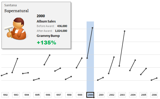
The folks at Washington Post made an interesting chart to understand whether winning a Grammy award makes any difference to album sales. Go ahead and browse it if you have not already seen it. Go, I will wait.
Are you impressed?
I really liked this chart. This is what I liked about the chart,
- It tells a story. [why charts should tell a story]
- It is an ego chart. We would all instantly search for our favorite artists and learn about how Grammy award changed their album sales.
- It is a simple chart. No clutter, no gaudy colors, just a bunch of lines and the story is out there.
- It lets you play. You can hover your most over an artist to see their sales before and after the award, and how much % bump they got.
In fact, I liked the chart so much that I wanted to make it in Excel.
Here is what I came up with:
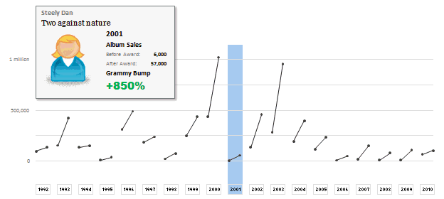
How does the chart work?
1. Data for the chart: The Washington Post guys did not give any details about the source of data. So I manually typed the data myself by looking at their chart. It took a few minutes. But totally worth it. I put the data in 5 columns – Year, Artist, Album, Before and After sales.
2. The chart: The chart is an XY Scatter plot. I took numbers from 0 to 37 (there is a total of 19 years of data – from 1992 to 2010. Each year has 2 data points – before and after). For even numbers I used the before sales and odd numbers I used the after sales. For this I wrote simple INDEX formula with a bit of MOD(). Again, nothing too fancy.
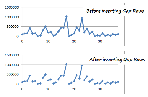
3. Getting the gaps in the chart:
This is the tricky part. By default, if you have 4 points (0,98000),(1,135000), (2,155000), (3, 427000) in the XY Scatter plot, Excel will draw a line connecting all 4. But we want to have a gap between first 2 points and second 2 points. How?!?
Thankfully, there is a simple workaround. You can insert blank rows between 2nd and 3rd row of your data and instantly you will see a gap in the chart. Repeat the same for remaining 18 points.
4. Year Selection & Highlighting
This is done using conditional formatting & Worksheet_SelectionChange Event Macro. First, I wrote a simple macro that would change the named range valSelectedYear to the selected year. The code is very simple. You can examine it in the download file.
Then, I used the valSelectedYear to drive the conditional formatting that would fill blue color across the column. As you can guess, the chart is transparent (ie no fill color for both chart area and plot area). So whatever color the cells beneath the chart have, they will show up in the chart too.
5. Creating the Dynamic Legend:
Here I have used picture links to fetch the artist image dynamically. (well, I was too lazy to download the actual images of Nora Jones and U2 etc. So I just used clip art).
Then, I used text boxes to make the dynamic legend, same as the technique demonstrated in smart chart legends & excel product catalog articles.
6. Formatting and aligning everything:
Once the basic setup is ready, I just moved and re-arranged the chart, legend box etc. so that everything looks right.
Download the Chart Workbook:
Click here to download the workbook in Excel 2007 format.
(click here to download the file in Excel 2003 format. I have not tested this, but it should work alright)
Mirror location for the files.
Please note that you must enable macros to select years.
Recommended Reading to make charts like these
- Picture Links – What are they and how to use them in Excel?
- Dynamic Chart Legends in Excel
- INDEX Formula – Examples, Tips & Tricks
- Conditional Formatting – Examples, Tutorials, Tips
- Further Examples,
How would you have made this chart?
I liked the original chart design and interactivity provided by Washington Post people. So I closely mimicked the same my Excel chart. But you may want to visualize the same data in a different way. So go ahead and download the workbook. It has data (hidden in columns A thru G). Play with it and make your own chart. Post them in comments.
I would love to see how you would have visualized the same information. Especially this type of data has a lot of relevance in business situations, so it would be fun to see your views and learn from each other. Go ahead and chip in.
Thanks to Washington post for the chart. Hat tip to Flowing Data for the link.


19 Responses to “Free Invoice Template using Excel – Download”
Nice post! Invoicing for the small biz or solo entrepreneur is something I see a lot of interest in. Also there are great templates from http://office.microsoft.com/en-us/templates
This is awesome.
I would need a little more. e.g. say I generate a Inv. # 1 with all the details. Once done I can click a button all the relevant details gets stored in some table. Further, when i generate a new invoice those details gets stored in same table but just below the previous invoice.
Is their a way to do this?
I did create a solution you are looking for, however its wrapped in a larger 'Medical Scheduler' and it uses VBA, But you can Save, Update, Lookup, Email, Print & Apply Payments to the Invoice.
You are welcome to download it here:https://www.dropbox.com/s/2yvo0o2tgq9quhe/Medical_Massage_and_Salon_Application-Free.xlsm
The Invoice Items are created from the Appt. Types & Service Items table.
I would love all feedback from this
Thank you for sharing. I will definitely have a look at it.
Daily dose of Excel held a competition in 2005 for this same topic
It obtained 9 solutions which are shown:
http://dailydoseofexcel.com/archives/2005/10/27/invoice-app-the-results/
[…] http://chandoo.org/wp/2014/03/19/free-invoice-template/?utm_source=feedburner&utm_medium=email&a… […]
How can i removed Dollar Sign, As want to use this in india.
Please reply.
Also if possible then can i use Indian Rupee Sign and how?
Hi Chandoo,
Thanks for sharing this invoice template, Let me tell you this template will definitely help me since I got a process to handle where this invoice piece comes. Just a small doubt, can we store all the invoice details in PRODUCT & SERVICES sheet. So that whenever I select an invoice number from invoice sheet I can take print out and I can share it as well. Can we do that?? Since I will be dealing with this on monthly basis.
It would be great if you can help me with this.
Thanks in advance for your help!
Regards,
Gaurang Mhatre
Hi Chandoo,
I was thinking learning excel is quite tuff task but your blog proved me wrong. You made it very interesting. Thank you. Also the template you have provided for Invoice is very helpful to us.
Thanks thanks thanks.. Very helpful. 🙂
Hi i love the speadsheet but would like to ask how do i get it to add the description into the invoice as well
Hi Randy, I tried to download one of your link "https://www.dropbox.com/s/2yvo0o2tgq9quhe/Medical_Massage_and_Salon_Application-Free.xlsm" However, i found the link unavailable. Can you please help me get the new link or can you please send this VBA file on my Email-ID.
Hello Anuj,
Thanks for alerting me to the broken link. This one should work:
https://www.dropbox.com/s/gz89gshex1ad0ex/Medical_Massage_and_Salon_Application-Free.xlsm?dl=0
Please let me know if you have any questions.
Randy
Thank you so much Buddy. will check and revert you soon.
Hi, is there any chance that this can work with the "Products & Service" sheet outside of the Invoice sheet. I create multiple invoice files for the numerous clients. Updating the product sheet for each of them maybe a task. Hence, I want to create a MASTER FILE from which data can be picked up without having to insert new data in each of the invoice files.
Possible? Or am I asking for the moon 😉
Thank you so much for tutorial.
This example can be reviewed for the example of the advanced invoice that made with excel userform :https://youtu.be/Qr-4of-38DI
Good Day
i love this template may i ask if it could be modified to have the following
when you lookup a item code in the next column to the right it brings up the description then the quantity, unit cost, discount and then total otherwise i love the template
Item Code Description Quantity Unit Cost Discount Total
When creating an Invoice template in Excel are you able to utilize the auto row height and wrap feature when the cell is a merged cell? I need to have a number of cells merged together to allow for enough space to type in the description of work performed (lets say cells A-D are merged in each row) however it seems that I am unable to utilize the auto format feature. To work around this I have to manually increase the row height after each entry. Is there a better solution for this? Thank you!