
Often, while creating a complex model or dashboard, you may want to include additional training material in the workbook. So let us learn how to embed flash movies, youtube videos etc. in to Excel workbooks.
To Embed Flash Movies, Youtube Videos in to Excel, follow these steps.
Step 1: Go to Developer Tab
Go to Developer tab in excel ribbon and locate insert button. From here, select the insert button and click on “More controls”. See this illustration.

PS: If you do not have developer tab, learn how to enable it.
Step 2: Insert a Shockwave Flash Object
From the list of controls shown, select the one that says “Shockwave flash object”. Once you do that, your mouse pointer changes to + sign. Draw a rectangle to insert a flash object on to your Excel workbook.
When you finish drawing, you will see a crossed-out rectangle, like this:

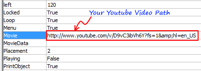
Step 3: Set properties of the Flash Object
Right click on the rectangle now and select properties. Locate the property Movie and set it to the path of your Youtube video along with ?fs=1&hl=en_US in the end, like this.
Step 4: Exit Design Mode
Close the properties window. Now, from Developer tab, click on the big button that says “Design Mode” to exit design mode.
Instantly you will see the youtube video loading in the embedded flash object.
Click play to watch it.
Bonus tips:
- You can use design mode to resize the youtube video size.
- You can embed other flash movies, flash games etc. using the same technique. The path of movie can be a URL or a local computer path.
- You can also embed other types of objects like Quick Time Movies, Windows Media Player movies etc.
Gotchas You should be aware of:
- Do not save in compatibility mode. While saving the workbook, select XLSX format if you are running Excel 2007 or above. If you save the workbook in compatible mode, you may not see the videos working when you re-open it.
Download this Excel Workbook that has a Youtube Video that Explains how to Embed Youtube Videos in to Excel
That is right. I have made a youtube video explaining how to embed youtube videos in to excel. Then I embedded that youtube video in to an excel workbook 😀
Click here to download the excel workbook.
More Excel Howtos:
- Using Word-art in Excel
- How to make a birthday reminder in Excel
- How to insert currency codes & other special symbols in to Excel
- … More Excel Howtos & Excel Video Tutorials
PS: Special thanks to Manzoor for sharing this technique on our forums.


27 Responses
Thank you!!
The trick is to get that URL for video. Some videos have this feature disabled… hmm…
very cool. how did you record what you do on Excel? it didn’t seem like you was using a camcorders.
This is a great tip. Is it possible to insert a PDF on an excel worksheet? I usually receive quotations in pdf format, and would like to show the quote on a worksheet, rather than using hyperlinks. Any and all help would be greatly appreciated.
Your instructions didn’t work for me, ether in Excel 2010 or 2007, and I tried several times, following the instructions very carefully and to the letter.
What I found out is that, for some odd reason, copying the YouTube URL then adding the ?fs=1&hl=en_US to the end would not work at all for me.
But if I went to the Embed code in YouTube and copied value parameter (minus quotes) and pasted it into the movie property, the movie would play. The Embed code value parameter includes the link and the extra bit you included at the end. No need to copy that as an extra step.
Best feedback on here. Worked like a charm after removing extra YT code. Thanks..
@Gregory,
Thanks your instructions.
I have carefully followed the Instructions mentioned by you and still i am unable to do embed the video in excel.
Please help and your immedate reply will be higly appreceiable.
Regards
Sonu Monga
A Chartered Accountant
If you are using excel 2010 or higher. then there is nothing like Shockwave flash player.
In that case you have to use windows media player.
There is a control naming Windows Media Player in that list.
Insert that contol and then open properties and insert link in URL.
It will work.
@Gregory,
Thanks your instructions.
I have carefully followed the Instructions mentioned by you and still i am unable to do embed the video in excel.
Please help and your immedate reply will be higly appreceiable.
Regards
Sonu Monga
Chartered Accountant
It wouldn’t play because you need to indicate the exact location of flash file….by ‘Embedding’ the file, you get the the exact URL, so it can be played….some videos can’t be ’embedded’ that’s why it won’t work….
My developer tools does not list a control for “Shockwave flash object”. Where/How do I find it?
Hi Chandoo,
why don’t use OCX Window media player ???
you can play your own local video or music
just indicate exact location (Full path or URL)
i.e :
C:\Users\Public\Music\Sample Music\Kalimba.mp3
C:\Users\Public\Videos\Sample Videos\Wildlife.wmv
with macro and userform :
Sub PlayMedia()
On Error Resume Next
UserForm1.WindowsMediaPlayer1.URL = ThisWorkbook.Path & “/” & ActiveCell.Value
‘ —– or
‘ —– UserForm1.WindowsMediaPlayer1.URL = Exact location
End Sub
Very cool. I also could not get the instructions to work, but was able to use Gregory’s suggestion about the embed code. Thanks for posting!
Thanks Chandoo. This is very cool. I was able to make it work using the embed code copying from http: up to _US as you indicated. This is a great way to provide additional training or message as you package your deliverable.
Hi Chandoo,
Excellent tip. Very useful.
Is there anyway to link the path in the properties to a cell value so that the user can select the video from a drop down and then have the video play?
Thanks Myles…. to link the path to a cell, I guess you need to use macros..
nothing happend in Embed Youtube videos in to Excel Workbooks, it shows only white blank screen.
Hi Chandoo, How Do I put more than one URL in movie field?
Hi Chandoo,
very good tip.
But how do I start the embeded video in an xlsm file once the tab is selected or through VBA programming?
Appreciating your answer
Steve
Query:
I have created 4 sheets excel file, but when i print this file to PDF it generates two sheets one PDF and two Sheets one PDF … can i know the setting which i had to change. because i want all 4 sheets in one PDF
while Printing i did setting as “Print Entire Workbook”
Awaiting for your reply.
Help!! THis works great, but I’m trying to use VBA to change the URL, which I can do. The problem I am having is getting it to play via VBA.
The object has both .play and .playing = true properties, but neither will actually play the video after updating the .movie url. The correct video appears within the object, but I can’t get it to play from VBA… which I really need it to do.. Thoughts?
Hello
Go to Developerr tab and select more control then find windows media player just click it.
after that you have to right click on the embeded object and select properties there you need to add your video file path.(dont forget to include extension like .avi, .mov etc.) in URL field. Then Press Alt+11 and deselct design mode. Once you close the module your video start playing…..
For the life of me, I cannot get this to work. I have followed Chandoos instructions to the letter and also tried using the embed code as Gregory suggested, all I get is a blank white box where the video should be. Is there any other reason that this might not work? Flash version perhaps? Quite frustrating.
Hi I was wondering if was a way after adding a video if one could save to HTML format and it would work?
Hi Chandoo,
This is very helpful, however, is there a way to auto-play the embedded youtube video as soon as somebody opens the excel file? Can you share the macro for the same?
Hi,
Very cool, how is it possible to start automatically the video when the excel sheet is open?
I would like to start the video when i open the worksheet :).
Best regards.
Hello
When trying this method, I got Flash-embedded videos are no longer supported. Is there a solution for this problem?