
It is very easy to customize Excel ribbon and save time. You can make a new ribbon or modify an existing one with new group of commands. This can be a huge productivity boost for people using MS Office applications.
How to create your own ribbon in Excel 2019 / 365 / 2016 / 2013 / 2010:
Customizing ribbon is as simple as customizing your coffee at Starbucks.
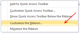
- Right click on ribbon area and select “customize ribbon” option.
- Now, add a new tab (or group or both) – see below for illustration.
- Add a few commands (or buttons) to your new ribbon
- Click ok and you have a sparkling new ribbon ready.
10 things you should know about ribbon customization
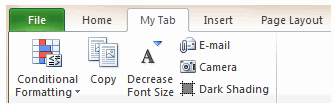
This is how the customize Excel ribbon screen looks.
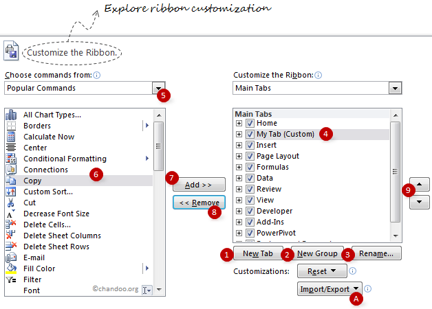
I have highlighted 10 items on the screen. Read thru below 10 points to master ribbon customization.
- Use New Tab button to create a new ribbon tab.
- Use New Group button to add a new group of commands to an existing or new ribbon.
- Rename button helps you to change the name of an existing custom group or tab.
- Once you add a group / tab, you have to select it to add items to that group / tab.
- You can choose the type of commands you want to add to your ribbon tab / group. You can also add any macros as well (sweet!).
- Now select the command you want to add to your group
- Click on “Add” button to add the command to your ribbon tab / group.
- You can use “Remove” button to remove any commands from custom tabs / groups.
- Use the up / down arrow buttons to move your ribbon tab / group up or down. (For eg. you can move your custom tab to first, ie before home tab).
- You can export your ribbon customizations and re-use them in other computers (both ribbon and QAT settings will be exported).
Ribbon and QAT Customization – Few Tips:
Use “Hide Command Labels” option to shrink your ribbon groups
See the below illustration to understand what I mean.

Customize tool ribbon tabs to save a ton of time:
By default, when you go to “customize ribbon” screen, you only see main tabs. But you can also customize tool specific tabs. For eg. I use only a handful of chart formatting options and all of these are spread across 3 different tabs – design, layout and format. So I combined all the options I use regularly to come up with a simple ribbon tab like this:

As you can guess, the above ribbon tab appears only when I am formatting a chart.
Add groups of commands to QAT:
You can now add a group of commands (for eg. all alignment options) to Quick Access Toolbar to improve your productivity.

Minimize ribbon with a click:
Press the ^ icon you see next to help icon to instantly collapse / expand ribbon. You can also use CTRL+F1 keyboard shortcut to do the same.
Export Ribbon Settings
In 2010 and later you can Export your Ribbon & QAT to a file that can be imported to another computer, or after reinstalling Office
In the Options dialog > Customize Ribbon (or Quick Access Toolbar) options > Import / Export button at bottom of both dialogs.
Ribbon Customization Gotchas!
While ribbon customization is a great move ahead for Excel in particular and Office apps in general, there are a few gotchas. Beware of the following to avoid un-necessary troubles.
- When you add a group or tab, excel doesnt ask you for a name. Make sure you click on “rename” button to change the name to something you remember.
- You cannot add commands to an existing excel defined group. You can however add groups to existing ribbons.
- Even if you try to make a group with exactly same commands, the group may look different.
- The ribbon and QAT customizations you do are local to your installation of excel only. You have to export the customizations and import them before they work on other comps.
What is your opinion about ribbon customization?
I am very happy to see the possibilities of ribbon customizations. It can improve productivity and simplify a lot of things.
What about you? How are you planning to customize your ribbon? What tips and ideas you have to share with us? Please tell me using comments.


23 Responses to “Learn Top 10 Excel Features”
What it looks like if excel without formula?? 🙂
It would be not excel it would just be fancy tables in which you could just use power point. (Chandoo) would Access be an alternative?
Awesome piece of work!!!
Great article.
Chandoo - my biggest interest in the article was the awesome word-graphic at the top - where did you go to get it done into a shape?
@Rich.. thank you. I used http://www.tagxedo.com/ to generate this word cloud. I took all the comments in the original post, pasted them in tagxedo website and set up the shape etc.
Awesome Chandoo.. You need always needs coffee to start up with. BTW , how did u created the Heart Shaped picture filled with High Repetitive text in it .. Please put it on your Next blog ...
Chandoo, good article. I’ve added a link to it from Connexion – our collection of the most useful and interesting spreadsheet-related articles from the web. See http://www.i-nth.com/resources/connexion
Hi,
Just one small question. Where the hell have been I in the past for not discovering this website sooner?
I've lost a job interview recently where even though I had the subject knowledge, I was not upto their mark in Excel.
Thank you for all the free tips, guidance and for creating this forum environment.
[PS: I've just been through the site for the 1st time, and have signed up for the newsletter. You can expect pretty stupid questions from me soon]
Hy Chandoo, you always inspire me with to explore something new in excel. This data structure table is only for excel 2007 or compatible to 2010. I recently installed latest excel version 2013 in my System and experience problems regarding operating according to previous one. I'm waiting your article relates to that excel version.
Thanks
Awesome article Mr. Chandoo and that is a awesome heart shaped pic you created. Great tips as well.
[...] Learn Top 10 Excel Features | Chandoo.org – Learn Microsoft Excel Online. [...]
Chandoo is awesome..
Thanks, i got better, And i always get 90.50 in my grade card but now i get 96.50 i improved because of the tutorials you gave, Thank You Very Much Chandoo Guy.
Hi chandoo, i am intersted in seeing the video or step by step done procedure of analysing the comments and presenting in the data percentage steps. I think this one would be first step in finding out how generally happens data calculation. Thank you.
As well i would like to know how to get that black shape art of your face which i see in chandoo. I am interested in making it for me.
Nice to see the features considered by Excel users to be most useful. It might be a good idea to also analyze StackOverflow Excel questions to see what keywords appear most often.
Here are my top 10 Excel Features (for advanced users):
http://www.analystcave.com/excel-10-top-excel-features/
Thanks a ton for this it totally helped with my homework ????
Very good effort
Thank you for this. Lots of learning in the links you've provided for this septuagenarian.
Pls send me new post
Dude, your humor ? ?
Loved your work.
Hello Sir,
I am Sanjeev Khakre and i from Indore City, India , I am your big follower and i have watch your videos and learnt a lots of excel trick or function and many more . thanks so much for all of your excellent support.
Your excel knowledge is real awesome.
Thanks
Sanjeev
Your work is excellent but pls willing to know more details about the features of microsoft excel
Chandoo Would Access be a better alternative than VB?