
Of all the charting features in Excel, Sparklines are my absolute favorite. These bite-sized graphs can fit in a cell and show powerful insights. Edward Tufte coined the term sparkline and defined it as,
intense, simple, word-sized graphics
Edward Tufte

Sparklines (often called as micro-charts) add rich visualization capability to tabular data without taking too much space. This page provides a complete tutorial on Excel sparklines along with 5 secret tips.
What is a sparkline?
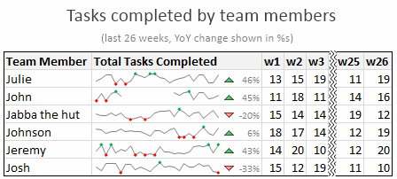
A Sparkline is a small chart that is aligned with rows of some tabular data and usually shows trend information.
Here is an example of sparklines in a project team status report.
Excel Sparklines Tutorial – 3 steps
Creating sparklines in Excel is very easy. You follow 3 very simple steps to get beautiful sparklines in an instant.
- Select the data from which you want to make a sparkline.
- Go to Insert > Sparkline and select the type of sparkline (you have 3 options – line, column and win-loss chart)
- Specify a target cell where you want the sparkline to be placed
- Optional: Format the sparkline if you want.
Here is a short screen-cast showing you how a sparkline is created.
Types of Sparklines in Excel:
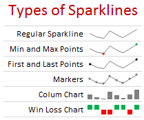
There are 3 basic types of sparklines in Excel 2010. They are,
- Line chart
- Column chart
- Win-loss chart (useful for showing a bunch of wins & losses denoted by 1s and -1s)
Sparkline Formatting and Options – Explored
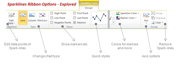
Whenever you select a cell with sparkline in it, you will find a new ribbon called as “Sparklines – Design” ribbon. This is where all the formatting options for sparklines are included. Some of the key formatting / customization options available are,
- Change the sparkline type – between line, column and win/loss
- Change the source data / target cells of sparkline
- Set different colors for first point, last point, highest & lowest points (applicable for column and line chart types)
- Set axis options (show / hide axis, set min and max value for vertical axis, set axis type to date axis etc.)
- Group / un-group a bunch of sparklines (you can change formatting options, axis settings en-masse when you group sparklines)
- Remove sparklines
Sparklines & Missing Data – How does it work?
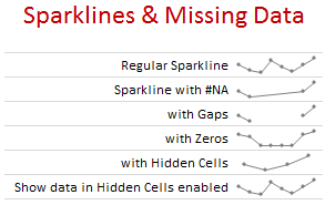
- Non-numeric data: If the sparkline source data contains non-numeric data, they are neglected while plotting the sparklines.
- Errors & #NA values: If data has some #NA values, they are neglected
- Blanks: sparkline show blanks as gaps
- Zeros: If data has zeros, zero value is plotted
- Data in hidden rows / columns: If data has some hidden rows / columns, the values are neglected (unless you enable “Show data in hidden cells” option)
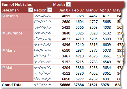
Sparklines in Tables & Pivot Tables
You can add sparklines to tables and pivot tables too. Adding them to pivot tables is a bit tricky but adding sparklines to tables is fairly straightforward and scales nicely.
5 Tips to use Sparklines better
Here is a bunch of quick tips & tricks for those of you starting on sparklines.
- You can auto-fill sparklines. Select the first set of values and add a sparkline. Now copy and past sparklines to auto-fill them based on data in adjacent cells.
- Change their size: When you adjust row-height or column-width of the cell containing sparkline, the size of sparkline changes too.
- Juxtapose sparklines with conditional formatting icons to create stunning charts and dashboards.
- If you want to copy a sparkline over to a ppt or document, you can use “copy as picture” option.
- Enable high / low points to highlight important values
Sparklines & Compatibility
Sparklines are available since Excel 2010. They work in desktop and web versions of Excel.
What happens when someone opens a file with sparklines in Excel 2007?
Sparklines don’t show up in if you open the file in older version of Excel (say Excel 2007).
How does Sparklines compare with other alternatives?
Sparklines vs. In-cell Charts
In-cell charts are a powerful and lightweight way to create bite-sized visualizations. The main technique is to use REPT formula to repetitively show a bunch of symbols (usually | symbol) to create a small chart. The advantage of this approach is that they work in any version of Excel. But the dis-advantage is that we can make only few types of charts (bar charts, column charts by rotating cell text, dot plots). Also, incell charts require some knowledge of excel formulas and creativity.
This is where Excel Sparklines shine, as they are very easy to create and maintain.
Sparklines vs. Conditional Formatting
In Excel 2007, MS introduced a bunch of useful Conditional Formatting options like icons, heat maps that effectively create small visualizations of underlying data. These features are further improved in Excel 2010, 2013 and 2016. While conditional formatting based visualizations are easy to implement and scale very well, there are only few options (a bunch of traffic lights, data bars etc.). This could leave you high and dry if you are looking for rich visualization options. these new features require the actual data to be present in underlying cells (which is a head-ache).
Again, sparklines shine as a simpler and easier alternative.
Sparklines vs. Shrinking an actual chart
We can take an actual chart, strip it of all the clothing (remove gridlines, axis, legend, titles, labels etc.) and resize it so that it fits nicely in a cell [example]. This is the easiest and cleanest way to get sparklines in earlier versions of excel. However this approach has one problem. It doesn’t scale. (ie if you want to get 2 sparklines, you need to do twice the work). Of course, we can write some macros to take care of that, but if you are open to macros, you might as well use SfE and save a lot of trouble. But this approach of shrinking a real chart is better as it gives you full power to customize the underlying chart (add multiple series etc.) which is not available in excel sparklines.
Download Excel Sparklines Tutorial Workbook
Click here to download Excel sparklines tutorial workbook. It shows all three kinds of sparklines in a simple dashboard format. Use the data to create your own sparklines to learn more.
Conclusions on Sparklines
The sparklines in Excel is certainly a great step forward in the world of data visualization. It brings ease and consistency to most users who want better visualizations but do not know how to create them. That said, Microsoft hasn’t really introduced any new types of sparklines since 2010. This is disappointing. Ideally few more types of sparklines such as these can help with dataviz.

On a lighter note, Kudos to Office Team at MS for not adding any 3D capabilities to these sparklines. That would have unleashed a fresh dose of chart monsters.
I use sparklines in most of my dashboards and business reports.
What about you? What are your thoughts on sparklines? Have you used them? What is your experience like? Please share your ideas, impressions and tips thru comments.
Additional examples on Sparklines:


62 Responses
Good preview of Sparklines. Will be waiting for your Sparklines for Pivot tables update 🙂
Btw, is it SparkLines, Sparklines or sparklines?
Subhash
This is a great new feature in Excel 2010. We are all working with more and more data. As our understanding of the data expands, we need more sophisticated ways to represent trends and patterns in the data. Sometimes basic charts and graphs just don’t show enough information. Because Sparklines offer a way to show a lot of data in a sophisticated, and yet not complicated, visual representation of the data, I think people are really going to use this new feature a lot. And, as you show in this helpful post, it’s pretty easy to create Sparklines with the new Excel. Thanks!
Too bad I will have to wait for a loooooong time until we get Excel 2010 in my workplace. Maybe I can win a personal licence by writing this comment.
This is the first I’ve seen sparklines–thanks for the overview. Can’t wait–this will be powerful! I’m excited to see the capabilities grow for visual analysis!
I’ve built a lot of tools to enable some pretty robust mapping in Google Earth from Excel data. Makes me wonder how future versions of Excel may be able visually represent data not only in charts, but also in maps… Anyone have any thoughts?
Hello. I used the SfE add-in to create some dashboards. My colleagues were impressed but the downside is that most people where I work don’t know how to install Excel add-ins, so I’m about the only one to use them. Excel 2010 sparklines really look easy to use. I just hope that we will soon swith to Excel 2010 but knowing of fast our IT moves, I think I’ll have to wait 4-5 years… Thanks.
Cool. Unfortunately, I don’t have Office at home. I wish open office has this feature
Here’s another Quick Tip for Sparklines
===
You can have a sparkline and a number in the same cell
Setup your sparkline as normal, except make the data range 3 or 4 cells longer than you want
If you want a number on the left side insert 3 or 4 =na() in the spare cells to the left of the data
In the sparkline cell type your reference to your data as normal
Good for highlighting the starting or finishing value of the sparkline
Here’s another Quick Tip for Sparklines
===
You can also use conditional formatting with sparklines and my previous tip
So a single cell can display 3 pieces of information:
+ a Sparkline,
+ a Value and
+ a Format
I get some decent mileage out of sparklines as it is. The biggest difficulty is that with SFE is distribution. I hope that excel 2010 solves some of that.
I do wish they’d put some more options in there—–for example the only pie chart that I really ever make use of is the SFE pie which is small enough to get a point across effectively yet small enough to not take up a whole page.
Incidentally: if you don’t mind getting a little cute you can do a pretty good impression of the ‘Consumer Reports’ rating system (http://accurateautoadvice.com/images/cr_ratings.jpg) with those little things. It has disadvantages obviously.
Chandoo, the stock chart arrows – in 2010 do you do those with the char map and conditional formatting? Or is that now a built in feature?
Dan I
You can do those Pie Charts using a Pie Chart Font
http://www.fontspace.com/curtis-clark/pie-charts-for-maps
I think Chandoo uses Paint.net for his markups
http://chandoo.org/forums/topic/how-do-you-do-those-squiggly-arrows
@Hui.. Excellent tip about using blank cells in the beginning & end to add labels… I didnt know about that.
However, I would not encourage anyone to add all 3 – value, CF and sparkline to same cell, as this could create some really complex visualization and take a ton of time to understand. But it may some interesting applications.
@Dan l … The arrows are part of CF in Excel 2010 (and if I am not wrong, they are in 2007 too).
Reg. your link to consumer report, we have done something similar in excel a while ago – checkout http://chandoo.org/wp/2008/10/07/excel-radar-charts-replacement-spot-matrix-download-template/
@Subash.. I am not sure what it is..
Good review – thanks Chandoo!
I like to miniaturize regular charts to allow for the most flexibility. I’ve written a fairly simple macro with automates the process (it places the chart to the right of the data series that I select, and it also links the chart to the cell so that it resizes when the cell is resized). I agree that this new feature will bring the idea to the masses and 1) provide more widespread acceptance and 2) promote more innovation in their implementation.
Good overview Chandoo. I look forward to finding a use for these…whenever I can get my hands on Excel 2010.
Rob
Great article, as always. I have tried using BonaVista and the free sparklines add in prior to Excel 2010 and find that most of the times when I run into issues–it is related to the scale. Having to load the custom fonts is also problematic (obviously, not in Excel 2010). I believe that the win-loss charts are the sparklines that convey information to the user in the most effective manner. The line and area charts are just too small to convey anything that isn’t an incredibly dramatic shift or very linear info. For example, the monthly net sales by region you show above, looks very good, but it is difficult to glance at and really understand what happened, without going back to the numbers. I am glad they are going more mainstream, I hope to start utilizing them in dashboards more frequently, but as it stands, in-cell charting is still my preferred method. Keep up the great work, Chandoo!
Great job as always. You are very thorough and answer all of my questions. I appreciate your posts.
Tom,
Can you share your VBA code to your macro that resizes the chart when the cell is resized?
Thanks!
Don’t forget: http://www.spreadsheetml.com/products.html
Tiny Graphs. It makes small standard charts
This is the first I’ve seen sparklines – thanks for the overview. Can’t wait – this is powerful! I’m excited to see the capabilities grow for visual analysis! Makes me look good, too, by adding new features to our dashboards. I look forward to finding a use for these…whenever I can get my hands on Excel 2010~
Cheers~
I’ve never heard of this before. I’m interested in better ways of presenting data visually, and look forward to trying this out as soon as I get the chance.
@Dan l… I am wrong. the up down arrows are new in Excel 2010. In Excel 2007, we can however use font symbols to get similar effect.
@all.. thanks for the comments. I am pretty excited about this new feature too…
Interesting you can also use Conditional formatting/Sparklines to create progress meters, by simply setting up Min/Value/Max and graphing them using the formatting or sparklines depending on vertical or horizontal orientation. (sparkline has to be one cell, formatting 3 cells) then simply use copy and paste as linked picture, with the sparklines you have to crop out the min and max, I then group the pasted picture with shapes, lines etc to make the chart! which is then re-sizable!
Sparklines rock! Looks like Microsoft may actually be listening to what the user community needs instead of giving us what they think we need.
Thanks, Chandoo!
An observation regarding bars/column in the spark line version – in normally sized charts, bars/columns emphasizes individual values because of their visual weight. However, in the spark line version they do not seem to have the same type of weight – look at the table in the post showing the different type of spark lines. While one would normally not use bars to show patterns in the data , in the spark line version I have used them for that purpose. Would be interested to know the experience of other users.
hello I cant see how to get the graph with the ups/down triangles and percentage changes in sparklines as shown in the first example. How is that done as it looks as if these are in the same cell as the line chart
@Jocelyn: I have used conditional formatting icons for that purpose. They are in separate cell. Only that I have removed cell borders and hidden grid lines so that everything looks smooth and merged.
Thanks for that Chandoo is there any chance to use your as a template as badly need something like yours to work with. If the template had all the formats you had dev it would be great please please
Hi Chandoo,
can u help me in preparation of MIS report of a manufacturing company in MS Excel.
awaiting for ur reply
I have Excel 2010 and see the Sparklines module in the ribbon, but it is grayed out, as if it is not enable. Do I require a different version or need to turn the feature on somehow?
@Shawn, Make sure you have selected a number of adjacent cells that are suitable for charting, ie: Numbers only, Don’t include text
Did you ever write the post that talked about how to add sparklines in a pivot table?
Hi Chandoo, I’m learning a lot, but I can´t practice and bring to life some exaples, specially the ones like this, because I’m using excel 2007, so I would love to win the excel 2010 H&S edition. By the way, your page has helped me a lot at work, reducing for exaple a two days of work in reports to a pair of hours. So my next step, is to create a dashboard integrating all data from every piece of work I have. Thanks!
Great feature – Maybe it’s time to upgrade from MS Office 2003 – long over due.
@Chandoo… Re: June 8, 2010 comment. I am trying to mimic your “smooth and merged” look since users cannot move the icon set to the right of the Sparkline. Since I cannot hide the gridline of just one cell, I colored the left border of the icon set column to white. But I still see the faint, thin white mark at the intersection of each column and row separator. How did you get yours so clean?
My son came to me for help with sparkline. I had never used it before but found it very interesting to use. Wish I had seen your explanation of it before experiencing the MS software. We did manage to get through it. By the way it does have 3-D.
Hi, I am not sure how to do it most effectively win pivot when the row vlues change according to slicers
Thanks
when I open excel I do not find the sparklines in the ribbon..! could you inform me how should I add it to the ribbon? on excel 2007
Superb Article and explanantions……i will certainly use these sparklines in my dashboards and presentations
When you view 2 or 3 lines, you can compare trends (up/down). Don’t you think that when you have a bunch of them, you can’t see the forest for the trees?
In your illustration I see a bunch of lines. I’d be looking for markers or line colors or arrow characters to clue me. Is there such a thing as diminishing returns / too much of a good thing?
Pls I need this for college help
@Nicole
What is the question?
Great but they cannot be vertical, or am I wrong?
They can be vertical … if you know how to take a screenshot and crop it. Alternatively, even better, use the camera tool and learn how to swivel!
I couldn’t find out the add-in Sparklines for Excel in Chinese website, would you pls help share the download link, many thanks.
I see this page is originally from 2010 but you revived it!
I have done the following with Sparklines, in addition to what you have written:
a very passable Histogram, with no spaces between the columns;
Sparklines with values/text AND up-down arrows and background formatting;
two sets of data, even three and more;
use them together with the camera tool;
scattergraphs;
dynamic horizontal and vertical axes
Other odds and ends!
I not really a creative person but Sparklines appeal to me!
Hi Duncan,
Do you have example that you can share in a link? What other resource would you recommend to learn more on what you posted.
Thanks
Thanks for asking Prakash. Here are the links to the things I have done:
https://excelmaster.co/sparklines-really/
https://excelmaster.co/sparklines-its-all-a-matter-of-scale/
https://excelmaster.co/sparklines-with-the-camera-tool/
https://excelmaster.co/icons-in-sparklines/
http://www.duncanwil.co.uk/sparklines.html
I would love your feedback!
Duncan
Thanks for sharing these links Duncan. Awesome techniques indeed.
It can help you there are interesting articles. Where you will be able to learn the basics of Excel and VBA.
In addition you will have consultants available.
Thanks for all those informations about Sparklines !!!
Someone plz share Chandoo’s article on “Adding SparkLines inside Pivot”.. First time I dont see a hyperlink for something tats interesting in Chandoo’s post 🙂