
 If you want to make better charts and create lasting impressions, chances are you have heard about Jorge Camoes. He writes at excelcharts.com (previously charts.jorgecamoes.com). I have been reading Jorge’s blog for over 2 years now and have linked to his excellent articles on PHD several times. Jorge also has an Excel Dashboard Training Kit, which teaches us how to make a dynamic and comprehensive excel dashboard.
What is Excel Dashboard Training Kit?
Jorge teaches a lot of charting and excel lessons at his blog excelcharts.com (I recommend that you subscribe to his blog, it is very good). The dashboard training kit is a culmination most of his lessons implemented in a practical way using Excel.
Jorge takes the demographic data of all countries in the world and creates an impressive dashboard out of it and teaches us how to do the same using this training kit. The training kit contains several videos explaining dashboard creation process as well as the dashboard excel files.
(take a look at final dashboard)
In the videos Jorge explains the process of dashboard creation by taking us thru,
- How to connect Excel to Access to get data for the dashboard
- How to create pivot tables from external data in MS Access
- How to make charts from data in pivot tables
- Putting the charts together in the dashboard (and adding form controls)
- Adding macros to control the dashboard (and refresh data, animate charts etc.)
- Final formatting touches to make it look better
The videos are structured in clear steps with lots of comments. Each video can take between 30 to 45 minutes to carefully watch and understand the concepts.
There are several valuable excel charting, formula, pivot table and VBA tricks and practical tips spread through out the tutorial vidoes. For eg. in the video “Creating pivot tables” Jorge teaches us how to make GETPIVOTDATA formula dynamic, how to fix pivot table layouts, how to get top10 values in pivot tables based on a data column. Most of these tricks are completely new to me. I have been replaying some of these videos whenever I have some time to keep the ideas fresh.
The final dashboard is shown to the right. (it is the non-VBA version, click on it for a larger image)
Benefits of Excel Dashboard Training Kit
If you have been reading PHD for a while, you will appreciate the necessity to know “tricks of trade” to make better charts and wow your audience. The dashboard training from Jorge is packed with tons of these.
In my opinion, this training will help you,
- learn about connecting to external data sources
- massaging (pre-processing) data so that you can create dashboard reports
- learn a handful of tricks and formula uses that you can apply anywhere
- format charts in aesthetically pleasing and info-graphically accurate ways
- connect the dots – charts, formulas, form controls, macros, pivot tables to make something outstanding
Who is this training for?
Make no mistake, this is not a training for absolute dummies. You should be familiar with basics of formulas & charting. You should not be afraid to experiment and practice the ideas in this. You should be familiar with Excel 2003 (as the training videos are all in Excel 2003). If you have never seen excel 2003, then you may not be able to relate several things to Excel 2007 ribbon menus.
What will you get with this kit?
When you purchase a copy of excel dashboard training kit, you get,
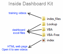
- One Excel dashboard linked to MS Access (without VBA)
- One Excel dashboard linked to MS Access (with VBA)
- One Excel dashboard (all data inside, noVBA)
- One Access DB with all the data
- Training Videos and HTML web pages to see them
- Free access to online training videos showing how to do this in Excel 2007 (only if you get this before Feb 1)
How much is the Excel Dashboard Training
For a limited time (until Feb1st), Jorge is selling the dashboard training kit for $47. This includes the free access to upgrades once they are released. Trust me when I say this is a HUGE bargain.
My Review & Opinion
Jorge is a widely respected authority on charting. His commentary is always insightful and practical. In this training videos, he brings all his experience to teach us how to make better dashboards, charts, how to connect to external sources and how to manipulate pivot tables.
My only gripe is that these videos do not have any audio. But Jorge provides compelling video with lots of comments & interactivity to bridge that..
I recommend the dashboard training kit for anyone making dashboard reports frequently or aspiring to make them using Excel.
(for free dashboard tutorials and templates visit PHD’s excel dashboards page)
Any questions?
Do you have any questions about this product? Please drop a comment. I have asked Jorge to answer your queries here directly.
Also, if you bought a copy of this, please share your review here, it will help others.
Disclosure:
Jorge is a friend of mine. I have received a complimentary copy of this training kit. I also get a small commission when you buy a copy of the product. But I am sure you will derive more benefit out of this than what Jorge or I make.
Go ahead and get the dashboard training kit.


26 Responses to “FIFA Worldcup Excel Spreadsheets [Roundup]”
Nice roundup! Do you know of any one-page spreadsheets which will be updated by an administrator after each game? Would be nice to be able to print out the latest results whenever I feel like checking them as I probably won't be following closely every day.
I actually haven't tried any of the above ones yet, but I thought I'd mention this one that I found which makes a nice one-page form you can fill in dynamically. http://exceltemplate.net/sports/world-cup-2010-schedule-and-scoresheet/
I would like to recommend you these one: http://www.anotagol.com/
You can choose your interface language (english, spanish, italian, portuguese, german or french) and your country for the timezone of match. I like it very much.
An awesome online world cup calendar in flash.
http://www.marca.com/deporte/futbol/mundial/sudafrica-2010/calendario-english.html
Got one more tracker in excel (one page)
http://cid-b09e57e6e960505c.office.live.com/browse.aspx/.Public
[...] Passend zu gerade laufenden Fußball-WM gibt es auf Chandoo.org alles wissenswerte über Excel-Anwendungen für den Fußball-Fan. [...]
Great!!!
I strongly recommend this :
http://www.en.excel-soccer-2010.de/downloads
Chandoo how you found this ...
@Rohit.. really beautiful file. I missed it during my research. Now, I recommend it. 🙂
Hi Chandoo - thanks for the recommandation 🙂 - Regards
[...] Excel, then print it on the other side of your Match Schedule from step 2 above. There are several other Excel spreadsheet templates you can download, but this is probably the only one-page version you can find; plus, it [...]
Does anybody know how to re-create this(?): http://www.marca.com/deporte/futbol/mundial/sudafrica-2010/calendario-english.html
...or do you know where a template can be found? I am DYING to have something like this on my site. When I found it, I had been looking for the longest time for a circular calendar. I found a couple that weren't adequate. Then I stumbled upon this one and my eyes nearly popped out of my head. If anyone can lead me in the right direction, I would be eternally grateful!
Thanks in advance!
Robert
@Robert...
Doing something like that is a lot of work. You can probably get it done with some hired help from a flash developer.
@Robert, the World Cup flash in the Spanish Marca newspaper is impresive, but not much as my own animated spreadsheet with the Goals of 2010 World Cup South Africa in Excel that I just published into my blog:
http://pedrowave.blogspot.com/2010/06/goals-of-2010-world-cup-south-africa-in.html
Download from here:
http://cid-6b219f16da7128e3.office.live.com/view.aspx/.Public/Goals%20South%20Africa%20Animated.xlsx
And start to enter the goals of the rest of matches.
Has anyone seen, or made, a Spreadsheet where you can record the scorers and see a 'top scorers' chart. Would be a nice enhancement
@Neil... checkout this one http://www.inflexionary.com/sports/world-cup-2010-excel
it uses macros to fetch scores from web (and provides very comprehensive analysis too)
@All.. Thanks for the comments. I have updated the post with few more links now.
Hi,
Check this dashboards too:
http://dashboards.org/world-cup-dashboards-and-visualizations/
😉
[...] Here is a collection of FIFA World Cup Spreadsheets if you are more in to that sort of thing. | [...]
[...] Cup fever is here!In FIFA Worldcup Excel Spreadsheets Roundup, Chandoo has some links to useful World Cup tracking workbooks. Only one of them (the first one) [...]
[...] World Cup fever is here!In FIFA Worldcup Excel Spreadsheets Roundup, Chandoo has some links to useful World Cup tracking workbooks. Only one of them (the first one) [...]
Hey, you missed ours! It has everything you need and more, but not a whole pile of silly extras (National Anthems, etc). I'll be making another one for the 2014 world cup. We had over 4000 hits on it!
@Michael Harwood.
Where is it then? You should have posted a link
Sie sollten an einem Wettbewerb teil zu nehmen für einen der besten Blogs im Web. Ich werde empfehlen Sie diese Seite!
Google translation: You should take part in a contest for one of the best blogs on the web. I will recommend this site!
[...] and welcome to the forum, Maybe these similar spreadsheets might give you a few initial ideas: FIFA Worldcup Excel Spreadsheets [Roundup] | Chandoo.org - Learn Microsoft Excel Online If you have specific areas / formulae / layout choices for parts of your spreadsheet that you are [...]
Calling all football fans around the globe! The biggest football festival will kick off on the 12th June 2014 and everyone is placing their bets of who will have the honour of lifting the golden trophy.
Use our free interactive Excel templatel to predict the World cup finalists ! No macros !
http://www.spreadsheet1.com/world-cup-2014-free-excel-prediction-template.html
I also made a Worldcup-tracker, with MS Access, which can also generate reports in Excel
e.g. a match-schedule with locations on y-axis and dates on x-axis, see:
http://worktimesheet2014.blogspot.com.es/2014/05/excel-with-match-schedule-for-2014-fifa.html
and:
http://worktimesheet2014.blogspot.com.es/2014/05/match-access-app-to-track-world-cup.html
where can i find raw data in excel file format of fifa world cups (1930-2014)
@Vivek
Have a read of: http://chandoo.org/forum/threads/goal-of-world-cup.17637/
The location is mentioned in Somendra's comments
Free XLSX Prediction Spreadsheet for World Cup 2018 Russia!
https://www.spreadsheet1.com/fifa-world-cup-2018-russia-free-prediction-templates-for-excel.html