
Sales funnel is a very common business chart. Here is a simple bar chart based trick you can use to generate a good funnel chart to be included in that project report.

Download the Sales Funnel Chart – Excel Template and learn it by playing with it.
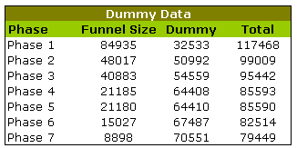
1. Get your sales data ready
The first step is to get your sales data ready for a funnel chart.
For this we take a normal phase-wise sales data and add a dummy series to it. The dummy values tell excel how far each of the sales figures should be moved away from y-axis to get the funnel effect.
The dummy values are calculated using a simple formula like =(some_large_number – funnel_size_at_that_phase)/2, In our case, I have used 150,000 for the large number.
We will also add a total column.
Tell me again, why are we using dummy series?
In order to create the funnel effect, we must move each of the bars in such way that they are all centered vertically. To do this, we take a large number and subtract funnel value from that and divide this by two. How it works ? well, that you can figure out while sipping coffee 😀
2. Create a simple bar chart with the columns Total and Dummy
Once you are done, the bar chart should look like this.

3. Now adjust bar overlap and gap width settings to create a funnel effect
Select the bars by clicking on them, and right click and go to format data-series. In the resulting dialog, go to options and adjust “series overlap” and “gap width” settings in such way that series are completely overlapped and gap is ZERO.
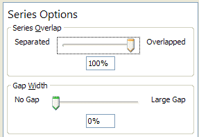
Once you do this, the chart should look like this.

4. Adjust colors and add labels
Select the dummy series and fill it with white color or make it transparent. Add data labels and you have a sparkling funnel chart ready.
Next time use this in your sales presentation to the boss and see everyone having a discussion.
Download the Sales Funnel Chart – Excel Template and learn it by playing with it.


104 Responses to “Form Controls – Adding Interactivity to Your Worksheets”
how to change the font and font size in list box or combo box?
@Kyrel
You cannot change the font size/type in a List or Combo Box Form Control
The Active X versions do give you that functionaility.
tq so much...
[...] link [...]
Just curious, has anyone been able to get a valid cell link from a list box when multiple selections are made? With both the combo and list boxes, I can get them to work okay when selecting 1 entry, but as soon as I try to get multiple selections, the list box seems to simply stop working.
FYI, I'm using XL 2003.
Great post.
@Luke
You can only access the Multi Select options through VBA programming and is beyond the scope of the post.
@Hui
Thanks for the response. I was thinking that was the case, but figured it didn't hurt to hope this was somehow available. Great post on explaining all the different forms.
Luke,
I discussed different techniques of implementing a multi-select input feature in Excel. A combobox / listbox and some other. As Hui already pointed out, there is some VBA needed. However it is not too complicated and the post provides all example workbooks for free download:
http://www.clearlyandsimply.com/clearly_and_simply/2009/01/approach-with-caution.html
Great Post. I use form control whenever I can. The only thing I don't quite understand when to use form control or active x control. Most often I'd do a trial and error and see which fits my needs. If one doesn't then most often than not it's the other control that I'll need.
I like form control very much as it makes things cleaner to look at, and limit how others interract with my spreadsheet.
question on list box: what if I pick "Multi" under control on List box format control? I have never use that one. How would chosen 1st, 4th and 7th and 9th on the list would make an impact on follow up formula/equation??
@Fred -VBA code need to be used to untangle choices with a box that allows multi selection. i have not found any example code.
Why not have just one (Form Controls or ActiveX Controls) and make it work on all platforms? Wouldn't it be a lot simpler?
Also, it would have been good if we're able to format Form controls.
Something for Microsoft to think about.
@Roji
Form Controls have been around for a long time in Excel.
Active X is the relatively new boy in town.
Microsoft has always tried to maintain backward compatibility with file formats and I would suggest that is why it is maintained.
A general observation - if you put too many of these controls on any one sheet ie Checkboxes then that sheet takes for ever to take focus so I am reluctant to overdo it
Chandoo - Just downloaded your excellent "Excel 2007+ Examples" file. Most useful !
What I can't quite figure out is on the Check Box tab how the TRUE/FALSE indicators show or hide the data line / chart element ? A brief explanation would be gratefully received.
Many Thanks
I just design an example of how to add interactivity to worksheets.
I've been playing with the pictures of shapes to create a solitaire where cards are generated in VBA from scratch. You can view and download from my blog.
@MarkyB: Thank you so much for your purchase. See http://chandoo.org/wp/2010/08/31/dynamic-chart-with-check-boxes/ for an example on what you are asking.
@MarkyB
The Check Boxes and other Form Controls don't show or hide the data line.
That is they don't control the chart.
.
They can be used to control the data that feeds the chart
I don't plot the data directly but via an intermediate range where I can use formulas to control the data
.
There are 2 techniques I use to do this
.
When a Check box is ticked a linked cell will be true
a) So use a formula for your data to make it say 200 when the Y Axis is set to a Maximum of 100
eg: =if(b1=TRUE,a10,200)
or
b) set the cells value to na()
eg: =if(b1=TRUE,a10,na())
.
Either way the point wont be plotted on your chart.
.
An Example of This is on the Check Box page of the example file above
http://rapidshare.com/files/455058939/Form_Controls.xlsm
I didn't realize ActiveX controls didn't work in Excel for Mac so I tested it out and you're absolutely correct. In fact, any VBA code that references an ActiveX control will fail when run by the compiler.
With form controls you can really look like a spreadsheet master. It also make it really easy for other users to enter data and ensure the integrity of the formats. Great information, thanks!
Hi there,
I have a question, It's very simple for you, I guess!!!
How can I get a vertical scroll bar (I get it yet) and an horizontal scroll bar (the challenge) in the same table?
The main idea is to show a 10x10 table, wich contains more than 100 rows and 100 columns?
I appreciate your advise a lot!!!
Kind regards,
pibfer
@Pibfer
You can use scroll bars linked to a cell and then use an Offset in your table to do what you want
Refer an example at: https://rapidshare.com/files/4271493887/Table_Scroll.xlsx
Hello Hui,
Is it possible to upload this example one more time? I working in the same type of problem as Pibfer.
Thank you
Regards,
Victor.
@Victor
I closed my Rapidshare account when they wanted to start charging me for the storage.
Luckily I moved all the files to Dropbox
The link is now:
https://www.dropbox.com/s/1avww8j6htg9wj2/Table_Scroll.xlsx?dl=1
Thank you Hui
Best Regards
Victor.
[...] Using form controls♥ Dynamic Charts with Check [...]
Is there a way to wrap text in a form control list box? I do not want to increase the horizontal size of my box to fit my list choices. Thanks!
[...] Using Form Controls [...]
How do we get the vale of a dropdown box in excel ?
@Pooja
Right click on the Drop Down box and Look at the Cell Link cell Reference
That cell has a number which can be used to lookup using Vlookup or Index the value from the source range
Lets say your source Range was AA1:AA10 and cell link was AB1
You can put =INDEX(AA1:AA10,AB1,1)
anywhere to return the value displayed in the DropDown
Verging on off-topic, but an important consideration! The Selected property of the listbox on the Mac appears to be broken, so it seems useless cross platform. If you looking to iterate through to work out which items are selected using (for example):
For i = 1 To .ListCount - 1
If .Selected(i) Then
Action here
End If
Next i
The method works on Excel 2010 but seems not be supported in Excel 2011.
Anyone got a work around?
I'd like to use the radio-select buttons on one sheet, for multiple things. Example... Question 1... Select Yes or No. "Yes" performs a function, "No" performs another. Works great on the first question. However, when I get to question 2.... My Yes / No button's cell reference defaults to the cell references in question 1. If I change it, question 1 defaults to question 2. Can you only use these form controls once-per sheet? ugh!
@Eric
Insert 2 radio buttons
Set their properties, cell links, text
Then add a group box
Group the 3 items
.
Repeat
Is there a way to completely lock an option button or check box so when it is selected and you have protected the workbook/sheet, no one else can change it. Currently anyone can click on a checkbox and remove the check.
Is there a way to lock the checkbox so it can not be unchecked by the user? I would like the checkbox to "default" to checked and not let the user change it.
My suggestion would be to right click the check box, click form control, then under control and then value, click checked then ok. Then protect the worksheet.
Anyone know if there's a way around the fact that the Extend option for Forms listboxes no longer works?
In 2003, if you checked Extend in a listbox, you could select multiple entries by keeping the CTRL button pressed while clicking each entry. In 2010, when you press the CTRL button and click on an entry in the listbox, the whole listbox gets selected.
I'd prefer not to use the Mutli option.
Thanks!
Is there a way to make the vertical scroll bar on an active x drop down list wider? The one I'm working with is super tiny & I haven't found in the properties how to change it.
@Infinitedrifter
Not that I am aware of
hi there! tanks for the post. 🙂 im starting familiarizing those control.. i want to have an idea of making an option form as reference to any formula..and how it works when it is included in the equation.. Tnx..
is this possible to assign a value to each button and it will appear to the linked cell?
Hi! Thanks for the tips! All I need are scroll bars to increase/decrease cell values, for which I use excel mixer pro (convexdna.com, I think). It makes amazing charts, on top of providing sliders. Has anyone tried it on excel 2011 for Mac? Do you know of any other similar tool?
Hi!
I am trying to add insert tick box. I have thousands of documents that i am recieving and would like to tick the box when i have recieved this information so i need to have alot of tick boxes over a wide cell range, how can i insert tick boxes over a wide range without individually adding them? I also would like to lock this box once i have selected it so that i cant mistakenly click it, is this possible?
Thanks!
@AB
You may want to have a look at this solution which Daniel at ExcelHero.com posted a while back
http://www.excelhero.com/blog/2011/03/excel-dynamic-checkmark.html
hello,
i wonder if there is a way to ajuste a range size controling a spinbutton.
ex:
when spinbottun says 1, the range became (a10:a10)
when spinbottun says 2, the range became (a10:a12)
when spinbottun says 3, the range became (a10:a13)
and so on
....
and i wonder if ther is a way to establice a range size with a formula inspired in this thing: =(a1:a"(=COUNTA(b1:b10000)")
thanks
@Silva
Q1- Maybe
Do you mean like
=OFFSET(A10,,,Spinbuttonlink,)
or
=Sum(OFFSET(A10,,,Spinbuttonlink,))
.
Q2 - Yes, Use Indirect
=INDIRECT("A1:A"&COUNTA(A:A))
or as a range
=SUM(INDIRECT("A1:A"&COUNTA(A:A)))
is there a way that you can show like an order form with check boxes on a facebook page then once submitted it will be compiled in another workbook or page where it cannot be accesed by visitors or viewers anymore? I am trying to prevent pranksters from vandalizing clients orders on an order form I am trying to create using excel. thanks.
I have spread sheet with Name of player in Row and his career highlights in column. I wanted to fetch particular details of player in one click so I created the combo box from form control. Combo box will give list of player and respective position in input range. Using if statement the data will be fetched to show particular details of player. I got what I wanted using simple "if" statement.
In my actual spread sheet the column and rows are more than 15. Is there any better alternate formula or neat formula for this?
@Ashwin
Have a look at Using Index(Match( ))
Refer: http://chandoo.org/wp/2008/11/19/vlookup-match-and-offset-explained-in-plain-english-spreadcheats/
how to use button (form control) to function like spin button, to increase value to an existing cell?
eg. value 10 in cell A1, and with a click of the button, it increases to 11
thanks
@Raymond
have a read of: http://chandoo.org/wp/2011/03/30/form-controls/
I saw a question here earlier and wondering if anyone knows the answer. Tim asked above in September. I think I have same question. I'm working on a form where we complete some data and customer completes the rest - we use the protect sheet featuer. I have used the locked cell option to lock down cells from customer changes. It doesn't seem to work for drop down lists though. If I click format control on the drop down list and select "locked" on the protection tab it doesn't work. When I protect the sheet, the user can still change the value slected in the drop down. Looking to lock that down. Thanks in advance for any help.
If you are working within a sheet using data validation it is possible to enter a 'new' value if there is a blank cell within the drop down list range and 'Ignore blank' is checked - may be a clue to your data entry form problem - Good luck
Check Box
? Under Format Object, move and size with cells is grayed out, why is this not available?
I want to format the checked box to a specific cell.
Thanks.
[...] [Related: Introduction to Excel Form Controls] [...]
Namaste chandoo garu,
I am abdul wahed. How are you ?
I have a small query regarding ms excel .
In the institute I am working that is NIIT,THANE 1 of mumbai. I have accidently deleted one excel sheet tab called poonam tab and saved the file.That tab conatined data of 6 years students details.The cashier si screaming at me and crying like anything .
I said that She should have put the backup of file ? Big problem has happened here ?
Now how can I recover the lost data ?
How to create an excel backup file ?
Help me.
Waiting eagerly for your reply
bye
Regards,
Abdul wahed
@Abdul wahed
1. Look for backups!, Official Backups, Has anybody taken a copy or emailed it recently etc
2. Using Windows Explorer Look in the directory where the file was, are there any odd named files? If so copy them and put them aside somewhere. On the copies rename them to *.xlsx and then try and open them in excel
3. Start typing!
[...] Set up a scroll bar form control [...]
[...] Combo boxes for selecting sort & view options [...]
[...] Check boxes – to mark each activity as done (or not done) [...]
[...] To insert check boxes & list boxes see this tutorial. [...]
Spin Button Challenge
I successfully linked a spin button form control to a cell, and have the spin button update the value shown in the cell. Great!
Now I want to take this further. I want to have the spin button cell link to a formula such as indirect or offset so that I might update another cell, which in turn easily changes the cell to which a particular Cell Link, the spin button refers. The Cell Link doesn't seem to be able to accept a formula such as OFFSET or INDIRECT. Can anyone help me with this please?
Ultimately what I want to achieve is to set up a template with spin buttons that update a summary page value which in turn change the displayed value on the template.
I want to have many templates, so I need many rows on summary page, and I want to have a cell on each template such as 1, 2, 3 etc. that is used to refer to the row number offset, which in turn is used in the spin button Cell Link to update the correct row in the summary worksheet based on the template number.
I would appreciate any help, even to solving this problem via a completely different method.
Many thanks in advance
@Brett
Hi from West Perth
You cannot link controls to formulas as you are suggesting
As you have already done, you link a control to a Cell
You can then use that cell in a Offset or Indirect formula as you have suggested
The Spin control changes the cell link cell
The cell link value is then used in the Offset/Indirect to adjust the range/sheet that is being sought
If that doesn't help you can email me, click on Hui... above, email address at bottom of the page
Thanks Hui
Happy Greetings to another Perthian.
Your help is much appreciated.
I need to digest what you have said. I can use offset or indirect functions but I can't see how I can get them to work in this instance. I will likely write to you.
Take care,
Brett
[...] Specify input range as lstChartTypes and cell link as a blank cell in your output sheet (or data sheet). [Related: Detailed tutorial on Excel Combo box & other form controls] [...]
How to add list name in Combo-box ??
@Aniket
There are two ways to load a Combobox
1. Line by line using
With ComboBox1
.AddItem "Yes"
End With
or
2. Load an array and then load the array in one line to the Combobox
ComboBox1.List = strArray
The files in here uses this technique:
http://chandoo.org/forums/topic/print-macro-for-selected-sheets-from-200-worksheets
How do you refer to a worksheet form control (e.g. button) in VBA code?
Something like:
Dim btnHelp As Shape
Set btnHelp = ActiveSheet.Shapes("button 1793")
Is this correct? Or should one do it differently?
@Jacques
It really depends on what you want to do with the buttons with VBA?
As most controls have a cell link, it is generally easier to reference that address to collect the status/value of the button
Hi,
Is it possible to have a Check Box (Form Control) appear/disappear in a cell by selecting a value from a dropdown menu? For example: I have my dropdown menu in cell b2. Based on certain dropdown values, I would like different Check Boxes to appear in B4-B6.
Meaning, if B2="Apple", I need B4 to have a check box to enable "Granny Smith", B5 to have a check box to enable "Pink Lady", and B6 to have a check box to enable "Fuji". But if B2="Grape", I need B4 to have a check box to enable "Green" and B5 to have a check box to enable "Purple".
I am open to using other types of form controls or coding to make this happen--it's just that my knowledge in that area is slim.
Appreciate the assistance!
@Chelsea
Yes
It requires some VBA Code
Can you post your file somewhere?
refer: http://chandoo.org/forums/topic/posting-a-sample-workbook
[...] Related: Introduction to form controls. [...]
[...] Option buttons to select the course [...]
How do you change change the index value of form control spin button with vba? The spin butoon contains two items. Something like Worksheets("Sheet2").Shapes("ListBox_TASKS").
Thanks...
@Zachary
The spinner doesn't have a value
So adjust the cell that the Spinner control is linked to
Thanks very much!
[…] Form controls to capture user choices. […]
[…] you know, there is a form control in Excel that behaves like on/off switch. It is called check box. Although they are easy to use, check boxes are not very slick. So I though, why not make an on/off […]
I like this template. I may modify how the checkboxes work though for a couple reasons:
1) It's a pain to add more rows. If I want to add 10 more rows, it appears that I have to re-point each new object to the appropriate link-cell. Otherwise, they all point back to the copied row - checking one causes all of them to check.
2) I can't group and collapse rows in the checklist without all the objects stacking together and remaining visible in the lowest non-collapsed row. With a simple "x", this would be ok.
One solution would be to have a simple "x" instead of a checkbox object. I could just use an "x" to mark complete, and make the TRUE/FALSE based on an If formula (If "x" then TRUE; otherwise FALSE).
You actually make it seem so easy with your presentation but I find this matter to be actually something that I think I
would never understand. It seems too complicated and
very broad for me. I am looking forward for your next post, I'll try to get the hang
of it!
So I've got a spreadsheet with some scrollbars, and when I quit the sheet, it doesn't save my format controls for the page change. Minimum and maximum values and incremental change are stored, but my page change is not--upon opening it always defaults to 0 page change.
What the heck? Suggestions?
C
@Chris
I've never seen Excel do that
A few ideas:
1. Are you using Form Controls or Active X Controls?
Changing to Active X Controls has fixed up a few odd things for me in the past
2. Try resetting the internal links in the file
Close Excel if open
.
Start Excel
Open your File
Ctrl+Alt+Shift+F9
Save your file
Close Excel
.
Start Excel
Open Your file
"They also have much better ties to VBA in terms of programmability and have a number of events that can be accessed programmatically."
I don't understand how you can say this if you can't even acess them programatically in any reasonable way. Sorry to come off so negatively but, I wasted days on trying to find a solution that should be as fundamental as incrementing a counter.
And BTW, Google searches for an answer that doesn't exist is great at producing thousands of dead ends.
You cannot put them in an array such as ShapeRange, you cannot identify the control name in an expression and requires some kind of awkward workaround like finding a unique property I guess?
Only solution seems to be hard coding the control name So if I have a 25x25 array of buttons, to change one I need to select from 625 cases? And once I give up I need to completely change my strategy and now 2 weeks work is trash.
But to work with a shape it's just a matter of:
ShapeName = "SomeName" & i
Shape(ShapeName).someproperty
Or create a ShapeRange array and reset a large group with a single statement
Am I offbase here? I really hope I'm wrong but I can't seem to find the answer other than one trick that required a new class but that treats all controls like they are clones which might work for some unique cases.
If you think this in just non constructive criticism, I wish I'd found one statement like this in my searches weeks ago.
Hi.. I am using combobox for one report. My need is i want to link 3 to 4 combo boxes to show the report understandably. Eg. If i am selecting "Zone 1" from combobox1, the combobox2 should show all the "Regions" under region 1 and combobox3 should all the "Branches". ie-Combobox1 for "Zone", Combobox2 for "Region" and Combobox3 for "Branch".. Please help me out sir... Thanks...
Hi.. I am using combobox for one report. My need is i want to link 3 to 4 combo boxes to show the report understandably. Eg. If i am selecting “Zone 1? from combobox1, the combobox2 should show all the “Regions” under Zone 1 and combobox3 should all the “Branches”under region 1. ie-Combobox1 for “Zone”, Combobox2 for “Region” and Combobox3 for “Branch”.. Please help me out sir… Thanks…
Not sure this is still monitored, but hoping you can help. I've created a worksheet that is sortable by checkboxes. This is probably outside the scope of this page, but . . . The macro code is as follows:
Sub Front_Door_click()
'
' Front_Door_click Macro
' When clicked, opens all FR DR options
'
'
If Check_Box_28 = True Then
Check_Box_30.Value = False
Check_Box_32.Value = False
Check_Box_34.Value = False
End If
If Sheets("Master List").CheckBoxes("Check Box 28").Value = 1 Then
Range("C193").Select
ActiveSheet.Range("$A$8:$X$206").AutoFilter Field:=3, Criteria1:=Array( _
"FR-LH", "FR-RH", "FR-RH FR-LH", "FR-RH FR-LH RR-RH RR-LH", _
"FR-RH FR-LH RR-RH RR-LH SD-RH SD-LH", "FR-RH FR-LH SD-RD SD-LH"), Operator:= _
xlFilterValues
Else
Range("C193").Select
ActiveSheet.Range("$A$8:$X$206").AutoFilter Field:=3, Criteria1:=Array( _
"FR-LH", "FR-RH", "FR-RH FR-LH", "RR-LH", "RR-RH", "RR-RH RR-LH", "SD-RH", "SD-LH", "SD-RH SD-LH", "FR-RH FR-LH RR-RH RR-LH", _
"FR-RH FR-LH RR-RH RR-LH SD-RH SD-LH", "FR-RH FR-LH SD-RD SD-LH", "RR-RH RR-LH SD-RD SD-LH"), Operator:= _
xlFilterValues
End If
End Sub
That's the code for one button, the other buttons list Rear Door options or Sideliners. The code works perfectly, but when a checkbox is chosen it jumps you down the page, sometimes below the list completely. How can I force it to stay at the top of the page?
@Chris
Add a line at the very end of the Subroutine before the End Sub
Range("A1").Select
hi Chandu,
I am facing problem in adding ALL option in combo box and then sum upon selection.
Like Sales of Region
A
b
c
d
All region
Can you help me ? How Can I do that?
@Adil
Can you ask the question in the forums
http://chandoo.org/forum/
Please include a sample file?
I normally use an If inside a Sumproduct function for that task
=Sumproduct((If(A1="All region",1,Region Range=A1))*(Sales range))
Hi,
I have created a dashboard using "Option/ Radio Button" and received a lot of appreciation.
Thank you for that!!!
Moving ahead, I have a query in the same.
Now I want to put those option button/check boxes in a way that whenever I'll select both of them, there will be two charts appearing at the same time so that I can compare.
I hope you got it what I am trying to say.
Awaiting your reply.
Regards,
Prajakta
hi
i am iranian
i like to leaning excel industrial
Hello,
I want to learn sumproduct() function.. can anyone discuss with proper example as i found it very tough to understand.
Where it is used and how?
Regards,
Mahantesh
@Mahantesh
Have a read of:
http://chandoo.org/wp/2011/12/21/formula-forensics-no-007/
http://www.excelhero.com/blog/2010/01/the-venerable-sumproduct.html
http://chandoo.org/wp/2011/05/26/advanced-sumproduct-queries/
its very interactive form in excel.. how to create form by calling value from one column..? How to create pop up entry data form in excel, by clicking a member
Hi Chandoo,
Is there any chance to select multiple radio buttons at a time in excel 2013.
please help me on this.
Regards,
Ramesh
@Ramesh
If your talking about Form Control Option Buttons
No, They are either on or off and when grouped only a single one can be active
If you want to select multiple items use a Check Box Form Control instead
You can use separate Radio Control Buttons
Each must belong to its own group
Each group will have different cell links
Then you will need to apply the logic to control them yourself
I have added the SEP date control to a spreadsheet to provide a date picker.
Does anyone know if it is possible to link the output (the picked date) to a text box or cell elsewhere in a workbook?
I have a form where I'd like to be able to pick the date, and then show this date on an output worksheet somewhere else.
Thanks
Andrew
[…] Using Form Controls […]
Hi,
Regarding the cell link in the Form Control. Can the cell link value be dragged from cell to cell vertically without having to input individually as a time saver? I would like to have c3, c4, c5, c6, etc. but when I try dragging it just populates c3 all the way down.
@Donna
A cell link can only refer to a single cell and can't be dragged as you describe
@Donna
In a week or so I will be writing how to link 1 control to a number of Cells !
Stay tuned
Comprehensive guide on excel form controls.
What are problems with using Active X controls?