
Most of us are comfortable with numbers, but we are confused when it comes to convert the numbers to charts. We struggle finding the right size, color and type of charts for our numbers. The challenge is two fold, we want to make the charts look good (we mean, really… really good) but at the same time we want our audience to focus on the message and not on the bells and whistles. This is where it gets tricky.
Almost 2 months ago our reader Jennifer sent me an email asking if there is an effective way to present market share changes between two periods for 2 products among five competitors. I have replied her promptly with whatever I could think of as better ways to present the data. But I also posted a visualization challenge: How to show market share changes?
We have got quite a few comments and recently Jon Peltier himself wrote on this here: Show Market Share Changes – Few Alternatives
I thought it would be great to summarize various approaches we discussed as a case-study in how you can take same data and present it in different ways.
This is the data Jennifer had:

- Here is how she presented it initially:


- After seeing user discussions she remade the charts like this.

- Derek from Information Ocean responded to the challenge with this step graph (which he admits is not so effective). Nevertheless, they are another fun alternative

- Derek also proposed this “who is responsible for that?” chart. Despite looking little cluttered I liked this one.

- Dave from Favillae responds with this aligned bar chart alternative to present the same data. Another innovative way, he used blank series to adjust the gaps

- Nixnut, a commenter, tried bar charts to come up this variation. These are pretty good and provide both absolute and changes in market share values. He used overlapped chart technique to achieve this.

(image url) - Finally the alternatives presented by Peltier.
This one is a panel chart (here is an excel tutorial for panel charts)
- A stacked bar chart

- A line chart

- A simpler, neater bar chart

- A panel chart, but this time two products are separated

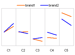
- Last but not least, these are the alternatives I could think of. First one is a Line chart.

- This is a tag cloud (excel tag cloud tutorial & templates). The fonts are sized based on their relative market share percentages.

- And in-cell chart variation.


Conclusions – Which chart is better?
Well, there were quite a few very good charts. Personally I liked the panel chart version (#7) and bar chart variation by NixNut (#6).
Which one did you like?
Knowing that there are various ways to present the same data and using the version most suitable for your needs and situation is very important. If you want to raise alarm about market share loss, use a chart that alarms people. If you want to downplay the marketshare loss, use a chart that barely shows the information.


15 Responses to “Make a Bubble Chart in Excel [15 second tutorial]”
Noooooooooooooooooooooooooooooooooooooooooooooooooooooooooooooooooooooooooooooooooooooooooo!!
Whyyyyyyyy?
The idea is to tell how to make a bubble chart. I got an e-mail from a reader recently asking how the scatter bubble is made. So I thought a 15 second tutorial would be a good idea to show this.
Did that email go "Dear Chandoo, I know that you scorn bubble charts, but if I don't do one in Excel for my boss then he'll fire my sorry ass, and my children will have to be sold for medical experiments in order for me to be able to afford the upgrade path to Excel 2010"?
If so, fair enough...it's all in the greater good 😉
Chandoo,
I am using excel 2003 and it is not working. The x axis is not the one that I enter in x axis column. Please help! Thanks.
Sorry, after few attempts, I managed to get the right result. I shouldn't select the title (header) of the table and select only the data to produce the right bubble chart.
What's wrong with bubble charts? Is there a better method for displaying scatter plots with lots of overlapping data points? Don't tell me you'd rather jitter!
@Sanwijay: Cool.
@Precious Roy: There is nothing wrong with bubble charts. Infact, it is the only way to show 3 dimensional data (x,y and sizes) without confusing your audience. Jeff is worried that people might misuse the chart. As with any chart, bubbles also have a place and time for using them.
I recommend using bubble charts to show relative performance various products in several regions and similar situations.
Also, human eye is notorious in wrongly estimating the bubble sizes (as we have to measure areas). See http://chandoo.org/wp/2009/07/28/charting-lessons-from-optical-illusions/
We can partially improve bubble charts by adding data labels, but if you have too many bubbles, the labels will clutter the chart and make it look busy.
I can't seem to find a way to plot more than ten bubbles on a chart and need to know how to add more
@KW.. why would such a thing happen. I am sure you can add more bubbles that that. Can you tell us exactly what you are doing...
Example table:
A B C (size)
Me: 25 30 15%
Him: 30 22 11%
Her: 12 30 20%
I am trying to make a bubble chart where the Y axis is A, the X axis is B, and the size of the bubble is C. There should be only 3 bubbles. I keep ending up with six (with the labels being only "Me" and "Her"). My goal is to have three bubbles, one representing each person. Clearly I am doing something wrong. Can you help explain...?
Hi,
I wanted to add data labels to the bubbles. Each bubble represents a different company name. Excel allows me to add the size, legend, x axis values and y axis values. How do I add instead- Company A, B, C, D for the bubbles?
youon you have to choice every data for every company..
ex:create bubble for A company,after that click right> add data label> adjust data labels :format data labels and choose : series name.
i hop u will succeed .
[...] we create a bubble chart with 2 bubbles. 1 for the actual mustache & 1 for target [...]
If we want bubble size to be controlled by one column, but the bubble labels to be controlled by another column, how can this be achieved?
many thanks!!!!