
Back when I was working as a project lead, everyday my project manager would ask me the same question.
“Chandoo, whats the progress?”
He was so punctual about it, even on days when our coffee machine wasn’t working.
As you can see, tracking progress is an obsession we all have. At this very moment, if you pay close attention, you can hear mouse clicks of thousands of analysts and managers all over the world making project progress charts.

So today, lets talk about best charts to show % progress against a goal.
Please download example file and keep it handy while reading the rest of this tutorial.
Data for these charts
For all these charts, we will use below data:
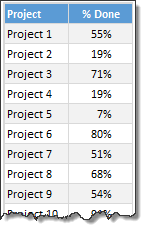
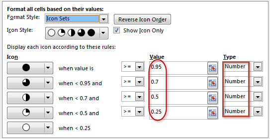
Chart #1: Conditional Formatting Icons + % values
This is my all time favorite. It is very easy to implement and works really well.
All you have to do is,
- Select the % completion data
- Go to Home > Conditional Formatting > Icon sets
- Select 3 traffic lights
- Edit the rule as shown below:
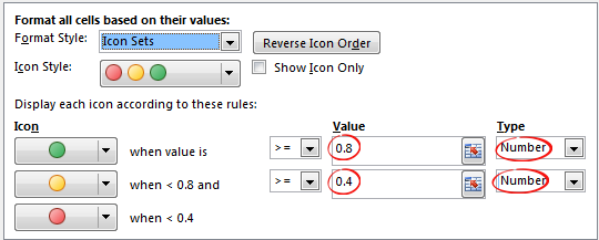
- Done!
Why you should use this?
- Very easy to set up.
- Scalable. Works the same when you have 20 or 200 or 2000 items to track.
- Looks great
Keep in mind:
- The traffic lights in Excel are not great for color-blind people.
- The traffic lights do not look good when printed in black-and-white (or gray scale)
Related: Never show simple numbers in your dashboards
Chart #2: Conditional Formatting Data Bars
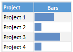
Another easy and quick answer.
- Select % completion data
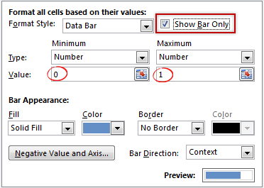
- Go to Home > Conditional Formatting > Data bars
- Select Solid Fill if available.
- Done!
- Extra step: Adjust maximum bar size to 100% so that you can see relative progress better.
Why you should use this?
- Very easy to set up.
- Scalable. Works the same when you have 20 or 200 or 2000 items to track.
Keep in mind:
- By default the maximum value in your data takes 100% of the cell width. So make sure you set this to 100% for better depiction of progress.
Chart #3: In-cell bar charts
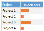
If for some reason you cannot use databars, then rely on in-cell bar charts. These are simple to setup and works great in many situations where conditional formatting may not be an option.
- Assuming your % data is in A1,
- In adjacent cell (B1), write = REPT(“|”, A1*100)
- You will get a lot of pipe symbols | in this cell.
- Select the cell and change font to Playbill
- Adjust font size and color if needed.
- Done!
Why you should use this?
- Very easy to set up.
- Scalable. Works the same when you have 20 or 200 or 2000 items to track.
- Can be handy when making dashboards or reports (where conditional formatting may have limitations)
Keep in mind:
- The font & size has impact on how in-cell chart is displayed. Use either Playbill or Script fonts.
Chart #4: Pies
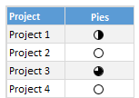
Conditional formatting pie charts are a simple alternative to show % progress data.
The process is same as traffic light icons. Make sure you adjust pie icon settings as per your taste.
Why you should use this?
- Very easy to set up.
- Scalable. Works the same when you have 20 or 200 or 2000 items to track.
Keep in mind:
- Pie chart icons have only 5 stops. So they are not really pies.
- Not everyone likes pie charts. Make sure your boss / customers dig them.
Chart #5: Color scales or heat maps
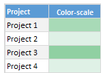
When you have a lot of items to track, your focus is really on which items are lagging (or leading). In such cases, a color scale (also known as heatmap) can work very well. It colors cells based on their value. For example, the darker a cell color is, the more that particular project is done and vice-versa.
Why you should use this?
- Very easy to set up.
- Scalable. Works the same when you have 20 or 200 or 2000 items to track.
Keep in mind:
- Make sure the color starting & end points are well contrasted. Else the color scale looks bland.
- By default color scales show the values too. To hide them use ;;; custom cell formatting code (how to).
Chart #6: Thermometer charts
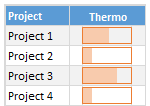
This is my favorite technique. It works very well for data like this.
Tutorial on how to create thermometer charts.
Why you should use this?
- Easy to understand
- Scalable. Works the same when you have 20 or 200 or 2000 items to track.
Keep in mind:
- If any value is more than 100% the chart may not explain it properly.
- Make sure the axis min & max are set to 0 and 1 respectively.
- You need a dummy column with 100% in it to show outline of thermometer.
Download Examples
Click here to download example workbook. It contains all these charts.
Special bonus for you:
As a bonus, the download workbook also has 5 step tracker to make you awesome in Excel. Go ahead and download now.
What is your favorite chart to show % progress?
My most favorite chart is thermometer. The next is traffic light icon-set.
What about you? Which of these 6 is your favorite? Please share your chart in the chart. If you use something else altogether, please tell me. I am eager to learn from you.
More on comparison charts

Just like my project manager, I am sure your manager too loves tracking & comparison. If so, please go thru below articles to learn few more tricks to impress her.
- Us vs. Them – compare one value with many using interactive chart
- Best charts to compare budget with actual values
- Indicating lower & upper bounds on a chart
- Customer service dashboard – a case study in comparison
- Exploring Flu trends in excel chart – a case study in heat maps for comparison
Now if you excuse me, I have to report to my new project manager: my wife. She is asking me about the progress of taking down Christmas lights. And I am still at 9%.


28 Responses to “Team To Do Lists – Project Tracking Tools using Excel [Part 2 of 6]”
[...] & tracking a project plan using Gantt Charts Team To Do Lists - Project Tracking Tools Part 3: Preparing a project time line [upcoming] Part 4: Time sheets and Resource management [...]
the templates are great (I bought the combo).
What I'm missing is a way to have the project gantt chart and reporting with the data per resource, in such a way that I can also show the occupation per resource on an extended gantt chart.
So with hours entered per person per project or sub-activity, to show a gantt chart of how many hours/days a person spent on which project (or plans to spend).
[...] from: Team To Do Lists - Project Tracking Tools using Excel [Part 2 of 6] 25 Jun 09 | [...]
Hi Chandoo,
Funny I have a post on the value of MS project lined up which I will post when the current monster project I'm working on finishes and I get some free time!
I'm not sure this would help with any of the projects I've worked on, closing down a to do list seems like more effort than it's worth, but it might be useful for some things. I guessing it doesn't, but does the time stamp not update when you recalculate the work book?
keep up the good work!
Ross
@Ross.. Thanks for sharing your ideas... I think to do lists are a great way to keep up with project activities and ensure accountability from individual team members, when they are implemented right.
"I guessing it doesn’t, but does the time stamp not update when you recalculate the work book?"
Your guess is right. When you change the calculation mode to "iterative", excel takes care of the nittygritties and retains older values in circular references in formulas.
[...] Project Management in Excel [New Series] - Gantt Charts | To Do Lists [...]
[...] & tracking a project plan using Gantt Charts Team To Do Lists - Project Tracking Tools Project Status Reporting - Create a Timeline to display milestones Part 4: Time sheets and Resource [...]
Hi Chandoo,
The template give me lot of convenience to monitor the thing to do. It simple. Thank You
[...] & tracking a project plan using Gantt Charts Team To Do Lists - Project Tracking Tools Project Status Reporting - Create a Timeline to display milestones Part 4: Time sheets and Resource [...]
[...] make sure you have read the first 4 parts of the series - Making gantt charts [project planning], team todo lists [project tracking], project time lines chart [reporting] and Timesheets and Resource Management using Excel. Also [...]
Chandoo,
I really do not see any befit to this function in Excel unless it was somehow tied into some other chart. That is say a scheduled activities % complete is based on the to-do list.
The only way this chart would be useful is if no one was assigned none dependent task that could be done by anyone. The cases were both of these conditions are true are so few and far between it really makes this chart worthless.
@Brian... Once you have a todo list up and running, it is easy to get metrics out of it. I didnt propose it as it might look a bit too micro-management-ish.
I am able to understand what you meant by "The only way this chart would be useful is if no one was assigned none dependent task that could be done by anyone. The cases were both of these conditions are true are so few and far between it really makes this chart worthless."
Can you explain?
"Chandoo"
What I mean is this. Lets say you have 10 task which are part of one activity/WBS that is in your schedule. One there are very few cases were many people would be assigned to complete this one scheduled activity with no direction being given who should what of the 10 task. It is poor management, and the task 90% of the time would not get done in a timely manner if say 4 people were responsible. Secondly, you are assuming all 10 task are independent of each other. You might need to do task 1 thru 3 before you can do task 4, and to do task 7 you might need to do 4 and 6. Thirdly, the time it would take to compile and then fill out the to-do-list even in limited applications is really not worth it.
I just see almost no applications why a team would need to inform others separate from the schedule that they have completed a task on a to-do list unless anyone of the 4 people could of completed that task.
My point is, there might be a few very limited applications for this type of list but this list would be worthless as a Project Management tool in every other case.
However, change this from a to-do-list to a document change log and it is perfect. Instead of to-do it is the documents name or summary of what changed in the document. The person is who edited the document, and the time stamp is when they checked it in. But I do not know why you would use excel when there is free software you can use commercially that is 10 times better that does document management.
I think using excel to do Project Management over a real Project Management application is a bad idea. Unless you are running a very small, simple project, the time and effort is a lot more to use excel compared to the cost of the Project Management software.
This comes back to my point, I love your site, however, just because you can do something in excel does not mean you should do it. To often the time it takes to use excel is wasted 10 times over from the cost of doing it in an application designed to for the specific application.
@Brian: The todo list mentioned here is meant to keep track of all the tasks for which detailed planning is not necessary but some sort of tracking is needed. These are not be confused with project activities (a la gantt chart).
I like your suggestion about using this as a document tracker. Pretty cool use.
Coming to your point about excel as a real project management tool, well, I have my views, but in a serious project environment, it would surely payoff to have a dedicated project management application.
[...] & tracking a project plan using Gantt Charts Team To Do Lists – Project Tracking Tools Project Status Reporting – Create a Timeline to display milestones Time sheets and Resource [...]
Chandoo,
Wonder how the timestamp column will maintain its previous data. Both Today() and Now() functions will update as and when the next timestamp happens.
[...] Preparing & tracking a project plan using Gantt Charts Part2: Team To Do Lists – Project Tracking Tools Part3: Project Status Reporting – Create a Timeline to display milestones Part4: Time sheets and [...]
I've combined this with the issue tracker since I like the automatic date stamp, but one thing I'm noticing is that I can't replicate the chart that goes along with the issue tracker because the cells that are referenced have the formula that inserts the time stamp instead of a the actual date value. All the dates of the last 30 days display 0 when they should have a value.
Is there a way around this?
I have edited the chart so that my team members can update the percentage completion of the assigned tasks. When the cell is updated, i would like the time stamp to update. How would I manipulate the formula to update whenever the drop-down list is changed?
[...] … ??? To Do List [...]
Excel is great however sometimes you need to get a better idea of what tasks each person on your team is working on at any given time. We've developed a web app that can do just that! Each person has a list of tasks, listed in the order they have to complete them.
HII,
I want to expand the database through excel where i am working on 11 cities as of now and i want to expand it upto 50 cities and hence forth the data related to it will also expand so i want to make it precise where i can get updates also that this work is required to be done at that particular day or date
Thanks for making all of this information available for free. I am currently using excel to track everything for the first time. I later plan to output our information here with a more visual presentation. Wish me luck!
Can some one point me out to some additional direction on the "Who Finished it?" column? Something more 'basic' for a newbie excel guy? lol I got everything else working on this tutorial but that column. I can't seem to recreate it and I know a lot of it is due to lack of knowledge with VB code. I'd like to recreate this column very much 🙁
Dear Chandoo,
Thanks for the team to do list, kindly let me know how to set the column who " finished it " from another work sheet
Hi Chandoo,
Unable to download it - can you please check the link and confirm.
Great inhisgt! That's the answer we've been looking for.
Hi Team,
I know u all are the best programmers in the world!!! that's I am here to rectify my issues. here is my question please ans me as soon as possible before 8-3-2017 its really urgent.
I have a project named the production tracker.
1) I require the user form which shows the names of the Associates which are linked to the different tracks. when the user is selected the particular track related details and dropdowns should appear.
2) I need to track the associate needs how much of the time to complete the particular task. with start stop and pause and resume timer.
3) It should display the daily count of the production and save the data to the another Excel file.
this production tracker should save all the data no matter how many people logs in into it.
Please help me for this it will be very appreciated.
you can directly email me on my mail ID: tusharkch694@gmail.com