Win Loss Chart from a Series of Win, Loss Data

Share

Facebook
Twitter
LinkedIn

Last week, we learned how to create win-loss charts in Excel. In the comments, Dan said,

Incidentally, the fastest way to do this would be using SFE, just reflect your data with 1 for a win, – 1 for a loss. There’s even an option to automatically invert negative numbers. #

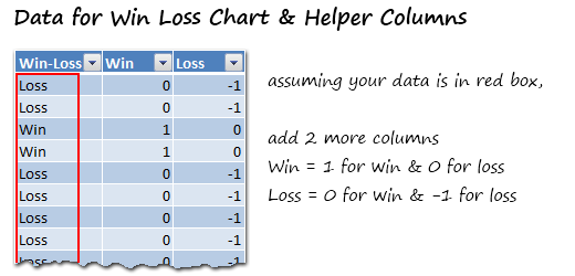
Of course, we can use the beautiful Sparklines for Excel addin to do this and several other charts. But if you just have a series of Wins and Losses, like below, you can use a column chart to create win loss charts too.

Your Data:

Lets say you have data like this,

Data for Win Loss Chart - Excel Win Loss Chart


Win Loss Chart in Excel – 5 Steps

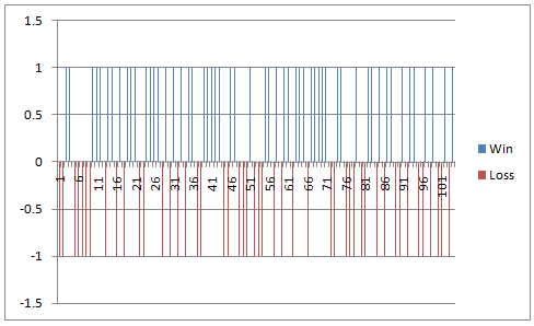
Step1: Select Win & Loss columns and Insert a Column Chart

This is the first and easiest step. At the end, your chart looks like this:

Win Loss Column Chart - Step 1

Adjust Series Overlap and Gap - Winloss Chart in Excel
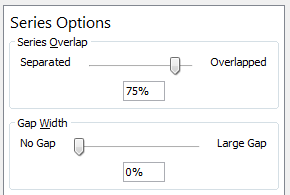
Step 2: Adjust the Series Gap & Overlap

  • Select either Win or Loss series and press CTRL+1 (or goto format series).
  • From here, adjust the gap to 0
  • and overlap to 75%, like shown aside.

Step 3: Remove un-necessary chart elements

  • Remove grid lines and labels
  • Remove horizontal axis
  • Select vertical axis and press CTRL+1 (format axis).
  • Now, adjust axis min to -1 and max to 1
  • Close it and remove vertical axis too

Step 4: Adjust colors

Change the colors if you fancy.

Step 5: That is all

There is no step 5. Your win loss chart is ready. Go ahead and show it off.

Win Loss Chart - Improved

Download Win Loss Chart (Improved) Template:

Click here to download the winloss chart template and play with it.


Click here to download the winloss chart template complete with Sinusoid chart template. (Supplied by Hui)

Learn more – Excel Charting

If you want to learn Excel Charts, start with our charting tutorials page. We have more than 250 articles on charting, visualization, data analysis and excel tips.

Facebook
Twitter
LinkedIn

Share this tip with your colleagues

Excel and Power BI tips - Chandoo.org Newsletter

Get FREE Excel + Power BI Tips

Simple, fun and useful emails, once per week.

Learn & be awesome.

Welcome to Chandoo.org

Thank you so much for visiting. My aim is to make you awesome in Excel & Power BI. I do this by sharing videos, tips, examples and downloads on this website. There are more than 1,000 pages with all things Excel, Power BI, Dashboards & VBA here. Go ahead and spend few minutes to be AWESOME.

Read my storyFREE Excel tips book

Overall I learned a lot and I thought you did a great job of explaining how to do things. This will definitely elevate my reporting in the future.
Rebekah S
Reporting Analyst
Excel formula list - 100+ examples and howto guide for you

From simple to complex, there is a formula for every occasion. Check out the list now.

Calendars, invoices, trackers and much more. All free, fun and fantastic.

Advanced Pivot Table tricks

Power Query, Data model, DAX, Filters, Slicers, Conditional formats and beautiful charts. It's all here.

Still on fence about Power BI? In this getting started guide, learn what is Power BI, how to get it and how to create your first report from scratch.

21 Responses to “Distinct count in Excel pivot tables”

  1. Al says:

    The distinct count option works well but I have found that if I have a date field and want to group by year, month, etc. that option seems to be disabled. I need to do both, distinct count and group by year/month.
    Example data; sales orders with item quantities with dates.
    Challenge; sum the item quantities, count the distinct orders and group by month. How do I do this?
    Perhaps that's not possible due to the grouping?

    • Chandoo says:

      @Al... When you use data model based pivots, you cannot group values manually anymore. Why not use Excel 2016's default date grouping option? In this case we have just a few dates, so Excel is not grouping them, but if you have an year's worth of data, when you make the pivot with date in the row label area, Excel automatically groups them. If you have fewer dates or want to use your own grouping, just create a table with all dates, add columns with month, week, year etc. Then connect this table (these types of tables are usually called as calendar tables) to your data on date field as a relationship. Now you can create reports by month, quarter etc easily.

      • Dan says:

        Is this the only way to do it in 2013? I find it rather cumbersome to have to create another data table listing dates with the another column for MONTH() and YEAR() to be able to summarise data for senior level...

        • Chandoo says:

          I know people find adding calendar tables cumbersome, but it is a best practice and let's you add more layers of analysis quite easily. For example, adding analysis by weekday vs. weekend or by financial quarter or YTD calculations (you would need either Power Pivot DAX or some very carefully setup pivot table value field settings)

  2. NC says:

    I had absolutely no idea this was possible. Very useful, nice work!

  3. Pete says:

    Doesn't work for 2010 version though (or at least not my works version)

    • NARAYAN says:

      Hi ,

      The post has the following in it :

      These instructions work only in Excel 2016, Office 365 and Excel 2013.

  4. Sarah says:

    when i have 2 different Pivot tables, one without the enabled “Add this data to data model” option, and the other one with it enabled.. is there anyway i can link slicers between them?
    if the answer is NO,, what to do ?

  5. Edgar says:

    Quick note, the “Add this data to data model” option is not available for the Mac version.

  6. Steve Curtis says:

    perhaps outside scope of this article but I have found when I attempt to create a pivot table from an external data source (connection to a sql view) the "Add this data to data model" becomes greyed out. Anybody experienced and found a solution so I can start getting distinct count in my pivot tables?

  7. Kelly Nanfito says:

    Is there a way to still add a calculated field when using distinct count?

  8. Luna says:

    I found I can't change the date source after tick the " add this data to the data model", can you help to adv how to change the date source in such case?

  9. Chris says:

    Is there a way to update the source once you have added to the data model? I receive a new spreadsheet weekly and would like to update the connection so my tables pull from the new source.

  10. Ankit Moral says:

    A big Thank you. It worked.

  11. Mohapi says:

    Hi, have survey data that I need to analyze but the challenge is that my key fields are showing horizontally. I tried to transpose the fields using Power Query, but unfortunately the new fields are returning same values on a pivot table despite using distinct values

  12. sorina says:

    How I can a do a pivot table with discount conts in some columns and then generate shor report filter pages. pls it drives crazy

  13. ira says:

    Hi. Why grand total pivot of distinct count is 13? shouldn't it be 67?

  14. Asia says:

    Great Answer! Saved me lots of time!
    Thank you!!!

  15. Suresh says:

    Worked awesome! Thanks!!

  16. Mayank says:

    Hi Chandoo,
    I am using pivot tables for distinct count and now I need to update them with new set of data. But when I update the source data, all the columns and formatting of Pivot table disappears and I need to build it from Scratch.

    Is there a possibility that I can update the source data with new rows added and also retain my pivot tables?

Leave a Reply