
This is a guest post by Sohail Anwar.
Let’s not bore you with an intro. You are about to learn a VLOOKUP trick that Lucifer himself would not want you to know. It’s so absurdly powerful that it was developed in a lab and had to be tested on Rocky’s arch nemesis Ivan Drago.

Presenting the Multiple criteria VLOOKUP!
…boring…pass, we’ve seen it.
Oh, have you? Not like this you haven’t. This will change the way you work with Excel.
Let me start with an easy example. Here’s some data and we would love to know what Bb and Dd is.
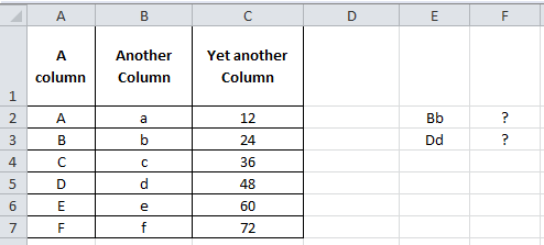
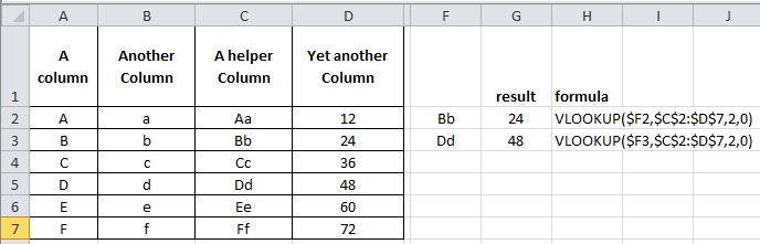
Easy. Let’s put a helper column in that concatenates the two inputs and do a basic VLOOKUP.
Puh-lease. How boring.
Bye Bye Helper Column, it was nice while it lasted.
With a dash of CHOOSE and sprinkling of Array formulas, we’re about to change the game:
=VLOOKUP($E2,CHOOSE({1,2},$A$2:$A$7&$B$2:$B$7,$C$2:$C$7),2,0) and press Ctrl + Shift + Enter
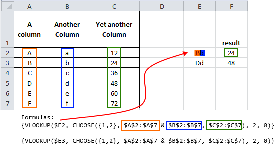
Without getting into too many details, using the Array creates a makeshift virtual helper column. You don’t have to understand Array formulas to make them work for you. I will lay out the simple structure that you can replicate
VLOOKUP(lookup value, CHOOSE({1,2,...N},Column1 & Column 2 &…& Column N, Result Column),2,0)
Where the lookup value is either something pre-concatenated (like Bb or Dd above) or you are using multiple criteria that you concatenate when entering the lookup value. The CHOOSE structure is easy. Always {1,2} then concatenate (with &) as many columns as you want (that the lookup values will need to look in) and the VLOOKUP’s column number is always 2. Let’s explore another example:

Let’s say we want to look up the Savings Produced for a Director of Grade D who started in 2014. That’s 3 lookup criteria. Let’s follow the structure.
=VLOOKUP(A13&A14&A15,CHOOSE({1,2},A2:A10&B2:B10&C2:C10,D2:D10),2,0) and press Ctrl + Shift + Enter
The two key things to note is that our lookup value is a concatenation of the criteria, in this case I have put the criteria in A13, A14 and A15 (hence A13&A14&A15 is our lookup value). Secondly, in the CHOOSE formula, the ranges in the middle part (A2:A10&B2:B10&C2:C10) have to be concatenated in the same order that the lookup value was concatenated. So we concatenated:
Start Year & Grade & Role
In both the lookup value and lookup columns within the CHOOSE.
I stumbled on this many years ago at work and it is the easiest way to do multiple criteria lookups. Play around and add more criteria…but that’s just the beginning!
When I get that feeling, it’s like Textual Healing
So how can we take this concept and make it even more useful?
First, let me share my story of pain and anguish.
Often when dealing with volumes of text data I make numerous helper columns to deal with the multitude of ways I am presented with names. Anyone who’s reconciled HR data to Finance data for example can appreciate that pain. Finance write their names First Name (column 1) Surname (column 2), then HR provide a spread with Last Name, Surname (column 1), then all of a sudden the Project team join in the fun with First Name, Surname (column 1)! Arrghh!
So I am now left to deal with this chaos via numerous text formulas involving SEARCH, LEFT, RIGHT, MID, LEN and MYSANITY (okay perhaps that last one is my own UDF, my volatile UDF). So, maybe it’s not that bad, but when you’ve been doing it for as long as I have, it gets tedious and you begin to search for efficiency. So, one day like the rebellious closing scene from Dead Poet’s society, I stood on my desk and declared ‘Oh Captain, My Captain’ as I refused to create another ‘helper’ column.

After my colleagues talked me down from the table and reassured me (“There there Sohail, I don’t mind inserting new columns for you occasionally”…”Sure you don’t John, sure you don’t”), I went about finding a less ‘helpful’ way. Would you believe, our new friend the multiple criteria lookup was the answer.
You see, not only can our criteria be cell references but also extra characters! Let’s say we have First Name(Column A), Surname (Column B) and Unique Reference (Column C). Someone gives us a spreadsheet with the names in either a First Name + Surname or Surname, First Name format. We can look this up by including the extra characters in our lookup columns within the CHOOSE.

Look closely at the middle of the CHOOSE since that’s where the magic is. Download the workbook to see the example in action.

We have pretty much instructed the two columns we are looking up to join up in a specific way. First we want them to join up with a space in between. Then the second formula has asked them to join up Surname, comma and space in between, then finally the First Name. So as far as Excel is concerned we have created two virtual helper columns that look like this:

This makes it straightforward for us to look up John Johnson or Johnson, John in them.
There are virtually no bounds to how you can use this Multiple Criteria VLOOKUP. It made my life tremendously easy and I’m sure it makes yours easier too. Do me a favor and let me know in the comments some of the crazy ways you are applying it.
And then if you haven’t already grabbed a copy of Chandoo’s VLOOKUP book I cannot recommend it enough as the ultimate resource in VLOOKUP mastery
Download Example Workbook
Click here to download the example workbook prepared by Sohail. Play with it to learn more.
Added by Chandoo
Thank you Sohail
Thank you Sohail for writing this very useful, incredibly fun tutorial. I am sure our readers will enjoy it as much as I do. Thanks.
If you like this, please say thanks to Sohail.
Related discussion on Multi-conditional lookups
As you can guess, this is not the first time we talked about using multiple conditions in VLOOKUP. Check out below articles for more ideas & tips:
- Multi-condition lookup using Excel
- Using CHOOSE formula to make VLOOKUP go left
- Introduction to SUMIFS & CHOOSE formulas
About the author: Sohail Anwar is a Londoner who has spent over 10,000 hours applying Excel in his professional life and earns well over 6 figures as a result. Now he’s on a mission to teach professionals how to massively increase their earnings by learning and applying Excel like never before. Find out more about Sohail on Earn With Excel or LinkedIn


14 Responses to “How to Add your Macros to QAT or Excel toolbars?”
We have only just got excel 2007 so this is helping me navigate my way through the differences cheers.
For Macro's i always add a Command Button, rename it something obvious, change the colour of it and finally add the following to its View Code section.
Application.Run "MAcro1"
This way anyone opening the file knows what to do if i ever win the lottery and dont make it in 🙂
Hi,
Good article. But I have this problem.
1) Customized QAT with a macro. Macro name = MacroX
2) Runs OK from original location (e.g. C:\TestLoaction1\TestFile.xls)
3) Copy past file to new location (e.g. C:\TestLoaction2\TestFile.xls)
Menu button now fails:
Cannot run the macro "C:\TestLoaction1\TestFile.xls'!MacroX' The macro may not be available in this workbook...
Of course the code is there, and macros are enabled.
Could get it to work after deleting and recreating macro custom buttons. So have to re-assign macro to QAT button every time I move the file?
If I put a form button on he worksheet and assign the macro to that, it's location independent.
Any ideas?
Thanks
@Ron
What you have said is correct
Macros within a worksheet are stored within the worksheet and hence follow it.
Macros referenced by a button in the QAT or elsewhere are locaed in a file and if that file is moved the linkages don't follow.
The easiest way around this is to store all your macros in a location that doesn't move and is in fact reloaded everytime that Excel starts and that is called the Personal.xlsx/b file.
These are refered to several time at Chandoo.org or have a read of
http://www.rondebruin.nl/personal.htm
or
http://office.microsoft.com/en-us/excel-help/deploy-your-excel-macros-from-a-central-file-HA001087296.aspx
In Excel 2003 and prior versions, a button added to the Toolbar maintained a DYNAMIC link to the file (e.g. Personal.xlsb) holding the assigned macro, such that if the file was relocated for any reason (by using Excel's native Save As command rather than just moving it via Windows Explorer), the link between the button and the file was updated.
I expected the same to occur with Excel 2007+, but alas, Microsoft in their infinite wisdom have removed another feature useful to advanced users (just as they did by removing the ability to design your own buttons)!!
So having just done some reorganisation of my files, I now have to remove and recreate every friggin macro button on my QAT (I have lots) - what a pain in the proverbial!!
Hi Hui,
Thanks for the help, that's really useful.
1) The macros I'm adding are for one specific Excel application, so I really wanted the macros to follow the file
2) I didn't want to have to pass other files around too and have users installing those - either Personal.xlsx/b or as an Add-In.
3) I realise now that the QAT additions will appear for other Excel workbooks in which I don't want the macros available.
So, it looks like I need to keep it local, by using a button on the worksheet. Unless you can suggest any way of adding to menus just for a specific workbook.
Thanks again for your help. Great site, so I'll be signing up for the emails.
Ron
I know I'm a little late jumping on this post, but wondering if anyone knows how to add a UDF to the QAT? I've saved my UDF in my personal workbook, but it does not show up in my list when I choose Macros when customizing my QAT. Suggestions? Thanks!!
@Cheryl: UDFs cannot be accessed like Macros. You can use them from other macros or from worksheet cells as formulas...
@David: If you save your macros file and then install it as an add-in then it will be always available for you.
The instructions work great when you are creating a new file, and it is still open. I find that I can't access macros after I've saved a file as an xlam and closed it. When I reopen the xlam, either by browsing to it, or by having it set to open as an addin using Excel Options, the macros are no longer available in the macros list when I go to edit the QAT. Any way around that?
[...] Add this macro as a button to Quick Access Toolbar [...]
I need to create a button that will run a macro. Once you click the button it needs to open up a browser asking you to select a report/file. Once you select the file, it will run the macro on the selected file and then save it as a new report with a name and the current date. I created the macro to sort/modify the report but I do not know how to do what I mentioned above. I hope this makes sense.
I'm having trouble adding a macro to the QAT. I've done everything up to step 5 but my macro isn't showing up. What am I doing wrong?
[...] Add Macros to Quick Access Toolbar (works in Excel 2003 & above) [...]
Hi,
Thank you for the explanation. Very useful for a recent switcher from office 2003 to office 2010.
My follow-up question is: in Excel (or ppt) 2010, can you customize the macro button that you put in the QAT?
In office 2003, once you chose the custom button for your Macro, you could then edit pixel by pixel the said button.
For instance, I've created 2 Macros in PPT that are converting all my slides to either English or French language, so I'd like one button to show EN and the other FR... that would be more meaningful that any of the possible "custom" office 2010 buttons
I read all the post and one important aspect to the QAT was never mentioned. That is, you have a macro driven worksheet that you want to share with other. You have customized the QAT with two icons to run the macros (VBA programs in reality). However, when the others receive the workbook, the icons are no where to be found. It's my understanding those "customized buttons" have been saved to an outside file, Excel.qat. QUESTION: Could one simply attach that file to your email, along with the worksheet, and tell the recipients to copy that file to correct location on their computer - C:\Users\\AppData\Local\Microsoft\Office|\
Would the customize macro buttons then appear in the worksheet and, more importantly, work? Thanks for your thoughtfulness and thanks for well written instructions Chandoo!
MortW