
This is a guest post by Faseeh, one of the Excel Ninja’s at our forum.
Triangular plot…! What is it?
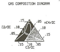
Recently, a Chandoo.org forum member asked this,
I want to be able to make a graph that, in some aspects, looks like below, but I have no idea how to do it at all.
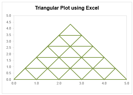
After seeing it, I said to myself in Barney Stinson’s tone, ‘Challenge Accepted!‘
The final plot is like this:
Making triangular plot in Excel – Tutorial
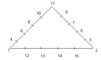
The first step to create such a chart starts from a manual drawing of how your chart will be looking like; at least you need to mark some important connecting points that will make smaller triangles.
The trick in this chart is simply to locate points in all three sides of the triangle and connect them in a way that results in smaller triangle. Here is a step by step approach to make this chart:
- Make a rough sketch of the triangle. Divide each side of the triangle roughly into the number of segments that you want, each side with equal number of segments (in this case 05 segments). And give each of them a number including corners of the triangle
- Now we can split this chart into three types of lines, horizontal, tilted towards right, tilted toward left.
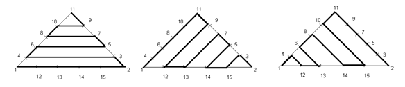
- For each of these lines we need to join certain points and when we combine these lines into a single series we will get our desired chart. So let’s list down the points in each line.
Horizontal Lines (L1): Point 01, 02, 03, 04, 06, 05, 07, 08, 10, 09, 11.
Right Lines (L2): Point 01, 11, 09, 12, 13, 07, 05, 14, 15, 03, 02
Left Lines (L3): Point 02, 11, 10, 15, 14, 08, 06, 13, 12, 04, 01 - Now we need to setup a table where the coordinates of these points are listed in tabular order, like this:

This can be done by using trigonometric ratio of sine and cosine, by representing each point in terms of Polar Coordinates [ These coordinates represent each point in terms of a distance “R” and an angle represented by Greek alphabet Theta (q), Line 01 makes an angle of 0° from X-Axis, Line 02 of 60° and Line 03 of 120° from +ive X- Axis, these details can be simply skipped if you don’t like math 😉 ]
Avoiding the details of trigonometry you can simply use following two formulas to get these values…For Value of X (Ordinate) you can use the following formula:
=IF(O6=”H”,N6*COS(RADIANS(Q6)),IF(O6=”L”,N6*COS(RADIANS(Q6)),$D$5+N6*COS(RADIANS(Q6))))For Y (Abscissa) you can use following:
=IF(O6=”H”,N6*SIN(RADIANS(Q6)),IF(O6=”L”,N6*SIN(RADIANS(Q6)),N6*SIN(RADIANS(Q6)))) - Once this Lookup Table is created we need to create another table where we list points in accordance to the Lines that we have already created. We will use VLOOKUP () to fetch the corresponding coordinate through this formula and we will do this for all the three Lines. The VLOOKUP() simply looks for the point in the left most column of the first table and bring the corresponding values from the 3rd and 4th column to form the point in second table.
- When we are done with bringing the coordinates of all of these points we just need to plot a Scatter Chart. Now use a XY scatter chart to plot the data. You need to add only one series, actually there are three types of lines but we can accommodate them in just one series. When they overlap, they will give smaller triangles in result.
Download Triangular Plot workbook
Click here to download the chart. Examine the formulas & chart series to understand how this is made.
Added by Chandoo
Do you make such complex charts for your work?
I will be honest. I never had to make a triangle plot. But then, I never had to make Ratatouille either. That doesn’t make me appreciate both of them any less. I think this chart shows fantastic technique. It also proves that Excel is highly flexible if you know which bolt to turn and which screw to tighten.
What about you? Do you make such complex charts or visual analysis for your work? What is the most challenging chart you have worked on? Please share using comments.
Shape up your Chart skills – Charts + Shapes
If your job involves making charts in all shapes and sizes, then you are in luck. Check out these tutorials to learn how to bend Excel charting rules to get any shape you want:
- Simulating a pendulum movement using Excel charts
- Wall hygrometric physics – modeling wall thickness in Excel chart
- Stars and lights using Excel Charts, VBA & animation
- Mustache shaped chart to measure your stash
- Spoke chart | 5 star chart
- Making various country flags using Excel charts
Thank you Faseeh
Many thanks to Faseeh for sharing this tutorial with all of us. I really enjoyed this and learned a few tricks from it.
If you like this chart, say thanks to Faseeh using comments.


25 Responses to “Shift Calendar Template – FREE Download”
Hi Chandoo,
your recent postings include only Excel 2007 templates. Unfortunately the company I work at still runs Excel 2003. Is it possible to get your awesome files in other excel version as well?
Thanks so much for your great excel stuff!
Is it possible to do this for shifts with hours instead of days? To organise a three shift day?
Thanks in advance,
Stelios
In my organization there are 45 employees i need split then into three shifts ex:A shift:14,B shift:14,C shift:14 and week off:3 kindly help me on this.
@Masthan
You need to understand what rules your company has for the various shifts / roster combinations
Chandoo, I once did a shift control spreadsheet for my team. I put one person in each line, the columns were the days. I put a shift code in each cell indicating in which shift that person should work, or if the person were out that day. I have two codes for being out. One is for vacations and one is to compensate days worked in weekends. This way I was able to count how many persons I have in each shift, how many were on vacations and how many were out compensating (that's the term we use here) weekend worked hours.
Later I included the possibility of a person be in two lines one for normal hours other for overtime. This is mainly used for planning purposes. If you would like I can send you an example. The only problem of this spreadsheet is that we don't have a person view, only this consolidated view.
Hi George, I would like to have a copy of your spreadsheet if you can share it.
Thanks in advance, Chuck
Hi Chandoo,
Where is the code located ? is it VBA ? If so , how do you hide it ? Or it is .NET ?
Thx
@Idan
.
No VBA or code, it is all done with Mirrors.
Only Joking,
.
But there is no VBA or code,
It is all done with Named Formulas and Lookups.
Have alook at the cells in the calander area and Named Formulas in the Formulas, Name Manager Tab.
How can i calculate between two or more different workbooks? Please, reply me as early as possible.
@Anand
Open the workbooks you want to link to
Start a formula = and click and change between workbooks as required.
You can use the View, Switch window menu to change workbooks mid formula
The format for using workbooks is
=[Workbook.xlsm]Sheet1!$A$1
or
=SUM('[Book2.xls]Sheet1'!$A$1:$D$10)
etc
Hi Chandoo,
I am working with a call centre wherein i ned to update at the month end 20 to 30 employees login hours which are defict to track it at the month end is very difficult is there any template which can be made to track that why on a particular day a guy who needs to be on calls was why not on calls.
Thank you so much Chandoo. This is really helping me. As usual, you rock.
What's FortyTwoDays and Calendar in Name manager?
Both are unused and FortyTwoDays doesn't make any sense.
I have a SQL db that contains records of events scheduled/completed on a particular date. Can this method ous building a calendar be used to display those events on the respective day?
Positively awesome!
I'm attempting to help a friend create a schedule for adult classes - and of course its not"paid help". Here is the scenario:
20 classes, instructor, room#, student class size, start date, number of class days (need to subtract weekends)
class
instructor
room
students
start
#days
PATH
karen
201
21
01/01/13
11
BILLING
jane
401
15
01/12/13
13
MEDISOFT
mike
301
11
01/25/13
9
he'd like to see these classes show up in different colors within the same month's calendar chart. He can draw it, but I'd like to see it done automatically through data, and I just can't visualize it, but I KNOW this will work - can you help?
Jan 🙂
Dear chandoo,
Try many way to download still can't access. Any way we want to try out 3 shifts with 3 guys in a group .eg Group A Morn, Group B Night and Group C Rest. And every each group must work on sunday to take turns. In fact we are security teams so that's why sunday is required to work. Pls guide and show how to put in the working calendar. Thank you in advance.
I've been trying to copy and/or recreate this to use in a workbook I'm doing for the transportation department I'm working for. I need to have the calendar on the first sheet in my document (it has graph's from data on another sheet). I'm trying to use it to track (with the conditional formatting) accidents and injuries. I've redone the conditional formatting to do 4 different accident types (no injury, near miss, OSHA recordable injury and work loss injury), but when I enter the formula's you have in the calendar portion where it says "DateOfFirst-FirstWeekDay" I can't figure out how you did that. Are you able to help?
I would like to use Excel to solve the following problem for a community work. I want to create a Driver schedule for a given month from a pool of volunteers for a community service. Each of these volunteers can drive only on specific days in a week. I would like to populate the driving schedule for each weekday with primary, secondary and tertiary drivers in a random fashion so that I do not overburden one person. I would greatly any help you can provide.
Hi chandoo,
Thanks for your valuable effort for create this template and let me know how to add multiple employees in the the Roaster.
Hi Chandoo,
This article on shift roaster is very helpful. Could you please let me know how i can use the same for n number of resources who work 24/7, considering their leaves and holidays?
Thanks,
Savitha
Hi Chandoo,
This article on shift roaster is very helpful to all. Could you please let me know how i can use the same if I want to add for some more shifts, since the color is not getting change if I add more shifts like 4,5 etc.,
Thanks,
Murali
nice post
How can I change the date to 2017 under Shift Data worksheet.
solution 1:
mydata=B2:C16
stoplist=E2:E8
=LET(RNG,A2:A16,SMR,C2:C16, F,(RNG=E2)+(RNG=E3)+(RNG=E4)+(RNG=E5)+(RNG=E6)+(RNG=E7)+(RNG=E8),SUM(SMR)-SUM(SMR*F))
=LET(RNG,A2:A16,SMR,C2:C16,RH,N(B2:B16=B2), F,(RNG=E2)+(RNG=E3)+(RNG=E4)+(RNG=E5)+(RNG=E6)+(RNG=E7)+(RNG=E8),TOT,SUM(SMR)-SUM(SMR*RH*F),SUM(SMR*RH)-SUM(SMR* RH*F))
ALTERNATE SOLUTION
=SUM(C2:C16)-SUM(FILTER(C2:C16,ISNUMBER(BYROW(A2:A16,LAMBDA(a,TOROW(SEARCH(a,E2:E8),2))))))
=SUM((B2:B16=B2)*(C2:C16))-SUM((ISNUMBER(BYROW(A2:A16,LAMBDA(a,TOROW(SEARCH(a,E2:E8),2))))*(B2:B16=B2)*(C2:C16)))
let
Source = Excel.CurrentWorkbook(){[Name="Table1"]}[Content],
#"Replaced Value" = Table.ReplaceValue(Source,null,";",Replacer.ReplaceValue,{"Column1"}),
#"Transposed Table" = Table.Transpose(#"Replaced Value"),
#"Removed Other Columns" = Table.SelectColumns(#"Transposed Table",{"Column1", "Column2", "Column3", "Column4", "Column5", "Column6", "Column7", "Column8", "Column9", "Column10", "Column11", "Column12", "Column13", "Column14", "Column15", "Column16", "Column17", "Column18", "Column19", "Column20", "Column21", "Column22", "Column23", "Column24", "Column25", "Column26", "Column27", "Column28", "Column29", "Column30", "Column31", "Column32", "Column33", "Column34", "Column35", "Column36", "Column37", "Column38", "Column39", "Column40", "Column41", "Column42", "Column43", "Column44", "Column45", "Column46", "Column47", "Column48", "Column49", "Column50", "Column51", "Column52", "Column53", "Column54", "Column55", "Column56", "Column57", "Column58", "Column59", "Column60", "Column61", "Column62", "Column63", "Column64", "Column65", "Column66", "Column67", "Column68", "Column69", "Column70", "Column71", "Column72", "Column73", "Column74", "Column75", "Column76", "Column77", "Column78", "Column79", "Column80", "Column81", "Column82", "Column83", "Column84", "Column85", "Column86", "Column87"}),
#"Merged Columns" = Table.CombineColumns(#"Removed Other Columns",{"Column1", "Column2", "Column3", "Column4", "Column5", "Column6", "Column7", "Column8", "Column9", "Column10", "Column11", "Column12", "Column13", "Column14", "Column15", "Column16", "Column17", "Column18", "Column19", "Column20", "Column21", "Column22", "Column23", "Column24", "Column25", "Column26", "Column27", "Column28", "Column29", "Column30", "Column31", "Column32", "Column33", "Column34", "Column35", "Column36", "Column37", "Column38", "Column39", "Column40", "Column41", "Column42", "Column43", "Column44", "Column45", "Column46", "Column47", "Column48", "Column49", "Column50", "Column51", "Column52", "Column53", "Column54", "Column55", "Column56", "Column57", "Column58", "Column59", "Column60", "Column61", "Column62", "Column63", "Column64", "Column65", "Column66", "Column67", "Column68", "Column69", "Column70", "Column71", "Column72", "Column73", "Column74", "Column75", "Column76", "Column77", "Column78", "Column79", "Column80", "Column81", "Column82", "Column83", "Column84", "Column85", "Column86", "Column87"},Combiner.CombineTextByDelimiter("|", QuoteStyle.None),"Merged"),
#"Split Column by Delimiter" = Table.ExpandListColumn(Table.TransformColumns(#"Merged Columns", {{"Merged", Splitter.SplitTextByDelimiter(";", QuoteStyle.Csv), let itemType = (type nullable text) meta [Serialized.Text = true] in type {itemType}}}), "Merged"),
#"Added Prefix" = Table.TransformColumns(#"Split Column by Delimiter", {{"Merged", each "|" & _, type text}}),
#"Replaced Value1" = Table.ReplaceValue(#"Added Prefix","||","|",Replacer.ReplaceText,{"Merged"}),
#"Split Column by Delimiter1" = Table.SplitColumn(#"Replaced Value1", "Merged", Splitter.SplitTextByDelimiter("|", QuoteStyle.Csv), {"Merged.1", "Merged.2", "Merged.3", "Merged.4", "Merged.5", "Merged.6", "Merged.7", "Merged.8"}),
#"Removed Columns" = Table.RemoveColumns(#"Split Column by Delimiter1",{"Merged.1"}),
#"Removed Duplicates" = Table.Distinct(#"Removed Columns")
in
#"Removed Duplicates"