
This is a guest post by Sohail Anwar.
Let’s not bore you with an intro. You are about to learn a VLOOKUP trick that Lucifer himself would not want you to know. It’s so absurdly powerful that it was developed in a lab and had to be tested on Rocky’s arch nemesis Ivan Drago.

Presenting the Multiple criteria VLOOKUP!
…boring…pass, we’ve seen it.
Oh, have you? Not like this you haven’t. This will change the way you work with Excel.
Let me start with an easy example. Here’s some data and we would love to know what Bb and Dd is.
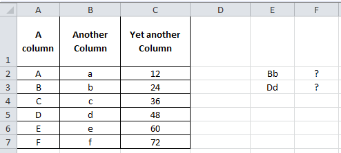
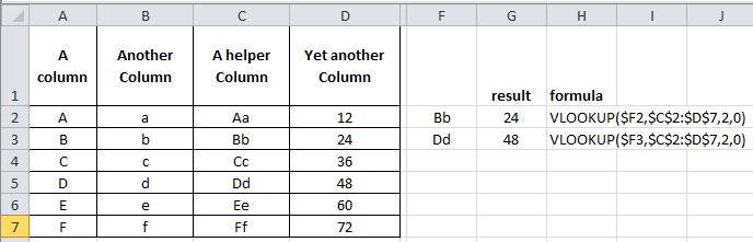
Easy. Let’s put a helper column in that concatenates the two inputs and do a basic VLOOKUP.
Puh-lease. How boring.
Bye Bye Helper Column, it was nice while it lasted.
With a dash of CHOOSE and sprinkling of Array formulas, we’re about to change the game:
=VLOOKUP($E2,CHOOSE({1,2},$A$2:$A$7&$B$2:$B$7,$C$2:$C$7),2,0) and press Ctrl + Shift + Enter
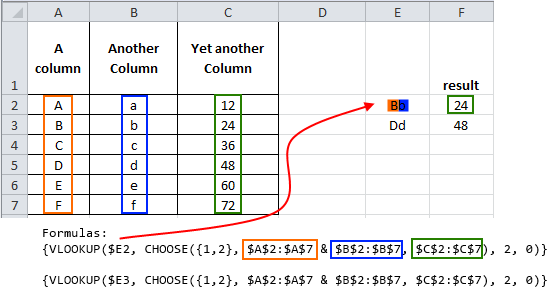
Without getting into too many details, using the Array creates a makeshift virtual helper column. You don’t have to understand Array formulas to make them work for you. I will lay out the simple structure that you can replicate
VLOOKUP(lookup value, CHOOSE({1,2,...N},Column1 & Column 2 &…& Column N, Result Column),2,0)
Where the lookup value is either something pre-concatenated (like Bb or Dd above) or you are using multiple criteria that you concatenate when entering the lookup value. The CHOOSE structure is easy. Always {1,2} then concatenate (with &) as many columns as you want (that the lookup values will need to look in) and the VLOOKUP’s column number is always 2. Let’s explore another example:

Let’s say we want to look up the Savings Produced for a Director of Grade D who started in 2014. That’s 3 lookup criteria. Let’s follow the structure.
=VLOOKUP(A13&A14&A15,CHOOSE({1,2},A2:A10&B2:B10&C2:C10,D2:D10),2,0) and press Ctrl + Shift + Enter
The two key things to note is that our lookup value is a concatenation of the criteria, in this case I have put the criteria in A13, A14 and A15 (hence A13&A14&A15 is our lookup value). Secondly, in the CHOOSE formula, the ranges in the middle part (A2:A10&B2:B10&C2:C10) have to be concatenated in the same order that the lookup value was concatenated. So we concatenated:
Start Year & Grade & Role
In both the lookup value and lookup columns within the CHOOSE.
I stumbled on this many years ago at work and it is the easiest way to do multiple criteria lookups. Play around and add more criteria…but that’s just the beginning!
When I get that feeling, it’s like Textual Healing
So how can we take this concept and make it even more useful?
First, let me share my story of pain and anguish.
Often when dealing with volumes of text data I make numerous helper columns to deal with the multitude of ways I am presented with names. Anyone who’s reconciled HR data to Finance data for example can appreciate that pain. Finance write their names First Name (column 1) Surname (column 2), then HR provide a spread with Last Name, Surname (column 1), then all of a sudden the Project team join in the fun with First Name, Surname (column 1)! Arrghh!
So I am now left to deal with this chaos via numerous text formulas involving SEARCH, LEFT, RIGHT, MID, LEN and MYSANITY (okay perhaps that last one is my own UDF, my volatile UDF). So, maybe it’s not that bad, but when you’ve been doing it for as long as I have, it gets tedious and you begin to search for efficiency. So, one day like the rebellious closing scene from Dead Poet’s society, I stood on my desk and declared ‘Oh Captain, My Captain’ as I refused to create another ‘helper’ column.

After my colleagues talked me down from the table and reassured me (“There there Sohail, I don’t mind inserting new columns for you occasionally”…”Sure you don’t John, sure you don’t”), I went about finding a less ‘helpful’ way. Would you believe, our new friend the multiple criteria lookup was the answer.
You see, not only can our criteria be cell references but also extra characters! Let’s say we have First Name(Column A), Surname (Column B) and Unique Reference (Column C). Someone gives us a spreadsheet with the names in either a First Name + Surname or Surname, First Name format. We can look this up by including the extra characters in our lookup columns within the CHOOSE.

Look closely at the middle of the CHOOSE since that’s where the magic is. Download the workbook to see the example in action.

We have pretty much instructed the two columns we are looking up to join up in a specific way. First we want them to join up with a space in between. Then the second formula has asked them to join up Surname, comma and space in between, then finally the First Name. So as far as Excel is concerned we have created two virtual helper columns that look like this:

This makes it straightforward for us to look up John Johnson or Johnson, John in them.
There are virtually no bounds to how you can use this Multiple Criteria VLOOKUP. It made my life tremendously easy and I’m sure it makes yours easier too. Do me a favor and let me know in the comments some of the crazy ways you are applying it.
And then if you haven’t already grabbed a copy of Chandoo’s VLOOKUP book I cannot recommend it enough as the ultimate resource in VLOOKUP mastery
Download Example Workbook
Click here to download the example workbook prepared by Sohail. Play with it to learn more.
Added by Chandoo
Thank you Sohail
Thank you Sohail for writing this very useful, incredibly fun tutorial. I am sure our readers will enjoy it as much as I do. Thanks.
If you like this, please say thanks to Sohail.
Related discussion on Multi-conditional lookups
As you can guess, this is not the first time we talked about using multiple conditions in VLOOKUP. Check out below articles for more ideas & tips:
- Multi-condition lookup using Excel
- Using CHOOSE formula to make VLOOKUP go left
- Introduction to SUMIFS & CHOOSE formulas
About the author: Sohail Anwar is a Londoner who has spent over 10,000 hours applying Excel in his professional life and earns well over 6 figures as a result. Now he’s on a mission to teach professionals how to massively increase their earnings by learning and applying Excel like never before. Find out more about Sohail on Earn With Excel or LinkedIn


173 Responses
Entertaining and informative! Thanks Sohail.
Dear Sir,
When i see your article .. i am shocked everytime …… because your article is soo usefull.. everytime .
thanking you and your team to give us helpful articles.
How to Concatenate and lookup means how can i join two lookup result
a b c
13 Mohit Gupta
I WANT TO LOOKUP through 13 and get the look result in one cell or concatenate b and c
Although helper columns seem not elegant, that’s my preferred option indeed.
Welcome to visit my post here for the topic
http://wmfexcel.wordpress.com/2014/05/11/perform-vlookup-with-2-lookup-values-2/
Whoah! MF that is a pretty sweet article, love it!
I do agree for the most part on helper columns but you know what beats helper columns? Just plain ol’ helpers. Yep, work your way up and get some support staff!
Jokes aside, where I would absolutely use the kind of approach in this article is for text stuff (personal preference), where I have lots of formulas involving COLUMN() and/or INDIRECT (rely on original column positions) and also if i’m using VBA which rely on original column numbers.
haha… i am the support staff in the office, i guess… 😛
Hi I need a solution to this. Please help.
This is in first sheet
Column A Column B Column C
MFRIL 2 MFN1024A
MFRIL 3 MFN1024B
MFRIL 2 MFN1024C
CNFMK 1 MFN1024D
FQLKP 4 MFN1024E
This is in second sheet
Column A Column B
MFRIL 2
MFRIL 2
CNFMK 1
FQLKP 4
I need to get the values of column C of the 1st page in Column C of the 2nd page. I actually need MFN1024A & MFN1024C as first 2 lines has duplicate values.
What about some shorter formula:
=INDEX(C$2:C$5,MATCH(A8,A$2:A$5&” “&B$2:B$5))
Micky Avidan
Yes Micky, when used as an Array Formula. Thanks.
Murali,
Post formula still an array. The only difference is that it isnot enter with Ctrl+shift+Enter.
Also, a helper formula will work much faster than a concatenation inside of the formula.
Regards
Mickey Avidan you are Da’ Man, that is just awesome! Once I put in FALSE at the end as Roger suggests, it’s good to go. I’m almost tempted to open up about 3 years worth of workbooks and replace about 1million of my formulas with your suggestion!
Thanks Sohail
THanks for sharing this. But I prefer to use Index Match instead of VLOOKUP.
Thanks to Micky fro sharing this formula
GREAT!!!!!
Simple and power packed Thank you very very much Micky…
Thanks Sohail!
I prefer to use INDEX MATCH instead of VLOOKUP because VLOOKUP is volatile, but I’m certainly going to have a go at combining multiple criteria in this way.
VLOOKUP isn’t volatile, Jonathan.
Hi Jeff, you are right, of course. Thanks for correcting me!
I prefer INDEX MATCH because its more flexible and I can look left.
Yup…!! That’s true it can see left..too…!!
When there is more than one condition, I use sumproduct almost exclusively.
For you specific problem I would use:
=SUMPRODUCT(–(A2:A5=”John”),–(B2:B5=”Johnson”),C2:C5)
Other benefits of sumproduct
– you can look at not only exact matches, but also greater or less than conditions.
– If you have multiple matches it will sum the value you are looking for.
SUMPRODUCT however doesn’t work if the result is text, not number…
Hi Folks,
This choose option is really stunning, however does not work with other regional settings.
My Regional settings are Hungarian, so the decimal separator is “,” and the argument separator in formulas is “;”.
I’ve tried to translate the formula, but got #REF! error. Stepping inside, I’ve realized that the arguments in curly brackets cause the error.
if I type CHOOSE({1,2} – comma – the formula retrieves the first column (in this case the joined Aa series)
if I type CHOOSE({1;2} – semicolon – the formula retrieves first item from the first row, then the second item from the second column, and #NA! for the rest
Please help me to get rid on this issue.
Your help would be very much appreciated
Andras
Hi Andras,
Thanks for the kind words. I’m afraid I have not experienced that problem. I would perhaps defer to the suggestions in here (i.e try \ instead of ; otherwise TRANSPOSE):
http://www.pcreview.co.uk/forums/regional-settings-finding-out-array-separator-characters-t3942968.html
Let us know how it works out!
Thanks
Hi Sohail,
Once again, I’d like to thank for this really great post and approach. Especially a VERY BIG THANKS for the help regarding the list separator issue under different regional settings. I’ve browsed truogh the provided links and I’d like to share the results, while some of you may find it useful.
Accordind to my not-representative research there are two main types of regional settings whis affects the list separators.
One is the let say English (containing UK, US, China, Australia, India and others) where the list separators are “;” and “,” inside the curly brackets.
According to the other is (let call European) settings the list separators are the follows:
{1\2} lists row 1 from colum 1 then row 1 from colum 2 and so on
{1;2} lists row 1 from colum 1 then row 2 from colum 2 and so on
{1;2} lists row 1 from colum 2 then row 2 from colum 2 and so on
Kindest regards,
Andras
Mauro says:
Your comment is awaiting moderation.
October 9, 2015 at 5:07 pm
Thanks for the “{1\2}”. I had hit a wall there.
Reply
Andreas,
Check the demofile. The syntax in there is =VLOOKUP($A7;CHOOSE({1\2};$A$2:$A$5&” “&$B$2:$B$5;$C$2:$C$5);2;0)
{1\2} is the way to write it not 1,2}
I am in Finland and the syntax for Excel dont use , but instead ;
For this case correct syntax was {1\2}
Excellent tip! I really love these kind of over-the-top workarounds. Particularly interesting is the the use of CHOOSE, I’ve not come across it used in an array formula like that before.
– That’s the Excel geek in me replying.
The pragmatic office employee in me will continue using helper columns – purely for spreadsheet readability. If one of my colleagues stumbled across an array formula like that they wouldn’t understand it at all.
As much as I love overly complicated formulae (especially array formulae!) I only do it when there is no other more simple alternative, or if the time saving is enormous.
Pete, a pragmatic high five coming your way! I too am a pragmatist. I’ve just accumulated far too much in my Excel arsenal. I won’t lie, most of it you don’t need as a professional. Your talk of time saving problem solving is music to my ears 🙂
However, you’re missing the point, sometimes its plain ego boostingly fun to look like a know it all Excel complicated formula wizard! j/k
As usual, an excellent tip and perfect timing! I am currently reading about arrays in Mike Girvin’s excellent book “Ctrl+Shift+Enter”, and this topic is right in step with it. However, the larger your dataset, the slower the Vlookup will execute. In fact, throw in several vlookup columns and your spreadsheet will grind to a near recalc halt. Also, if you have duplicate data, only the first instance will be retained in the result. So Mike also explores the use of index and match, a lookup join, use of DGET, a helper column, and even PivotTable, pointing out pros and cons and timings of all. It’s a good book. See his thousands of free Excelisfun YouTube videos too.
To make matters worse, there is the wonderful issue of GIGO at my work site. Example is one name shown as T De La Portilla, another as DeLaPortilla, T., another as Portilla, T. De La, etc. This just kills the vlookup-choose.
Keep the newletters coming. I look forward to each one.
Pstloui, great food for thought, I appreciate the insightful comments. For sure ‘Performance’ is always a consideration. My rule of thumb is for every 1Mb of file size, your approach potentially needs changing. Especically if you’ve got 1000’s of formulas and double especially if they are processor power consuming Array Lookups. Then bring on the helper columns + pastespecial Values.
Also, as much as i complain, dealing with GIGO (Garbage in garbage out for the uninitiated) has kept my skills in demand so I can’t entirely complain ;-P
Hi Shohail,
Great trick!!! Thank you for sharing.
I have always used the VLOOKUP formula in combination with helper columns in multi dimensional lookups. With 2-dimensional lookups I have lately also started using the INDEX formula in combination with the MATCH formula. With a more than 2 dimension lookup the trick presented will indeed be very helpful.
Can you help me understand why
the array formula {=VLOOKUP(A13&A14&A15, CHOOSE({1,2}, A2:A10&B2:B10&C2:C10, D2:D10), 2, FALSE)}
gives the same result as the array formula {=VLOOKUP(A13&A14&A15, CHOOSE({1,2,3}, A2:A10&B2:B10&C2:C10, D2:D10), 2, FALSE)}
Note that the difference in the first parameter of the CHOOSE function used in both formulas.
The first formula is used in the demonstration of your first example, while the second formula is in accordance with the simple structure layed out before the demonstration in the second example. The formula used in the example does not follow this structure, but still gives the desired result.
Regards,
Herbert
Cheers Herbert! Well done on your progress my friend 🙂
As for your question. The key component of the array formula is the {1,2} in the Choose. It instructs the CHOOSE to generate 2 ranges for the vlookup to use (1 containing the concatenated range A2:A10&B2:B10&C2:C10 and the other containing D2:D10. Now if you put {1,2,3}, the CHOOSE attempts to create 3 ranges, but you haven’t declared a 3rd option in the CHOOSE so Excel just assumes a #N/A error. so we have 3 ranges that the VLOOKUP checks out, since we have told the VLOOKUP to look in the 2nd range, it doesn’t care what’s in the 3rd. So even if you put {1,2,3,4,5} it will still only care about 1,2 (and give result from 2).
As a learning tool to understand Arrays play with the structure: i.e
{=VLOOKUP(A13&A14&A15, CHOOSE({1,2,3,4}, A2:A10&B2:B10&C2:C10, 1,2,D2:D10), 4, FALSE)}
will give you the correct result (but it takes the scenic route). I would strongly encourage the use of ‘Evaluate Formula’ and stepping through. Use small arrays (3 rows of data max) and it will make it a bit easier to grasp.
Hope that helps!
Thanks Sohail,
This indeed helps 🙂
Hi
Nice solution, Sohail.
It also works with Tables, either using structured references
=VLOOKUP(A7,CHOOSE({1,2},Table1[First Name]&” “&Table1[Surname],Table1[Uniqe Reference]),2,0)
or by using the absolute formulae as you used.
The advantage of ocurse, if it is a table, and even though the references look to be fixed, the range will grow as more data is added to the table.
@Micky
I think you need to add the final parameter of 0 or FALSE to your formula to get consistent results.
Your solution gives the correct result by pure chance.
If you have any multiples of names in the list, then your formula as it stand will not find the first occurrence.
@Jonathan
I also prefer Index, Match, but Vlookup is NOT one of the volatile functions in Excel.
Regards
Roger
Roger, awesome suggestion on working it in a table. Thanks!
Awesome post. I’m going to echo Sophies comment above and give this post the best feedback there is:
Informative AND funny.
Look forward to more of the same.
Jeff, I’m humbled my friend, I’m just following your lead, you are the original value-adding Excel joker!
Is this going to be any faster than index/match though? I have been index/matching the concatenation of three columns against a different concatenation on another sheet. It seems that vlookup combined with array formulae will be slower.
Hi Louise, good question and I have to declare two things I strongly believe in:
1. If it ain’t broke, don’t fix it
2. Quick turnaround for the win!
So if you have a process and approach that works for you, carry on!
If you’re dealing with 1000’s of formulas, than yes this will be slower. Have a look at my reply to MF as to when I use them.
Thanks for the questions!
Great post. Thank you
Thank you folks, you have all utterly delighted me with your incredibly kind words. With your support and encouragement I hope to continue edu-taining!
Hi Sohail,
Really clever trick, never knew you could do that with vlookup and choose. I use arrays a lot and have used choose before but are struggling to understand the choose part of the solution.
So the CHOOSE({1,2},$B$2:$B$5&”, “&$A$2:$A$5,$D$2:$D$5) will create two ranges, how does choose process these two ranges to give us one array/table for looking up?
I read your response to Herbert but are still struggling.
Thanks
Mark
Hey Mark,
Thanks for the comments. I appreciate the probing question. Let’s break it down like this, The vlookup only like contiguous i.e going left to right and up to down whilst being joined up (i.e. A1:J10, not A1:C10&F1:J10) but we are essentially dealing with non contiguous ranges, i.e B then A, with a “,” to add to the fun. We need to turn this mess into a contiguous range (or the Vlookup will have a hissy fit!). This is where the wonderful choose comes in. Not only does Choose produce static values or formulas but it can also spit out ranges. The Choose plus the array takes all that and concatenates all of it and spits out a virtual 1 column containing B&”,”&A. the {1,2} tells the choose that the range it outputs (i.e Range1:Range2) will be made from the 1st and 2nd values (or choices) in the Choose, so we get Range1 as B2&”,”A5 and Range2 as D2:D5. So we have now got the following Vlookup(“Johnson, John”, Range1:Range2,2,0), which is simple to solve! So when Herbert asked about {1,2,3} this was creating 3 ranges: Range1 as B2&”,”A5 and Range2 as D2:D5 and Range3 as #N/As (because we only have specified 2 options in the choose, if you put a 3rd option like1 after the D2:D5, then Range3 will become 1s. Of course the Vlookup doesn’t care because it is only ever going to look in Range2 for the answer.
I hope that helps, its tricky to explain via a plain text editor, especially for a visual person like me! If you’re London based I’m happy to meet for a coffee and go through it some more!
Thank you Sohail for your reply, your explanation does help. I will continue to play with the function to see how i might be able to use it.
I love learning new ways to do things.
Thanks for sharing this with me.
I am based in Australia so we will have to have virtual coffee 🙂
Hi Mark ,
I think the concatenation is coming in the way of understanding the basic part played by the CHOOSE function.
If we consider just the basic CHOOSE formula , we can have something like this :
=CHOOSE({1,1},3,4,5,6,7,8,9,10)
I have deliberately inserted more values than are required for the CHOOSE function , to show that Excel will not complain ; Excel will complain if the values are less in number. Thus , the following will generate an error :
=CHOOSE({1,2},3)
since there is no second value to choose. However , if we shorten the first formula to :
=CHOOSE({1,1},3)
Excel will not complain , since all we are doing is choose the same value twice.
To see what the above formula does , wrap it inside SUMPRODUCT :
=SUMPRODUCT(CHOOSE({1,1},3))
You should get 6 ; how is it 6 ?
Because the CHOOSE function is creating a virtual array { 3,3 }.
If we move on to a more complex formula , as in :
=CHOOSE({1,2},1+(ROW(1:8)-1)*2,ROW(1:8)*2)
what Excel does is create a virtual matrix of 8 rows and 2 columns , taking one item at a time , alternating between the first range and the second range.
The first range is an array of odd numbers 1 , 3 , 5 , 7 , 9 , 11 , 13 , 15 ; the second range is an array of even numbers 2 , 4 , 6 , 8 , 10 , 12 , 14 , 16.
The virtual array we will end up with is :
{1,2;3,4;5,6;7,8;9,10;11,12;13,14;15,16}
If you change the above formula to :
=CHOOSE({2,1},1+(ROW(1:8)-1)*2,ROW(1:8)*2)
you can easily understand that you will have the virtual array :
{2,1;4,3;6,5;8,7;10,9;12,11;14,13;16,15}
where the first column of the virtual matrix consists of numbers from the second array , while the second column of the virtual matrix consists of numbers from the first array.
Narayan
Thanks Narayan for the other examples of how the function works.
It just goes to show you how many next things you can do in excel. I havent used the choose function to create a virtual array so its a new thing for me.
Will take a look at your examples now!
Thanks
Mark
Wow!!! Very Very useful……Thank you very much Sohail and Chandoo…..
Wonderful… This really helped Thanks
Wow… Awesome!
Excellent stuff Sohail.
Interesting to work with vlookup+choose…
Many Thanks for the wonderful trick.
Great tip and hats off to all…maybe this trick can be used in table/example No.3:
=LOOKUP(2^4,SEARCH(A3&B3,A2:A7&B2:B7),C2:C7)
Dennis! wow that is too cool for school my friend. Thanks
What is 2^4?
Ever need to find a value in a range but dont want to bother identifying the row and column every time? Try a double axis index match.
=index($b$2:$z$10,match(rowvalue,$a$2:$a$10,0),match(columnvalue,$a$1:$z$1,0))
Typed on my phone so forgive minor errors… love me some index match.
Chris
You do have to be careful with concatenation. When you concatenate AB & C, you get ABC. When you concatenate A & BC, you also get ABC. Make sure the result is unique or you may get wrong answers.
Thank you, Sohail! That was a great article. Not only was it clear, concise, and easy to follow, but the humour and references to 80s movies was a nice touch.
Estimado Chandoo, buenos días.
Excelente!
Te sigo desde hace años, y este truco, sinceramente, no lo sabía, ni siquiera lo imaginaba.
Muchas, muchas, muchas gracias.
**********
Dear Chandoo, god morning.
Excelent!
I follow you years ago, and this trick, I don’t know about that, sincerely.
Lots, lots, lots thanks.
If you use index/match and wrap the match in a sumproduct, there’s no need for ctrl+shift+enter:
=INDEX(C2:C7,SUMPRODUCT(MATCH(E2,A2:A7&B2:B7,0)))
Regards,
Alex
Actually this is better:
=INDEX(C2:C7,MATCH(E2,INDEX(A2:A7&B2:B7,),0))
Wrapping “A2:A7&B2:B7” in an index function with a null second parameter coerces the reference into an array. Sumproduct does the same, but just seems less ‘clean’ to me.
-Alex
Hi Chandoo,
We use a purchasing factor table that inflates or deflates the price depending on the quantities being ordered. I have used h and v lookup in stages to date, but now I am going to try and do it all together, got me thinking! Some comment above that may help.
Debs
Nice Article for v lookup. i have tried to apply these new technique but faced some issue as did not get the correct result
Excellent….. Thanks Sohail.
great tip, thanks! I was wondering how the formula would change for hlookup(). i wouldn’t think it would be substantially different, but i can’t seem to get it to work. vlookup() version is just fine…. any ideas?
Hi ,
The same technique would work if you wanted to use HLOOKUP.
However , for HLOOKUP to work correctly , your data layout would have to be changed to suit.
Thus suppose all the data was laid out in rows , with :
a) The first names in A12 through D12 ,
b) The surnames in A13 through D13 ,
c) The unique references in A14 through D14
the equivalent formula to retrieve the unique reference corresponding to John Johnson would be :
=HLOOKUP($A7,CHOOSE({1;2},$A$12:$D$12&” “&$A$13:$D$13,$A$14:$D$14),2,0)
Similarly , the equivalent formula corresponding to Johnson, John would be :
=HLOOKUP($A8,CHOOSE({1;2},$A$13:$D$13&”, “&$A$12:$D$12,$A$14:$D$14),2,0)
Both of the formulae would be array formulae , entered using CTRL SHIFT ENTER.
Narayan
While this method might seem to be more elegant, helper column is much more effective. Because your way creates ‘virtual helper column’ for every cell where formula is. And if you have lots of data, that can become quite a problem.
Just when you thought you were getting good at Excel, comes this post… and the comments! Excel Rocket Science! Good!
You can do with Chandoo!
this also will work particularly loo up reference is not in the leftern most column of relevant range.
=INDEX(C1:C5,MATCH(1,(A1:A5=A2)*(B1:B5=B2),0))
Good Golly, Miss Molly! Has this ever sorted me out!!!
Often with a wide data table, I need to create multiple helper columns at the left, or at least to the left of the useful bits.
And then because you have to share the results with a user (or heaven forbid someone who thinks he’s the Excel expert), you hide the helper columns away so the poor thing doesn’t get confused. Then … user/expert discovers them (he actually notices that there’s a B missing beteen A and C), unhides them, doesn’t like them and deletes them … and everything goes pear shaped until you painstakingly repair it!!!
One of the useful things about this approach is that user/expert will see how complex the formula looks, get frightened of changing it, and leave it alone!!!
Hopefully.
Bag’oong, you have perfectly described the most common scenario for when I use this, over helper columns!
and what if you have multiple lookup value with same criteria. like Bb in multi time entry.
A Column Another Column Yet Another Column
A a 12
B b 24
C c 36
D d 48
B b 60
F f 72
Bb 84 =SUMIFS(C:C,A:A,LEFT(E2,1),B:B,RIGHT(E2,1))
Dd 48 =SUMIFS(C:C,A:A,LEFT(E3,1),B:B,RIGHT(E3,1))
Hi Rajesh,
I have submitted another article to Chandoo which addresses your question on multiple occurrences and also multiple values. But as a spoiler, here’s a formula that will help you find all values for Bb, put this in F2 with Ctrl + Shift + Enter and drag down
INDEX($C$1:$C$6,SMALL(IF($A$1:$A$6&$B$1:$B$6=E2,ROW($A$1:$A$6)),ROW()-1),1)
I have left out IFERROR so you will get #NUM! errors after the 2nd entry.
All will be explained in the article!
Instead of using row in the end of formula i have used
-> COUNTIF($U$4:U4;U4) (Results into T column)
As additional help column.
Here is the syntax as whole:
IF(ISERROR(INDEX(‘KHH YHTEENVETO’!$D$11:$P$44;SMALL(IF(‘KHH YHTEENVETO’!$D$11:$D$44=Poikkeutus_summary!U4;ROW(‘KHH YHTEENVETO’!$D$11:$D$44));(T4))-10;7));””;INDEX(‘KHH YHTEENVETO’!$D$11:$P$44;SMALL(IF(‘KHH YHTEENVETO’!$D$11:$D$44=Poikkeutus_summary!U4;ROW(‘KHH YHTEENVETO’!$D$11:$D$44));(T4))-10;7))
in this syntax T4 contain the cumulative number for gathering data.
You article is very gooooooooooooooooooooooooooooood!!!!
After reading it i have started kicking out the helper column from all my excel files ….
Thnx a lot…
If you can spare sometime i can send you my excel file in which i am maintaining my companys inventory and wanted you to optimize that file.
It is very helpful and will solve lot of problems i was facing
Hi,
I want to know about multiple conditional
COUNT COUNTIF Function which count girls and boys or male female or first three no. Fail and passed candidates somebody help me or give example to use it in school result report
Dear Sir
I would like to ask about the third methodology of extract the name regardless the form of the name. Ok what about if it was the opposite?, for instance, if the spreadsheet was the name in column and the surname in another column and my target is to combine them in one cell.
Does this VLOOKUP and CHOOSE function also work when referencing values in other tabs/sheets? I am having trouble getting my formula to work- any help would be appreciated! THANK YOU!!!
We are able to correlate all the arguments apart from column index number which is 2,if you just give some suggestion which can help me to understand the functionality.
Hi there,
That’s an awesome article. Very helpul, thanks. I have one question though. I want to use the 1st formula in your post and vlookup the final value by using a MATCH function. However, I have realized that your formula seems to be only able to deal with looking up the 1st or 2nd row specified? Can you please show me how to amend your formula in order to look up any column value by using a MATCH function for the vlookup?
Thanks so much!
You are amazing, I bow down to your mad excel skills. Long live the king
Thank you Sohail 🙂
Thanks Chandoo!
I love you man. THe answear I was looking for! Thank you so much!
Entertaining and mind-blowingly simple to use.
Thanks for sharing this tip, Sohail!
Thanks Sohail!! Very entertaining and informative! The right mix!!
Thank you very much…that was exactly what I have searched!
Can I also use the choose function above in cooperation with an indirect.ext? Because the combination of vlookup + choose need to grab the data (result status) out of some reports (closed workbooks on a network share).
Let me explain my request.
Main.xls
Column A = Names
Column B = Numbers
Reports.xls stored on a share
Column B = Names
Column C = Numbers
Column E = Result –> that is exactly the info which I have to grab.
I need to search for the mapping of NamesNumbers in closed workbooks, as I do require the result status.
I would highly appreciate in case anybody has an advice.
Hi, have been trying out your vlookup with concatenate for multiple column selection but somehow not getting there as result is zero.
am trying to do as below
column b1,c1 is to be concatenated and vlooup in another sheet where it need to be lookup to similar b1,c1 column and then return say column no 5 of the data… also iferror is added by me becz the value being looked up not necessary be in table that is being lookedup to..
please could you help ?
Hi
I am trying to use this formula of multiple conditional v lookup & every time getting error as #N/A. I am reproducing my formula. if anyone can help.
=VLOOKUP(A2&B2,CHOOSE({1,2},Sheet2!A:A&Sheet2!B:B,Sheet2!C:C),2,0)
Pl help.
Regards
Puneet
Press Crtl + Shift + Enter Dude !!
Is it true that Array formulas wont transcend across separate worksheets ?
@Steve
No, its not true
Some Functions can handle multiple worksheets and some can’t
Even those that can’t can sometime be coaxed into working across multiple worksheets by using sneaky methods
I will actually be publishing Formula Forensics No 38 this week and in that we look at finding the Maximum Value across multiple worksheets and the actually finding which worksheet it is on. This involves using the Index function, which doesn’t natively handle multiple worksheets, yet can be coaxed into returning the correct answer with a workaround
If you have a specific requirement let us know in the comments
HUI,
Dang I love you man !!
With your comment above I endeavored to persevere to make my Multi Condition vLookup transcend to another worksheet.
It was tricky .. I also found that assembling the Array in the formula works.. in my case the Vlookup source was not in the correct column order, so assembling them A&B&C etc wouldn’t work.. I had to assemble my Array B&G&D to get the correct result.
Here is my vLookup, notice COST! is another worksheet, and Array is B&G&D:
{=VLOOKUP(B4&$K$1,CHOOSE({1,2},COST!B:B&COST!G:G,COST!D:D),2,0)}
Thanks very much !!
Steve
PS..
Experiencing a 15 to 20 second workbook Re-Calculating with any change to moved forward in attempting to speed up the Array ..
Notice my previous formula was looking at the entire columns, after I modified that to look at only the areas of data there is no noticeable lag time .. it’s literally milliseconds now.
Modified formula, notice absolute cell references using $:
{=VLOOKUP($B4&$K$1,CHOOSE({1,2},COST!$A$1:$A$50&COST!$F$1:$F$50,COST!$C$1:$C$50),2,0)}
Thanks everyone.. this is a great resource!
Steven
@Steve
You are now recalculating 1/20,000th of the the data you were before
It is always poor structure and use of inappropriate formula that slow spreadsheets down
Good job in solving your issue
EXCEL 2013 – I am trying to Compare Column A to Columns B,C,D for matches and put location of match in column E. Is this possible?
I love the article!
Chandoo.
Thanks, even though I took your online class some time ago. I couldn’t concentrate much.
Now along with the above, the one condition of the Vlookup I rquire is date, there are multiple dates, but I want the latest dated value.
which one to use ?
This is the best VLOOKUP solution! It works so well! Thanks so much for the easy to understand solution!
Excellent job! Nice trick:)
I have compared operational times for INDEX MATCH and then for this VLOOKUP CHOOSE.
First one requires much less time to calculate (I’m using whole columns in parameters like E:E instead of range E1:E2000) and then filling hundreds of lines with formula.
But good to exercise this one too 🙂
Hi, I need a vlookup formula in below scenario where i need to pull data from another sheet(2) where only SKU code is available and in sheet(1) where SKU is repeated but of different MFD. I need to pick the oldest stock only is it possible to put vlookup..
VLOOKUP SHOULD CONSIDER 2 COLUMNNS SKU & MFD..And should Qty should appaer only against old MFD
Sheet 1
SKU Disc MFD Qty
02N JW 100 CL 21-Jul-16
02N JW 100 CL 22-Jul-16
02N JW 100 CL 26-Jul-16
02N JW 100 CL 26-Jul-16
02N JW 100 CL 31-Jul-16
Sheet 2
SKU Disc Qty
02N JW 100 CL 1
I normally never comment on these type of articles, however I cannot ignore the greatness that is an Ivan Drago reference. Well done sir, well done
Table No Start date End date Society Name
1 1/7/2015 3/7/2015 ABCD
2 2/7/2015 5/7/2015 PQRS
1 5/7/2015 7/7/2015 ABCD
1 7/7/2015 10/7/2015 XYZ
HI ,
My query is that if i have to develop a vlookup with multiple criteria such that if Table No is 2 and the satart date and End date lies between the mentioned dates then the society name should be pulled out.
Can you please help!!
Thanks Sohail, this formula is working great although a bit slow as I have more than 800 rows containing this formula. Thumbs up!
Nice function, clever and clear. But… for my 100 thousand row table and three criteria it kills my computer premanently 🙂
RadekB
There are other techniques that you can use for dealing with Large Tables that are borrowed from the programming world
Have a look at Conjunctive Truth Tables
They can handle 100,000+ rows with 20 or 30 criteria in a flash when implemented correctly
I implemented a basic version in a post at:
http://chandoo.org/wp/2011/02/25/excel-age-survey-results/
You can download the file here:
http://img.chandoo.org/d/My-Excel-Age-hui.xlsb
I will stick with my helper columns as it is more intuitive. I have copied this formula exactly and am getting #N/A. the 15 minutes I have wasted on this could have been spent on a hundred Helper Columns.
It’s a matter of practice and patience :). If You are getting #N/A and You know that data is O.K, there is no other way than to find out what is wrong. In my case I had to change original one:
=VLOOKUP(A13&A14&A15,CHOOSE({1,2},A2:A10&B2:B10&C2:C10,D2:D10),2,0)
into
=VLOOKUP(A13&A14&A15;CHOOSE({1\2};A2:A10&B2:B10&C2:C10;D2:D10);2;0)
Then it worked.
Thanks for the “{1\2}” (where that came from??). I had hit a wall there.
Actually, thanks do Adras, who bring it up!
thank you chandoo
thank you sohail
this article is exactly nice
I believe
VLOOKUP(lookup value, CHOOSE({1,2,…N},Column1 & Column 2 &…& Column N, Result Column),2,0)
should read
VLOOKUP(lookup value, CHOOSE({1,2},Column1 & Column 2 &…& Column N, Result Column),2,0)
Lovely stuff
Hi,
I am stuck with a problem and would like some help. I thought this may be a right place to ask my question.
tab 1
col name1
red
green
blue
black
tab 2
col1 col2 col3 col4
red blue red red
blue green blue green
black
This is the result I want
tab 1
col name1 col name2
red col1
green col2
blue col1
black col3
what I’m looking for is to search for exact string in a different tab and return values of the corresponding column name where it finds it first. Does anyone have a solution for this?
Thanks!
@Daffodil
Can you post the question at the Chandoo.org Forums
http://forum.chandoo.org/
Attach your file if possible
Hi,
I follow this post and I can tell this multi condition vlookup works nice when using the A1 references, but I am unable to make it work with R1C1 notation.
In my application i typed
=VLOOKUP($D$4&D7,CHOOSE({1,2},’services 60 days’!$F$4:$F$200&’services 60 days’!$I$4:$I$200,’services 60 days’!$L$4:$L$200),2,0)
As an example it would be VLOOKUP(A&7,CHOOSE({1,2},A:Z&1:200,’1-Jan:31-Dec),2,0)
This formula reads from another sheet and works perfectly.
But when I type it and Ctrl+SHft+Enter I get an error. The RC references are ok and point to the same cells.
=VLOOKUP(INDIRECT(“C[1]”,FALSE)&INDIRECT(“C[2]”,FALSE),CHOOSE({1,2},’services 60 days’!$F$4:$F$200&’services 60 days’!$I$4:$I$200,’services 60 days’!$L$4:$L$200),2,0)
What I have seen is that (INDIRECT(“C[1]”,FALSE)&INDIRECT(“C[2]”,FALSE) provide the same info as $D$4&D7, A7
CHOOSE({1,2},’services 60 days’!$F$4:$F$200&’services 60 days’!$I$4:$I$200,’services 60 days’!$L$4:$L$200)
when calculated independently in a cell provides the good results for the choose() with Ctrl+SHft+Enter, –> A:Z&1:200
but when included into the multi vlookup function it returns a different range, so the overall vlookup is N/A because it looks for A, in a range AA:AZ
Could it be the issue is because of choose being an array not being updated properly? Anything not right in the syntaxis?
Thanks,
Alberto
i want to do a vlookup for date wise for exp given below
mobile number 1st 2nd 3rd
xxxxxxxx 5 5 6
kindly help me to get the formula
Sohail, thanks for the great tip! However I have run into a problem, where I am getting a #VALUE error and I have not been able to figure it out.
I am trying to write a program for my daughter, who is a loan office at a local bank to select the correct Loan Rate based upon the Model Year, Loan Term and Points.
I have the following input data cells:
B7 = Model Year of Auto (num) – USER INPUT
B8 = Loan Term in Months (num) – USER INPUT
B9 = Points to determine Loan Rate (num) – USER INPUT
B10 = Loan Interest Rate (%) – Value I am trying to return from data table
I also have a data table where I have the following data
S6:S86 – Mdl Year of Auto (num), 16 rws for ea year, sorted ascending
T6:T86 – Loan Term (num), 4 rws for ea TERM x 4 different TERMS (72,60,48,36) x 4X, sorted ascending
U6:U86 – POINTS (num), 4 rows for each Term x 4 different Terms, sorted ascending (4,7,10,13) x 4X
V6:V86 – RATE (percent), This is the value I am trying to return to B10
B10 Formula – {=VLOOKUP(B7&B8&B9,CHOOSE({1,2},S7:S86&T7:T86&U7:U86),2,0)}
In the step-by-step Evaluate Formula, shows this VLOOKUP(“20137210”,{“2004364″,#Value!;”2004367″,#Value!;”20043610″,#Value!;”20043613”,#Value!;…………….this repeats 4X for each term with the year & term values changing.
I have that same problem:
=VLOOKUP(A10&A11,CHOOSE({1,2},A2:A7&B2:B7),2,FALSE) results in #VALUE!
Any ideas?
Namaste ,
I have been using this formula, it works for me, but now i have increase the data in my answer cell, and the formula forced to give me ans for false condition.
Please let me know how to resolved this issue.
Hi,
Can someone assist me with my query?
I have a list of 199 names in one column and a list of 2573 names in another column that I need to match and them sum the multiple commissions to the 199 names given.
I need to match the names and add all the commission amounts to the 199 names.
Please assist
Vincent
@Vincent
can you ask the question in the Chandoo.org forums
http://forum.chandoo.org/
Attach a sample file and you will get a more specific answefr
Good Morning Chandoo,
Can someone assist me with my query?
I have a list of 199 names in one column and a list of 2573 names in another column that I need to match and then once the names have been matched, I need to sum any matches by name with another column with commissions. Some of the commissions are duplicated hence the need to match the name columns (NB: some of the names don’t match exact).
Much appreciated if someone could assist me with my query to match the 2 name columns and add all the commission amounts to the 199 names.
Regards
Vincent
@Vincent: thanks for the question.
Assuming your 2nd list (2573 names) is in 2 columns (D1:E2573), with second column containing the commission and first list starts from A1, use this formula
=SUMIFS($E$1:$E$2573, $D$1:$D$2573, A1)
For more about SUMIFS, see this: http://chandoo.org/wp/2010/04/20/introduction-to-excel-sumifs-formula/
Hi Sohail & Chandoo
Your above formula is the one i am searching
I have to match 2 columns & then take the value
data in sheet 1
Col A Col B Col C
Conveyors 1 Row 15000
Conveyors 2 Row 17000
Sheet 2
when i type VLOOKUP($E2,CHOOSE({1,2},$A$2:$A$7&$B$2:$B$7,$C$2:$C$7),2,0) and press Ctrl + Shift + Enter no help
pl. help
darshana kesareea
Conveyors 1 Row = i want the value 15000 to appear
i tired your above formula , but i get an error”NA”
Really like this – great idea of being able to combine search criteria. I was beating my head against the wall b/c I can’t seem to make this work on Google Spreadsheets – any ideas why? It worked great on excel but can’t seem to make it carry over to google spreadsheets where all of my data is.
I tried just simplifying the formula to see where it was breaking and google spreadsheets gives me “#REF” error on this formula below. It evaulates to “b” on excel. Any ideas?
=VLOOKUP(“a”,CHOOSE({1,2},”a”,”b”),2,0)
Data below – using “FICO, LTV and TERM – i’m trying to get the MI Factor.
Fico LTV Term MI FACTOR
Excellent 0.8 360 0
Excellent 0.85 360 0.0023
Excellent 0.9 360 0.0039
Excellent 0.95 360 0.0054
Excellent 0.8 180 0
Excellent 0.85 180 0.0021
Excellent 0.9 180 0.0029
Excellent 0.95 180 0.005
Good 0.8 360 0
Good 0.85 360 0.0027
Good 0.9 360 0.0044
Good 0.95 360 0.0062
Good 0.8 180 0
Good 0.85 180 0.0025
Good 0.9 180 0.0034
Good 0.95 180 0.0057
Fair 0.8 360 0
Fair 0.85 360 0.0033
Fair 0.9 360 0.0057
Fair 0.95 360 0.0089
Fair 0.8 180 0
Fair 0.85 180 0.0029
I have an issue with this formula.
Excel 1: Contains Roll Nos, Subject that he has taken (3 subjects attached with each roll no, namely: English, Hindi & Maths) and His Marks in each of those subjects in YEAR 2015. Ex:
Roll Sub Marks15
101 Hindi 72
101 English 60
101 Maths 78
102 Hindi 71
102 English 69
102 Maths 32
Excel 2: Contains Roll Nos, Subject that he has taken (Again SAME 3 subjects attached with each roll no, namely: English, Hindi & Maths) and His Marks in each of those subjects in **YEAR 2016**. Ex:
Roll Sub Marks16
101 Hindi 75
101 English 62
101 Maths 70
102 Hindi 75
102 English 68
102 Maths 32
My problem is to use one formula in sheet for YEAR 2016 and fetch the corresponding marks of each of the ROLL nos for all 3 of his subjects in Year 2015 and put them right in beside his marks achieved in the Year 2016. Ex, the result should look like
Roll Sub Marks16 Marks15
101 Hindi 75 72
101 English 62 60
101 Maths 70 78
102 Hindi 75 71
102 English 68 69
102 Maths 32 32
I am unable to get the results of any of the formulas above and even no results with using Index and match too. Pls help.
best lookup for me thanks really
Parameters:
Item Start Date End Date Value
A 01-Apr-11 02-Feb-12 2
A 03-Feb-12 01-Mar-12 3
A 02-Mar-12 31-Dec-13 4
A 01-Jan-14 31-Jan-14 5
B 09-Jan-13 04-Apr-14 6
B 05-Apr-14 07-Feb-15 7
B 08-Feb-15 01-May-16 8
B 02-May-16 01-Jun-16 9
Item Date Value
A 30-Apr-12
A 05-Feb-12
A 30-Jan-14
B 07-Apr-14
B 20-Feb-15
Please help for for the above value column based on provided parameters.
My mail id is maruti.thakur@gmail.com
@Maruti
Are you able to post a sample file in the Chandoo.org Forums?
http://forum.chandoo.org/
Please explain the logic behind the answers
could someone translate this into VBA as a application.worksheetfunction???? this is exactly what im looking for but cant seem to translate it to vba and I don’t want to use formular1c1.
Lets consider column
A B
steel spoon, plate, rod, bus stand
wood door, window, table, chair
I want that if my Column
C has D should return
plate steel
spoon steel
chair wood
How to do this?
Lets consider column
A | B
steel | spoon, plate, rod, bus stand
wood | door, window, table, chair
I want that if my Column
C has | D should return
plate | steel
spoon | steel
chair | wood
How to do this?
Regarding the delimiter within {1,2}
As far I could find out, various language related settings make it very tricky to get the correct delimiters: Regional settings in Windows and Excel option regarding the use of decimal and thousands separators, and maybe also Excel language itself.
So I wrote a simple formula to create the following 2r x 3c matrix (as different delimiters are used for rows and columns), here are the results:
A B C
1 2 3
RegionalSettings: German (Austria)
Excel Settings: Language German; UseSystemOperators
={“A”.”B”.”C”;”1″.”2″.”3″}
Excel Settings: Language German; UseSystemOperators=False, DecSep = . and ThsSep = ‘
={“A”\”B”\”C”;”1″\”2″\”3″}
RegionalSettings: English (Great Britain)
Excel Settings: Language German; UseSystemOperators
={“A”\”B”\”C”;”1″\”2″\”3″}
Clearly, you will never be allowed to use the decimal separator (which is the “,” with standard German settings) as any of both array delimiters as you can insert decimal numbers instead of text values into the array.
Interestingly, even with Windows regional settings on English, I do not get “,” as column delimiter (as in the example of Sohail)
Link exchange is nothing else but it is just placing the
other person’s website link on your page at appropriate place and other person will also do similar
in favor of you.
How can I use the 3 column VLookup formula with a sum function?
i.e. using the example in the “Bye Bye Helper Column, it was nice while it lasted.” section, how could I sum and return multiple of the values in the ‘Savings Produced’ Column (D)?
Thanks so much!!
Hi Chandu,
I tried to use above formula for cell reference in second file, Its providing Error. Can you please let me know how can I tackle this
I managed to get this to work, but need to copy the formula down the column so the other items can be looked up. I keep getting an error message that says “Excel ran out of resources while attempting to calculate one or more formulas. As a result, these formulas cannot be evaluated”. Also, the formula results aren’t correct for most of the cells I copied it to. Any idea why?
I fixed it by not referencing the entire column
Such a Good tip! alert(123)
=VLOOKUP($E$2&A7,CHOOSE({1,2},’dec16′!$A$2:$A$2000&’dec16′!$B$2:$B$2000,’dec16′!$H$2:$H$2000),2,0) WHEN USE I HAVE #NA IN SOME COLUMAN WHAT I CAN DO FOR THIS #NA
Hi
I need help for Vlookup formula
in one sales order two deference part code are there and the part code are reputed in other sales number so i need price for part code which was billed in sales no.
Please need help for this i have the more than 10000 list are there and i’m strangling to lookup
sales number Purchase NO Part code Rate
5210001010 5290001771 F01U216216 =vlookup(
5210001010 5290001771 F01U251672
5210001245 5290001561 F01U908172
5210001245 5290001561 F01U110889
5210007256 5290001861 F01U624555
5210002452 5290001782 F01U110220
5210002452 5290001782 F01U110220
5210007262 5290008282 F01U216216
5210001324 5290008811 F01U219876
sales number Purchase No Part code part code
Price
5210001010 5290001771 F01U216216 4100
5210001010 5290001772 F01U251672 1000
5210001245 5290001561 F01U908172 2000
5210001245 5290001561 F01U110889 3200
5210007256 5290001861 F01U216216 4200
5210002452 5290001782 F01U110220 2000
5210002452 5290001828 F01U110220 2200
5210007262 5290008282 F01U216216 1500
5210001324 5290008811 F01U216216 1955
@Pavan
Can you please ask the question in the Chandoo.org Forums http://forum.chandoo.org/
Please attach a sample file for a more targeted response
I have 12 Person which needs to be allotted some task on each days. For ex. on Sunday 4 different person will be allotted different task, on Monday another 4 person will be allotted different task and so on.
I have created a sheet as sunday, monday where each sheet have person name and their task.
I have created a drop down list which displays days and on clicking Sunday, 4 person associated with Sunday is displayed. Now on clicking on the person A name, i want to display that particular person’s task in a cell, on clicking On person B, result should be displayed on the same cell, replacing the older result.
Please help.
You are my hero. Thank you.
This is really awesome.. It helps me in my work. Thank you so much…
I have a normal drop down and a dependent drop down(dependent on first drop down) in one sheet, in adjacent sheet i have a table which have first two column with values same as both the drop downs.my first column is car model and next is engine type. one car model can have one or more engine type. So what i want is, if i select something from first dropdown(any car model) and any one engine type from second drop down(second drop down only shows the type of engines which a particular car has), the rest entries like cost of repair , interval of repair etc or simply all the next columns of the table should appear in the bottom. Also they should change automatically as soon as i change car model or engine type. please suggest a wayout.
Thank you very much, Sohail
Thanks, Sohail.. That is quite informative.. This site is very informative.. This is easier when all the data is either only in columns OR only in rows.. Here all the data is in columns.. Do we have a solution, if say, 2 of these data elements are in rows and the third data element is in column…? Say, we might have to apply a combi. of vlookup and hlookup..? is there a faster way to achieve this process using INDEX and MATCH..? Pls let us know.. Thanks
Hi,
What if I would like to lookup a value in column A OR in column B and not both of them? what should I do?
Wow, Another day another new learning. Thanks for this. Saves a whole bunch of time for me on my reporting needs.
Does this function still work? I am interested in using it in Google Sheets, but I can’t get it working in either G Sheets or excel. I am using this formula:
=vlookup(D2&” “&F2,CHOOSE({1,2},$D$2:$D$3122&” “&$F$2:$F$3122,$O2:$O3122),2,false)
I’m expecting CHOOSE to build a 2 column result set consisting of col 1 = concatenated values of d and f, and col 2= values in o.
The VLOOKUP evaluates to an out of bounds because it does not seem to acknowledge the second column (values from O) created by CHOOSE.
Any ideas?
@Kathy
It still works in Excel, I can’t comment on G Sheets
Your formula looks ok
Don’t forget in Excel you need to array enter the formula, that is press Ctrl+Shift+Enter
If you still have problems,post a question in the Chandoo.org Forums https://chandoo.org/forum/
and attach a sample file, as it maybe your data that is inconsistent, ie: Leading or trailing spaces or numbers that are text not numbers?
That’s a great tip! Thank u very much!
Thanks Sohail – awsome. Thanks Chandoo – I am a big fan.
Someone might have pointed this out …
General structure should be
VLOOKUP(lookup value, CHOOSE({1,2},Column1 & Column 2 &…& Column N, Result Column),2,0)
and not
VLOOKUP(lookup value, CHOOSE({1,2,…N},Column1 & Column 2 &…& Column N, Result Column),2,0)
I am using the formula below to lookup a column containing a phone number.
{=VLOOKUP(($D$8&” “&$D$7),CHOOSE({1,2},’Combo Of Orders’!D11:D2010&” “&’Combo Of Orders’!E11:E2010,’Combo Of Orders’!I11:I2010),2,0)}
If the cell is blank, it is returning a 0 so I tried the following to test for a blank and return a blank if that is the case. This works in simple formulas, but it does not work here.
{=IF(VLOOKUP(($D$8&” “&$D$7),CHOOSE({1,2},’Combo Of Orders’!D11:D2010&” “&’Combo Of Orders’!E11:E2010,’Combo Of Orders’!J11:J2010),2,0)=””,””,VLOOKUP(($D$8&” “&$D$7),CHOOSE({1,2},’Combo Of Orders’!D11:D2010&” “&’Combo Of Orders’!E11:E2010,’Combo Of Orders’!J11:J2010),2,0))}
Thank you. I keep coming back to this periodically…
…more. Since trying to do a pivot table on text values in Excel doesn’t work out so well, I used this today to great effect to get what I wanted.
I wanted to pivot “normalized” data like this:
flag code textstring
0 ‘123’ ‘54321’
…
to:
code 0
‘123’ ‘12345’ ‘54321’
…
worked great! thank you.
Dear Sir,
Thanks. I can use the multi-condition-vlookup, but need to use “Ctrl + Shift + Enter”. Please guide to use without “Ctrl + Shift + Enter”.
Thanking you.
My email ID is ajaypune99@gmail.com
I have noticed you don’t monetize your website, don’t waste your traffic, you can earn additional bucks every month.
You can use the best adsense alternative for any type of website (they approve all websites), for more info simply search in gooogle: boorfe’s tips monetize
your website
Fantastic! I’m using it for a joke right now (a randomized, 25-spot management jargon bingo card), but I can’t tell you how many times over the years I’ve wanted a two-criteria vlookup!
Good day
Is it possible to match names that contains the same text in the same column. eg.
Name Customer:
Apple
Apple123
To return the name to Apple
Thank you
Hello, I’m looking for a pretty difficult formula. Hopefully you can help me out. I have to look up a price of a bottle, but the bottle can be filled with different capacities. 40ml, 100ml, 200ml and 350ml. I tried a formula where I combined IF with VLOOKUP. The price for different volume fills have to be in one row, because there is more information about the product. So there is only one row with different prices. I like to search (lookup) with the order number and the capacity. The formula I tried is as follow:
=IF(C29=$E$3,VLOOKUP(B29,$B$5:$AF$17,8,IF(C29=$L$3,VLOOKUP(B29,$B$5:$AF$17,15,IF(C29=$S$3,VLOOKUP($B$5:$AF$17,22,IF(C29=$Z$3,VLOOKUP(B29,$B$5:$AF$17,29))))))))
As you can see it only works with the 1st IF and it shows the vlookup from column 8. Vlookup with column 15, 22 and 29 doesn’t work, it shows “FALSE”.
Thank you in advance!
Chris
Thank you very much. I have learnt a lot from this site already. Keep the good job.
Hi everyone
Example of the problem:
Column A Column B
ABC CDE
DBE AGB
CDE ABC
etc etc…
I want to return the concatenation of Column A and Column B irrespective of the order.
Therefore, ABC&”-“&CDE is the same as CDE&”-“&ABC and should only return ABC&”-“&CDE.
I have about 90 000 rows that need to be matched as above.
How can I do this?
Hi!
So I have a problem…
Column A Column B
ABC CDE
FGH XMN
HMN BLM
CDE ABC
etc etc…
The above is just a sample of origin – destination pairs. There are a couple of thousand of pairs. The origin destination (ABC – CDE) can be visa versa as well (CDE – ABC), in which case I want it to return only ABC – CDE.
How can I do this in excel?
How to create a program same as below.
Scenario:
Code Description
1818 ABC
1819 DEF
1818 GHI
1819 JKL
Program:
Code Description
1818 ABCGHI
I need to merge in 1 cell the description if i type 1 unique code in excel.
Kindly Help. Thanks Allens
@Allen
You can use the Concatif() User Defined Function
Use the Search Box at the top right of this screen and there is a post about it
How would this approach work with a very large data set, i.e multiple hundreds of thousands of rows? I use a helper column and then a V lookup with a ‘true’ in it on a sorted list for a particular problem i have, any other method takes a literal age to calculate.
Hamish: If you’ve got Excel 2016 or later, take your hands off the keyboard and step away from the VLOOKUP. Instead use PowerQuery to do a merge. Haven’t heard of PowerQuery? It’s the best thing since sliced PivotTables, and it’s built into Excel 2016 or later. And it’s available as a free add-in in Excel 2010 and Excel 2013.
VLOOKUP is dead to me. PowerQuery is the new VLOOKUP.
Really great,
Very well explained.
So helpful.
Another way is the lookup formula
=lookup(A7,A2:A5&” “&B2:B5,C2:C5)