
This is a guest post by Krishna, a football lover & one of our readers. He is also a student of Chandoo.org online VBA classes.
The wait for lifting the most valued priced in football for Germans was finally over. For a football fan, world cup is best time that is scheduled every four years and that if your favorite team lifting the trophy is like your crush is going on a date with you. 🙂
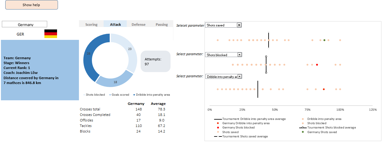
A sneak-peek at the final dashboard
Here is the final dashboard (it has more functionality than depicted). Click on it to enlarge.
Download the dashboard workbook
Click here to download the workbook. Refer to it while reading this article for most benefit.
How it all began…?
So, after the world cup, I have thought to analyze this tournament using excel. And also Chandoo’s podcast session 13 made me more excited to start on this.
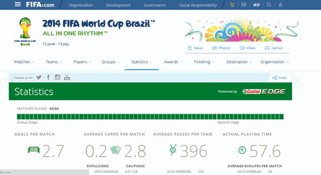
I have started the by searching for information over net and thanks to FIFA for having all the information at one place.
1. Planning of dashboard
I have made some dashboards and I think one of the essential steps to do is to plan what all needs to be represented in our dashboard. Having a checklist helps me to focus more on making it more interactive and creative rather than digging out for the data. In this dashboard, I wanted to show analysis of individual teams, matches played, and comparison of teams. However, I have added the top performers of World Cup in later stages.
2. Collecting data
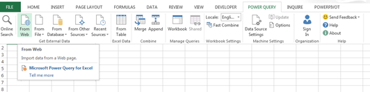
Having all the data on single site is great, however exporting to excel might seem a bit cumbersome because of formatting issues. So, it’s better to use PowerQuery (a Microsoft add-in) to extract the data from sites. (I came to know about PowerQuery, PowerView and PowerPivot though Chandoo podcast session 3, an interview with Mike Alexander). This provides us the data in tabular form and that saves a lot of time in formatting, especially when you copy from web.
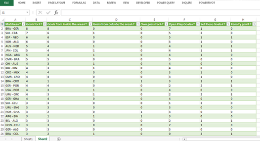
Once, I have the data for goals scored, I have collected data for other parameters as well and the stats are matched for the respective matches between the teams using Index-Match.
Now, we have the data related to matches played between the teams.
Similarly collect data for the teams. (FIFA.com has huge resource of information collected for this world cup)
3. What makes a team
Now, we need to make the right graphs for data representation.
For the first part of the dashboard (performance by teams) there are four areas that I wanted to show independently. I was tired of using the form controls. So, I have used the select cells control which requires a small macro and some form of conditional formatting to do the magic. For more on this technique refer to Interactive Sales Chart tutorial.
Now for the country selected there should be a flag. Here I have named all the flags with abbreviation of each country. A macro code is used to select the country flag which is the ‘Flag’ (selected cell) cell.
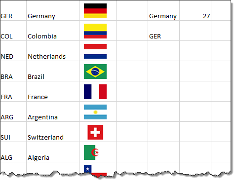
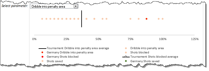
Scatter plot in the dashboard
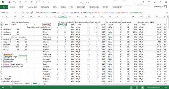
The chart on the right is scattered plot, where the data points are selected as per the categories selected in the drop-down. I have used Index, Match and Choose functions to select the data points for the all the teams. The pic below is for the “Dribble into penalty area” that is under “Attack”.
INDEX($E$2:$AR$34,MATCH($AZ3,$E$2:$E$34,0),MATCH(CHOOSE($AW$16, $AU$15,$AU$16,$AU$17,$AU$18,$AU$19,$AU$20), $E$2:$AR$2,0))
Which is
INDEX($E$2:$AR$34,MATCH($AZ3,$E$2:$E$34,0),MATCH(CHOOSE($AW$16, $AU$15,$AU$16,$AU$17,$AU$18,$AU$19,$AU$20), $E$2:$AR$2,0))
INDEX($E$2:$AR$34,MATCH(Germany, Teams selected,0), MATCH(Dribble in to penalty area, row headers,0))
INDEX(Data table,1st row,19th column) = 28
Similarly the data points required for the graph are populated.
Now, for finishing, add a small box that gives few details about the team. Here, we need to accommodate all the data in the box that can be done using CONCATENATE or just simply use “&”
For e.g.,
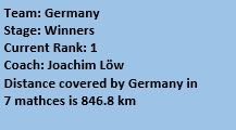
=”Team: “&linkedCellFlag &CHAR(10) &”Stage: ” &INDEX($E$3:$F$34,MATCH(linkedCellFlag,$E$3:$E$34,0),2)
linkedCellFlag :named range for the selected team and Char(10) is required to provide ample space to goto next line.
The output will be (if I selected Germany):
Team: Germany
Stage: Winners
And similarly use & to add the data into the cells
So putting all together the final output is (yes I am a bot bad in choosing the right color scheme)
4. Match vs. Match ()
So now moving on to the next phase of the dashboard, the analysis of matches played.
Here, when I select two teams, say, Germany vs. Argentina, the match stats for corresponding teams must come up. Here, there are two things that we need to check:
- When I select Germany as my first team, I need to select all the teams against whom Germany played in this World Cup
- When selecting the match like GER vs. ARG, we need to have the same result even though I have chosen ARG vs. GER
To solve these two situations I have used the following method:
- Make a matrix of the teams played against every other teams as shown below. I have sorted the teams based on groups and using IF,MATCH, IFERROR populate the array as shown below
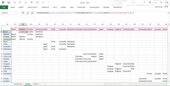
Formula used:
IFERROR(INDEX($AN$3:$AN$34,IF(AP$2=$AN3,” “, IF(ISNUMBER(MATCH(AP$2,GrpA,0)), MATCH(AP$2,$AO$2:$BT$2,0),””)),1),””)
For case of the selected cell, if, Brazil = Mexico, <<blank>>, If Brazil is part of Group A, then value of the team in header Row (AO2:BT2)
Similar procedure is followed for the other matches
For the drop down,
The index number (for eg., Brazil is the 1st team in the drop down bar, hence it has number 1) of the team selected and MOD (number,4) is evaluated. Corresponding teams are added from (i) (if the selected team is Spain, index number is 5, then teams are Chile, Australia and the Netherlands). Similar process is done for teams proceeded into later stages of the tournament is done.
Evaluation of the match
For the matches, when we select the teams, let say, Brazil vs. Croatia, here the home team is Brazil and away team in Croatia. So the index number assigned is “1-3”. I have defined the index number for each of the teams using CONCATENATE, INDEX, MATCH functions.
=CONCATENATE(MATCH(LEFT(F40,3), $AM$3:$AM$34,0),”-“,(MATCH(RIGHT(F40,3), $AM$3:$AM$34,0)))
F40= BRA-CRO
Hence, the formula becomes
CONCATENATE(MATCH(BRA),$AM$3:$AM$34,0),”-“,(MATCH(CRO),$AM$3:$AM$34,0)))
CONCATENATE(1,”-“,3)
Which gives 1-3
In case, I have selected to Croatia first and Brazil second, then I would have it as “3-1”, which doesn’t match with the list of matches. Hence in that case, we need to invert the number to “1-3”.
So finally, got the numbering right, which leaves us to lookup values for each category. So when I have seen initially, the list is too long. So I have decided to subgroup them.
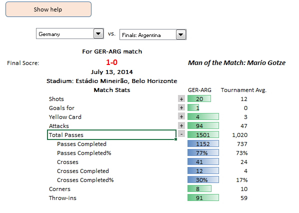
On an average the match stats that most of us look are shots, goals, suspension, attacks, procession. However, showing many statistics is often too dangerous. So, I have adjusted to the top stats and sub stats can be viewed if one like to. For example, one wants to look in-depth about goals scored, total attacks and total passes then small box in Column AG (the one highlighted) can be used to hide the rows or show the rows accordingly. A small macro to hide/show rows is sufficient for the same.
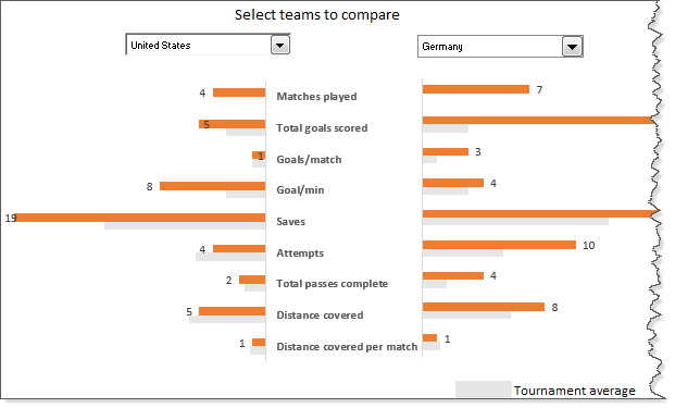
5. Where do the teams stand
Now the third part to compare any two teams in the tournament and compare with tournament average. So this would be just a graph with all the data available. So I thought of animating the graph.
Before animation, an important thing to note is to check for the dimension of the variables we are analyzing. Since, all the data is coming on the same graph, plotting goals scored (e.g. 18) and total passes complete (e.g. 4200) in same would not help us. Hence, use total passes complete (in 100s) is to be checked. Similarly for other parameters.
For animation of the graph, I have done a similar as mentioned Chandoo in Excel VBA classes. (That course is really awesome. If you are looking to know more on excel VBA, I recommend you to join)
Top 5 teams
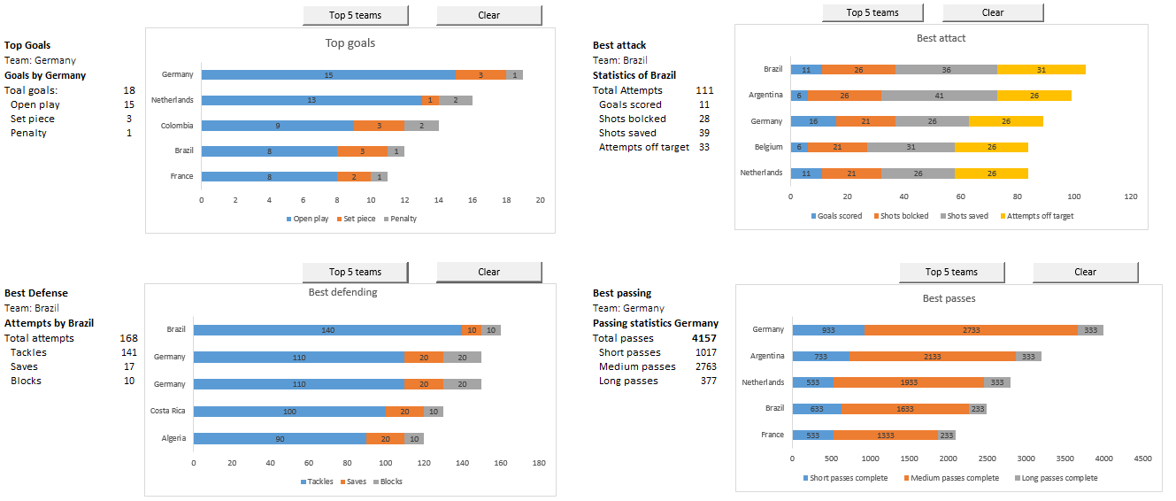
And at last, the comparison of top 5 teams. This is done using INDEX,LARGE formula.
INDEX($E$3:$N$34,MATCH(LARGE($I$3:$I$34,1),$I$3:$I$34,0),1)
In I3:I34, there are values of total goals scored by a team. Here we get Germany
In similar way we can check out for the remaining by substituting 1 with other numbers.
The charts are animated in the similar way as done in the previous graph, although an additional dimension is added.
So this is it. Make final touches by specifying the appropriate hyperlinks to the each section and maintaining the formatting is essential.
Thanks Chandoo for encouraging me to write a guest post.
Added by Chandoo: Thank you Krishna
Many thanks to Krishna for sharing his dashboard file & explanation with all of us. Your work is a proof of how much we can accomplish with Excel.
If you like this article,please say thanks to Krishna.
Want to learn how to create dashboards like these?
Then check out:


38 Responses to “Time to showoff your VBA skills – Help me fix ActiveSheet.Pictures.Insert snafu”
I tried your code with 2003, it works.
But, I know Addpicture does not take URLs anymore with 2007 onwards, perhaps its the same with picture.insert as well.
http://support.microsoft.com/kb/928983/en-us
The above link gives the solution as "picture fill in a shape such as a rectangle".
Tried to recreate this, but it worked fine for me. I just took the image of the error you showed in the post. Is there more info that can narrow this down a bit?
Don't know if this helps?
http://www.theserverside.com/discussions/thread.tss?thread_id=47101
Hi
Not sure if this is what you're after, but I just tried this
Sub Macro1()
ActiveSheet.Pictures.Insert("http://www.google.co.uk/intl/en_uk/images/logo.gif").Select
End Sub
Tied a button to it on the sheet and it seems to work; hope this helps a little
Ian
@All.. the issue is in Excel 2007. In 2003 ActiveSheet.Pictures.Insert seems to work fine. Unfortunately, I have design this in Excel 2007.. that is why I posted it here..
v2
Sub Macro1()
Set n = ActiveSheet.Pictures.Insert("http://www.google.co.uk/intl/en_uk/images/logo.gif")
With Range("c12")
t = .Top
l = .Left
End With
With n
.Top = t
.Left = l
End With
End Sub
Ian
That didn't come out very well. This positions at c12, so can change easily:
Sub Macro1()
Set n = ActiveSheet.Pictures.Insert("http://www.google.co.uk/intl/en_uk/images/logo.gif")
With Range("c12")
t = .Top
l = .Left
End With
With n
.Top = t
.Left = l
End With
End Sub
Works OK in 2007
Ian
The above codes work fines to my EXCEL 2007. Thanks.
Chandoo:
Try 'ActiveSheet.Pictures.Insert'
With ActiveSheet.Pictures.Insert("C:\Example.png")
.Left = ActiveSheet.Range("A1").Left
.Top = ActiveSheet.Range("A1").Top
End With
activesheet.pictures.insert "C:\Documents and Settings\Jon Peltier\Desktop\2007 stuff\insert_charts_2007.png"
Works for me in 2003 SP3 and in 2007 SP2.
Check the URL, and make sure you have internet connectivity.
What also works, and is newer (pictures.insert was supposedly deprecated in '97):
activesheet.shapes.addpicture "C:\Documents and Settings\Jon Peltier\Desktop\2007 stuff\insert_charts_2007.png", false, true, 200,200,100,100
Unfortunately you must specify dimensions (the last four arguments) and you don't necessarily know them. But the picture size is still related back to the original picture size, so you could use scaleheight and scalewidth to fix this.
Chandoo: I just re-read your post.
The code I posted works for me. However, I'm using a local picture. If you try to add a picture from the web, this won't work.
I remember solving this problem before by adding a rectangle shape first, then using the Shapes.AddPicture method to get a picture from the web.
I'll find that code and post it here.
Some more updates... The code "ActiveSheet.Pictures.Insert (path)" works fine in Excel 2007 at home. Strange it failed miserably on my work laptop. Do you think this has got something to do with SP2 of MS Office 2007 or something like that?
@Ian, Jon: Thanks for the code snippets. I guess I will use my home installation of excel to do this.
Chandoo:
Try this on your work laptop:
Sub test()
ActiveSheet.Shapes.AddShape msoShapeRectangle, 50, 50, 100, 200
ActiveSheet.Shapes(1).Fill.UserPicture _
"http://www.datapigtechnologies.com/images/dpwithPig6.png"
End Sub
FYI:
http://support.microsoft.com/kb/928983/en-us
I didn't mean to post code with a local file, because both approaches worked with an internet image as well. This is in Excel 2007 SP2.
activesheet.pictures.insert "http://peltiertech.com/images/2009-07/col_area_noblanks.png"
Jon: Looks like I have SP1 on my client machine! I wasn't paying attention.
Just checked my home computer where I have SP2, and you're right...looks like they fixed it.
I didn't even bother testing in SP1, though I could if anyone cares enough.
I'm afraid I don't have a solution, but I find it remarkable that after attaining a certain status in the Excel world, Chandoo does not need to post on an Excel discussion forum to get help for an Excel problem. Instead, he posts on his blog and all the gurus come rushing to his help.
Isn't Web 2.0 great?
Teylyn - I saw Chandoo's tweet first, and followed the link back to his blog.
@Mike.. thank you. I have seen the fill rectangle solution before posting the query here. For that matter, I have also tried the solution of embedding a browser control on a spreadsheet. both of these seemed a bit extreme. That is why I have asked it here.
But I guess I will end up using it if I had to build this in work laptop.
@Teylyn: I have thought of posting this in a forum. (Unfortunately I have not been to any excel group in the last 5 years. Last time I was active was when I built a jave based excel sheet construction solution using POI.HSSF classes of Apache... ) After searching for a few hours, I found several forum posts where others had same problem and the solution recommended (using .left and .top parameters) is not working for me. Incidentally most of these solutions are from a certain Jon Peltier 😛
I thought may be the problem is interesting for fellow blog readers. So I posted it here.
Hi,
Adapting the code in the question,
[code]
Sub InsPicture()
pPath = "http://chandoo.org/images/pointy-haired-dilbert-excel-charts-tips.png"
With ActiveSheet.Pictures.Insert(pPath)
.Left = Range("a1").Left
.Top = Range("a1").Top
End With
End Sub
[/code]
Seems to work fine
Looks like it was a problem in 2007 up to SP1, which was corrected in SP2.
@Jon.. seems like the case. I just checked the version at work laptop. it is 12.0.6331.5000 (SP1).
Thank you so much every one. I really appreciate your time and suggestions in solving this.
Glad to help. I couldn't understand why something so straightforward wasn't working.
Hi All
Is there a way of inserting a motion clip eg animated gif or swf or flv?
Thks
You can insert animated GIFs by inserting them in a browser control through VBA. For other types of movies, I can guess you can insert them as clip art.
I WANT THE INSERT PICTURE BY USING COADING
so currently i was struggling same as you, chandoo, with the insert picture method in excel 2007/10 from an url and came along your thread here.
so i re-designed the code on the addshape method as mike was suggesting it and all of the sudden it works just fine.
thanks alot to you guys, you were a great help
a big salut from switzerland
Hi guys,
I need help copying and pasting an image with the path in a cell.
I leave the code.
And thank you very much!
Sub Copiarimg()
Dim pic As Picture
With ActiveSheet
Set pic = .Pictures.Insert(Range("f2").Value)
With .Range("e9:g22")
pic.Top = .Top
pic.Left = .Left
pic.Width = .Width
pic.Height = .Height
End With
End Sub
I've played around with the approaches in these comments, and the code below is what I've come up with. The ImagePath can be a local file or a URL. As Jon mentioned above, the trick is to set an arbitrary value for the width and height, then call the ScaleWidth and ScaleHeight methods afterward to reset the picture to its original size. Once the LockAspectRatio property is set, you can change the picture width and the height will automatically scale (or vice-versa).
Sub AddPictureToRange(TopLeftCellAddress As String, ImagePath As String)
Dim pic As Shape
Dim l As Single, t As Single
Dim temp As Single
l = Me.Range(TopLeftCellAddress).Left
t = Me.Range(TopLeftCellAddress).Top
temp = 10# ' arbitrary value
Set pic = Me.Shapes.AddPicture(ImagePath, msoFalse, msoTrue, l, t, temp, temp)
pic.ScaleHeight 1#, msoTrue
pic.ScaleWidth 1#, msoTrue
pic.LockAspectRatio = msoTrue
End Sub
I need some help with inserting pictures. I have an excel file with a column of item numbers next to this row I want to insert a picture of this item. The pictures are coded with the item number so I tried to insert it with one of the codes above:
Sub InsPicture()
pPath = "http://img.bricklink.com/P/80/55236.gif"
With ActiveSheet.Pictures.Insert(pPath)
End With
End Sub
That worked but I need to do that for every row separtly.
So I tried in the code
pPath = "http://img.bricklink.com/P/80/"&Text(a1;"#")&".gif"
But that gives errors.
Anybody ideas?
Hi Nicholas, I used your solution in a related problem in Excel 2003 and it worked flawlessly..thank you!
Hi Mike Alexander,
Your solution with some changes was helpful in my problem in XL 2007, thanks.
Hi,
thanks all. In addition, I had a problem with multiple pictures inserting (every new picture replaced the prior one). I've changed it a bit, may be helpful..
Sub test()
ActiveSheet.Shapes.AddShape msoShapeRectangle, 50 , 50, 100, 200
ActiveSheet.Shapes(1).Fill.UserPicture _
"http://www.datapigtechnologies.com/images/dpwithPig6.png"
ActiveSheet.Shapes(1).Copy
ActiveSheet.Paste
End Sub
Try this instead:
Sub test()
ActiveSheet.Shapes.AddShape msoShapeRectangle, 50 , 50, 100, 200
ActiveSheet.Shapes(ActiveSheet.Shapes.Count).Fill.UserPicture _
"http://www.datapigtechnologies.com/images/dpwithPig6.png"
End Sub
Thanks to everyone, this thread has been very helpful. However, image inserting still doesn't work quite as expect for me.
While I can get a picture inserted into an Excel 2010 worksheet using either:
1) ActiveSheet.Shapes(ActiveSheet.Shapes.Count).Fill.UserPicture...
2) ActiveSheet.Pictures.Insert(pPath), and
3) Shapes.AddPicture...
unfortunately the images all insert with a display size determined not by the actual pixel dimensions of the image but by the dpi resolution.
So for example, if I insert two copies of the exact same 600x600 pixel image, one with a 300dpi resolution and the other with 72dpi, they display at vastly different sizes on screen.
While this might be intended behaviour for Excel in order to maintain a WSYWIG printing layout, I actually need a way to insert the image based on the the actual pixel dimesnsions and ignoring the dpi resolution.
Any help appreciated.
Thanks
Kez
Not doing an intentional bump, but realised I posted in rely to one of the repsonses here instead of to the main thread, so reposting.
=====
Thanks to everyone, this thread has been very helpful. However, image inserting still doesn’t work quite as expected for me.
While I can get a picture inserted into an Excel 2010 worksheet using any of the below methods:
1) ActiveSheet.Shapes(ActiveSheet.Shapes.Count).Fill.UserPicture....
2) ActiveSheet.Pictures.Insert(pPath), and
3) Shapes.AddPicture....
unfortunately the images all insert with a display size determined not by the actual pixel dimensions of the image but by the dpi resolution.
So for example, if I insert two copies of the exact same 600×600 pixel image, one with a 300dpi resolution and the other with 72dpi, they display at vastly different sizes in Excel on screen.
While this might be intended behaviour for Excel in order to maintain a WYSIWYG printing layout, I actually need a way to insert the images based on the the actual pixel dimesnsions and ignoring the dpi resolution.
Any help appreciated.
Thanks
Kez
Well, answered my own question 🙂
For those who might be interested, you can use this function:
Public Function GetPicDims(strFilePath As String, strFileName As String) As String
GetPicDims = CreateObject("Shell.Application").Namespace((strFilePath)). _
ParseName(strFileName).ExtendedProperty("Dimensions")
End Function
to get the dimensions of the image you want to insert. Then you can parse the return string and use the width and height values to add a rectangle shape of the appropraite size, like:
ActiveSheet.Shapes.AddShape msoShapeRectangle 50, 50, iWidth, iHeight
which you then fill with the picture:
ActiveSheet.Shapes(ActiveSheet.Shapes.Count).Fill.UserPicture "c:\temp\test.jpg"
This way the picture gets inserted using the pixel dimensions and the (print) resolution gets ignored.
If desired, the GetPicDims function can be made more generic to get other ExtendedProperties.
Regards
Kez