Sawadee Krup folks. Today, we begin a new series on Chandoo.org – Making a Customer Service Dashboard using Excel. This 4 part tutorial teaches you,
Designing Customer Service Dashboard
Data and Calculations for the Dashboard
Creating the dashboard in Excel
Adding Macros & Final touches
Customer service is one area where a lot of data is collected regularly. Understanding all this and making business decisions is quite complex task. This is where dashboards shine.
Sneak-peek at the Final Dashboard
Before we jump in to the tutorial, let me show you the final dashboard. Click on it to enlarge.
What do we want in our customer service dashboard?
The very first step in making our customer service dashboard is to ask “what do we want in this dashboard?”
The answer to this question changes from company to company & individual to individual. In our case, lets assume, we are designing a customer service dashboard for a large computer manufacturer – LCM inc.
The context of our dashboard
A bit of context on LCM’s call center,
- The call center services 6 different product categories – Monitors, Desktops, Laptops, Accessories, Software and Misc.
- The call center receives calls from 5 regions – North, South, East, West and Mid-west
- The call center services 4 types of customers – Large corporates, SMEs, Individual customers, and non-profits.
- And LCM has 6 agents to take care of the calls – Agent Bond, Harry, Smith, Mary, Vinod and Neo
- During each call, the LCM agents try to up-sell a product in the same category of the call (for ex. if we get a call related to monitors, we try to sell another monitor to the customer, just like in real world!)
Below you can see the data collected for each call:

What are the goals of our dashboard?
Now that we know the context & how our data looks like, lets understand what should our dashboard do.
We need to answer this question from the perspective of the end users of this dashboard – in this case, the customer service head of LCM.
I have never been customer service head of a large call center. All my experiences with call centers involve waiting on the call listening to horrible music over and over and over… So I will just use my imagination and say that our dashboard should,
- Provide a view of key metrics (KPIs) for the 4 week period starting from a given date.
- Like call volume, durations, resolution rate, satisfaction ratings, upsell $s
- Allow for comparison between any two values of a dimension
- Like Monitors vs. Desktops, Agent Bond vs. Agent Smith, North vs. South
- Allow for comparison based on any metric
- Like Call volume by day, resolution rate by day, upsell by day etc.
- Show everything in single view
Designing a rough sketch of the dashboard
Based on all these needs of our customer service head, lets design a dashboard. This is where we get creative. For this part, I rely on a technique that is so natural that even my 2 year old son uses it. I doodle.
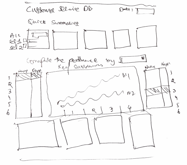
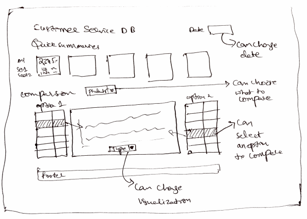
So lets doodle our dashboard on a blank paper. This is what I came up with. Feel free to draw your own based on what our boss wanted.
Customer Service Dashboard – Design #1
This is my first attempt.

Customer Service Dashboard – Design #2
This is what I got after I have refined the design a bit and made it compact so that we can fit everything in single view.

Validating your Design
This is where we take the rough sketch and discuss it with colleagues & boss. We make sure that all our dashboard goals are met by this design. We also validate whether our data can support this design (for example, we may want to show certain metrics, but our data may not allow this.)
In our case, I validated my sketch with what we mentioned in the goals section and made sure everything is met.
A demo of Final Dashboard
Since I have already made the final dashboard, here is a quick demo of how it works:
[Watch the demo on our YouTube channel]
What next? – Getting Data & Calculations in place
Now that we are done with the design, next step is to get our data and all the calculations (formulas, named ranges, validations, pivot tables) in place.
How would you design a customer service dashboard?
Customer service is one area where dashboards are used quite often. Have you ever designed dashboards or one page reports in this area? If so what is your experience like? How have you designed the dashboard? What Excel techniques and ideas have you used? Please share using comments.
Also, if you were to design the dashboard for LCM inc., how would you approach it? Please share your ideas using comments.
References & Related Learning
If you are looking for examples, information & tutorials on Excel dashboards, you are at the best. At Chandoo.org we have elaborate examples, tutorials, training programs & templates on Excel dashboards, to make you awesome. Please go thru below to learn more:
- Customer Service Dashboard Example
- KPI Dashboards in Excel – 6 part tutorial
- Excel Dashboards – Information, Examples, Templates & Tutorials
- Excel School Dashboards Program – Learn how to create this and other dashboards in Excel in detail
Special thanks to NY Times:
I must thank New York Times’ 2012 Money Race visualization. I have used the comparison idea for this dashboard.


23 Responses to “Learn Top 10 Excel Features”
What it looks like if excel without formula?? 🙂
It would be not excel it would just be fancy tables in which you could just use power point. (Chandoo) would Access be an alternative?
Awesome piece of work!!!
Great article.
Chandoo - my biggest interest in the article was the awesome word-graphic at the top - where did you go to get it done into a shape?
@Rich.. thank you. I used http://www.tagxedo.com/ to generate this word cloud. I took all the comments in the original post, pasted them in tagxedo website and set up the shape etc.
Awesome Chandoo.. You need always needs coffee to start up with. BTW , how did u created the Heart Shaped picture filled with High Repetitive text in it .. Please put it on your Next blog ...
Chandoo, good article. I’ve added a link to it from Connexion – our collection of the most useful and interesting spreadsheet-related articles from the web. See http://www.i-nth.com/resources/connexion
Hi,
Just one small question. Where the hell have been I in the past for not discovering this website sooner?
I've lost a job interview recently where even though I had the subject knowledge, I was not upto their mark in Excel.
Thank you for all the free tips, guidance and for creating this forum environment.
[PS: I've just been through the site for the 1st time, and have signed up for the newsletter. You can expect pretty stupid questions from me soon]
Hy Chandoo, you always inspire me with to explore something new in excel. This data structure table is only for excel 2007 or compatible to 2010. I recently installed latest excel version 2013 in my System and experience problems regarding operating according to previous one. I'm waiting your article relates to that excel version.
Thanks
Awesome article Mr. Chandoo and that is a awesome heart shaped pic you created. Great tips as well.
[...] Learn Top 10 Excel Features | Chandoo.org – Learn Microsoft Excel Online. [...]
Chandoo is awesome..
Thanks, i got better, And i always get 90.50 in my grade card but now i get 96.50 i improved because of the tutorials you gave, Thank You Very Much Chandoo Guy.
Hi chandoo, i am intersted in seeing the video or step by step done procedure of analysing the comments and presenting in the data percentage steps. I think this one would be first step in finding out how generally happens data calculation. Thank you.
As well i would like to know how to get that black shape art of your face which i see in chandoo. I am interested in making it for me.
Nice to see the features considered by Excel users to be most useful. It might be a good idea to also analyze StackOverflow Excel questions to see what keywords appear most often.
Here are my top 10 Excel Features (for advanced users):
http://www.analystcave.com/excel-10-top-excel-features/
Thanks a ton for this it totally helped with my homework ????
Very good effort
Thank you for this. Lots of learning in the links you've provided for this septuagenarian.
Pls send me new post
Dude, your humor ? ?
Loved your work.
Hello Sir,
I am Sanjeev Khakre and i from Indore City, India , I am your big follower and i have watch your videos and learnt a lots of excel trick or function and many more . thanks so much for all of your excellent support.
Your excel knowledge is real awesome.
Thanks
Sanjeev
Your work is excellent but pls willing to know more details about the features of microsoft excel
Chandoo Would Access be a better alternative than VB?