
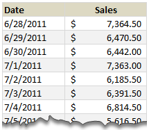
Lets just say, you run a nice little orange shop called, “Joe’s Awesome Oranges“. And being an Excel buff, you record the daily sales in to a workbook, in this format.
After recording the sales for a couple of months, you got a refreshing idea, why not analyze the sales between any given 2 dates? for analysis sake.
So you entered 2 dates, Starting Date in cell F5 and Ending Date in cell F6
How would you sum up the sales between the dates in F5 & F6?
This is where use the powerful SUMIFS formula.
Assuming the dates are in column B & sales are in column C,
we write =SUMIFS($C$5:$C$95,$B$5:$B$95,">="&$F$5,$B$5:$B$95,"<="&$F$6)
to calculate the sum of sales between the dates in F5 & F6.
How does this formula work?
- $C$5:$C$95 portion: This is the range of cells where our Sales values are recorded. We want these to be summed up based on the conditions as below.
- Condition 1: $B$5:$B$95 >= $F$5: This condition tells SUMIFS to check Column B for any dates on or after F5
- Condition 2: $B$5:$B$95 <= $F$6: This condition tells SUMIFS to check Column B for any dates on or before F6
- When combined, the SUMIFS formula checks for both conditions and adds sales only for dates between Starting (F5) and Ending (F6) dates.
- Learn more about SUMIFS syntax & how to use it.
What formula you should use in Excel 2003?
As you may know, SUMIFS formula does not work in earlier versions of Excel. But you don’t have to shut your orange shop because of that. We can use the all powerful SUMPRODUCT formula for this.
For example, =SUMPRODUCT(($B$5:$B$95>=$F$5)*($B$5:$B$95<=$F$6),$C$5:$C$95) would work the same.
Learn more about SUMPRODUCT formula & why it is awesome.
We can even use SUM & OFFSET formulas if …,
We can also use SUM & OFFSET combination to perform this calculation, provided dates are in smallest first order and all dates are entered. For the example, see download file.
Download Example Workbook:
Click here to download example workbook & play with it.
How would you sum up values between 2 dates?
In reporting situations, showing summary of values between 2 dates is a common requirement. So I use either formulas like above or Pivot Tables to do this.
What about you? How would you sum up values between 2 dates? Please share your ideas & tips using comments.
Learn More Date Related Formulas:
- How to find if 2 sets of dates overlap?
- Extract Quarterly Totals from Monthly Data
- Automatic Rolling Months in Excel
- How to Clean-up Dates in Excel
- Calculate Elapsed Time in Excel
- More on Date & Time
Want to Learn More Formulas? Join Our Crash Course
If you want to learn SUMIFS, SUMPRODUCT, OFFSET and 40 other day to day formulas, then consider my Excel Formula Crash Course. It has 31 lessons split in to 6 modules and makes you awesome in Excel formulas.
Click here to learn more about this.


27 Responses
I would apply a filter and use function subtotal, with option 9. This way you can see multiple views based on the filter.
hey Chandoo, the solutions you proposed are very efficient, but if I wanted to be fancy I would do it this way .. the references are as your example workbook.
=SUM(INDIRECT(“C”&(MATCH(F5,B5:B95)+4)):INDIRECT(“C”&(MATCH(F6,B5:B95)+4)))
I like things simple:
=SUMIF(B5:B95,”>=”&F5,C5:C95)-SUMIF(B5:B95,”>”&F6,C5:C95)
use something like: =SUM(OFFSET(B1,0,0,DATEDIF(A1,D1,”d”)))
and have D1 be the date that I want to sum to.
In Excel 2003 (and earlier) I’d use an array formula to calculate either with nested if statements (as shown here) or with AND.
{=SUM(IF(B5:B95>F5,IF(B5:B95<F6,C5:C95,0),0))}
Note that I truly made this for BETWEEN the dates, not including the dates
I turned the data set into a table named Dailies.
I named the two limits StartDate and EndDate.
And used an array formula:
{=SUM((Dailies[Date]>=StartDate)*(Dailies[Date]<=EndDate)*Dailies[Sales])}
If I would still be using the old Excel I would do it as follows:
SUMIF($B$5:$B$95,”<="&H6,$C$5:$C$95)-SUMIF($B$5:$B$95,"<"&H5,$C$5:$C$95)
Works as simple as it is.
Regards
=sum(index(c:c,match(startdate,c:c,1)+1):index(c:c,match(enddate,c:c,1))
=sum(index(c:c,match(startdate,b:b,1)+1):index(c:c,match(enddate,b:b,1))
Great examples and thanks to Chandoo. You have simplified my work.
Hi! great tips I have found in your page, have you seen this
http://runakay.blogspot.com/2011/10/searching-in-multiple-excel-tabs.html
Thank you! Thank you! Thank you!
=SUMIF(A2:A11;”>=”&B13;B2:B11)-SUMIF(A2:A11;”<"&A11;B2:B11)
awesome… thank yoo Chandoo!
which is most efficient and fast, if all are efficient ?
Thank you for this formula, I’ve just spent ages trying to find something to work on my data, I knew it would be possible! Don’t care if others think there are easier/other ways to do it, you explained it so I understood it and could apply it to what I was doing so I’m happy!
The above said example is awesome for calculating values between dates,
can you pls let know how to calculate sale values if we have 10 sales boys for
ex: 1,rama
2,krishna
3,ashwin
4,naga
5,suresh
how much rama sale value between 1/jan/2015 to 10/jun/15
how much krishna sale value between 10/jan/2015 to 15/july/2015
i think you understood can you pls let me know the formula for how to calculate the sale between diffrent sale man sale value from master data file
Thanks,
Nagaraju
Hi
I have a list of people’s names in column A, I have a list of dates in column B which records the dates they have been off sick, in column C I have either 1 if it is a full sick day or 0.5 if it is a half day.
What I would like to do is to add up the number of dates a specific person has been off within two dates.
For example, I want to look at my list of names and to find Joe Bloggs (column A), then add up all his sick days (column C). The start date will be in cell E1 and the end date will be in F1.
If this possible using SUMIFS?
List of names are in range A2:A100
List of dates in B2:B100
List of sick days (either 0.5 or 1 in C2:C100
The start date is in cell E2
The end date is in cell F2
Your help would be greatly appreciated.
Yes, with the help of SUMIFS you can have the solution.
Note: you need have an extra col. D2 where you will input Name of the person.
=SUMIFS(C2:C100,A2:A100,D2,C2:C100,”>=”&E2,C2:C100,”<"&F2)
Col. A Col. B Col. C Col.D Col. E Col. F
Name Date Sales
ABC 28-Jun-11 1 MNO 28-Jun-11 25-Sep-11
XYZ 29-Jun-11 0.5
MNO 30-Jun-11 1
PQR 1-Jul-11 1
Typo ERROR / Correction in formula:
Yes, with the help of SUMIFS you can have the solution.
Note: you need have an extra col. D2 where you will input Name of the person.
=SUMIFS(C2:C100,A2:A100,D2,B2:B100,”>=”&E2,B2:B100,”<"&F2)
Hi
I have a list of people’s names in column A, I have a list of dates in column B which records the dates they have been off sick, in column C I have either 1 if it is a full sick day or 0.5 if it is a half day.
What I would like to do is to add up the number of dates a specific person has been off within two dates.
For example, I want to look at my list of names and to find Joe Bloggs (column A), then add up all his sick days (column C). The start date will be in cell E1 and the end date will be in F1.
If this possible using SUMIFS?
List of names are in range A2:A100
List of dates in B2:B100
List of sick days (either 0.5 or 1 in C2:C100
The start date is in cell E2
The end date is in cell F2
Your help would be greatly appreciated.
Viv
@Viv
Can you please post the question in the Chandoo.org Forums
http://forum.chandoo.org/
Please attach a file so that a specific answer can be delivered.
Thanks for this – it solved the problem that I was having. However can someone please explain to me why the “” needs to be around >= and <= as well as why we need to add & in order for the formula to work? Thanks in advance!
This formula works perfectly as well. Any ideas?: =SUM(INDEX(C5:C95,MATCH(H5,B5:B95,1)):INDEX(C5:C95,MATCH(H6,B5:B95,1)))
ikkeman had posted the same thing.
I am trying to sum total a range of cells between date ranges ie column n has $ amounts column d has the transaction dates ie 1/3/2015 or 25/3/2015 or 25/4/2015 column b has the text saying drp or distribution – reinv
In another cell I am trying to sum or total (in column n) with the value of a range of different dates (column d) that contain different text (column b) ie cell n48 is 50, n65 is 85, n165 is 36
with the dates ie cell d48 is 1/3/2015, d65 is 25/3/2015 and d165 is 25/4/2015
with different text that says drp or distribution – reinv ie cell b48 is drp, b65 is distribution – reinv, b165 is drp
If I wanted to sum the amounts between 1/3/2015 to 31/3/2015 with drp then the total would be 50. Also if I wanted to sum the amounts between 1/4/2015 to 30/4/2015 with drp the sum total would be 36 If I wanted to sum the amounts between 1/3/2015 to 31/3/2015 with drp and distribution – reinv the sum would be 115
What would the formula be for these different questions
hope you can help, it has been driving me nuts and cant work it out