
A good dashboard must show important information at a glance and provide option to drill down for details.
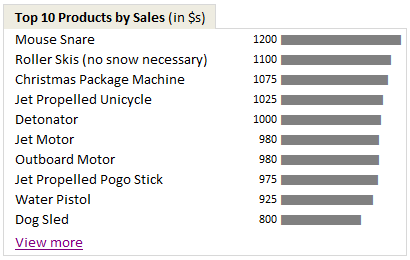
Showing Top 10 (or bottom 10) lists in a dashboard is a good way to achieve this (see below).
Today we will learn an interesting technique to do this in Excel.
Lets assume you are the owner of ACME inc. and you want to show the performance of your products in a dashboard. But since you hate clutter (and love Coyote, your lone customer), you want to show the top 10 products by sales & orders and give an option to drill down if someone is interested.
Lets say your data looks like this:

Now, follow these simple steps.
- Select your data & insert a pivot table (tutorial here).
- Use product as the row label & sales as the value for pivot table.
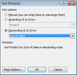
- Now, sort the products by descending order of sales – See this:
- Comeback to dashboard and point to first 10 rows of the pivot report using cell references.
- Type view more in a cell beneath the top 10 and press CTRL+K (this opens the hyperlink dialog box).
- Just point to cell A1 in your pivot report worksheet. Click OK.
- Now, if you click on the view more link, you will jump to pivot report instantly. Pretty neat, eh?
- That is all. Go sell some Mouse Snare or Iron Bird Seed. Mr. Wile is at the counter.
Advantages of this technique:
Ardent readers of chandoo.org or dashboard practitioners usually rely on a sort & scroll technique similar to the one we discussed in KPI Dashboards post. But as you can see, using formulas & form controls is a tedious process. If you want to filter your source data based on a criteria (say top products by sales where refund rate is more than 3%) then your formulas will be awfully long and complicated.
This is where pivot tables shine. They are easy to setup. You can sort & filter pivot tables in multiple ways & then link the output to dashboard tables (or charts) with ease.
Download Example Dashboard with top 10 tables
Click here to download the example dashboard with top 10 tables. This is a demonstrative file, not a real dashboard. So take it with a pinch of salt (or TNT if you fancy).
Do you show Top 10 values in Dashboards?
I use them all the time. You can see top 10 values in many of the dashboards I constructed or recommend. (here is 1,2,3). I think they are a great way to capture attention and encourage analysis. You can get top 10 values using either pivot tables like above or use formulas like large & small. You can even set up dynamic charts to show top 10 values. or use Conditional formatting to highlight top 10 values. I just love them.
What about you? Do you show top / bottom values in your dashboards? What techniques and ideas you follow. Please share using comments.
More Excel Dashboard Techniques:
- Display Alerts in Dashboards to catch user attention
- Budget vs. Actual charts in Dashboards
- Use shapes in Dashboards to make them effective
- More Excel Dashboard tips, tricks, templates & tutorials
Get Dashboard Training from Chandoo.org
I have made an hour long video training explaining how to construct Excel Dashboards using a recent dashboard I made as an example. If you work on dashboards, this is a good program for you. Click here to learn more.


58 Responses to “Are You Trendy? (Part 2)”
[...] This post was mentioned on Twitter by Chandoo.org and Stray__Cat, Excel Insider. Excel Insider said: Are You Trendy? (Part 2): Forecasting using Excel Functions “Todays forecast will be Hot and Humid with a Chance... http://bit.ly/dX8kBX [...]
Nice second part but I've notice some kind of cut/paste between TREND and FORECAST which disturb my understanding of the differences between them.
Can you explain a bit more how they differ ?
@Cyril
They give the same results but ask for input in a slightly different way.
Forecast is useful for a single point
Trend is an array function and can do 1 point as a normal function or a number of points as an array function
Dear Sir,
I have a dataset which I believe shows exponential growth. I am trying to make a formula to know y when I know x. I did not study statistics (I studied law) so I am having a hard time figuring it out. Could I ask you to take a look at it and send you the dataset?
Thank you for your consideration.
Kind regards,
George
@George
Can you please ask the question in the chandoo.org Forums
http://forum.chandoo.org/
Please attach a sample file to give a more targetted answer
again, a wonderful post. quick questions: are you suggesting that r2 be the only evaluative statistic on model form and goodness of fit? what statistic could/should be used to compare "goodness of fit" across all linear and non-linear regression model forms? how can it be derived from the Excel formulas?
I've used about 27 difference variations of the linear model transforming X and/or Y with square root, squared, natural log, and reciprocal. This includes the linear model and two models for when both X and Y have values between 0 and 1. These two models are the logistic and log probit models.
Hi Hui, great post...very timely as I was just scratching my head yesterday trying to work out the growth function. I have a question: one of the data models I was working on was corrupted (not by excel, but by its lesser equivilent, a human being) so I need to estimate a set of data points for December 2010. The data in question was definiately not linear, and has no clear trend, upward or downward. I'm thinking some type of average would be the best way to go (I have a couple of years worth of data), what would be your thoughts?
Prem
from EHA
Excellent tutorial. I must say that not many are aware of these features in EXCEL -- how they added from pure Pivot Tables to all the way in Data Analysis and array functions all types - Stats, Math, Date and many more. Thank you, I am intimately familiar what you presented here and have used at one time or another...
Thanks, may be MS will give you some credit for advancing their tools beyond their own publicity.
Keep it coming
Wonderful Post. Man, I'm going to bookmark it for later reference.
@bill. r2 is very good only if the outcome has certain randomness (think stock price). But like Hui has shown in the last chart. An polynomial chart hitting almost all the dots like that may have r2 = .99 or so, given the known x and y. but the straight line which miss all the points may have a r2 = .96 or .95 So in that case I "eye-ball" them and make a human judgement as to which to use. Right, Hui?
[...] For more details on the individual Tren Types refer to Are You Trendy (Part 2). [...]
[...] http://chandoo.org/wp/2011/01/26/trendlines-and-forecasting-in-excel-part-2/ [...]
[...] Are You Trendy (Part 2) [...]
[...] http://chandoo.org/wp/2011/01/26/trendlines-and-forecasting-in-excel-part-2/ [...]
Chandoo: Googled 2 days for information related to logarithmic trends, including Microsoft sites and Excel forums.
None of them had a comprehensible, complete, graphical, professional explanation that match your level.
Congratulations!
[...] be a part of your forecasting system. Now, let's have an overview of the FORECAST function in Excel.Let's begin by saying that FORECAST function in Microsoft Excel is not a complete inventory forecast...el. WordPress › [...]
[...] Trend lines & Forecasting in Excel – Part 2 [...]
[...] A useful post I found about Logest. The handiest tip I found is to use the “Index” function when using LOGEST, which makes it not necessary to enter it as an array formula. [...]
Excellent. Thank you...
Thanks so much for this great resource. I do have a question though. In theory, I would think that Slope and Trend are both trying to get to the same thing, right? Aren't they both based on finding the line of best fit? If so, I would think that the following might be true (although it isn't):
Let's assume a time series (monthly data) of rates and I am trying to predict the next value in that series (think extending a forward curve). I would think that if I took the Slope of the series and added it to the last number in the series, I should get a reasonable 'forecast' for the next month. However, this doesn't always match the number that TREND or FORECAST predict. I think if you have a perfect R^2 then perhaps it matches. Not sure. But in most real situations it doesn't match.
Is this because [SLOPE + Last Data Point] doesn't take into account the volatility or 'tightness' of the line of best fit, and TREND / FORECAST do? Very interested in any suggestions.
@Tracy
Your totally correct about the r2 value and its impact on adding the slope to the last value for linear functions
If r2=1.0 then the last value will be on the average slope line and adding the slope will give you the next Y value for the next X Value
There is a small but important caveat here.
Dates, especially Monthly data is not linear on the X Axis, because some months have 28, 29, 30 or 31 days
so you do need to be careful when assuming this applies to Date based data.
It sort of depends is the data based on say an accumulation of data from the month in which case the no of days is important or is the Month just a name for the X Axis and the data is independent of the days per month.
Thank you for your quick response. I understand about the daily/monthly issue. In my case, I am looking at a monthly rate so the amount of days in a month doesn't matter, but the point is well taken.
So just to confirm, Trend & Forecast use the variance in the R^2 to inject additional volatility (based on passed behavior) back into the future forecast which moves it off of (but within the overall regression and continuing to maintain the line of best fit) the perfect slope line? If so, I think I am on the same page.
And a Logarithmic forecast would basically be the inverse of a Growth forecast, right? Based on the shape of the curve?
Thanks a ton!
dear sir .... how to calculate a,b, and c from Y=ax+by+c using excel 2007.
i know Y ,x,and y values but i need a,b ,c sd, R values
@Manjunathan
Do you mean Y = aX + c or equivalent ?
It would be ideal if you could post a sample file of data so we can review
Refer: http://chandoo.org/forums/topic/posting-a-sample-workbook
BIG THanks pal..
It's very useful for me... Keep posting
[...] http://chandoo.org/wp/2011/01/26/trendlines-and-forecasting-in-excel-part-2/ [...]
I need to use Winter-Holt's model of forecasting in Excel. If there is any user defined function, it would be of great help to me.
@Satya
Have you had a look at some of the You-Tube vids on exactly this topic: http://www.youtube.com/watch?v=VxwHMMgluOg
Hi Hui, great work, this was very helpful!
However, the link for downloading the Trend2.xls file seems to be broken. I was able to download the Trend1 and Trend 3 files successfully though. Can you repost it or email it to me?
Thank you!
@David
The link is fine?
I will email you
Chandoo - This is awesome; great example workbook too! I never leave your site without knowing a little bit more about excel and what it can do. Thanks a ton.
Tim
Chandoo,
Looking at your formulas for the Logarithmic function on the example workbook and trying to recreate for a project I'm working on. I'm curious, for your a and b you have the exact same formula, but with two different results (cells B19 and C19). Can explain how these two are working?
Thanks!
-Mike
@Mike
B19 and C19 have the same Formula as they are array entered
What this means is that the formula =LINEST(C6:C13,LN(B6:B13))
Returns an array
Linest actually can return up to a 5 x 5 array of results
But for this function on the 2 positions are required.
The Linest Function returns the b and a parameters from the equation y = b.ln(x) + a
There is a list of the Linest()n array results at:
http://office.microsoft.com/en-au/excel-help/linest-HP005209155.aspx
and
http://www.excelfunctions.net/Excel-Linest-Function.html
Hello!
I am doing commodity price forecasting, and I have data of daily prices from April 2012- April 2014.
The problem i'm having is (1) There are some daily data values missing, and (2) after I have dealt with the missing values (using smoothing), i have a problem calculating the seasonal indices because there are different numbers of working days in each month. some months have 23 days, some 21, some 20. because of the differing number of days, I cannot successfully calculate the seasonal effect. how do i tackle this problem?
P.S. I'm fairly new to excel, so please be gentle 🙂
@Mubin
Can you post your data?
I'd suggest asking the question in the Chandoo.org Forums
http://chandoo.org/forum/
Ill post on the forum too, thanks a lot
Week-DayNo.-Day- Date Wheat Prices/100kg (PKR)
1 1 Monday 02-Apr-12 2625.00
2 Tuesday 03-Apr-12 2625.00
3 Wednesday04-Apr-12 2625.00
4 Thursday 05-Apr-12 2625.00
5 Friday 06-Apr-12 2625.00
2 6 Monday 09-Apr-12 2625.00
7 Tuesday 10-Apr-12 2625.00
8 Wednesday 11-Apr-12 2625.00
9 Thursday 12-Apr-12 2625.00
10 Friday 13-Apr-12 2625.00
3 11 Monday 16-Apr-12 2625.00
12 Tuesday 17-Apr-12 2625.00
13 Wednesday 18-Apr-12 2625.00
14 Thursday 19-Apr-12 2625.00
15 Friday 20-Apr-12 2625.00
4 16 Monday 23-Apr-12 2625.00
17 Tuesday 24-Apr-12 2625.00
18 Wednesday 25-Apr-12 2625.00
19 Thursday 26-Apr-12 2625.00
20 Friday 27-Apr-12 2625.00
5 21 Monday 30-Apr-12 2625.00
22 Tuesday 01-May-12 2625.00
23 Wednesday 02-May-12 2625.00
24 Thursday 03-May-12 2625.00
25 Friday 04-May-12 2600.00
6 26 Monday 07-May-12 2600.00
27 Tuesday 08-May-12 2600.00
28 Wednesday 09-May-12 2588.00
29 Thursday 10-May-12 2588.00
30 Friday 11-May-12 2588.00
7 31 Monday 14-May-12 2575.00
32 Tuesday 15-May-12 2588.00
33 Wednesday 16-May-12 2588.00
34 Thursday 17-May-12 2588.00
35 Friday 18-May-12 2600.00
8 36 Monday 21-May-12 2613.00
37 Tuesday 22-May-12 2613.00
38 Wednesday 23-May-12 2613.00
39 Thursday 24-May-12 2569.00
40 Friday 25-May-12 2568.00
9 41 Monday 28-May-12 2588.00
42 Tuesday 29-May-12 2598.00
43 Wednesday 30-May-12 2588.00
44 Thursday 31-May-12 2588.00
45 Friday 01-Jun-12 2588.00
10 46 Monday 04-Jun-12 2588.00
47 Tuesday 05-Jun-12 2588.00
48 Wednesday 06-Jun-12 2588.00
49 Thursday 07-Jun-12 2588.00
50 Friday 08-Jun-12 2588.00
11 51 Monday 11-Jun-12 2588.00
52 Tuesday 12-Jun-12 2588.00
53 Wednesday 13-Jun-12 2588.00
54 Thursday 14-Jun-12 2588.00
55 Friday 15-Jun-12 2588.00
12 56 Monday 18-Jun-12 2588.00
57 Tuesday 19-Jun-12 2588.00
58 Wednesday 20-Jun-12 2588.00
59 Thursday 21-Jun-12 2588.00
60 Friday 22-Jun-12 2588.00
13 61 Monday 25-Jun-12 2588.00
62 Tuesday 26-Jun-12 2588.00
63 Wednesday 27-Jun-12 2588.00
64 Thursday 28-Jun-12 2588.00
65 Friday 29-Jun-12 2588.00
14 66 Monday 02-Jul-12 2588.00
67 Tuesday 03-Jul-12 2588.00
68 Wednesday 04-Jul-12 2588.00
69 Thursday 05-Jul-12 2588.00
70 Friday 06-Jul-12 2588.00
15 71 Monday 09-Jul-12 2588.00
72 Tuesday 10-Jul-12 2588.00
73 Wednesday 11-Jul-12 2588.00
74 Thursday 12-Jul-12 2588.00
75 Friday 13-Jul-12 2588.00
16 76 Monday 16-Jul-12 2588.00
77 Tuesday 17-Jul-12 2588.00
78 Wednesday 18-Jul-12 2588.00
79 Thursday 19-Jul-12 2588.00
80 Friday 20-Jul-12 2588.00
17 81 Monday 23-Jul-12 2588.00
82 Tuesday 24-Jul-12 2588.00
83 Wednesday 25-Jul-12 2588.00
84 Thursday 26-Jul-12 2588.00
85 Friday 27-Jul-12 2588.00
18 86 Monday 30-Jul-12 2588.00
87 Tuesday 31-Jul-12 2588.00
88 Wednesday 01-Aug-12 2588.00
89 Thursday 02-Aug-12 2588.00
90 Friday 03-Aug-12 2588.00
19 91 Monday 06-Aug-12 2588.00
92 Tuesday 07-Aug-12 2588.00
93 Wednesday 08-Aug-12 2588.00
94 Thursday 09-Aug-12 2588.00
95 Friday 10-Aug-12 2588.00
20 96 Monday 13-Aug-12 2600.00
97 Tuesday 14-Aug-12 2600.00
98 Wednesday 15-Aug-12 2600.00
99 Thursday 16-Aug-12 2600.00
100 Friday 17-Aug-12 2600.00
21 101 Monday 20-Aug-12 2600.00
102 Tuesday 21-Aug-12 2600.00
103 Wednesday 22-Aug-12 2600.00
104 Thursday 23-Aug-12 2600.00
105 Friday 24-Aug-12 2600.00
22 106 Monday 27-Aug-12 2600.00
107 Tuesday 28-Aug-12 2600.00
108 Wednesday 29-Aug-12 2600.00
109 Thursday 30-Aug-12 2600.00
110 Friday 31-Aug-12 2600.00
23 111 Monday 03-Sep-12 2600.00
112 Tuesday 04-Sep-12 2600.00
113 Wednesday 05-Sep-12 2600.00
114 Thursday 06-Sep-12 2575.00
115 Friday 07-Sep-12 2575.00
24 116 Monday 10-Sep-12 2575.00
117 Tuesday 11-Sep-12 2575.00
118 Wednesday 12-Sep-12 2575.00
119 Thursday 13-Sep-12 2575.00
120 Friday 14-Sep-12 2575.00
25 121 Monday 17-Sep-12 2575.00
122 Tuesday 18-Sep-12 2575.00
123 Wednesday 19-Sep-12 2575.00
124 Thursday 20-Sep-12 2575.00
125 Friday 21-Sep-12 2575.00
26 126 Monday 24-Sep-12 2575.00
127 Tuesday 25-Sep-12 2575.00
128 Wednesday 26-Sep-12 2575.00
129 Thursday 27-Sep-12 2575.00
130 Friday 28-Sep-12 2575.00
27 131 Monday 01-Oct-12 2575.00
132 Tuesday 02-Oct-12 2575.00
133 Wednesday 03-Oct-12 2575.00
134 Thursday 04-Oct-12 2575.00
135 Friday 05-Oct-12 2575.00
28 136 Monday 08-Oct-12 2575.00
137 Tuesday 09-Oct-12 2575.00
138 Wednesday 10-Oct-12 2575.00
139 Thursday 11-Oct-12 2575.00
140 Friday 12-Oct-12 2575.00
29 141 Monday 15-Oct-12 2575.00
142 Tuesday 16-Oct-12 2575.00
143 Wednesday 17-Oct-12 2575.00
144 Thursday 18-Oct-12 2575.00
145 Friday 19-Oct-12 2575.00
30 146 Monday 22-Oct-12 2838.00
147 Tuesday 23-Oct-12 2838.00
148 Wednesday 24-Oct-12 2838.00
149 Thursday 25-Oct-12 2838.00
150 Friday 26-Oct-12 2838.00
31 151 Monday 29-Oct-12 2838.00
152 Tuesday 30-Oct-12 2838.00
153 Wednesday 31-Oct-12 2838.00
154 Thursday 01-Nov-12 2838.00
155 Friday 02-Nov-12 2838.00
32 156 Monday 05-Nov-12 2838.00
157 Tuesday 06-Nov-12 2875.00
158 Wednesday 07-Nov-12 2875.00
159 Thursday 08-Nov-12 2875.00
160 Friday 09-Nov-12 2875.00
33 161 Monday 12-Nov-12 2875.00
162 Tuesday 13-Nov-12 2875.00
163 Wednesday 14-Nov-12 2875.00
164 Thursday 15-Nov-12 2875.00
165 Friday 16-Nov-12 2875.00
34 166 Monday 19-Nov-12 2875.00
167 Tuesday 20-Nov-12 2875.00
168 Wednesday 21-Nov-12 2875.00
169 Thursday 22-Nov-12 2875.00
170 Friday 23-Nov-12 3025.00
35 171 Monday 26-Nov-12 3025.00
172 Tuesday 27-Nov-12 3025.00
173 Wednesday 28-Nov-12 3025.00
174 Thursday 29-Nov-12 3025.00
175 Friday 30-Nov-12 3025.00
36 176 Monday 03-Dec-12 3025.00
177 Tuesday 04-Dec-12 3025.00
178 Wednesday 05-Dec-12 3025.00
179 Thursday 06-Dec-12 3025.00
180 Friday 07-Dec-12 3025.00
37 181 Monday 10-Dec-12 3025.00
182 Tuesday 11-Dec-12 3025.00
183 Wednesday 12-Dec-12 3025.00
184 Thursday 13-Dec-12 3025.00
185 Friday 14-Dec-12 3025.00
38 186 Monday 17-Dec-12 3025.00
187 Tuesday 18-Dec-12 3025.00
188 Wednesday 19-Dec-12 3025.00
189 Thursday 20-Dec-12 3025.00
190 Friday 21-Dec-12 3025.00
39 191 Monday 24-Dec-12 3075.00
192 Tuesday 25-Dec-12 3075.00
193 Wednesday 26-Dec-12 3075.00
194 Thursday 27-Dec-12 3075.00
195 Friday 28-Dec-12 3075.00
40 196 Monday 31-Dec-12 3075.00
197 Tuesday 01-Jan-13 3075.00
198 Wednesday 02-Jan-13 3075.00
199 Thursday 03-Jan-13 3075.00
200 Friday 04-Jan-13 3075.00
41 201 Monday 07-Jan-13 3075.00
202 Tuesday 08-Jan-13 3075.00
203 Wednesday 09-Jan-13 3075.00
204 Thursday 10-Jan-13 3075.00
205 Friday 11-Jan-13 3075.00
42 206 Monday 14-Jan-13 3075.00
207 Tuesday 15-Jan-13 3075.00
208 Wednesday 16-Jan-13 3075.00
209 Thursday 17-Jan-13 3075.00
210 Friday 18-Jan-13 3075.00
43 211 Monday 21-Jan-13 3075.00
212 Tuesday 22-Jan-13 3075.00
213 Wednesday 23-Jan-13 3075.00
214 Thursday 24-Jan-13 3075.00
215 Friday 25-Jan-13 3075.00
44 216 Monday 28-Jan-13 3075.00
217 Tuesday 29-Jan-13 3075.00
218 Wednesday 30-Jan-13 2995.20
219 Thursday 31-Jan-13 2997.68
220 Friday 01-Feb-13 3000.17
45 221 Monday 04-Feb-13 3002.65
222 Tuesday 05-Feb-13 3005.14
223 Wednesday 06-Feb-13 3007.62
224 Thursday 07-Feb-13 3010.11
225 Friday 08-Feb-13 3012.59
46 226 Monday 11-Feb-13 3015.08
227 Tuesday 12-Feb-13 3017.56
228 Wednesday 13-Feb-13 3020.05
229 Thursday 14-Feb-13 3022.53
230 Friday 15-Feb-13 3025.02
47 231 Monday 18-Feb-13 3027.51
232 Tuesday 19-Feb-13 3029.99
233 Wednesday 20-Feb-13 3032.48
234 Thursday 21-Feb-13 3034.96
235 Friday 22-Feb-13 3037.45
48 236 Monday 25-Feb-13 3039.93
237 Tuesday 26-Feb-13 3042.42
238 Wednesday 27-Feb-13 3044.90
239 Thursday 28-Feb-13 3047.39
240 Friday 01-Mar-13 3049.87
49 241 Monday 04-Mar-13 3052.36
242 Tuesday 05-Mar-13 3054.84
243 Wednesday 06-Mar-13 3057.33
244 Thursday 07-Mar-13 3059.81
245 Friday 08-Mar-13 3062.30
50 246 Monday 11-Mar-13 3064.79
247 Tuesday 12-Mar-13 3067.27
248 Wednesday 13-Mar-13 3069.76
249 Thursday 14-Mar-13 3072.24
250 Friday 15-Mar-13 3074.73
51 251 Monday 18-Mar-13 3077.21
252 Tuesday 19-Mar-13 3079.70
253 Wednesday 20-Mar-13 3082.18
254 Thursday 21-Mar-13 3084.67
255 Friday 22-Mar-13 3087.15
52 256 Monday 25-Mar-13 3089.64
257 Tuesday 26-Mar-13 3092.12
258 Wednesday 27-Mar-13 3094.61
259 Thursday 28-Mar-13 3097.09
260 Friday 29-Mar-13 3099.58
53 261 Monday 01-Apr-13 3102.07
262 Tuesday 02-Apr-13 3104.55
263 Wednesday 03-Apr-13 3107.04
264 Thursday 04-Apr-13 3109.52
265 Friday 05-Apr-13 3112.01
54 266 Monday 08-Apr-13 3114.49
267 Tuesday 09-Apr-13 3116.98
268 Wednesday 10-Apr-13 3119.46
269 Thursday 11-Apr-13 3121.95
270 Friday 12-Apr-13 3124.43
55 271 Monday 15-Apr-13 3126.92
272 Tuesday 16-Apr-13 3129.40
273 Wednesday 17-Apr-13 3131.89
274 Thursday 18-Apr-13 3134.37
275 Friday 19-Apr-13 3136.86
56 276 Monday 22-Apr-13 3139.35
277 Tuesday 23-Apr-13 3141.83
278 Wednesday 24-Apr-13 3144.32
279 Thursday 25-Apr-13 3146.80
280 Friday 26-Apr-13 2938.00
57 281 Monday 29-Apr-13 2938.00
282 Tuesday 30-Apr-13 2938.00
283 Wednesday 01-May-13 2938.00
284 Thursday 02-May-13 2938.00
285 Friday 03-May-13 2938.00
58 286 Monday 06-May-13 2938.00
287 Tuesday 07-May-13 2844.00
288 Wednesday 08-May-13 2844.00
289 Thursday 09-May-13 2844.00
290 Friday 10-May-13 2844.00
59 291 Monday 13-May-13 2844.00
292 Tuesday 14-May-13 2844.00
293 Wednesday 15-May-13 2844.00
294 Thursday 16-May-13 2844.00
295 Friday 17-May-13 2844.00
60 296 Monday 20-May-13 2844.00
297 Tuesday 21-May-13 2844.00
298 Wednesday 22-May-13 2844.00
299 Thursday 23-May-13 2844.00
300 Friday 24-May-13 2844.00
61 301 Monday 27-May-13 2844.00
302 Tuesday 28-May-13 2988.00
303 Wednesday 29-May-13 3031.00
304 Thursday 30-May-13 3031.00
305 Friday 31-May-13 3031.00
62 306 Monday 03-Jun-13 3031.00
307 Tuesday 04-Jun-13 2975.00
308 Wednesday 05-Jun-13 2975.00
309 Thursday 06-Jun-13 2975.00
310 Friday 07-Jun-13 2975.00
63 311 Monday 10-Jun-13 2975.00
312 Tuesday 11-Jun-13 2975.00
313 Wednesday 12-Jun-13 3013.00
314 Thursday 13-Jun-13 3013.00
315 Friday 14-Jun-13 3157.00
64 316 Monday 17-Jun-13 3157.00
317 Tuesday 18-Jun-13 3157.00
318 Wednesday 19-Jun-13 3157.00
319 Thursday 20-Jun-13 3157.00
320 Friday 21-Jun-13 3157.00
65 321 Monday 24-Jun-13 3157.00
322 Tuesday 25-Jun-13 3157.00
323 Wednesday 26-Jun-13 3275.00
324 Thursday 27-Jun-13 3288.00
325 Friday 28-Jun-13 3338.00
66 326 Monday 01-Jul-13 3338.00
327 Tuesday 02-Jul-13 3338.00
328 Wednesday 03-Jul-13 3338.00
329 Thursday 04-Jul-13 3338.00
330 Friday 05-Jul-13 3338.00
67 331 Monday 08-Jul-13 3338.00
332 Tuesday 09-Jul-13 3338.00
333 Wednesday 10-Jul-13 3338.00
334 Thursday 11-Jul-13 3338.00
335 Friday 12-Jul-13 3338.00
68 336 Monday 15-Jul-13 3363.00
337 Tuesday 16-Jul-13 3363.00
338 Wednesday 17-Jul-13 3363.00
339 Thursday 18-Jul-13 3363.00
340 Friday 19-Jul-13 3363.00
69 341 Monday 22-Jul-13 3363.00
342 Tuesday 23-Jul-13 3363.00
343 Wednesday 24-Jul-13 3363.00
344 Thursday 25-Jul-13 3363.00
345 Friday 26-Jul-13 3363.00
70 346 Monday 29-Jul-13 3363.00
347 Tuesday 30-Jul-13 3363.00
348 Wednesday 31-Jul-13 3363.00
349 Thursday 01-Aug-13 3363.00
350 Friday 02-Aug-13 3363.00
71 351 Monday 05-Aug-13 3363.00
352 Tuesday 06-Aug-13 3363.00
353 Wednesday 07-Aug-13 3363.00
354 Thursday 08-Aug-13 3363.00
355 Friday 09-Aug-13 3363.00
72 356 Monday 12-Aug-13 3363.00
357 Tuesday 13-Aug-13 3363.00
358 Wednesday 14-Aug-13 3363.00
359 Thursday 15-Aug-13 3363.00
360 Friday 16-Aug-13 3588.00
73 361 Monday 19-Aug-13 3588.00
362 Tuesday 20-Aug-13 3588.00
363 Wednesday 21-Aug-13 3588.00
364 Thursday 22-Aug-13 3588.00
365 Friday 23-Aug-13 3588.00
74 366 Monday 26-Aug-13 3488.00
367 Tuesday 27-Aug-13 3488.00
368 Wednesday 28-Aug-13 3488.00
369 Thursday 29-Aug-13 3488.00
370 Friday 30-Aug-13 3488.00
75 371 Monday 02-Sep-13 3635.00
372 Tuesday 03-Sep-13 3635.00
373 Wednesday 04-Sep-13 3635.00
374 Thursday 05-Sep-13 3635.00
375 Friday 06-Sep-13 3635.00
76 376 Monday 09-Sep-13 3635.00
377 Tuesday 10-Sep-13 3650.00
378 Wednesday 11-Sep-13 3638.00
379 Thursday 12-Sep-13 3635.00
380 Friday 13-Sep-13 3635.00
77 381 Monday 16-Sep-13 3650.00
382 Tuesday 17-Sep-13 3635.00
383 Wednesday 18-Sep-13 3635.00
384 Thursday 19-Sep-13 3635.00
385 Friday 20-Sep-13 3635.00
78 386 Monday 23-Sep-13 3686.00
387 Tuesday 24-Sep-13 3635.00
388 Wednesday 25-Sep-13 3594.00
389 Thursday 26-Sep-13 3944.00
390 Friday 27-Sep-13 3635.00
79 391 Monday 30-Sep-13 3594.00
392 Tuesday 01-Oct-13 3638.00
393 Wednesday 02-Oct-13 3656.00
394 Thursday 03-Oct-13 3656.00
395 Friday 04-Oct-13 3656.00
80 396 Monday 07-Oct-13 3656.00
397 Tuesday 08-Oct-13 3656.00
398 Wednesday 09-Oct-13 3656.00
399 Thursday 10-Oct-13 3656.00
400 Friday 11-Oct-13 3656.00
81 401 Monday 14-Oct-13 3656.00
402 Tuesday 15-Oct-13 3675.00
403 Wednesday 16-Oct-13 3675.00
404 Thursday 17-Oct-13 3675.00
405 Friday 18-Oct-13 3675.00
82 406 Monday 21-Oct-13 3675.00
407 Tuesday 22-Oct-13 3675.00
408 Wednesday 23-Oct-13 3675.00
409 Thursday 24-Oct-13 3675.00
410 Friday 25-Oct-13 3675.00
83 411 Monday 28-Oct-13 3725.00
412 Tuesday 29-Oct-13 3725.00
413 Wednesday 30-Oct-13 3725.00
414 Thursday 31-Oct-13 3725.00
415 Friday 01-Nov-13 3738.00
84 416 Monday 04-Nov-13 3763.00
417 Tuesday 05-Nov-13 3763.00
418 Wednesday 06-Nov-13 3675.00
419 Thursday 07-Nov-13 3675.00
420 Friday 08-Nov-13 3675.00
85 421 Monday 11-Nov-13 3853.00
422 Tuesday 12-Nov-13 3550.00
423 Wednesday 13-Nov-13 3788.00
424 Thursday 14-Nov-13 3853.00
425 Friday 15-Nov-13 3853.00
86 426 Monday 18-Nov-13 3925.00
427 Tuesday 19-Nov-13 3925.00
428 Wednesday 20-Nov-13 3925.00
429 Thursday 21-Nov-13 4025.00
430 Friday 22-Nov-13 3925.00
87 431 Monday 25-Nov-13 4013.00
432 Tuesday 26-Nov-13 4013.00
433 Wednesday 27-Nov-13 4013.00
434 Thursday 28-Nov-13 4013.00
435 Friday 29-Nov-13 4013.00
88 436 Monday 02-Dec-13 4013.00
437 Tuesday 03-Dec-13 4013.00
438 Wednesday 04-Dec-13 3200.00
439 Thursday 05-Dec-13 3943.00
440 Friday 06-Dec-13 3943.00
89 441 Monday 09-Dec-13 3988.00
442 Tuesday 10-Dec-13 3988.00
443 Wednesday 11-Dec-13 3988.00
444 Thursday 12-Dec-13 3988.00
445 Friday 13-Dec-13 3988.00
90 446 Monday 16-Dec-13 3988.00
447 Tuesday 17-Dec-13 3988.00
448 Wednesday 18-Dec-13 3988.00
449 Thursday 19-Dec-13 3938.00
450 Friday 20-Dec-13 3988.00
91 451 Monday 23-Dec-13 3988.00
452 Tuesday 24-Dec-13 3943.00
453 Wednesday 25-Dec-13 3943.00
454 Thursday 26-Dec-13 3988.00
455 Friday 27-Dec-13 3988.00
92 456 Monday 30-Dec-13 3988.00
457 Tuesday 31-Dec-13 3988.00
458 Wednesday 01-Jan-14 3988.00
459 Thursday 02-Jan-14 3988.00
460 Friday 03-Jan-14 3988.00
93 461 Monday 06-Jan-14 3988.00
462 Tuesday 07-Jan-14 3982.00
463 Wednesday 08-Jan-14 3794.67
464 Thursday 09-Jan-14 3988.00
465 Friday 10-Jan-14 3975.00
94 466 Monday 13-Jan-14 3975.00
467 Tuesday 14-Jan-14 3807.09
468 Wednesday 15-Jan-14 3988.00
469 Thursday 16-Jan-14 3975.00
470 Friday 17-Jan-14 3975.00
95 471 Monday 20-Jan-14 3975.00
472 Tuesday 21-Jan-14 3988.00
473 Wednesday 22-Jan-14 3988.00
474 Thursday 23-Jan-14 3988.00
475 Friday 24-Jan-14 3988.00
96 476 Monday 27-Jan-14 3988.00
477 Tuesday 28-Jan-14 3988.00
478 Wednesday 29-Jan-14 3858.80
479 Thursday 30-Jan-14 3861.97
480 Friday 31-Jan-14 3865.13
97 481 Monday 03-Feb-14 3888.00
482 Tuesday 04-Feb-14 3888.00
483 Wednesday 05-Feb-14 3888.00
484 Thursday 06-Feb-14 3888.00
485 Friday 07-Feb-14 3888.00
98 486 Monday 10-Feb-14 3888.00
487 Tuesday 11-Feb-14 3888.00
488 Wednesday 12-Feb-14 3888.00
489 Thursday 13-Feb-14 3888.00
490 Friday 14-Feb-14 3888.00
99 491 Monday 17-Feb-14 3900.34
492 Tuesday 18-Feb-14 3903.50
493 Wednesday 19-Feb-14 3906.66
494 Thursday 20-Feb-14 3909.83
495 Friday 21-Feb-14 3913.00
100 496 Monday 24-Feb-14 3913.00
497 Tuesday 25-Feb-14 3913.00
498 Wednesday 26-Feb-14 3913.00
499 Thursday 27-Feb-14 3913.00
500 Friday 28-Feb-14 3913.00
101 501 Monday 03-Mar-14 3888.00
502 Tuesday 04-Mar-14 3888.00
503 Wednesday 05-Mar-14 3888.00
504 Thursday 06-Mar-14 3888.00
505 Friday 07-Mar-14 3888.00
102 506 Monday 10-Mar-14 3888.00
507 Tuesday 11-Mar-14 3888.00
508 Wednesday 12-Mar-14 3888.00
509 Thursday 13-Mar-14 3888.00
510 Friday 14-Mar-14 3888.00
103 511 Monday 17-Mar-14 3888.00
512 Tuesday 18-Mar-14 3888.00
513 Wednesday 19-Mar-14 3941.00
514 Thursday 20-Mar-14 3041.00
515 Friday 21-Mar-14 3962.80
104 516 Monday 24-Mar-14 3965.93
517 Tuesday 25-Mar-14 3969.05
518 Wednesday 26-Mar-14 3972.17
519 Thursday 27-Mar-14 3975.30
520 Friday 28-Mar-14 3978.42
105 521 Monday 31-Mar-14 3981.54
@Mubin
Did you post on the Forums as I haven't seen it?
I have just posted on the forum. Thanks for the help, and please see my thread!
[…] If you want to learn about how to do simple forecasting and trend analysis, please see the official forecast function in Excel post on the Microsoft website, and this handy tutorial on trend lines and forecasting in excel. […]
[…] If you want to learn about how to do simple forecasting and trend analysis, please see the official forecast function in Excel post on the Microsoft website, and this handy tutorial on trend lines and forecasting in excel. […]
[…] If you want to learn about how to do simple forecasting and trend analysis, please see the official forecast function in Excel post on the Microsoft website, and this handy tutorial on trend lines and forecasting in excel. […]
[…] If you want to learn about how to do simple forecasting and trend analysis, please see the official forecast function in Excel post on the Microsoft website, and this handy tutorial on trend lines and forecasting in excel. […]
[…] In dit artikel staat een praktische uitleg hoe je hiermee kunt […]
hi, thanks for this page. a lot of nice examples. spent a very long day(s) finding another item example that i still need to incorporate into my sheet.. but i think you might add an example for: PERCENTILE
i needed an exact relative position between two points, for varying price & volume.
what currently using is a sumproduct(match(volume)-match(price) gets a required level of volume > than minimum level. the problem was (still is until i figure out how to combine these), is needing the varied levels inbetween my volume - price levels / too big of gaps to get a good reading will be fixed by:
=PERCENTILE($AB$1:$AB$18,1-PERCENTRANK($AE$1:$AE$18,FT783))
(col AE ascending volume levels 10k to 100M, col AE desc price levels $10 to 0.0001), gets the exact volume level needed between my settings..
the formula in use for volume as stated, for: sumproduct( match(volume - match(price is below, but combining these 2 will get the best of bothe worlds..
sorry don't have that yet to give, but:
=IF(OR(B9=0,FC9={"",0},FC9$AB$18,20,MATCH(FC9,$AB$1:$AB$18,1)))-O9),0))
O9 being the price half of that:
=IF(B9>0,IF(FT9>$AE$1,0,MATCH(FT9,$AE$1:$AE$18,-1)),0)
does all that make sense ? 🙂
follow up comments means, >>>> (to my post) ??
STILL A PROBLEM: (site dropping my eg) see if this works.. 2nd formula from bottom should say:
IF(OR(B9=0,FC9={"",0},FC9$AB$18,20,
MATCH (FC9,$AB$1:$AB$18,1)))-O9),0))
CORRECTION:
ouch.. i pasted right from from a cell, don't know how sumproduct terms etc dropped out of what posted, 2nd formula from bottom should read:
=IF(OR(B9=0,FC9={"",0},FC9$AB$18,20,MATCH(FC9,$AB$1:$AB$18,1)))-O9),0))
it is dropping pieces out of the example trying to give, not sure what the deal is. one more time:
I F ( O R ( B9=0,
FC9={"",0},FC9$AB$18,20,
M A T C H ( F C 9,$AB$1:$AB$18,1)))-O9),0))
@Dave
Use gt gte lt & lte instead of the >'s
too funny, 2nd formula from bottom is incorrect, site will not let me post it.
if this works should say: 0, max (sum product, if fcx>ab18,20, match( fc 9 etc
IF(OR(B9=0,FC9={"",0},FC9$AB$18,20,MATCH(FC9,$AB$1:$AB$18,1)))-O9),0))
Hi
I'm trying to do a 6th order polynomial giving error.
This is the formula:
=INDEX(LINEST(OFFSET($C2,0,1,1,'Liquidations actuals'!$DS$2-1),OFFSET($C$1,0,1,1,'Liquidations actuals'!$DS$2-1)^{1,2,3,4,5,6},1),1)
I tried replacing the offsets with some sample references and it didn't work. All values are +ve, and plotting the data with a 6th order trend gives no problems, the equation shows nothing amiss.
What's going wrong? Does the data need to be in columns rather than rows?
TIA
I forgot to add. Evaluate gives
=INDEX($D$2:$AL$2,{2,3,4,5,6,7,8,9,10,11,12,13,14,15,16,17,18,19,20,21,22,23,24,25,26,27,28,29,30,31,32,33,34,35,36}^{1,2,3,4,5,6},1),1)
$D:$AL is a 35x1 array so that should be ok.
Next step in eval gives
=INDEX($D$2:$AL$2,{2,9,64.625,7776,117649,#N/A,#N/A,...#NA},1,1)
which then goes to INDEX(#VALUE!,1)
Substituting the OFFSETS with D2:AL2 and D1:AL1 yields the same result.
@Johnny
Can you please ask the question at the Chandoo.org Forums
http://chandoo.org/forum/
Please attach a sample file to get a more targeted response
Thank´s for all, I have a question, how can I recognize wich is the best function to use in a specific time series to make a forecast? Is the best way to look the chart and implement the one who the chart show me (Exponential, linear, etc) and second for example for a stock price or sales in a company wich is the most used?
Nice tutorial! I found another helpful tutorial on http://www.microsofttut.com at http://www.microsofttut.com/2016/10/regression-analysis-using-forecast-and-trend-functions.html. It may also help you!
Hi
I have been asked to use scientific method to predict/forecast for post implementation review result.
Post implementation review is a survey to seek end user’s feedback on the overall project delivery. The rating scale is a 5 point scale. Our goal is to achieve 50% for rating <=2.
Attached a set of data set. Management would like to predict what would be the result for the rest of months in FY17. I used excel and add the trendline but I don’t understand it. I surfed nets and there are lots of overwhelming information online. The more I read the more I confuse, like alpha, Std Dev, linear, regression, exponential, etc.
I read through and decided to use the simplest model and something I can understand is the Forecast () function to do the prediction. My colleague questioned me amongst so many models what is the reason you use the forecast () function. I don’t know how to answer them and I am not sure whether this is the right technique to use or not.
Please help.
Thanks
Best regards, Yin2
MMM-YY Rating<=2 Trend
Apr-14 57% 63%
May-14 36% 62%
Jun-14 62% 62%
Jul-14 50% 61%
Aug-14 100% 61%
Sep-14 57% 61%
Oct-14 33% 60%
Nov-14 67% 60%
Dec-14 78% 59%
Jan-15 83% 59%
Feb-15 50% 59%
Mar-15 56% 58%
Apr-15 50% 58%
May-15 40% 57%
Jun-15 70% 57%
Jul-15 100% 57%
Aug-15 67% 56%
Sep-15 70% 56%
Oct-15 56% 56%
Nov-15 36% 55%
Dec-15 46% 55%
Jan-16 42% 54%
Feb-16 60% 54%
Mar-16 40% 54%
Apr-16 43% 53%
May-16 50% 53%
Jun-16 43% 52%
Jul-16 43% 52%
Aug-16 75% 52%
Sep-16 45% 51%
Oct-16 57% 51%
Nov-16 60% 51%
Dec-16 33% 50%
Jan-17 29% 50%
Feb-17 50% 49%
Mar-17 58% 49%
Apr-17 57% 49%
May-17 63% 48%
Jun-17 31% 48%
Jul-17 17% 47%
Aug-17 67% 47%
Sep-17 67% 47%
Oct-17 46%
Nov-17 46%
Dec-17 46%
Jan-18 45%
Feb-18 45%
Mar-18 44%
@Yinyin
Can you please post a question in the Chandoo.org Forums
https://chandoo.org/forum/
Please attach a sample file for a targeted response
Thanks to each and every one of you for your contribution.
Hi there! I found your post on Forecasting using Excel Functions very informative. It's impressive how Excel has so many built-in functions and tools to aid in forecasting. Your explanations and examples were easy to follow and understand, and I appreciated the use of nomenclature and visual aids. Overall, great job on the post!