
A good dashboard must show important information at a glance and provide option to drill down for details.
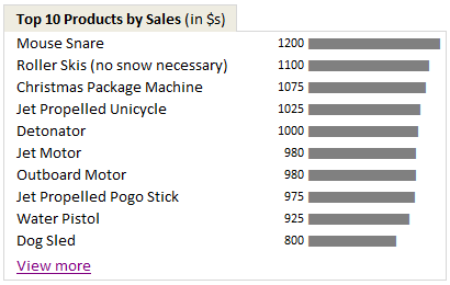
Showing Top 10 (or bottom 10) lists in a dashboard is a good way to achieve this (see below).
Today we will learn an interesting technique to do this in Excel.
Lets assume you are the owner of ACME inc. and you want to show the performance of your products in a dashboard. But since you hate clutter (and love Coyote, your lone customer), you want to show the top 10 products by sales & orders and give an option to drill down if someone is interested.
Lets say your data looks like this:

Now, follow these simple steps.
- Select your data & insert a pivot table (tutorial here).
- Use product as the row label & sales as the value for pivot table.
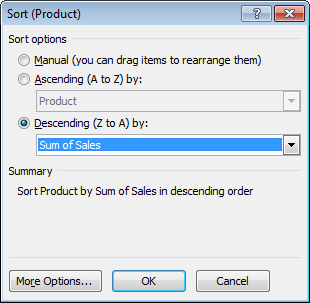
- Now, sort the products by descending order of sales – See this:
- Comeback to dashboard and point to first 10 rows of the pivot report using cell references.
- Type view more in a cell beneath the top 10 and press CTRL+K (this opens the hyperlink dialog box).
- Just point to cell A1 in your pivot report worksheet. Click OK.
- Now, if you click on the view more link, you will jump to pivot report instantly. Pretty neat, eh?
- That is all. Go sell some Mouse Snare or Iron Bird Seed. Mr. Wile is at the counter.
Advantages of this technique:
Ardent readers of chandoo.org or dashboard practitioners usually rely on a sort & scroll technique similar to the one we discussed in KPI Dashboards post. But as you can see, using formulas & form controls is a tedious process. If you want to filter your source data based on a criteria (say top products by sales where refund rate is more than 3%) then your formulas will be awfully long and complicated.
This is where pivot tables shine. They are easy to setup. You can sort & filter pivot tables in multiple ways & then link the output to dashboard tables (or charts) with ease.
Download Example Dashboard with top 10 tables
Click here to download the example dashboard with top 10 tables. This is a demonstrative file, not a real dashboard. So take it with a pinch of salt (or TNT if you fancy).
Do you show Top 10 values in Dashboards?
I use them all the time. You can see top 10 values in many of the dashboards I constructed or recommend. (here is 1,2,3). I think they are a great way to capture attention and encourage analysis. You can get top 10 values using either pivot tables like above or use formulas like large & small. You can even set up dynamic charts to show top 10 values. or use Conditional formatting to highlight top 10 values. I just love them.
What about you? Do you show top / bottom values in your dashboards? What techniques and ideas you follow. Please share using comments.
More Excel Dashboard Techniques:
- Display Alerts in Dashboards to catch user attention
- Budget vs. Actual charts in Dashboards
- Use shapes in Dashboards to make them effective
- More Excel Dashboard tips, tricks, templates & tutorials
Get Dashboard Training from Chandoo.org
I have made an hour long video training explaining how to construct Excel Dashboards using a recent dashboard I made as an example. If you work on dashboards, this is a good program for you. Click here to learn more.


11 Responses
I know you said that it wasn’t a real dashboard, but I really like your design. It was very simple, but that was the beauty. I also really liked the one from yesterday (the 10,000 comment article). Although this wasn’t the purpose of the post, I loved the way you created the in-cell charts using the REPT function. That’s something I was unaware of in the past, but will certainly be using now. Since I’m always concerned about efficiency and speed with regards to file size, load, and calculation time, how do these formula based “text” charts compare to actual bar charts (made to look similar)?
Oddly, being fairly proficient in Excel, I’ve never really used Pivot Charts. I feel like I’m missing something.
I have a dashboard where I show the top 5 budget expenditures for each month. It is dynamic, so users can change which month they are viewing. Each month, the expenditures must be re-ranked so my ranking formula must be linked to my named formula which selects the current month. I use this formula to dynamically rank the line items:
=SUM(1*((INDEX(CustServRankOperating,COUNTA($B$47:$B47),1)) < CustServRankOperating))+1 +IF(ROW(INDEX(CustServRankOperating,COUNTA($B$47:$B47),1)) - ROW(INDEX(CustServRankOperating,1,1)) = 0,0, SUM(1*(INDEX(CustServRankOperating,COUNTA($B$47:$B47),1) = OFFSET(INDEX(CustServRankOperating,1,1),0,0, INDEX(ROW(INDEX(CustServRankOperating,COUNTA($B$47:$B47),1)) - ROW(INDEX(CustServRankOperating,1,1))+1,1)-1,1))))
Awful, I know (I'm open to suggestions). The good thing is that this formula does break ties when two ranked items are tied (i.e. there are always several zeros).
Anyways, cool post, Chandoo!
Tom
I would think you could make a DSUM quite dynamic also without making the formulas horrendous. Nice way of doing it though. The main reason I shy away from pivot tables is the lag time when you have a large amount of data. I tried them at first and decided it just took too long to work with.
Nice concept, very easy to implement and can take your data presentation to the next level.
Thanks a Lot!
@Jon, thanks for your response. I can’t take any credit for that formula as I found it somewhere on the internets. Also, thanks for validating my aversion to Pivot Tables. I’m sure there is a time and place, but they just seem like a canned solution to data analysis which is limited by nature. Perhaps I just need to learn more about them…
@ Jon & Tom, I did not love Pivot Tables (PT) at all at the beginning, however when you start using this tool, you really can’t stop using them until you realize that PT have some downsides.
The biggest downside from my personal experience is that you need to ‘update’ it manually every time your raw data changes, I would love that Microsoft could include some trigger in future Excel versions to make an automatic update.
Second disadvantage is you can’t manage filters outside from PT, once you have set the filters, you can’t change them from your dashboard. It would be enormously nice if Microsoft could solve this issue.
My personal advise is, use PT, is a very powerful tool, and PT will show show you they are very useful.
Back to the tip: Topten solution is nice and easy, and could be for you the start of a love
relationship with Pivot Tables.
By the way, I mainly use PT to aggregate information, i.e.: aggregate inventory by model from different warehouses.
Regards,
cALi
cALi,
I’ve played with PTs for a while but for my application the time delay on refresh is not acceptable especially when I could get the same information with a DSUM with no noticeable delay. Since I’m working for myself I have have the time to create my own specialized formulas and class for reports and charts. But for those who need a quick solution pivot tables are definitely the solution.
My biggest gripe with them too is how finicky they are. One time I tried refreshing one and it wouldn’t refresh. I didn’t get down to the root problem, it might have just been that lost the connection to the data somehow (which resided on a different workbook).
I tried to use top ten values in an existing pivot table report, and was disappointed to find that the summary values relate only to the top ten. I needed the summary values to show the totals, averages, etc. for the entire population under discussion, so I had to create two separate pivot tables, one with the summaries, and one with the top tens.
And of course the controls had to be changed individually by the users for each table; they couldn’t change one table and have the other respond automatically.
@cALi – thanks for the feedback!
Hi Chandoo,
I am trying to use your method above but I want to use slicer as well. I am using cost centre report with monthly expenditure by supplier by cost centre. I have one pivot table for each cost centre in different worksheets. In my pivot table I have Supplier name in first column then the next is cost. I put the cost centre no & month in the report filter. Then I use slicer by month. So, if say oct 12 is selected, the data in pivot table show oct costs. What I want to do is use drop down arrow for month selection above the Top Ten spend (as per your aboove examples) and somehow link the result to pick up costs for the month selected from pivot table.
Every month I will add new month expenditure so the pivot table will have more columns.
If anyone can help, that would be appreciated.
Thanks
Hi Chandoo,
in my dashboard, I make a graphic showing the 5 best items of my pivot table, and the last item on the graphic is “All the rest”.
I can’t afford to do it automatically with the pivot table. Is there any way to achieve it ?
For the moment, I do it manually by copying the 5 first lines of my pivot table on another patrt of my spreadsheet, and calculate the last line of this new table with the difference between a GETPIVOTDATA formula and the sum of the 5 items above… My graphic is made from this table.
Example:
Initial Pivot table
Name Sales
John 150
Ann 137
Alan 131
Joe 107
Suzan 106
Mark 105
Jenny 100
Philip 93
TOTAL 929
And now what I want to get :
Name Sales
John 150
Ann 137
Alan 131
Joe 107
Suzan 106
Laa the rest 298
TOTAL 929