
Dynamic charts are like my favorite food, Mangoes. They tempt, tease and taste awesomely. In this post, we are going to learn how to create a dynamic chart using check boxes and formulas. Are you ready for some excel chart cooking?
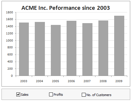
What our mouth-watering chart will look like when its done:
Ingredients:
Some data, Few check-boxes, IF formula and a dash of espresso
Instructions for preparation:
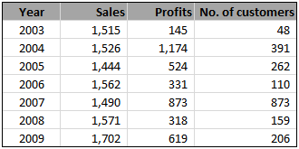
- First get your data. Make sure its clean and arranged neatly, like below, in the range B4:E11.
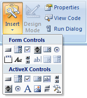
- Since our data has 3 series (sales, profits and number of customers), we will take 3 check boxes and place them somewhere on our worksheet.
Insert check boxes from developer ribbon / forms tool bar (tip: show developer ribbon in excel 2007)
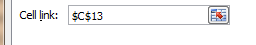
- Now, we want the check boxes to tell whether to show or hide a particular series of data in the chart. So, link each check box to one cell, say C13, D13 and E13.
- We will use IF formula to roast our data based on what the check boxes say. So, create a similar table and load it with IF formulas like this:
=IF(C$13,C4,NA())

- Finally, make a chart with the data in this new table you created.
- Put everything together and neatly arrange with your favorite colors and labels.
- Serve hot and see your boss drool.
Download the prepared chart:
You can download FREE dynamic chart template and serve it instantly.
More recipes on dynamic charts:
- Select & show one chart from many
- Make a chart that grows as you add data
- Dynamically group related events in a chart
- More Dynamic Charts
Do you use dynamic charts?
I like dynamic charts a lot. They provide a wealth of information in a compact form. I use them whenever possible, especially in dashboards and analytical outputs.
What about you? Do you use dynamic charts often? What techniques do you use when implementing dynamic charts? Share your experience and tips using comments.
http://chandoo.org/wp/2009/08/27/dynamic-event-grouping-in-charts/


19 Responses to “Free Invoice Template using Excel – Download”
Nice post! Invoicing for the small biz or solo entrepreneur is something I see a lot of interest in. Also there are great templates from http://office.microsoft.com/en-us/templates
This is awesome.
I would need a little more. e.g. say I generate a Inv. # 1 with all the details. Once done I can click a button all the relevant details gets stored in some table. Further, when i generate a new invoice those details gets stored in same table but just below the previous invoice.
Is their a way to do this?
I did create a solution you are looking for, however its wrapped in a larger 'Medical Scheduler' and it uses VBA, But you can Save, Update, Lookup, Email, Print & Apply Payments to the Invoice.
You are welcome to download it here:https://www.dropbox.com/s/2yvo0o2tgq9quhe/Medical_Massage_and_Salon_Application-Free.xlsm
The Invoice Items are created from the Appt. Types & Service Items table.
I would love all feedback from this
Thank you for sharing. I will definitely have a look at it.
Daily dose of Excel held a competition in 2005 for this same topic
It obtained 9 solutions which are shown:
http://dailydoseofexcel.com/archives/2005/10/27/invoice-app-the-results/
[…] http://chandoo.org/wp/2014/03/19/free-invoice-template/?utm_source=feedburner&utm_medium=email&a… […]
How can i removed Dollar Sign, As want to use this in india.
Please reply.
Also if possible then can i use Indian Rupee Sign and how?
Hi Chandoo,
Thanks for sharing this invoice template, Let me tell you this template will definitely help me since I got a process to handle where this invoice piece comes. Just a small doubt, can we store all the invoice details in PRODUCT & SERVICES sheet. So that whenever I select an invoice number from invoice sheet I can take print out and I can share it as well. Can we do that?? Since I will be dealing with this on monthly basis.
It would be great if you can help me with this.
Thanks in advance for your help!
Regards,
Gaurang Mhatre
Hi Chandoo,
I was thinking learning excel is quite tuff task but your blog proved me wrong. You made it very interesting. Thank you. Also the template you have provided for Invoice is very helpful to us.
Thanks thanks thanks.. Very helpful. 🙂
Hi i love the speadsheet but would like to ask how do i get it to add the description into the invoice as well
Hi Randy, I tried to download one of your link "https://www.dropbox.com/s/2yvo0o2tgq9quhe/Medical_Massage_and_Salon_Application-Free.xlsm" However, i found the link unavailable. Can you please help me get the new link or can you please send this VBA file on my Email-ID.
Hello Anuj,
Thanks for alerting me to the broken link. This one should work:
https://www.dropbox.com/s/gz89gshex1ad0ex/Medical_Massage_and_Salon_Application-Free.xlsm?dl=0
Please let me know if you have any questions.
Randy
Thank you so much Buddy. will check and revert you soon.
Hi, is there any chance that this can work with the "Products & Service" sheet outside of the Invoice sheet. I create multiple invoice files for the numerous clients. Updating the product sheet for each of them maybe a task. Hence, I want to create a MASTER FILE from which data can be picked up without having to insert new data in each of the invoice files.
Possible? Or am I asking for the moon 😉
Thank you so much for tutorial.
This example can be reviewed for the example of the advanced invoice that made with excel userform :https://youtu.be/Qr-4of-38DI
Good Day
i love this template may i ask if it could be modified to have the following
when you lookup a item code in the next column to the right it brings up the description then the quantity, unit cost, discount and then total otherwise i love the template
Item Code Description Quantity Unit Cost Discount Total
When creating an Invoice template in Excel are you able to utilize the auto row height and wrap feature when the cell is a merged cell? I need to have a number of cells merged together to allow for enough space to type in the description of work performed (lets say cells A-D are merged in each row) however it seems that I am unable to utilize the auto format feature. To work around this I have to manually increase the row height after each entry. Is there a better solution for this? Thank you!