
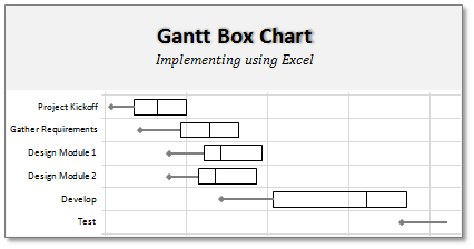
On Firday, we proposed a new chart for showing project plans. I chose an ugly name for it and called it Gantt Box Chart.
Essentially, a gantt box chart is what you get when a gantt chart and box plot go to a bar, get drunk and decide to make out. It shows the project plan like any other gantt chart, and it shows the distribution of activity end dates, like any other box plot.
You can see an example gantt box chart for a fictional software project above.
Today, we will learn how to create a similar chart in Excel. Get a steaming cup of coffee or whatever keeps you going and follow these simple steps to make a gantt box chart.
[Read this post if you want to know what GBC is and how to read it]
1. Set up your data:
Just like any other chart in excel, a gantt box chart too requires well structured data. In our case, we need 5 things.
- Activity name
- Start Date
- Best Case End Date
- Realistic (or Plan) End Date
- Worst Case End Date
Getting all the 3 variations of End dates can be tricky. But if you are managing projects for long, you might already know how to get these dates. Otherwise, here is one approach, proposed by Joel Spolsky, called as Evidence Based Scheduling that can help you.
We will also need 3 additional helper columns where we need to calculate some numbers so that our gantt box chart can be constructed without resorting to magic wands. These are,
- BC: Number of days between Start Date and Best Case End Date
- R: Number of days between Best Case End Date and Realistic Date
- W: Number of days between Realistic Date and Worst Case End Date

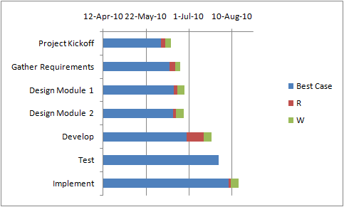
2. Create a Stacked Bar Chart
Add a new stacked bar chart. The series to be stacked are,
- Best case end date
- R
- W
Use the “Activity Name” column for category axis labels.
Now, our chart should look like:

3. Say your favorite curse word and Reverse the categories
 Ok, time for a minor annoyance. Excel has magically showed the first activity of project at bottom. So, we need to reverse the category axis values before any further.
Just select the category axis, go to format axis (press CTRL+1) and click the little box that says “order reverse in Categories”.
Now, the chart should look like this:
4. Add Error Bars to Best Case Series
Now, add error bars to the best case series of the chart so that it looks like a line is drawn connecting best case date to start date of each activity. To do that, follow these steps:
- Select “best case end date” series.
- Add Error Bars (from format ribbon)
- Specify the type of error bar as “Negative only”
- Select “Custom” for error bar values
- Now, point the error bar values to the helper column “BC”
- Format the error bar in such a way that no cap is shown and it is thick.
At this point, our gantt box chart should look like this:

5. Finally, format the chart
Now, our gantt box chart is almost ready. But it is still ugly. We need not hire a Hollywood grade make-up man to beautify this. We just need a few clicks.
- Remove legend
- Add vertical and horizontal grid lines. Make them subtle.
- Change text colors to soothing ones.
- Remove fills from all series in stacked bar chart.
- Apply borders to 2nd and 3rd series to create a box effect.
- Format the date axis,
- Adjust the starting point (unfortunately you have to enter the number equivalent of date, like 1-May-2010 as 40299)
- Adjust major unit – I used 14 days, you can try something else depending on overall project length.
- Set the axis number formatting to d-mmm or mmm or myy or something else that works for you.
- Add a chart title
That is all. Our Gantt Box Chart is finally ready. Now, go figure why your project is not on track and do something about it.

Displaying Completed Activities:
The easiest way to show completed activities is to change all 3 end dates to the same date: that of the actual end date. This way, you just see a line when an activity is done and a box when there are variations in end dates.
Of course, you can use another helper column to show a vertical line or a symbol of your choice to denote the end point as well. I leave it to you to figure out that portion.
Download the Gantt Box Chart Template:
I have prepared an excel template for creating Gantt Box Charts quickly. Go ahead and download the version that you want.
Excel 2007+ version | Excel 2003 version
Here is a mirror with both files as a zip. Go on, be awesome 🙂
Share your experiences of using Gantt Box Chart:
If you like this chart and implementing it in one of your projects, do tell me how it went. Or just share your thoughts on this implementation and any suggestions. Go ahead and share.
Templates & Tutorials on Project Management:
- Excel Gantt Chart Template
- Project Milestones – Timeline Template
- Project Status Dashboard Template
- More resources on using Excel for Project Management
Project Management Template Set – Get a copy today
I have made a set of 24 templates that take care of various activities in a project right from planning to time sheets to issues to project status reporting thru dashboards. These templates have been bought by more than 500 project managers all over the world and they are saving hours of time every week using these templates.
Go ahead and a get a copy of my project management templates.


13 Responses
Hi Chandoo
As one of your students I have followed your detailed example through with great success. However, Excel is acting in an unexpected way and I wonder if you could take a look?
http://cid-95d070c79aef808e.office.live.com/self.aspx/.Public/Gantt%20Box%20Chart.xlsm
On my version, I have to type 40239 (Which equates to 2 Mar 2010) to get the chart to display 31 May 2010 (which should be 40329)!!??
Have I done something wrong or is Excel acting up?
Thx
Oli
PS Your example file in 2007 displays correctly.
Hi,
I like this idea a lot, but I agree the name is a little drab.
As an American I may just be seeing things, but to me the combination of lines and bars on your chart looks like a bunch of cricket bats.
Maybe you could work that into a catchier name. 🙂
Cheers!
Here is some code I use to keep the axis synched.
It may be useful to some of your readers
It is based on a comment I saw on Daily Dose of Excel.
Function SynchGanttAxis(Cname, lower, upper)
‘Sets the X min and X max for Category axis
Application.Volatile
On Error Resume Next
‘
‘Top Horizontal Axis
With ActiveSheet.Shapes(Cname).Chart.Axes(xlCategory, 1)
.MinimumScale = lower
.MaximumScale = upper
End With
‘Bottom Horizontal Axis
With ActiveSheet.Shapes(Cname).Chart.Axes(xlValue, 2)
.MinimumScale = lower
.MaximumScale = upper
End With
End Function
Function SynchVerticalAxis(Cname, lower, upper)
Application.Volatile
On Error Resume Next
‘ Excel 2007 only
‘Right hand vertical axis
With ActiveSheet.Shapes(Cname).Chart.Axes(xlValue, 1)
.MinimumScale = 0
.MaximumScale = upper
End With
End Function
@Oli.. Can you check your file again.. I see 40329…
@Dave: Even I saw things.. the bars actually looked like lollipops. How about calling this lollipop chart – now that would be yummy and goes along the tradition of naming charts after eatables (bar, pie, donut…)
@Bob: Superb stuff… thanks for sharing 🙂
Hi Chandoo
This looks really good and I think it can also be applied to show project phases / milestones.
Question: Thinking further could this be amended to display a project lifecycle (Idea through to Implementation say 7 phases) on one bar / row? Just imagine 20 projects within a programme all on one chart one bar each showing their respective lifecycle stages i.e. on one page.
Idea: As the Gantt Box Chart this is quite intensive to set up re formatting etc how about the added extra of once you have completed this to “Save as template” i.e. saves the formatting and layout of the chart as a template so you can apply to future charts. Simple to do and will save the time formatting etc again and again and again.
Therefore tip: Click on your chart demo and then click on Save As template icon (2007) – edit file name and click on save. Ready to use / apply via Templates in Change Chart Type window.
Thanks and be very interested if the lifecycle question can be resolved
Mike
How embarrassing.
I was obviously suffering from numerical dyslexia. I was one of those days.
@Mike H: You can easily make this chart to work like a generic project lifecycle plan chart. All you have to do is,
1. in a separate sheet define the steps of lifecycle and various dates in a table (with 5 columns for each of the projects you have).
2. now use a control cell to input the project name you want to show in the chart
3. based on the input, use OFFSET Formulas to get the correct data
4. Rest is same as the tutorial above
For more info on the dynamic charting visit http://chandoo.org/wp/tag/dynamic-charts/ and http://chandoo.org/wp?s=OFFSET
Your solution is really smart but in the en Excel isn’t meant to do stuff like this. I, as a former PM, always thought is was frustrating that you had to do stuff like this for something simple like a Gantt chart. So I built Tom’s Planner. And would like to plug it here. I think it really solves the problem you are trying to solve in the most efficient way. Check out http://www.tomsplanner.com for a free account or play around with the demo.
Hi there,
Chandoo – this is really a very nice and helpfull chart – I adopted it, so I can report a forecast or the delay of a certain task (coming from my role as an auditor for projects).
One topic I´m currently struggeling with: I do have a project lasting for lets say 12 month. For a management reporting, I want to have kind of snapshot, lets say one month back and 2 month in the future. I tried with the offset formula, but failed. Any idea?
Thx
Lopi
Hi Chandoo – fantastic xls. One thing I can’t figure out how to do is adjust the alignment of the vertical axis. I would like to left align so that I could indent to represent sub tasks. Can that be done? Or is there a better way?
I’ve been trying to work out if there’s a way to show weekends on the graph. The closest thing I’ve got is to add them on a secondary axis, but then I haven’t been able to keep both axis lined up together! Any ideas?
Following on from this – is it possible to show things like holidays?