
Comparison of lists of data is something that we do all the time. Today, lets learn a few tricks that you can apply immediately to compare 2 lists using Excel.
This post discusses how to compare two lists with formula based rules. If you just want to quickly highlight common values, click here.
If you want to compare two tables (based on multiple columns), see this.
We will learn how to compare 2 lists of data in 3 + 1 different ways. (click on links to jump to that section of post)
- Highlight items that are only in first list
- Highlight items that are only in second list
- Highlight items that are in both lists
- Search and highlight matches in both lists – Home Work
Understanding the Comparison Logic:
Whenever you compare 2 sets of values, there are 3 possibilities, as shown in the illustration below:
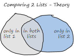
Apart from looking like circles drawn by hulk with a crayon, these circles show important concepts of set theory in simplest form.
[there is a fourth possibility of a value not being in either lists, we omit that for now]
What you need to compare 2 lists?
1. Of course, you need 2 lists of data. But, just to make formulas simpler and easier to read, lets name the 2 lists as lst1 and lst2.
Lets assume your data looks like this:

2. Also, you should know how to use COUNTIFS Excel Formula, it is so awesome, I wonder why MS hasn’t called it MAGIC() ?
So in order to find-out if a value is in list 1 only, we use a formula like =COUNTIFS(lst2,value)=0.
This checks whether “value” occurs anywhere in lst2 and returns false if that is the case. (it assumes that value is already in lst1).
Highlighting Items that are in First List Only

 Select values in first list (assuming the values are in
 B21:B29)- Go to conditional formatting > add rule (related: conditional formatting basics)
- Select the rule type as “formula”
- Write a rule like this:
=COUNTIFS(lst2, B21)=0 - Double check the reference and make sure it is relative (and not like $B$21). Select the reference and press F4 repeatedly to change it to relative reference
- Set the formatting you want.
- Click ok.
- All done. You should see values only in first list highlighted.
Highlighting Items that are in Second List Only

- Select values in second list (assuming the values are in
C21:C28) - Go to conditional formatting > add rule (related: conditional formatting basics)
- Select the rule type as “formula”
- Write a rule like this:
=COUNTIF(lst1, C21)=0 - Repeat steps 5-8 as above.
Highlighting Values in Both Lists:

Now, it gets interesting as you should apply conditional formatting individually to both lists.
- Select values in first list (assuming the values are in
B21:B29) - Set the conditional formatting rule as
=COUNTIF(lst2,B21)>0 - Apply formatting as you want.
- Now select second list (assuming the values are in
C21:C28) - Set the conditional formatting rule as
=COUNTIF(lst1,C21)>0 - Again, apply formatting as you want.
- That is all.
Searching for a value and Highlighting Matched Items in Both Lists – Your Homework:
This is another common thing we do. We want to find-out a given value (say in A1) is in the both lists, first list or second list and highlight all the matches. Like this:

Of course, doing this is very straightforward in Excel once you understand the above 3 things. So I am leaving this as your home work.
Go ahead, figure this out, practice it on a workbook. When you are satisfied with your result, post the answers here. Discuss!
Download Example Workbook on Comparing 2 Lists in Excel:
Go ahead and download the example workbook on comparing 2 lists in excel. [download from mirror]
It also contains the answer to homework above. Play with it and become comparison ninja.
How do you compare lists in Excel?
I often have to compare values in multiple lists (for eg. customers of one product vs. another, defect status this month vs. last month etc.). I use formulas to compare with-in table. And if I want to highlight the matches, I use CF.
What about you? How do you compare lists of values in Excel? What formulas do you use? Please share your techniques and tips using comments.


112 Responses
I use a similar formula to check for duplicates in a column
=COUNTIF(list3,A1)>1
The following is a link to a VBA file from Daily Dose of Excel for comparing 2 lists
http://www.dailydoseofexcel.com/archives/2010/05/27/comparing-two-lists/
cheers
Kanti
great post, as always !!
here’s a twist: what if I wanted to create a validation list on the home work example, using a single list containing the unique values from both lists? How do I do that?
Rgds,
Martin
Hi Chandoo,
The Home Work is pretty simple after the above tutorial…
Just add conditional formatting and use the Find function…
=FIND($E$3,A1,1)>0 (case sensitive)
==SEARCH($E$3,A1,1) (non-case sensitive
assuming, the search value was in E3. and the data list start from A1
now copy and paste the Formats to the other cells and on every change in the search string will highlight all the matching items…
~Vijay
Can u Explain how to searched a value matched items in both list, i tried many times but i cant sort it out
Can you send me the file that has this conditional formatting with the find function. TY
Something I would consider is looking at all unique values for both lists,which would be the compliment of customers in both lists.
When you compare two sets of values, as your Venn diagram shows, there are four possibilities:
1) Only in List 1
2) Only in List 2
3) In Both Lists
4) Not in Both Lists (the mathematical compliment to 3)
Very good post. I’ve never considered using CF in this way but can see the possibilities. Comparing tables I will usually uses vlookup or index/match.
@Martin.. I have a post coming up on this shortly (give it a week :D)
but here is the general approach –
(1) create an aggregated list in a helper column from lst1, lst2 (use if formulas, counta() and rows() )
(2) now get rid of duplicates from this (here is a tutorial: http://chandoo.org/wp/2008/11/06/unique-duplicate-missing-items-excel-help/ )
(3) assign a name to the list of uniques
(4) finally make all this dynamic using dynamic named ranges (tutorial: http://chandoo.org/wp/2009/10/15/dynamic-chart-data-series/ )
1)DUPLICATES COMPARING IN TWO LISTS IS OK FOR A SMALL AMOUNT OF DATA.
2)FOR A LARGE AMOUNT OF DATA(LIKE 1 LAKH OR ABOVE) IT IS GETTING STRUCK…..IS THERE THERE ANYWAY OR METHOD TO STOP IT AND GET RESULTS IN COUPLE OF MINUTES.
~~THANK YOU CHANDOO……….GARU……..~~
“How do you compare lists of values in Excel”
I just use formulas as criteria in Advanced Filter
The quickest way to find all about two lists is to select them both and them click on Conditional Formatting -> Highlight cells rules -> Duplicate Values (Excel 2007). The result is that it highlights in both lists the values that ARE the same. Then in one list non-highlighted are values that are not present in the second list, and opposite for the second list. I think it is sell “geeky”, but it gets job done very very quickly when you don’t want to mess around.
Hi Artem..you method for comparing lists are really fantastic..That helped me to solve my critical problem.Thank you very much
This was exactly what I needed!!! Thank you so much!
Tried this as a reconciliation tool but it fails as it also highlighted the number if duplicated in the first list e.g if 2.8 appears twice in list one it is highlighted although not appearing in list two.
@Artem.. wow, that is cool. Why didnt I think of it.. ?!?
Using Become a Comparison Ninja – Compare 2 Lists in Excel and Highlight Matches topic, how do I compare data that is non identical. Example US Telepacific Co vs U.S. Telepacific Company. and sometimes I will have the parent’s company name like Brenntag North America Inc vs Coastal Chemical Co (this being the same company). Can I email you my data so you can give me the most efficient way to do this? I’ve tried =IF((LEFT(A1,3))=(LEFT(D1,3)),TRUE,FALSE) which will compare the first three characters and then I will “eyeball” the rest to match them up. I have tried vlookups to match the information. Is there another way to do this?
Is there a way to compare non identical data. For example Saint Louis United States vs. St. Louis USA. Column A contains the name of an asset and Column B contains the facility name. In other instances we’ll have the parent company name ex: Brenntag North America Inc vs Coastal Chemical Co LLC (those two are the same co but the master file has a different name) Is there a formula I can use that can make the comparison in excel. Besides, a vlookup function or comparing the the first characters of the name and eyeballing the rest. Is there a more efficient to do it. Can I email you a data sample of what I’m talking about? Thank you,
@Fernando.. you mean compare but do not highlight if cell values are synonymous? now that is an interesting problem.. let me think about it and get back to you..
Hi there, I noticed that usisng the solution you provided, for Beth (for instance) it highlights even Elisabeth (because having the part “beth” in it I guess) using the following conditional format =AND($B$4″”;COUNTIF(B8;$B$4))
instead of the original one i.e: =AND($B$4″”;COUNTIF(B8;”*”&$B$4&”*”))
gave the result shown on your page (this one!)
Hope it was helpful
cheers!
Kader
You can do the same using simple boolean operators in lieu of COUNTIF
Highlighting Items that are in First List Only:
=AND(valuelst2) [entered into the conditional formatting for list 1]
Highlighting Items that are in Second List Only:
=AND(valuelst1) [entered into the conditional formatting for list 2]
Highlighting Values in Both Lists:
=OR(value=lst2) [entered into the conditional formatting for list 1]
=OR(value=lst1)} [entered into the conditional formatting for list 2]
This method (like COUNTIF) finds exact matches only. To highlight the partial matches like your .gif file demonstrates for the homework, SEARCH or FIND as suggested by Vijay is the best solution I think. I don’t run 2007, so the Duplicate Values to me is not useful.
Hi Tim.
Thanks for the tip. I’m very new to excel and was just wondering do you know how to make excel highlight the duplicate cells concurrently? As per chandoo’s GIF. Thanks!
– Chern
The comment engine removed my not equal sign, so replace “not=” with the appropriate symbol and the following should work.
You can do the same using simple boolean operators in lieu of COUNTIF
Highlighting Items that are in First List Only:
=AND(value not= lst2) [entered into the conditional formatting for list 1]
Highlighting Items that are in Second List Only:
=AND(value not= lst1) [entered into the conditional formatting for list 2]
Highlighting Values in Both Lists:
=OR(value=lst2) [entered into the conditional formatting for list 1]
=OR(value=lst1) [entered into the conditional formatting for list 2]
This method (like COUNTIF) finds exact matches only. To highlight the partial matches like your .gif file demonstrates for the homework, SEARCH or FIND as suggested by Vijay is the best solution I think. I don’t run 2007, so the Duplicate Values to me is not useful.
Hi Chandoo,
I’ve been following your blog for the past few days (only recently started using an RSS reader !)…
I’ve made a small improvement to your search-n-compare in 2-lists conditional formatting trick.
1. In a separate cell (E1), the user can select ‘Exact’ or ‘Partial’ to match the search text.
2. Based on this selection, the conditional format will display cells which match exactly or partially.
A screen-shot of this setting can be viewed/ downloaded at :
http://docs.google.com/leaf?id=0B-rjqFlfGuBoYWI4ZTBlYWMtNWIzZC00MzI1LWE4ODgtNzRjZGQ0NWY1MDg2&sort=name&layout=list&num=50
I’ve added this as a new sheet in your file itself.
If you want, I can email the file to you for sharing with the rest of us.
Cheers!
Khushnood
Mumbai
Hello,
I need help with a formula. I’ve got two spreadsheets of data. I need a formula that will look at both lists and find a match of the product number (C2:C400), and if it does match then it will look at the product price (E2:E400) for a match. I don’t care what value is returned for the matches.
Thank you so much. rmal
If u display the steps with the picture that will be more easy to learn.
Nice Excel icon on your home page for this blog 😉
Hi dear
i am also a professional trainer of Ms Excel do you share your experince with me
Chandoo,
@fernando and @Chandoo in regards to comparing lists that are similar but not exact – i have run across problems on a massive scale and “eyeballing” the matches becomes impossible.
For example – imagine a list of all professors at a university: names come in many formats with middle initials, two middle initials, PhDs, MDs, and various other issues. The text document is then split out via “text to columns” and I have little confidence that i can pull last names or first names out accurately.
I have to then compare those professors to lists of various professional organizations that they may be affiliated with their own unique lists that may or may not match my professors names 1 to 1. This exercise could be used to see how large the universities network has grown.
The methodology i have used starts with finding last names and concatenating a first initial (eg SmithP for Peter Smith). Then try the same method with the lists of professional organizations and attempt to match.
Can you think about more efficient ways to compare non-exact data? Or is Excel not the right tool for this job?
@Cole… Interesting question.
I generally use a fuzzy match algorithm in cases where I need to match values that have spelling mistakes, extra spaces etc. Use the below UDF in your conditional formatting and you should be able to solve good portion of the problem.
http://chandoo.org/wp/2008/09/25/handling-spelling-mistakes-in-excel-fuzzy-search/
How do you compare a list of named ranges? For instance if I have named the range [=Sheet8!$D$2:$F$1339] NEW and named the range [=Sheet8!$A$2:$C$239] ORIGINAL, and I want to show which rows do not exist in the original?
lst1, lst2??? I have 2 columns of data. How do I tell Excel which column is lst1 or lst2??? This does not help me.
@Eric where they have used Lst1 put your range in eg: A1:A20
Or you can name the ranges as well
@ Eric: Highlight the 1st list and right click and pick “Name a Range”, thats how Chandoo has defined Lst1 and Lst2.
@ Eric – hope you have for your answer ! If no then :
You need to name the lists to help Exel identify thesame, for this-
1. select the list to be named
2. Name the list by typing say “list1” in the name box
3. Name box is the a space which displays the cell address ( top left before the “fx” formula bar.)
Any idea how to tweak this to accommodate wildcard (*) searches? For example, I have one large list of company descriptions:
-Fire Damage Restoration
-Fire Damage
-Fire Damage Repiar (spelling mistake purposeful)
-Fire Damage Repair
-Fire Prevention
-Fire Prevention Services
I need to filter the above list for a smaller, but broader set of titles, such as:
-Fire Damage*
-Fire Repair*
But not:
-Fire Prevention
-Fire Prevention Services
But the COUNTIF function doesn’t seem to like wildcard words if the wildcard is in another list. Any ideas?
You’re hairdo is magical.
Your Hairdo is magical, ahh gramar
How do I make this same functionality work across sheets? We enter billing by month (each month has a tab) and want to highlight if we receive an invoice more than once. So say I title my lists Jan, Feb, March and so on. Can I create a formula to highlight an invoice number as soon as I type it into the March sheet if it’s in the January sheet also?
I’d appreciate any help with this!
Hi Chandoo,
I have question we can highlight same value in 2 coloumn, but in example if column a have 3time 101, 101, 101, and colomn b have only 1 time 101. So if i use conditional formetting it highlight all four cells but if i want 1 from a and 1 from b only means howmany times in column a that only time in coloum b should be highlighted how that possible ??? … pls. advice me
How to Compare two Data in Excel 2007 with VLOOKUP
How can I compare Column A with Column B and Column C and smallest of the 3 in Column D.
Assume they are in the same ROW. Please advise
@Soon
In D2 put =Min(A2:C2)
Copy down
Thanks! I have never found anything as simple as this even in MS tutorials! Saved my day 🙂
Hi All,
Need help, i have to generate reports weekly and do comparison between last weeks report vs today’s report to know what changes/progress have been happend in recent week.
Hi all,
Really struggling with this conundrum…
I have to do a comparison between to sets of staff lists, where name that are highlighting in the first list who do not appear in the second list have left the firm, and people highlighting in the second list who do not appear in the first are new arrivals.
To further muddy the issue, when I say ‘list’, what I actually have is one column for 1st names and another for surnames in both instances.
IE: C(First Name), D(Surname); then H(First Name), I(Surname)
With many thanks in advance…
N
I’ve successfully used the =COUNTIF(Lst1,A21) formula originally described above to great success either in conjunction with conditional formatting (=COUNTIF(Lst1,A21)>0) or stand alone =COUNTIF(Lst1,A21).
When using the =COUNTIF(Lst1,A21) formula I get two read-outs in my cell:
‘0’ if my data point A21 is NOT present in Lst1
and
‘1’ if my data point A21 IS present in Lst1.
What would like to do is have the read out to be a defined text value. For example:
‘Present’ if my data point A21 is NOT present in Lst1
and
‘Absent’ if my data point A21 IS present in Lst1.
Does anyone have any ideas.
Cheers
Mark A
Please help me figure this out: I have 2 separate lists.
List 1 has a Column with Serial Numbers, Computer Names, and others; List 2 has a Column with Serial Numbers and associated Asset #s. I need to match each SN in List 1 to SN in List 2 and return the Associated Asset# that matches that SN into List 1. In Short, FIND exact SN from List 1 in List 2, return Asset #from LIst 2.
Thanks
If you’re using Excel ’07 or ’10, you can use the VLOOKUP function for that.
=VLOOKUP([sn_cell], ref_cells, colnum_with_asset#s, FALSE)
Say you have this data:
A B C D E F
1 Compname SerialNo AssetTag SerialNo AssetTag
2 —————————————————————————-
3 JOHNDOE 123456 112233 ABC123
4 JANEDOE 112233 223344 XYZ987
5 JOESDOE 223344 123456 QWR678
In C3 you would enter =VLOOKUP(B2, $E$3:$F$5, 2, FALSE) and then copy it down through the rest of the cells in Column C.
I’ve been trying to figure out how to do this in excel for AGES! Seriously! I think I’m going to put together a sweet spreadsheet evaluating the pros and cons of all the different mold removal services that I can find to experiment. My bathroom is crazy gross lately, so it will be a good way to push me towards getting something done about it…
Love your site and formuals.. Very helpful. I need to do excatly what you described in the beginning: Compare to columns with data and highlight the ones that are matchs in both columns; the twist is, i need to have the non matches deleted from both columns.
Hi Lawrence.. thanks for your love and support.
You can do this with VBA. To know the basics, visit http://chandoo.org/wp/excel-vba/
I have three lists:
Customer System Name System Invoice
John Smith John A. Smith #123 123.00
Sam Smith Smith, Sam 55.25
and so on… I need to compare the first list (225 entries) with the second (6450 entries) and return the Invoice number that corresponds with the first list .
I am not sure I understand this data. Can you email a sample file to chandoo.d @ gmail.com so that we can help?
I have the same issue as Fernando. I found this site when doing a google search. I have two lists – both of just the company name (so there is no other data to compare). I need to find out which ones are duplicates but the tricky part is that they may not be an exact match. For example, list one may have “Global Company Inc.” and list two may have “Global Co.” – Is there a way to note if the names are similar? I usually use =If(Countif(A$2;A$1099,A2)>1,”DUP”,””) to find duplicates without deleting them but it only works for exact matches.
Dear Chandu,
My salesman from other city sends me an excel sheet on daily sales update. The excel sheet has 31 rows for each date and he enters his sales for the day in the row as per the date. I want that while he is sending me the data for today, he should not be able to edit/change the previous day figures (rows). How can I do it ?
Is “lst1” the name of the worksheet? I have 2 worksheets, 1 list on each, and I’m trying to identify duplicate entries. Could anyone offer input on how to format this? Many thanks.
@JP
Chandoo has written several posts on the subject
Type Duplicate into the Google Search Box at the top right of the screen
Pivot tables are a great way to compare two or more lists.
Combine the two lists into one contiguous block. Create another column (titled Source) and identify which which list the row came from; ie. lst1, lst2, …
Create the pivot table with the Source field on the top and the field to be compared along the side. Using the “magic” filter function, you can quick sort out matching or non-matching rows.
Hi Chandoo.
I want to compare the two lists cell by cell.
Ex.
List-1 List-2
a c
b b
c e
d d
I want to find number of cells in list-1 matching with its corresponding cells in list-2.
In above example i want to compare A2 with B2, A3 with B3 and so on.
That means in the example above it should return me 2.
I haven’t surfed your site yet, but looks very interesting, i’ll surf more often.
Thanks.
can anyone help me to match 2 colum of serial number in excel 2003 please thanks,
Piyush,
You can use the MATCH function to accomplish what you want. In Column C, (or where ever) you would enter =MATCH($A1,$B$1:$B$10000,0). C1 would result in #N/A if the value was not found, Otherwise it would return the position of the matching value.
If you are simply looking to check if a value in Column A is located within the list of values in Column B, you can do something like this:
=IF(MATCH($A1,$B$1:$B$10000,0),”Found”,”Not Found”)
— Matt
Hi, I am new to the Excell and my question is possibly has been asked before (if that’s the case, i do apologise). I have a problem with matching a data in two lists. One list contains the product code in one column and product description in another column. The other list contains the product code and other data (3 or more extra columns) but no product description. How can I merge both lists so the second list then contains the product description as well (matched to the appropriate product code). Mind you, both lists are not identical in size and the second list does not contain all product codes. Thank you for your assistance.
AG,
If you are using Excel ’07 or above, you can use the VLOOKUP function to add the description from List_1 to a column in List_2.
=VLOOKUP(<List2_ProductID_Cell_Ref>, <List1_First_Cell_ProductID> : <List1_Last_Cell_ProductDesc>, 2, FALSE)
This looks up the ProductID from List_2 and reports back the Description from List_1.
Thank you Matt for your reply. I have tried to play with this code, but being very new to this business of Excell, I have trouble to implement it correctly. Can someone please provide me with step by step description of how to insert it into the worksheet to make it work? I am using Excell 2010. Cheers, AG.
OK, let’s see if this helps. Let’s say you have copied your two lists onto the same sheet, so that they look something like these:
LIST_1
____A____|_______B_______|
1|_ITEM__|_____DESC_____|
2|_RWGN_|_Red Wagon___|
3|_BWGN_|_Blue Wagon___|
4|_GWGN_|_Green Wagon_|
LIST_2
____J____|____K____|__L__| _____M_____|
1|_ITEM__|_PRICE__|_LOC_|_SHIPPING _|
2|_BWGN_|_$10.00_|__1___|_____$5.00_|
3|_GWGN_|_$12.00_|__2___|_____$5.00_|
4|_RWGN_|_$15.00_|__1___|____$10.00_|
If you wanted to add the description into LIST_2 from LIST_1, you would enter the following formula into the corresponding CELLs:
N2: =VLOOKUP(J2, $A$2:$B$4, 2, FALSE)
N3: =VLOOKUP(J3, $A$2:$B$4, 2, FALSE)
N4: =VLOOKUP(J4, $A$2:$B$4, 2, FALSE)
And the result would end up looking like this:
____J____|____K____|__L__| _____M_____|_______N_______|
1|_ITEM__|_PRICE__|_LOC_|_SHIPPING _|_____DESC_____|
2|_BWGN_|_$10.00_|__1___|_____$5.00_|_Blue Wagon___|
3|_GWGN_|_$12.00_|__2___|_____$5.00_|_Green Wagon_|
4|_RWGN_|_$15.00_|__1___|____$10.00_|_Red Wagon___|
If your two lists are on different sheets or even in different workbooks, you would just point the lookup_array $A$2:$B$4 to the correct location for List_1. Just make sure you make them specific instead of relative by adding the $ in the lookup_array cell references. Otherwise, as you copy the formula down (in a large list), it will change the lookup_array location as you copy the formula down into the other cells.
I have data in excel which reads like this
Account Number & Balance as per actuals.
Account NUmber & Balance as per software.
Now if i want to compare data and find out only those account numbers where balances are not matching or the uncommon ones.
At the moment we do this manually, but i am sure this can be automated.
Please help
Just to explain the problem better
say the account numbers refer to the Family account number and have multiple members in the family with different balances as per my software and as per bank.
All techniques presented here are good, but it’s lengthy and it requires some thinking. I Googled and found the web site below offers several Excel programs that can do the same at lightning speed, and it does all the hard work for you at a touch of a button.
http://www.excelville.com/profile/Excel-Power-Utilities
In this web site, I found the following programs are extremely helpful:
1/ Synchronized Excel Workbooks Comparison
2/ Find Delete Duplicate Rows
Take a look, and I hope you find what you are looking for.
Excel 07/10 have a “Remove Duplicates” function under the data tab. All of those NOT FREE pages are only for Excel 2003.
Even though it said Excel 2003, but in the description of the “Synchronized Excel Workbooks Comparison,” it said “the program has been tested under Excel 2000 through Excel 2010, and it all worked as expected.”
I bought the program and tried it out using my Excel 2010 at work, it performed beautifully as expected, and I saved many many hours of tedious work! My worksheets at work have too much data, and it would be impossible if if I have to do the comparison manually.
I also tried out the “Find Delete Duplicate Rows” program, and again, it worked for Excel 2010 too. I think maybe the programs were developed using an older version of Excel, but with the new versions in mind, and that’s why it worked for older and newer versions.
In a way, I believe developing these programs using an older version, but make them also work for newer versions is even better, because Excel 2010 can open an Excel file of older version, but not the other way around. Another word, if someone has only Excel 2000, he or she cannot open/use the comparison program if it were developed using Excel 2010. So, this way, users with old or new Excel version can use the same program!
Hai,
I want to compare two clumns, consedering one column is standard and the another column is to check with that statard column and i want to highlight the another column with color. pls help to get the problem solved.
Thanks and regards,
Praveen
If you are using Excel 2007/2010, you can use conditional formatting to highlight the Matched cells. In the example below, Column C contains your lookup formulas (i.e., =IF(MATCH($B1,$A$1:$A$10000,0),”*”,””)). Then you would highlight Column C and choose your conditional formatting (Home tab) to only highlight the cells that contained an asterisk (*).
_*_|__A__|__B__|_C_
_1_|_abc_|_www_|___|
_2_|_cde_|_xyz_|_*_|
_3_|_fgh_|_def_|___|
_4_|_xyz_|_cde_|_*_|
Hello – I have succesfully used the countif function in the past for comparing lists, but am running into some issues wher I cannot figure out why the countif function is not finding matches. Using the Conditional Formatting trick above is way cool, but did not work either, so I have to assume it is something in the values.
I ahve tried forcing the formats to be the same with the function text(value,”0000000000″) but that did not work.
Here are the trick values that just don’t want to find each other:
125M-2FA
125M-3FA
150M-2FA
150M-3FA
150M-5FA
200M-5FA
200M-71/2FA
2C100PE
CT05FAB
2C100
But 2C150 does work – don’t get it!
Thanks – Jeff
Here is the comparison list values that are not wroking – they look identical, but can’t find each other, unless I manually retype them over replacing whatever formatting issue they were having.
One list came from an excel sheet, the other from a copied PDF file, with paste special as values
125M?2FA
125M?3FA
150M?2FA
150M?3FA
150M?5FA
200M?3FA
200M?5FA
200M?71/2FA
CT05FAB
2C100
-Jeff
Here’s a quick solution: I put your first list in Col A and the second in Col C (so you have reference in the formula), and then the formula in Col F.
I simply had it lookup the value and return it if it was found.
=IF(NOT(ISERR(FIND(“-“,A1))),VLOOKUP(REPLACE(A1,FIND(“-“,A1),1,”?”),C$1:C$10,1,FALSE),VLOOKUP(A1,C$1:C$10,1,FALSE))
It basically states that IF the formula FINDs “-” in the ref cell, to do a VLOOKUP of the value, REPLACEing the “-” with a “?” when it looks it up. If it doesn’t find “-” then it does a VLOOKUP for the unmodified cell value.
So,
125M-2FA = 125M?2FA
125M-3FA = 125M?3FA
150M-2FA = 150M?2FA
150M-3FA = 150M?3FA
150M-5FA = 150M?5FA
200M-5FA = 200M?5FA
200M-71/2FA = 200M?71/2FA
2C100PE = #N/A
CT05FAB = CT05FAB
2C100 = 2C100
Matt,
Thanks for the response.
I just noticed the “?” in the second list, it actually appeared as a “-” when it was in excel, but must have actuall been a different character so when I pasted it into the reply the “?”. Came up.
The second list came from copying tables out of an Adobe PDF document. So that is why I beleive the issue to a formatting rather than formula problem.
Any thoughts on why the 2C100 would not always find the 2C100? That is what confused me the most. (yet it would succusfuly compare the 2C150 to a 2C150)/ The only way I got it to matach was by typing over the “2” in the second data set “2C100”. Obviously not a solution for comparing large data sets.
Best Regards – Jeff
The 2C100 was finding the identical match. It was the 2C100PE that turned up N/A. I didn’t account for that in the formula. You could just add another nested IF statement to account for extra characters at the end if it’s going to be relatively patternistic.
You may want to check out this Fuzzy Search add-in. I may solve the problem: http://www.microsoft.com/en-us/download/details.aspx?id=15011
Hi friends,
We can use vlookup to compare two lists. If you want to search the existence of one list in another list, write vlookup function after the bigger list and select the smaller list as the table array. And drag up to the end of bigger list so that we get the values in the smaller list in the respective position and rest of the cells shows #N/A error.If your bigger list is A2:A95 and smaller list is C2:C9 then,
Here is the formula:
VLOOKUP(A2,$C$2:$C$9,1,0)
This is a simple method if you want to filter out a list of records from a big database
Just try this guys..
Actually, you don’t need to write ANY formulas in order to compare two lists. Select the two lists as separate ranges (hold down Ctrl.), go into Conditional Formatting, Highlight Cells Rules, Duplicate Values, and change “Duplicate” to “Unique”. Select your formatting colours and OK. Voila! The items which are different in both lists are highlighted…i.e. the highlighted items in list 2 are those which do not exist in List 1, and vice versa. Sorry if somebody has already pointed this out…I don’t have time to read all the replies at the moment!
Andy.
Hi,
I need a help,I am trying to compare two sheets with reports of different environment say dev and prod,i will have two columns matching in both list,I have to pick exactly matching records(i.e first and third column match) and fetch the matching records one after another in new sheet to get the average time taken in dev and prod.I am trying with macro but still i am getting unformatted result.can you help me on this?
Sub Compare()
‘ Macro1 Macro
‘ compare two different worksheets in the active workbook
CompareWorksheets Worksheets(“Sheet1”), Worksheets(“Sheet2”)
End Sub
Sub CompareWorksheets(ws1 As Worksheet, ws2 As Worksheet)
Dim dupRow As Boolean
Dim r As Long, c As Integer, m As Integer, k As Integer
Dim lr1 As Long, lr2 As Long, lc1 As Integer, lc2 As Integer, lr3 As Long
Dim maxR As Long, maxC As Integer, cf1 As String, cf2 As String
Dim dupCount As Long
Application.ScreenUpdating = False
Application.StatusBar = “Creating the report…”
Application.DisplayAlerts = True
With ws1.UsedRange
lr1 = .Rows.Count
lc1 = .Columns.Count
End With
With ws2.UsedRange
lr2 = .Rows.Count
lc2 = .Columns.Count
End With
maxR = lr1
maxC = lc1
If maxR < lr2 Then maxR = lr2
If maxC < lc2 Then maxC = lc2
DiffCount = 0
lr3 = 1
For i = 1 To lr1
dupRow = False
Application.StatusBar = “Comparing worksheets ” & Format(i / maxR, “0 %”) & “…”
For r = 1 To lr2
For c = 1 To 3
If (c = 2) Then
GoTo 46
End If
ws1.Select
cf1 = “”
cf2 = “”
On Error Resume Next
cf1 = ws1.Cells(i, c).FormulaLocal
cf2 = ws2.Cells(r, c).FormulaLocal
On Error GoTo 0
If cf1 = cf2 Then
dupRow = True
Exit For
Else
dupRow = False
End If
46: Next c
If dupRow Then
Exit For
End If
Next r
If dupRow Then
dupCount = dupCount + 1
ws1.Range(ws1.Cells(i, 1), ws1.Cells(i, maxC)).Select
Selection.Copy
Worksheets(“Sheet3”).Select
Worksheets(“Sheet3”).Range(Worksheets(“Sheet3”).Cells(lr3, 1), Worksheets(“Sheet3”).Cells(lr3, maxC)).Select
Selection.PasteSpecial
lr3 = lr3 + 1
ws2.Select
ws2.Range(ws2.Cells(i, 1), ws2.Cells(i, maxC)).Select
Selection.Copy
Worksheets(“Sheet3”).Select
Worksheets(“Sheet3”).Range(Worksheets(“Sheet3”).Cells(lr3, 1), Worksheets(“Sheet3”).Cells(lr3, maxC)).Select
Selection.PasteSpecial
lr3 = lr3 + 1
‘ws1.Select
‘For t = 1 To maxC
‘ ws1.Cells(i, t).Interior.ColorIndex = 19
‘ ws1.Cells(i, t).Select
‘ Selection.Font.Bold = True
‘Next t
End If
Next i
Application.StatusBar = “Formatting the report…”
‘Columns(“A:IV”).ColumnWidth = 10
m = dupCount
Application.StatusBar = False
Application.ScreenUpdating = True
MsgBox m & ” Rows contain different values!”, vbInformation, _
“Compare ” & ws1.Name & ” with ” & ws2.Name
End Sub
thanks
Mirunalini S
The above formula works when there is an exact match between two lists. i.e
List 1 List 2
ATT ATT
Verizon VERIZON
Sprint Sprint…….
Question:
But i want to match and highlight two lists which has similar names.
Example:
List 1 List 2
Airtel Airtel Pvt Ltd
BSNL BSNL Public Ltd
Tata Tata Sky Ltd
JP Morgan J.P. Morgan
Southwest United
Alaska Virgin
Action Required:
I want to compare List 2 with List 1 and highlight the names in List2 that have similar match in List 1
Expected Output:
The following names in List 2 are to be highlighted:
Airtel Pvt Ltd
BSNL Public Ltd
Tata Sky Ltd
J.P. Morgan
(Since they have similar match in List 1).
———————————————————————————–
What did i try?
For Exact Matches : I tried conditional formatting.
(For Similar Matches : ?????)
How did you define the variable lst1 and lst2?
You can name a cell range by highlighting it and then typing the name you want to give it in the cell-reference field above Column A. Excel will know that the name you gave it refers to the cell range from that point on.
Thanks a ton. It really helped.
One note: I worked through these examples, and they did not work at first – until I figured out that you had created “lst1” and “lst2” as named ranges within the spreadsheet. That may have been obvious to so some, but I was scratching my head for a while. You may want to mention that towards the beginning of the instructions (I looked but couldn’t find it, but I noticed you used “named ranges” as a tag for the post.)
Anyway, great information and it helped me do exactly what I needed to do in sorting some data for a client report. Thanks for the helpful post.
-Doug
this is NOT helpful. Don’t have time to do “homework” while working under deadlines! And – how do you create a list? Used to know and EASILY access this info in Excel versions prior to 2007, now everything is renamed and hidden – TERRIBLE new programs :/
This is a bloody terrible tutorial. It doesn’t work for new versions of excel, and is poorly explained. It is a shame that it comes up in the crappy Bing help search.
@Matt
Having a bad day hey ? (The tutorial doesn’t work and Bing is Crappy)
This tutorial works quite well in Excel 2010 and Excel 2013, so you must have a newer version of Excel than me!
I haven’t tested it on a Mac though.
Instead of just slamming it, maybe you could help Chandoo and all of us by telling us what works and what doesn’t. Where abouts does it not work etc
Hui…
Hi,
I struggle with finding a function if exists at all. The case is, I have a table with calendar months (columns) and people (rows). In the columns I enter working hours for each employee. Not all employees work a full year and I need to figure out what is their last month at work based on the hours entered in the table.
I think, it should be a function that returns the name of the last column containing value >0?
Would you please advise on this one.
Thanks!!!
Stefan
@Stefan
Are you able to post a sample file?
Refer: http://chandoo.org/forums/topic/posting-a-sample-workbook
Hi Hui,
Here is the link.
Thanks
Stefan
https://www.dropbox.com/s/a9dcbhk8lpu7glb/Stefan%27s%20sample.xlsx?m
The link 🙂
I am currently performing DAILY updates to a table. The table has 19 columns, and the # of rows change on a daily basis. All relevant data is within 1 row. Is there a way that I can highlight the ones that need to be added and/or deleted from my table each day? I am currently doing this manually. My “Yesterday’s Table” has 19 columns, and the “Info Pull” has 15. The last 4 columns must be added manually as they are looked up on a case by case basis. Any help would be greatly appreciated. Thank you, jbrydges@finning.ca
If possible set up data import as a table. This will automatically extend or remove rows as needed. If the extra columns are calculations, they will be re-done upon data import.
I really need your help!
I’m comparing two columns. I’m taking each cell from column A (A1, A2, A3, etc…) and using the ISNA(MATCH function to compare with the entire column of B to see if there is a match. That is working fine and everything but I just encountered a problem with case-sensitive characters.
For example, cell A4 is Adams dui and in column B there is an Adams DUI. It is indicating that this is a match when in reality it is not. Do you have another formula that would also check for case-sensitive characters?
You’ll have to use COUNTIF, which is case-sensitive in place of MATCH. It will return a 0 if the item is not found.
A1 = Adams DUI
B1 = adams dui
B2 = Adams dui
B3 = Adams DUI
C1 = COUNTIF(B:B,A1) == 1
A1 = Adams DUI2: C1 == 0
— Matt
It’s returning a TRUE value when it shouldn’t be. I need something that will find out if the cells in column A can be found somewhere in column B. The cells need to match identically. Case-sensitive, spacing of characters, just basically exact. Do you know of such thing?
Have you tried using the EXACT function?
Here’s a good use of the MATCH, INDEX, and EXACT functions all combined to make a rock-solid case-sensitive solution:
http://www.notjustnumbers.co.uk/2013/09/excel-tip-case-sensitive-vlookup.html
Exact function won’t work because it’ll only cross-reference the cells in that string. A coworker of mine found the formula:
{=INDEX(B:B,MATCH(TRUE,EXACT(A2,B:B),0))}
It’s an array formula so you have to do CTRL+SHIFT+ENTER
This checks each cell in column A starting with A2 and looks for an exact match in column B. If there is, it’ll populate their name. If there isn’t, it’ll return a #N/A. If you find all the #N/A’s, then you found all the cells that aren’t identical
Hi,
I’ve tried your formulas for highlighting items that are in both lists, but nothing is happening. Is there a step missing?
You need to set up Conditional Formatting?
Good morning, I am *so close* to my solution but I can’t figure out what I’m doing wrong! Hope you can help me:
I am using =COUNTIF conditional formatting to compare two lists; I want to highlight the values in List1 that are not in List2. My problem is, I have duplicates I want to keep in List1, and when I use the formula =COUNTIF(List1,N3)=0 (where N3 is the first cell of List2), SOME of the values in List1 are highlighted, but some aren’t!
For example: In List1 I’ll have the value 100332965 repeated in D1, D2, and D3 (where this value does NOT appear in List2), but only D1 and D2 will have returned the highlighted format, with D3 unformatted! I am racking my brain to figure out why that would be and I just can’t get it. Any help you could provide would be *much* appreciated!
Without knowing what version you are using, I created two lists and did a conditional formatting similar to what you are describing.
In each list I had six cells, the first list (A1..A6) I had 123 repeated 3x and 234 repeated 3x. In the second list (B1..B6) I had random numbers, but replacing one with 123.
Then in the Conditional Formatting “Use a Formula…” option, I highlighted all of the the cells in the first list and then entered =COUNTIF(B$1:B$6,A1)=0. I think your idea is correct, but you may be reversing the references to your formula. Try reversing your values and have either =COUNTIF(List2,List1)=0 or =COUNTIF(List2,[first cell of List1])=0 and see if that helps any.
Matt. Genius.
As always, it was user error, not the formula at fault. 🙂 =COUNTIF(List2,[first cell of List1])=0 is the exact formula I was using, but for some reason I didn’t understand what it was actually DOING until your explanation. You have saved my sanity…. Thanks so much!!!!
Hi,
I was using the formula =COUNTIF(firstlist,B1)=0 in order to compare two pretty extensive list of names. I had named the range for the first list, “firstlist” and name the second list, “secondlist.” The issue was that it would highlight the entire column. Odd, so I went in to compare some names and noticed that there were repeated names that were still being highlighted even though they were duplicates. I’m not sure what I am doing wrong…..
The names are also formatted as so: name/location
So, I’m not sure if capitalization had anything to do with it or if the slashes did either. HELP PLEASE!
Hi
Suppose I have 04 columns and i want to compare first row of these columns.I want to highlight a column if the difference between the columns is 02 times greater.
Hello, Thank you guys for your help. now i have a question.
I use the conditional formatting to compare two lists, not i have to lists of numbers, bank transaktions. Im trying to find matches. I can do that using countif. Im tring to see which banktransaktions match eachother, same value, i want the cell to be colours so i know they match. However, doing it this way is not that good, because, lets say i have the value 200 in one list. and it apears in the second list i have that value multipule times, then they all get coloured in/not coloured in depenting on my formula. Now how do i write something so that it only “registers” the 200 one time. I want to find one match for each value and not multiple.
Is there any way to do partial or fuzzy matching?
For example, I live in Florida and I want to compare 2 lists of cities and I know that most times Tampa is spelled correctly, but I have also see Tmapa or Tampz. There is also the case where the length of the data may be different, as when one list only has the street address but the second list may have a street address that includes “Apt 20” or “Ste A”