
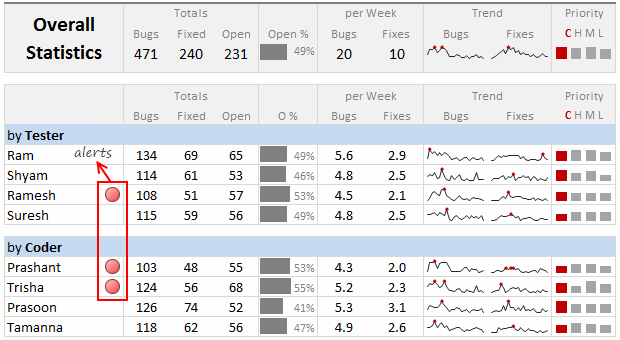
Dashboards can be overwhelming with lots of details and context. A simple way to drag user’s attention to important stuff in the dashboard is to use alerts. See this example to understand what alerts mean.
How to display alerts in Excel Dashboards?
The easiest way to display alerts is to use Excel 2007’s Conditional Formatting feature – Icon sets.
[Excel 2007+]

Assuming you have a table in dashboard like above (data),
- Select the alert column and go to Conditional Formatting > Icon sets > 3 Traffic Lights (unrimmed)
- Now, go to Conditional Formatting > Edit Rules
- check “Icons in reverse order” and “Show icons only” buttons and you are done!

[Excel 2003]
- Add an extra column next to Alert column.
- Here type the formula
=IF(C1,CHAR(152),"")[assumes column C has alert data] - Select the column and set its font to “Wingdings 2” and color to Red. The Char code 152 is a big black circle in wingdings 2 font.
Do you use Alerts in Dashboards?
I think alerts add richness to dashboards and prompt users to take action. But too many alerts can be distracting. I have used alerts by showing red color dots or circles in dashboards to draw my manager’s attention to certain points.
What about you? Do you use alerts in dashboards? How do you automate them? What technique do you use? Share your ideas and tips using comments.


25 Responses
I prefer the red,grey,light grey,black icon set. I’ve also used in-cell pie charts from Fabrice’s Sparklines for Excel as an alert which could also provide another piece of information.
I prefer the red,grey,light grey,black icon set. I’ve also used in-cell pie charts from Fabrice’s Sparklines for Excel as an alert which can also provide another piece of information.
For Excel 2007, your formula should do the same as the Excel 2003 version, so that non-alert rows are blank – if they are 0, the unnecessary green icon will show
Hi Chandoo,
Nice Post !! just to add something for EXL 2003, we can also 4 Ifs and link to the alert data
For Ex: If we have alert data in Cell A2 and want to split in 4 orders namely <25%, 25-50%, 50-75% and 75%< then we can following formula and put fonts as you have suggested :
=IF(A2<0.25,CHAR(153),IF(A2<=0.5,CHAR(155),IF(A2=0.76,CHAR(152)))))
And then using Conditional Formating we can dashboard reflected on different COLOURS as per their respective alert.
Best Regards
Rohit1409
Hi Chandoo,
Nice Post !!! just to add something for EXL 2003, we can also 4 Ifs and link to the alert data
For Ex: If we have alert data in Cell A2 and want to split in 4 orders namely <25%, 25-50%, 50-75% and 75%< then we can following formula and put fonts as you have suggested :
=IF(A2<0.25,CHAR(153),IF(A2<=0.5,CHAR(155),IF(A2=0.76,CHAR(152)))))
And then using Conditional Formating we can dashboard reflected on different COLOURS as per their respective alert.
Best Regards
Rohit1409
The Complete formula [Don’t Know how it got cut ]
=IF(A2<0.25,CHAR(153),IF(A2<=0.5,CHAR(155),IF(A2=0.76,CHAR(152)))))
PS : Use in single line [I have split it to avoid cuts 😉 ]
Hi Chandoo..
why it is not displaying the complete formula..
anyways here is the balance
“=IF(A2<0.25,CHAR(153), IF(A2<=0.5,CHAR(155), IF(A2=0.76,CHAR(152)))))"
@Rohit… your formulas are fine. Just that the width of comment area is fixed and hence my website is cropping it at 640pixels. I just edited your formula and added few white spaces so that it wraps nicely.
Very good idea btw.. kudos!
Hi,
Maybe just go for ‘bold’ ; ‘underline’ or ‘italic’ to draw the users attention? Those methods (if those can be called methods) are used cross media type (books, journals, blogs, billboards, …) to guide the readers eye to valuable information.
Just a basic thought
@Tom.. good idea..
Hi Chandoo,
You certainly grabbed my attention! although I wasn’t sure what my brother (Suresh) and cousin (Shyam) were doing right, and I was doing wrong? 😉
I love your blog btw – Many thanks for all your hard work in unravelling the secrets and mysteries of Excel!
Best regards
Ramesh
I thought I saw an advertisment for a book about learning excel called excel himalaya or something. It cost about 35.00 us money but seemed to have the things I need to have my admin assistant to start to use. I was hoping to start with this book and then send her to school if she shows some interest and aptitude. Any help on this would be appreciated. Thanks
Great web site and information!!!!
@Jeff… checkout http://chandoo.org/wp/2010/08/25/excel-everest-review/
thanks, your website is awesome!
Hi Chandoo
Firstly thanks for all the cool tips on how to use Excel better.
I am new to the site and have a question which you may be able to assist with but dont know if these comment boxes are the best way of asking ?
I am looking at assets and trying to calculate the depreciation total by taking a year (say 2010) adding the expected life of the asset (say 10 years) then comparing that to a future date (say 2015) using an IF statement. The calculation in normal is – IF((year in col B (2010) plus 10years)>year 2015, add a years depreciation, otherwise leave blank). The converted date value does not appear able to add 10 years in order to compare it to 2015. Am I missing something ?
I use the “IF” Statement in conjunction with Conditional Formatting in MS Excel to give verbiage to alert one of a required action, dependant on a review date. This makes a visual stimulus, plus it clues one as to what the conditional format is trying to warn you about and what follow-up actions are required.
Wow, I’m really impressed with dashboards. I had no idea this stuff was even possible with excel. I’d like to offer an interactive dashboard to my customers, showing analytics of their data. I have a .pdf file with the datapoints. I’d like them to enter the data on my website, and be able to see their data. Is something like that possible.
Hi Chandoo,
I’ve recently purchased the package for both templates.
In the portfolio dashboard,under the calculations worksheet, I’m attempting to change the date range in the gantt chart to show only the range of the project that starts in late 2013. How do I do this?
Thanks
Adam
Hi Chandoo,
I’m new at Excel Dashboard and found your blog really useful and helpful! It’s very nice of you that you dedicate your time to do this.
Could you please explain how can I use Alerts based on dates on a Dashboar?
For example, if a target date is coming closer to the actual date, the alert is yellow or red.
I’d really appreciate some help!
Thank you
Where can I download the file Excel of Averall Statistics ???
Thanks a lot.