

What if we can make an excel workbook that can teach us excel? Wouldn’t that be cool..?
It was a question that motivated Sean Duffy, a former Google employee and his friends to design Excel Everest – an excel spreadsheet built to teach you, … wait for it … , Excel.
Sean wrote to me a few weeks back and invited me to test his beautiful product. I have played with Excel Everest and I found it to be quite an interesting tool to learn Excel, so much that I wanted to share with you about this.
What is Excel Everest?
Excel Everest is an excel workbook designed to teach you excel. It has 41 topics and has 155 exercises, 339 buttons, and 87 embedded videos. It is a text book, problem set, video library all rolled nicely in to one excel file. It teaches you various excel topics, one at a time and gives you some problems to work on. Once you finish the problems, Excel Everest even grades you automatically. Pretty cool, eh?
See this short demo to understand how Excel Everest’s automatic grading works:
and here is a superb youtube video explaining Excel Everest:
Who is this for and What can you learn from Excel Everest?
Excel Everest is designed to help beginners and not-so-regular users of excel learn various features without getting lost. It teaches the following topics very well:
- Excel basics: What is excel, how to format data, using paste special, sorting and filtering data, adding / removing / hiding rows or columns, working with shapes
- Formulas: Formula basics, text formulas, IF formula, VLOOKUP formula, basic math formulas, statistical formulas (average etc.)
- Charts & Pivot Tables: Understanding numbers and answering questions.
- Tips to make your life easy with Excel: Removing duplicates, using keyboard shortcuts, introductory macros, printing excel sheets
Each topic is explained in a separate worksheet with text, images, videos (youtube videos embedded in excel) and various examples.
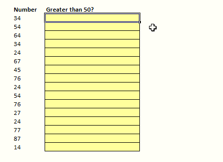
See an example page – Learning Basic Mathematical Formulas using Excel Everest
How much is it?
Excel Everest is priced at $34.95.
But here is the good news. When I told Sean that I would love to write a review of his product, he was kind enough to give readers of Chandoo.org a discount of 20%. So, you will actually pay just $28 for this when you use the discount code “chandoo“.

What is my opinion about Excel Everest?
Excel Everest is a fantastic way to learn excel if you are starting out. It is beautifully designed with lots of clear, simple explanations for various everyday excel features. I especially liked,
- How the file is structured and how each topic is flagged as easy / medium or hard (see below).

- Exercises and automated grading. There are questions / short quizzes after each topic and as soon as you enter you will graded.
- You can keep track of your progress and see how well you have scored across various topics / difficulty areas
That said, this is not the product if you are already familiar with various excel features and use them decently. For the rest of you, this can be an extremely fun way to learn excel all the while using it.
I recommend getting a copy of Excel Everest if you are new to Excel or need a thorough introduction to various features in Excel. Make sure you use the discount code chandoo to get 20% off the final price.
Do you have any questions about Excel Everest?
I have been using Excel Everest for last few weeks, so I kind of know what it does best and how it works. If you have any questions about it, ask them thru comments. I can answer them.
Disclosure: I receive small commission whenever you buy a copy of Excel Everest with discount code “chandoo“. But I am sure you will derive more benefit out of this than Sean or I will make out of the sale.


15 Responses
Great Post Chanddo as usual. I bookmarked it and purchased a copy.
Hi all, it’s Sean from Excel Everest. Thrilled to receive such a positive review and let me know if you’ve got any questions (support@exceleverest.com).
Cheers,
Sean Duffy
Hi I have a question…
I see that this tool is only available for Window PC’s at this time.
My daughter would love this product but she has a Mac. Could she purchase it and keep it on a thumb drive or flash drive and practice it when she has access to a PC by loading it from her travel drive or thumb drive or ( various names )? Please advise and thanks!
jt kaufmann
(Love your newsletter!)
@Pat… Thanks. I am happy you liked it. Do tell us what you think about the product once you used it. I am sure our readers will enjoy your views.
@JT: I think your daughter can safely use the file in other windows PCs by loading the file from thumbdrive. She can save the file back to the drive so that her progress, scores are preserved and will be loaded next time she opens the file. The file is licensed to your daughter, not to a computer.
@JT: She can indeed purchase it and use it / save her progress on a thumb drive. Also, Excel 2011 for Mac will have VBA support so we *should* (fingers crossed) be able to make a Mac version soon enough. Let me know if you’ve got any more questions!
Sean Duffy
Excel Everest
Hey Chandoo and Sean,
Indeed a good product… however When i tried to purchase the same I am getting error messages… can you please look into this…
Chandoo… can you not offer this product from your site and we can transfer money to your India account
~Vijay
@Vijay… Thanks for your comments. I am sorry to know that you are getting errors while trying to get a copy. But unfortunately I cannot offer this product from my site. Sean is the owner of it and I am just recommending it as I found it to be a valuable resource for our members here.
I suggest that you write to Sean (can get it his email id from exceleverest.com ) and see if he can help you.
@Vijay… what sort of errors are you getting? I’m sorry about that. I just checked our purchasing systems and everything seems to be running smoothly. What browser were you using? Maybe try from Chrome or Firefox? Feel free to email me directly at seanduffy — at — exceleverest.com and we’ll figure this out.
Cheers,
Sean
Chandoo/ Sean
I have downloaded the trial copy and it looks engaging. I like to gift it to someone who do not have an internet access. Do you have any version that packs all the videos (like Chandoo did for his excel tutorial downloads)?
Hey Chandoo and Sean,
this looks amazing. Although I would label myself as intermediate Excel user, I think I will purchase ExcelEverest. It looks pretty interesting to me and I am very sure that I will learn a new approach or something new from it. As I am preparing an internal Excel network in our company (>400,000 employees world wide) as well as a beginners training for my colleagues in our local office, I am sure it will give me lots of inspiration. Thanks for reviewing (and discounting 😉 it…
Phil
Hi Chandoo and Sean,
Very excited to try Everest as I am a bit rough on some of the formulae types in Excel. I purchased a copy – but its not working 🙁
Good Morning,
I purchased Excel Everest yesterday and am having trouble with the download. It downloaded from my email with no problems – but when I open it I get errors. This one pops up 24 times: “File error: data may have been lost”. It then shuts down.
I’ve tried downloading a few times on different computers and get the same error.
Please help!
Please advise! I am very anxious to try the software. Thank you!
@Darcy
Hi Darcy,
Hmm… that’s an odd error that I don’t think we’ve seen before. Why don’t you email us at support@exceleverest.com and we’ll figure out what’s going on.
I need a little more information from you!
Cheers,
Sean
You should probably take down this post and/or the discount code – it doesn’t work.
I have been trying to get a hold of the company, but no none answers my emails. Is there a phone number?