
This is a guest article written by John for our Excel Dashboard Week.
Executive Review Dashboard using Excel
Snap-shot of the dashboard:
Purpose of the dashboard:
This Dashboard was constructed for a number of reasons, one of which was to reduce the number of reports produced with the same data ( up to 6 separate files ). As we all know, when it comes to senior management and reports / files the more information they can get on one report / file the better for them. So, with this in mind I created the Dashboard to show the data they need to see “quickly” each week.
How this Executive Review Dashboard is made?
I used various functions / formulas to help me construct this Dashboard, this isn’t the first one I have created, but I think this is the best one I have done so far and it is all thanks to the hints and tips and assistance I get form Chandoo’s site as well as Excel User *(Charley Kyd was the first inspiration for me to get involved with Dashboards ) and also a shout out to Clearly and Simply, another great site.
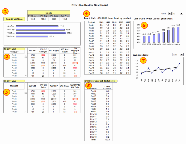
[Note by Chandoo: I have added numbers 1 to 7 on the snapshot to help you understand below portion.]
The top left corner (1) has data that shows what is happening right now, i.e. QTD Order volume, WW Requested supply, WW Available supply and the Avg projected orders ( based on historical analysis ). This table format is then supported by a simpler bar chart below it.
Below that I have used Scroll Bars (2 & 3) to allow a lot of data to be shown in a small space, scroll bars do this very nicely. The data in here would be a list of all the products within the current range of orderable parts ( the detail behind the table and bar chart above ). [Related tip: How to create a scrollable list in Excel Dashboards?]
The middle table (4) ( Last 4Qtrs + CQ 2009 Order Load by product ) shows the historical data for each of the current products ( and perhaps their predecessors ) with a bar chart to the right of it (6) showing the overall volume of those products and the table and bar chart are controlled by the drop down menus above the bar chart.
The Line Chart below (7) that shows the overall Sales Trend by month with a drop down menu to enable you to choose each year separately.
To the left of that there is a table (5), which is a snapshot using the picture link function, of the current order load status by product and again supports the data on the left hand side of the Dashboard.
Final Notes:
If anyone would like to leave a comment or ask questions about this Dashboard or indeed need help with anything ( even if I don’t know the answer I am sure Chandoo and his growing community would be able to help ) please feel free to ask.
Just a note to close. Since I started utilizing Chandoo’s site I have now started my own community internally within the company I work for and I am now teaching other people about Excel ( albeit 2003 level for now ) and encouraging them to expand their own knowledge of Excel and perhaps share what they learn with their colleagues and I fully intend to point some of these people to Chandoo’s site and will encourage them to sign up for Excel School.
Download Executive Review Dashboard Workbook:
Click here to download the executive review dashboard workbook & play with it.
Added by Chandoo:
What I liked in this Dashboard:
Techniques used: John used a variety of techniques like formulas (SUMPRODUCT, OFFSET), dynamic charts, scrollable lists and picture links which help us in analyze lots of information and present the results in minimal space.
Dynamic Dashboard: The dashboard lets us analyze and understand information for any quarter or region which is very good.
What can be improved in this dashboard:
Layout: Ideally, if a dashboard is in a rectangle or square layout, it would be easy to read and understand. The current setup suggests that it is incomplete.
A little more visualization: There are lots of numbers in this dashboard. I would suggest adding few more visualizations like showing indicators or applying conditional formatting or replacing a table with a chart. This would reduce the comprehension time. Of course, you can always add hyperlinks to detailed data so that if an executive is interested to drill-down, she can do so.
Spell out key messages: This dashboard would become even more effective by adding a small comment area at the bottom or top where key messages can be highlighted. [Related: Tweetboards as an alternative to Dashboards]
Thanks to John
Thank you very much John for sharing your work with all of us and showing us what is possible. I really appreciate your effort in writing this guest article and spreading good word about Chandoo.org and Excel School.
Say thanks to John
If you liked this dashboard, say thanks to John. Also, feel free to share your views on this dashboard. How would you have designed an executive review dashboard if it were up to you? Please share using comments.
Contribute to Excel Dashboard Week:
You can contribute tips, screen-shots, excel workbooks or links that I can share with our readers on Friday (25th March).
Click here to send your tips & files for Dashboard Week
PS: The link to Excel user site is affiliate link, meaning if you click on it and purchase anything from the site, I get a small commission. I do this because I think Charley’s products are awesome.


8 Responses
Hi Chandoo – do you also do excel school for beginners? I am a novice in excel but would like to learn it to a level where i can become an awesome guru like you. Please help.
Vaibhav
Table 4 lines up the decimal points nicely, making it easier to compare or add numbers. The other tables could be improved by right adjusting the numbers and lining up the decimal points. Bar graphs require a zero baseline since we compare lengths in bar graphs.
I am impessed with John’s dashboard. I am wondering if you can suggest a resource (example) that will help me to create a dropdown box in EXCEL 2007. I can Create average loking drop down – using list reference/ Data Validation technique, But I realy like John’s dropdown design where little image is not go away when you move the mouse off cell.
@ Vaibhav
Chandoo runs an excellent online Excel school
http://chandoo.org/wp/excel-school/
@Vaibhav.. if you can open Excel, write a formula to add 2 numbers and not scare yourself, you are a good candidate for Excel School.
@David: The drop down used by John is form control. You can easily insert it from Developer ribbon > forms > scrollbar. Once you have it, just link tell it which range to show and link it to a cell for output. That is all.
Hi guys, Thanks for the comments on this Dashboard, I appreciate any and all feeback.
Chandoo : Thanks for your comments, I am glad you like this, in addition, the layout does have room to grow, so if we have a need to add some additional data there is room for a couple of charts or graphs to be added, hence why it may look incomplete.
Naomi: Again, thanks for your comments, I will look into your suggestions for future dashboards.
Vaibhav: If this is your first time on this site, welcome, I would recommend Excel School run by Chandoo, or if you want to gain some experience first search Chandoo’s site or others such as Contextures.com, Clearlyandsimply.com or Exceluser.com ….. there are many more but these sites are very valuable in my experience and in no time you will be posting on here 🙂
I do believe all the ideas you’ve offered on your post. They are very
convincing and can certainly work. Still, the posts are very
brief for novices. Could you please prolong them a little from next time?
Thanks for the post.