
Let us say you have built a nice chart showing your sales and profits for the top 5 products (learn how to highlight top 5 products in a list), with products on X axis. Suddenly your boss wants to switch the rows to columns (or transpose the chart) so that she can see metric level grouping instead of product level grouping. No need to freak out and rush to Espresso machine, You can do it very easily with Excel Charting features.
In today’s quick tip you will learn how to swap chart rows and columns in excel,
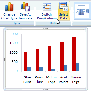
In Excel 2007+, select the chart and go to “Design” tab. Here you will see a big-fat-“Switch rows and columns” button. Just click it and thump your chest. See this tutorial to understand.
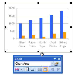
In Excel 2003, select the chart and in the chart toolbar, you see 2 little buttons, called as “by row” and “by column”. Click the one you want and off you go. See this tutorial to get it.
Read more quick tips and/or charting tips, be awesome at work.


19 Responses
Love your blog — thanks for sharing so much Excel wisdom. it’s been really helpful for me.
Do you know if there an equivalently easy way to switch the columns and rows of *data* itself (that is, the info in the celles), not just the charts? If you could point me in the right direction on how to do that, you’d have my eternal gratitude.
@Susan.. Thanks for the compliments. you can transpose the data using paste special.
Select the table you want to transpose, press CTRL+C, go to paste special and select transpose option. You can also use the keyboard shortcut – ALT+ESE
@Chandoo: You’ve just saved my sanity. Thank you!
Chandoo, Nice writeup. I have been working with dynamic ranges for populating dynamic charts which works nicely for column charts (as no. of columns are fixed I can declare that many named ranges and assign them to series). But when it comes to row charts (each row is a series now), I am not able to find a way to define dynamic chart ranges. Is it possible to apply some sort of formula to make this “switch rows to columns” ? It would be great if it is achievable through formulas alone without any Macros and please share any info if you are aware of. (I referred here – http://office.microsoft.com/en-us/excel/HA011098011033.aspx for dynamic column charts).
TIA.
The ‘switch ro/column button, fat as it is, is greyed out. Why?
@Mike
Some chart types don’t support this
or
You didn’t choose a Horizontal range to start with (You don’t have to with lots of the charts)
Yeah – like all the charts I make, the big Switch button is grayed out and totally useless. The real question is what charts DOES the big Switch rows/columns button work for? Can I even transpose the source data and re-select new data for the chart? Of course not – Excel doesn’t allow me to select new data for the chart. I have to start over from scratch!!!
Excel 2007 charts are so rigid and difficult – truly AWFUL!!! Just give me 2003 with better colors and graphics, thank you.
Is there a way to switch rows/columns when building your chart off a pivot table?
I am able to do it if I switch the row/column layout in my pivot table but I don’t want that. I want my pivot displayed with “Client Name” as row and “Amount” as a column. But, in my chart I want the client name to be my horizontal axis and my Amount be my vertical.
I hope this makes sense. Thanks.
I had this same problem in Power Point 07 with a greyed out switch row/column button. I noticed that the switch row/column button became enabled after clicking on the select data button.
Hi Adam,
I just tried your suggestion with the 2010 Microsoft Office Excel program and had no results 🙁 is there any other advice you could suggest? Stuck on this test and need to get past it. Thanks Lisa
I felt your frustration but was not going to let Excel 2007 defeat me! I finally got it to work by selecting each series and editing the formula bar. Messy, but my chart is what I want.
You can also write small macro for the same. Please find below the one which i write to randomly put columnr cell values in to rows cells.
Sub CopyRandomCells()
Dim stOrig As Worksheet
Dim stName As Worksheet
Dim lnCont As Long
Dim i As Integer
Dim j As Integer
i = 1
j = 1
Application.ScreenUpdating = False
lnCont = 0
idCont = 0
Set stOrig = Sheets(“SAT01”) ‘replace sheet1 with your sheet name
lnCont = 3196
For i = 2 To lnCont
j = Int((lnCont – 2 + 1) * Rnd + 2)
stOrig.Cells(j, 2).Copy Destination:=stOrig.Cells(i, 6)
Next i
Application.ScreenUpdating = True
Set stOrig = Nothing
End Sub
Hi!
Is there a way to switch rows/columns of the sheet itself?
to create a rotated table?
This can really save me…
thanks
Having same problems as others with faded “Switch row/column” button in a chart with two line graphs plotted vs. time. Time is in the leftmost column so I don’t know why it did not come out right the first time.
1 1743.43 2 1410.03 3 1178.23
4 693.76 5 454.48 6 1033.43
7 735.06 8 557.02 9 1300.01
10 1445.28 11 867.07 12 828.99
i need to convert them in to
1 1743.43
2 1410.03
3 1178.23
4 693.76
5 454.48
6 1033.43
7 735.06
8 557.02
9 1300.01
10 1445.28
11 867.07
12 828.99
And i have 5000 of these. can any1 help?
@Ali..
Welcome to chandoo.org and thanks for your comments.
Assuming your data is in range A1:D1667 (with column A has numbers 1,4,7,10…)
and you want the re-arranged data in F1:G5000,
In F1 write =ROW() and drag it to fill till F5000
In G1 write =INDEX($B$1:$D$1667, INT(F1/3)+1,MOD(F1,3)+1)
and fill it until G5000
This should work.
@Ali
I am sure I could come up with a fancy formula
However the quickest way is to:
.
I assume the data is in Column A
Select Column A
Data Ribbon, Text to Columns
Delimited, Next
Tick Space, Finish
.
You will now have 6 columns of Data
Copy Data in Columns C & D and paste at th Bottom of the Bottom of the data in Column A
Copy Data in Columns E & F and paste at th Bottom of the Bottom of the data in Column A
Now Sort Column A and B by Column A
.
Voila
Thanks Chandoo!
Where is the like button?
Thx a lot for the tip!
K