
We all know that bar charts can be used to display values spread across various categories or times. We also know that pie charts / donut charts can be used to display percentage breakup of various quantities in a sum total. How about mashing up both to create a Donut Bar chart?
“oh, donut what?!? It sounds like a brand new junk food from dunkin’ donuts”
Well, not really. It is a mash-up or combo chart using which you can display, for eg. sales over last few years along with percentage break-up of individual products. See below to understand.
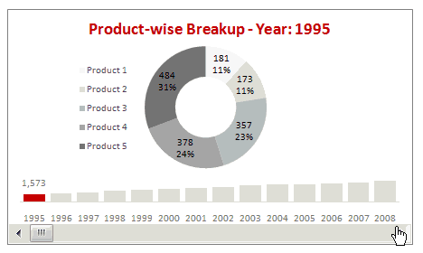
In the above chart we have mixed a bar chart with a donut chart and sprinkled it generously with a scroll bar form control.
In this charting tutorial, we will learn how to cook a donut bar chart using Microsoft Excel. Scroll down the page to get the downloadable workbook to see this in action.
Recipe for making a donut bar chart
A good donut bar can be healthy while adding variety to your regular menu of charts. To make a neat looking donut bar chart, just follow the recipe.
Ingredients:
Sales data (finely chopped – year vs product level), one donut chart, one bar chart, one scroll bar form control and 5 minutes of spare time.
Step 1: Get your dough, err, data ready
As with any chart, we need the right data in right format to make a perfect donut bar chart.
I have arranged the data for our chart in the below format.

The last column shows the values as per scroll bar position. (more on this in the next steps)
Step 2: Insert a scroll bar control and link it to a cell
 Go to developer ribbon tab and insert a scroll bar form control. (learn more about turning on developer toolbar in excel 2007)
Once you have the scroll bar, link it to a cell, say B18.
Also, set the scroll-bar minimum value as 1, maximum value as the number of years you have (in our case it is 14) and incremental change to 1.
Step 3: Determine product-wise breakups and totals based on scroll bar selection
We can use INDEX() excel formula to do this.
What is INDEX excel formula?
INDEX formula (examples) returns a specific value from a range of cells by taking the row and column of that range as input. For eg. =INDEX(A1:C10,2,1) will return the value in 2nd row, 1st column, ie, the value in cell A2.
So, how to write the INDEX formula in our case?
That is your home work. Just use the kitchen sink to experiment.
Once you are done, the product-wise breakups should be listed in a tabular format like this.

Step 4: Put everything together and boil for a minute
We have done all the ground work required to make the donut bar chart. Now, We just need to put everything together and make some charts. Here we have 4 small steps.

- Insert a donut chart using the product-wise breakup data
- Insert a bar chart with the yearly totals
- Insert another series in the bar chart to show the selected year total. Completely overlap this series with the totals series.
- Position everything together.
Finally adjust formatting and colors as per your taste.
That is all, the donut bar is ready for consumption. Serve hot or chilled. The donut bar tastes great with a cup of coffee.
Download the donut bar chart excel work book and play with it
Click here to download the donut bar chart template & workbook. Change the values and chart attributes to understand how this works.
Also try a Bar Pie chart, just follow the same recipe, but replace donut with pie.
Please tell me how your donut bar tasted using comments. 🙂
Recommended charting tutorials for you:


25 Responses
Replace the donut with a bar chart, and you might be on to something.
Hi Chandoo,
Once again a clear and simple example of how to get more from your Excel charts.
I have two questions:
(a) could you do without the use of a second table for the selected year use a name for example ?
(b) is there any mean in Excel to use a “onclick” event on a chart ? When I saw your chart, my first impression was that it might be great to be able to click on one of the data point of the small chart instead of using the scrollbar.
Many thanks for all the shared knowledge.
hi chandoo…am assuming that u r the chandoo from PG… this is an awesome website that u have maintained…kudos for that..
i was wondering…is there any smple way to directly copy all this stuff from Excel to Powerpoint ?? 😀
Definitely have to agree with Jon. It doesn’t seem like the donut adds much value at all.
That’s yet another wonder by Chandoo 🙂
Very Nice work. Thanks again for spreading such great knowledge.
I like this idea, albeit with Jon’s suggestion that you use a line chart.
Here’s another thought…instead of inserting a bar chart with the yearly totals, you could consider inserting a stacked bar chart.
This might be useful if you only had a few series, and your stacked bar chart was a bit wider than in the above example.
This would give a bit more ‘overview’ info, and perhaps would mean that users would only need to select a particular year if something stood out from the stacked bar chart, rather than having to scroll though each year to see anything noteworthy.
See screenshots at http://screencast.com/t/ySIAgPcy and http://screencast.com/t/OGzfl510m to see what I had in mind. I’ve uploaded my example to http://cid-f380a394764ef31f.skydrive.live.com/self.aspx/.Public/Revised%20donut-bar-chart-template.xls
@Jon.. I am expecting this from you. While I also do not recommend excessive use of donut or pies, I think they have a reasonable place in chart catalogs. In this case, donut seems to do no damage as it is very common to show individual breakups in donut / pie charts.
But more than the chart types, I wanted to highlight the technique of combining scrollbar with 2 charts to make it dynamic. The same can be used to make a bar-bar chart or even a line – bar chart.
@Stephane: Thank you.
Answers to your questions:
(1) the second column is a overlapped series. I have used it to color the chart based on selection and show the data labels. You can do away with it for sure, but then you will have no idea which year is selected.
(2) Very good idea, I am not aware of any VBA events that capture chart series clicks. There is a generic chart_click event that tells us the x and y co-ords of the click. But it would be too much math to find where user clicked from that. May be Jon has an idea..
@Puneet… I am the same Chandoo :mg:
Unfortunately some of these charts are meant to live inside a spreadsheet, not a powerpoint. You can embed the whole sheet and encourage users to click through.
@Scott: Yes, see above comment as well as Jeff’s reply. He has done a bar-bar chart using similar technique.
@Nimesh: Thanks Nimesh.
@Jeff: Very good example Jeff. Yes, a stacked bar would definitely improve the chart.
Puneet,
you can get excellent charts to save in Excel or PowerPoint format at:
http://www.juiceanalytics.com/chartchooser/
Cheeers
Hi Chandoo,
How do you display the number AND the percentage in the donut chart?
@Govi… just add data labels, then select the labels and hit ctrl+1, in the options, choose value and percentage (check both of these). Select new line as a separator.
Thanks,
This only works with donut and pie charts.
Not with my bar chart, I had to put in another bar chart with percentages
@Govi… You are right. For bar/column/line/area charts you need to manually create another series to show the percentages. Or you can use the Rob’s chart labeler to automate some of it http://www.appspro.com/Utilities/ChartLabeler.htm. I heard it is a very good tool.
Hi Chandoo,
I need help writing the Index formula to the case. I seem to be missing something???:(
@Chickie… Can you tell me where exactly you have problem?
Ok I think I got it now Chandoo…
Thanks to your downloaded excel workbook:)
I must say, this is a very helpful site.
Keep up the good work!!
Dear Chandoo,
Another excellent chart and excellent style of presentation and can look even better if you garnish it with different varieties like stacked bar etc.
Chandoo, though I’m a novice in charting but I was able to do it after several attempts except dynamic chart title with all the efforts notwithstanding. So please help me in this area as how can I link it to the cell C17etc., so that year in title also changes with the change in data selected through scroll bar.Moreover, as there are mainly two charts merged in one, any tips as to how smoothly and quickly this can be done like we prepare the donut chart first(format>fil>no fill>border color>no line) then prepare bar chart(format>fill>no fill>border color>solid line) and then drag donut chart into bar chart area etc.
Would really appreciate your help and quick response (this is my favourate chart now and I want to use it) as we know you have a very busy schedule ahead.
Best regards
Fakhar
Hi Chandoo,
Please read it’s B18, the cell in execl file that refers to Year
Sorry for inconvenience
Have a nice week-end but don’t forget to answer my query
Thanks and regards
Fakhar
I come back to this site so often, and it has helped me immensely, thank you so much!
Hi Chandoo
It’s a great chart presentation. I,m not able to prepare the second series to highlight the selection and add a data label to it. Please advice in details.
Cheers!
How do you get it to scroll and stop at each year? Whenever I click the arrow, it speeds through each year.
@3G
It works ok for me when just clicking
Are you clicking or click and holding the end of the scroll bar?
What version of o/s and Excel are you using?
Hi Chandoo,
Thanks for this excellent chart and presentation you have given here. I really appreaciate your efforts you put-in to help the beiginners like me and make them understand how efficiently one can utilize the excel charts and its other features.
i have one small question here – while presenting bar chart value (the total for products), mine graph displays all values whereas in your chart only one lable is appearing there for “selected year total”. can you pls tell me how you have done that?
Hi chandoo,
I have to say I’m a long time fan…but the simplicity with which this chart displays the data is simply… to use your word AWEOSME.
I have always been in love with pivot tables but this is pretty neat way to make sense of data… excellent work.
Hi,
Can you please help me with importing the Activex bar in a powerpoint presentation?
Thank you!!!!