
Sales funnel is a very common business chart. Here is a simple bar chart based trick you can use to generate a good funnel chart to be included in that project report.

Download the Sales Funnel Chart – Excel Template and learn it by playing with it.
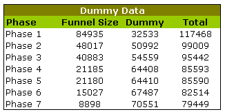
1. Get your sales data ready
The first step is to get your sales data ready for a funnel chart.
For this we take a normal phase-wise sales data and add a dummy series to it. The dummy values tell excel how far each of the sales figures should be moved away from y-axis to get the funnel effect.
The dummy values are calculated using a simple formula like =(some_large_number – funnel_size_at_that_phase)/2, In our case, I have used 150,000 for the large number.
We will also add a total column.
Tell me again, why are we using dummy series?
In order to create the funnel effect, we must move each of the bars in such way that they are all centered vertically. To do this, we take a large number and subtract funnel value from that and divide this by two. How it works ? well, that you can figure out while sipping coffee 😀
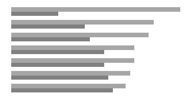
2. Create a simple bar chart with the columns Total and Dummy
Once you are done, the bar chart should look like this.
3. Now adjust bar overlap and gap width settings to create a funnel effect
Select the bars by clicking on them, and right click and go to format data-series. In the resulting dialog, go to options and adjust “series overlap” and “gap width” settings in such way that series are completely overlapped and gap is ZERO.
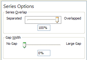
Once you do this, the chart should look like this.

4. Adjust colors and add labels
Select the dummy series and fill it with white color or make it transparent. Add data labels and you have a sparkling funnel chart ready.
Next time use this in your sales presentation to the boss and see everyone having a discussion.
Download the Sales Funnel Chart – Excel Template and learn it by playing with it.


25 Responses
Btw, checkout this article by Jon to get a different perspective on Funnel charts (not the kind presented here though)
http://peltiertech.com/WordPress/2008/06/29/bad-graphics-funnel-chart/
Chandoo – I’m not a big fan of this one. I would simply have used a bar chart in descending order by phase. By using an effective title you can accomplish the same visualization in less time.
I quite like this, as someone who regularly deals with web analytics data – it’s a nice way of showing drop-off through the user journey. A bit gimmicky maybe, but I don’t think you lose anything in the interpretation, versus a bar chart.
Jon’s version doesn’t really have the same application.
It would be better to use a stacked bar to make your funnel, with Funnel Size stacked on Dummy. Then you can just make the Dummy series invisible, and mousing over the Funnel Size bars would provide a meaningful value in the little screen tip.
But the act of centering your date reduces the sensitivity of the chart. You may as well have a non-funnel bar chart that’s half as wide.
A funnel is the wrong analogy anyway, just as it is in the article of mine you cited in the first comment. In a real-life funnel, everything passes through the funnel. In a phased process, at the end of each phase, a proportion of items are not passed through to the next phase.
If you look closely, the bad 3D funnel I discussed is only conceptually different from Chandoo’s in that Chandoo’s uses width perpendicular to the process flow to show values, while the bad 3D version tried to use thickness along the direction of travel (and therefore reduction in width). The same types of processes could be shown in either version.
I’m with Tony: use a bar chart, though I think he would put Phase 1 at the bottom, and I’d put it on top. A column chart would be even better, showing Phases left to right in the order in which they are encountered in the process. Problem with column charts is the reduced space available for horizontal labels.
@Tony: yeah, as I said, these are just another alternative to bar charts. Funnel is an accepted norm in sales lingo and using this type of chart might go with the team often.
@Allys: You are welcome 🙂
@Jon: Stacked bar chart is a good option. I didnt use it because the labels would be in the center and distract the funnel look.
I donot agree with you that funnel is a wrong analogy. Contrary to that, in sales and marketing lingo it is very well accepted. Infact almost all courses in CRM would deal with funnels. It might be that a real world funnel will let everything flow, just the same way as a real world pie tasting good 😀
but funnel when used in this context means flow of prospects to successful sales.
In fact the 3d funnels you have described are actually even worse (as you have identified) since they use height (which is totally wrong, if they must use height, it should probably denote how much time that sales process step took)
Despite my aversion to the analogy with a funnel, I understand that it is widely used in this context. Well, I can only boil the ocean one drop at a time, right?
You’re right about the thickness measurement of the bad 3D funnel I wrote about. If the thickness is made into a variable tracking the passage of time, which is a good thing to do, then the chart should be turned sideways so that time runs left to right. Then you could make a nice line chart.
I’ve further outlined my preference of bar chart over centered/floating bar chart (funnel chart) in my latest post, Funnel (Tornado) Chart. Even if the funnel metaphor weren’t flawed, centering the bars makes them more difficult to compare.
I must agree with your statement that real world pies taste better than pie charts look.
@Jon: Thanks for taking the discussion forward.
How about using a waterfall chart in reverse? That might be clearer and more effective than the funnel chart.
Help -please – I just can’t seem to recreate this – yes I have downloaded the pack, but I really want to figure out what I am doing wrong. I get stuck between step 2 and 3, I get the bars on top of each other but it seems like the bar that I want to make white – (eg knock out the bigger bars) is underneath like as if teh z-index is lower – so I can change the color etc and still has no effect….
really frustrating….
What am i doing wrong ?
Mike
@MikeeSpikee: Welcome to PHD and thanks for asking a question.
Did you change the order of the series? You can do that by selecting the chart series and hitting ctrl+1 and adjusting its order in excel 2003 and earlier. In excel 2007 you can do this by selecting the chart and going to “select data” and then changing the order of the series by moving data up /down.
Let me know if this is not the problem you are facing…
I am running Vista with 2007 Excel and am experiencing the same problems as mikee spikee. I cannot get the funnel to have larger values at top and cannot remove the colour block on the left hand side to leave the funnel shape.
I’m sure it’s simple – but I just can’t recreate your example !
Please help !!
@Dave H: I have tried to open the above excel in the Excel 2007 on Vista and it works fine. As mentioned above, you need to adjust the order of data series by right clicking on the chart and choosing “select data”. In the window, select a data series press the up and down arrow icons above the series list to move the series up and down. Do this until the white series is on top of black one.
I like it a lot.
I analyse customer behaviour and lifecycle within a Tiered (annual worth) loyalty scheme.
This is an ideal, AND SIMPLE, way to illustrate the value contribution, numbers of customers and movement of customers within the overall population.
Fortunately, for me, both marketing and management like pretty pictures to tell the story – this chart type is great for this.
@Justin: I am happy you like this.
“Fortunately, for me, both marketing and management like pretty pictures to tell the story – this chart type is great for this.”
That alone tells us that at the end of the day all the things we do are to s(t)ell stories and connect with each other. Charts are just another mechanism.
Chandoo, I truly thought I would never love again….sigh!!!! But I’d leave you in a New York minute if I could find someone as brilliant posting on Access topics. You give me such good ideas. Love and kisses.
@DeskDiva: that is lovely.. thanks 🙂 Even I thought I could never love again.. http://chandoo.org/wp/2006/12/31/birds-of-different-feather-flock-together/
but then I found excel (Jo, if you are reading this, you are my first love… :* )
just kidding.
I will let you know if I come across any interesting access blog.
@Jon – I agree wit your comment #4 – in the context of a “sales funnel” a bar chart could be more effective. The technique to create the chart, though, is useful in other context, like sensitivity analysis of a model (usually a financial one, but applicable to other fields). I’ve written on the topic http://8020world.com/blog/2009/05/business/tools-methodologies/tornado-charts-in-excel-2007-update
Now that is a cool technique! If you want to include a conceptual sales funnel drawing (with little people on it) to include in your presentation, there’s one available here:
http://www.istockphoto.com/file_closeup.php?id=10275152
Then you can follow it up with sales data the way Jon describes. Home run!
An alternative (and arguably a bit more intuitive) approach would be to overlap two bar charts (one with negative half-values and one with positive half-values).
I have also written a macro that creates funnel charts automatically, using a preset template in Excel.
You can read about my two-bar-charts approach and download the Macro template from here: http://goo.gl/bSMur.
Thanks a lot for your template! helped indeed
I live this for the creativity involved. One risk is this: I can almost hear my boss saying “I love this, now run back and superimpose the number of units sold at each phase, you have two minutes to do that”. 🙂 A straightforward bar chart would have paid off as a more effecient bet for the situation at hand.
Hello!!!
I found it to be easy to implement (thanks by the way). I have a question though. I am trying to add another field in the text appearing on the labels (a percentage from one step to another) and although I am able to make it appear, it does not show it as a percentage but as a normal number with a full set of decimals. Is there any way that i can make it appear as a percentage? thanks