
This is a bonus post in the project management using excel series.
Gantt charts are very good to understand a project progress and status. But they are heavy on planning side. They give little insight in to what is happening. A burn down chart on the other hand is good for understanding the project progress and how deliverables are coming along. According to Wikipedia,
A burn down chart is graphical representation of work left to do versus time. The outstanding work (or backlog) is often on the vertical axis, with time along the horizontal. That is, it is a run chart of outstanding work. It is useful for predicting when all of the work will be completed.
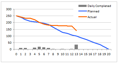
An Example Burn Down Chart:
Making a burn down chart in excel
Step 1: Arrange the data for making a burn down chart
To make a burn down chart, you need to have 2 pieces of data. The schedule of actual and planned burn downs. As with most of the charts, we need to massage the data. I am showing the 3 additional columns that I have calculated to make the burn down chart. You can guess what the formulas are. (Hint: there is a NA() too)

Step 2: Make a good old line chart
Just select the Balance Planned and Balance Actual series and create a line chart. Use the first column (days) in the above table for x-axis labels.
Step 3: Add the daily completed values to burn down chart
Select the “daily completed” column and add it to the burn down chart. Once added, change the chart type for this series to bar chart (read how you can combine 2 different chart types in one)
Step 4: Adjust formatting and colors
Remove or set grid lines as you may want. Adjust colors and add legend if needed.
Step 5:
There is no step 5, just go burn down some work.
Download the excel burn down chart template
Click here to download the excel burn down chart template. Use it in your latest project status report and tell me what your team thinks about it.
Download 24 Project Management Templates for Excel
What Next?
This is a bonus installment to the project management using excel series. We will revisit the burn down charts during part 6 of the series – Project Status Reporting Dashboards. Meanwhile, make sure you have read the remaining parts of the series:
Preparing & tracking a project plan using Gantt Charts
Team To Do Lists – Project Tracking Tools
Project Status Reporting – Create a Timeline to display milestones
Time sheets and Resource management
Issue Trackers & Risk Management
Project Status Reporting – Dashboard
Also check out the budget vs. actual charting alternative post to get more ideas.
Where would you use burn down charts?
We have used burn down charts in a recent presentation to client and they loved the way it was able to tell them the story about status of Phase 1 of the project. We needed to deliver 340 items in that phase and we have finished 45 when we made the presentation. My client could easily understand where the project is heading and what is causing the delays (of course by asking questions).
What do you think about burn down charts? Where will you use it? Tell me about it using comments.
Resources for Project Managers
Check out my Project Management using Excel page for more resources and helpful information on project management.


28 Responses to “Use burn down Charts in your project management reports [bonus post]”
there seems to be a problem downloading the files for this example... this looks like a valuable tool
@Michael: Often some offices and networks block skydrive. Can you try from some other connection and let me know if you still face the problem?
Unable to open the file.
I think it's an interesting view and relatively simple to generate. It can give a quick view of how your run rate is progressing against plan. The same can be done with the hours expended on a project as well.
Your burn down approach is most valuable if all of your deliverables are relatively equal in size/complexity. In your example chart, although you're currently behind, it looks as though you'll be catching up quickly with the recent acceleration in delivery. If the delay was caused by tackling the larger/more complex deliverables first, I'll have a lot of faith that you can catch up to plan quickly. On the other hand, if you've only completed small/simple deliverables, then I doubt you're going to get back on schedule.
But that gets in to more complicated earned value analysis...and the whole point of this was to do something quick and easy. I think the payback/effort is well worth it in this case and is a good balance to the hours being charged to your project against deliverables being produced.
One final comment...did you consider putting the Daily Completed bar chart on a secondary axis? Since daily volume is plotted against the total volume, it's always going to be difficult to see low volume days.
One other thought. If I were your customer, I'd be asking for a revised plan based on actuals to date to understand whether you think you're going to get back on track or not. To do that, you'd need another column to plot. The original plan could be captured in a new column ("Baseline") and the planned column could be updated with the new forecast.
[...] Preparing & tracking a project plan using Gantt Charts Team To Do Lists - Project Tracking Tools Show Project Milestones in a Time Line Chart Excel Timesheets and Resource management Part 5: Tracking issues and risks [upcoming] Part 6: Project Status Reporting - Dashboard [upcoming] Bonus Post: Using Burn Down Charts to Understand Project Progress [...]
@Michael: I posted a reply to it a while back, strangely I find it missing...
I have considered the secondary axis thing. Then all the issues of axis scale etc. seemed like a headache. Assuming the weekly productivity is prettymuch same, then excel quickly shows very tall bars (and adjusts the max accordingly). This creates an annoying effect. But may be for a given project we can find the usual pattern and set the axis max accordingly.
"Your burn down approach is most valuable if all of your deliverables are relatively equal in size/complexity. "
I agree. It is better to chunk work in to meaningful portions and then make the chart. If the portions (or deliverables) are not equal, we can consider adding one more column where we can compute burn down units based on the weightage of individual items.
Usually burn down charts work well for function point based estimate. The more complicated a function or deliverable is, the more function points it will have.
"One other thought. If I were your customer, I’d be asking for a revised plan based on actuals to date to understand whether you think you’re going to get back on track or not. To do that, you’d need another column to plot. The original plan could be captured in a new column (”Baseline”) and the planned column could be updated with the new forecast."
Hmm... I thought Planned is supposed to convey that. If there is more than one version of plan, it is likely that the manager is interested in the deviation wrt latest plan. Everything else is sunk cost. 😀
That said, we can easily add one more line to this chart with "original plan" values and color it differently.
[...] Preparing & tracking a project plan using Gantt Charts Team To Do Lists – Project Tracking Tools Project Status Reporting – Create a Timeline to display milestones Time sheets and Resource management Issue Trackers & Risk Management Part 6: Project Status Reporting – Dashboard [upcoming] Bonus Post: Using Burn Down Charts to Understand Project Progress [...]
[...] Burn Down charts – Project Management using Excel [...]
[...] Preparing & tracking a project plan using Gantt Charts Team To Do Lists – Project Tracking Tools Part 3: Project Status Reporting – Create a Timeline to display milestones Time sheets and Resource management Issue Trackers & Risk Management Project Status Reporting – Dashboard Bonus Post: Using Burn Down Charts to Understand Project Progress [...]
[...] Preparing & tracking a project plan using Gantt Charts Part 2: Team To Do Lists – Project Tracking Tools Project Status Reporting – Create a Timeline to display milestones Time sheets and Resource management Issue Trackers & Risk Management Project Status Reporting – Dashboard Bonus Post: Using Burn Down Charts to Understand Project Progress [...]
[...] Part1: Preparing & tracking a project plan using Gantt Charts Part2: Team To Do Lists – Project Tracking Tools Part3: Project Status Reporting – Create a Timeline to display milestones Part4: Time sheets and Resource management Part5: Issue Trackers & Risk Management Part6: Project Status Reporting – Project Management Dashboard Part7: Using Burn Down Charts to Un... [...]
[...] to create a Burn Down Chart http://chandoo.org/wp/2009/07/21/burn-down-charts/ [...]
[...] Preparing & tracking a project plan using Gantt Charts Team To Do Lists – Project Tracking Tools Project Status Reporting – Create a Timeline to display milestones Time sheets and Resource management Part 5: Issue Trackers & Risk Management Project Status Reporting – Dashboard Bonus Post: Using Burn Down Charts to Understand Project Progress [...]
I am confused... I just ordered the dashboard template and the deliverables are in number of days but everything else is in number of weeks... what am I missing?
@Sally.. Thanks for getting a copy of this. You can change the column title to weeks and everything should be alright.
[...] Use burn down Charts in your project management reports [...]
[...] Burn Down Chart – Excel Tutorial & Free Template [...]
[...] Burndown Chart [...]
Why do you have to login to get the Excel tool? I Think he is phishing. People like him give the web a bad name!
Why do you have to login to Windows Live to get the Excel tool? I was already signed in in another window and his link is still is asking for my password to Windows Live. Think he is phishing. People like him give the web a bad name!
@Fred... It is a skydrive limitation. They want you to login to Windows Live before giving access to the files I have uploaded. If you dont want it, do not download.
Why do you need to call me an idiot. I never asked you to share your login details with me.
Is there a way that I can make the burndown chart dynamically adjust the length of the x axis (number of days) based on when the planned task balance in the fourth column reaches 0? I considered the offset function as outlined here: http://www.tushar-mehta.com/excel/newsgroups/dynamic_charts/#BasicRange
But, I am not entirely sure how to properly implement it based on the given example. I am also not sure if it will work given that the actual balance and the daily completed (4th and 5th) columns will return #N/A values when the planned task balance reaches zero.
Why not have one online and shared for free like http://www.burndown-charts.com does ??
How do you come up with the "Planned" numbers per day?
Do you have explanations for the fields and how this tool should function with the multiple worksheets. I am a novice looking for a great project management tool and not quite sure where to start.
I have one query that in that table how we calculate planned and actual balance in excel with formula?
[…] Learn more: Burn down Chart for project management […]