
Does this sound familiar?
You have made an impressive presentation with lots of data and charts. You have analyzed the data so well to arrive at some really amazing conclusions. You have included several pie charts since they are easy to digest. You thought your audience are going to love it.
But your pie charts failed to evoke any response.
How to make your pie charts likable ?
Well, you don’t really want them to like your charts, you want them to like your insights, your ideas.
But, to get there, you need to shake up your audience, so that they take notice of what your charts are saying.
A simple trick for achieving this is showing charts in different formats (while retaining the meaning).
Here we will see 9 creative ways to alter your pie charts so that they can start a conversation.
- Get some bottom aligned bubbles

Bottom aligned bubbles are a new fad in visualization. You can do them by using Excel’s bubble chart. Convert the pie values in to a bubble chart. Change the X and Y co-ordinates to align the bubbles at bottom. - How about concentric circles

Concentric circles can be a good alternative to pie chart and they are very easy to do using excel’s built in bubble chart. Just make all the X and Y co-ordinates as same. - Why not slices instead of pies

Using slices instead of pies is another simple and intuitive visualization trick. For this we can use bubble chart with axis adjustments so that bottom half of the bubbles is cropped. - Use a radar chart tweak

Using Excel Radar Chart, you can make a cool alternative to pie chart. Simply copy paste the pie chart values in to few more columns (you are seeing the result of 8 columns) and fire up a radar chart with area. - A stacked bar is often tastier

Of course, the simplest and most elegant of them all, a stacked bar chart. This is also very easy to implement. - Or even a regular bar chart

- Use a tree map

Using a non-hierarchical tree map to replace pie charts is a good idea. Unfortunately making the same in excel is a bit of manual job (or VBA). For smaller set of values, the manual job is worth the effect.A simple alternative to manual job is to use Many Eye’s tree map tool
- If circle is hard to swallow, a Square Pie can Help

Square pies are a simpler alternative to pie charts. They are easy to develop using conditional formatting. Here is a tutorial. - Show them in a tag cloud

Tag clouds are a famous visualization technique. They are very easy to do (either manually or automated) in Excel. Here is a tutorial for Excel tag cloud visualization.
Added later: All these charts are effective for fewer values (<6) and with data labels.
What is your favorite Pie chart alternative?
Also check out, 14 different ways to present same data


35 Responses to “Why No One Likes Your Pie Charts (And What to Do About It)”
1, 2, 3 and 4 all have the problem that a one-dimensional number is being represented as a 2-dimensional area. Is it the radius of the circles you're supposed to be judging, or the area? is the area obscured by the smaller circles in front supposed to count (clustered overlap) or not (stacked area)? Your audience won't know without a tedious explanation of what everything means. At least pie charts have a universally-acknowledged protocol.
If you insist, then you don't need the radar to make octagonal shapes: just pick a shape from Autoshapes, then paste it on a bubble. The bubble becames the shape you choose, not just a circle!
@Derek : good points, While numbers represented by shapes can lead to confusion as size of the shape can vary based on whether width or area is used to scale.
When used well (and with fewer values) bubbles can convey the idea while looking sleek. (See the map of internet cables : http://world-secure-channel.com/uploads/map_cables(1).jpg world cable capacity part of the chart)
Btw, very good tip on using shapes instead of radar. Thank you 🙂
Bottom-aligned bubbles look great, and can give a decent idea of scale comparable to a regular pie - something high on my list when representing data meaningfully and honestly.
I've always had a problem with concentric circles, a trend that seems to be increasing in news media. Without seeing the numbers, it is unclear whether the inner circles represent segments of the large circle (the large circle representing 100%, segmented like a Euler diagram) or the smaller circles are stacked on top of the large circle (with the combined total being 100%). Ditto radar charts when there are used in a similar way.
I'd also discourage the use of tag clouds to represent proportions, and limit their use to tags in blogs and other text-heavy websites, where their primary use is to draw attention to the most frequently read/searched text strings. With a font of varying pitch (unless maybe you use Courier or similar), the scale is unsuitable for showing the proportional relationship between the labels unless the plain numbers are used, as in your example. It is similarly unclear what 100% would look like, something important to consider when showing a dataset larger than three items (a pie chart shows this perfectly; with a tag cloud it is impossible to combine the text into one blob that shows a total).
Can't wait to see Jorge's and Jon's answer ...
I would for 5 and 6.
9 has a great impact too.
Okay Fabrice, I was going to let it go for now.
Chandoo: it's Fabrice's fault.
I find the bottom aligned bubbles interesting. I still never know if the data for each circle is represented by the entire area of the circle or just the area that is the color of the circle. Derek and Sam brought up this point. The concentric circles and polygons also suffer from this uncertainty. At least as Sam points out, a pie chart shows you exactly the area of each wedge, though you can't count on the chartsman being honest and including all 100% of the total, as I discussed in Pie Chart Plotting Deficiency.
The problem remains that any graphic that requires one to judge areas will be less accurately interpreted than one which is based on length. This includes pies, the bubbles in #1 and 2, the slices in #3, the octagons in #4, and the tree map in #7. It may also include the square pie; the one shown here is really just a stacked bar, but many have been posted with very irregularly shaped regions.
The stacked bars are okay, the variables are encoded in a parallel length measurement but the baselines for each bar are different. Looks like the boring old bar chart wins out. The only advantage a pie has is that an infrequently violated rule forces the values to total 100%. Additional labeling is needed in a bar chart to show proportions of a whole.
I'm intrigued by the wordles or tag clouds. I think they are badly misused. They should only be used for qualitative comparisons, all the text should be horizontal, color should only be used for a reason (and decoration is not a reason). If you try to force quantitative data into these, the issue arises of whether height or area is the relevant measure, and even without this issue, longer words of the same height appear larger. Tag clouds showing popularity of different topics on one's blog are a good application; so are word clouds comparing relative frequency of words in, say, speeches by opposing candidates.
A great set of techniques. I do have a critique about the tag clouds though. The area of each label should be proportional to the value represented. This is something Stephen Few gets very dogmatic about...and he's right!
So, if the font size for the "60" is 6x bigger than the font size of the "10", then the area of the "60" is 36x bigger. So the font size of the "60" should be sqrt(6) times bigger than the font size of the "10".
@Sam: Most of the charts (not just pies) will work better with data labels (or grid lines). While we overestimate our ability to assess values by looking at length or size, we are very poor at it.
That is why, I have added a note to the post later saying all these techniques work well when labels are on.
And yeah, tag clouds are very well suitable for text analysis. The tricky thing with using them is most of us dont understand how font scaling and other typographic stuff works. While tag clouds look jazzy and provide variety in-correct scaling can give undesirable effect. See Chris' comment to get more idea.
@Fabrice: thanks 🙂
@Jon: Thank you very much for your insightful comments. Whenever I do a post on charting, I wait eagerly to read yours and Jorge's comments. I always like the discussion that happens here.
Btw, thanks for the pointer to Pie chart plotting deficiency article.
@Chris: welcome to PHD blog. I am great fan of Juice Analytics and have been reading it for almost 2 years now. It is a pleasure seeing your comments here. And thank you so much for the pointer on font scaling.
While sqrt of the value works as a good approximation for font size, it is often complicated due to other typographic issues like type of font, letter spacing. It is further complicated by OS used as same font looks differently in Mac OS compared to Windows. Another issue to keep in mind is if the size is too small (less than 8pt) it would be difficult to read the labels.
[...] What to do no when no one likes your pie | Non sucky excel chart templates [...]
Wow !! you guys are blowing my mind!! it's been a while since I last learned so much in so little time....
then again, correlating lessons... what about changing the macro into a function? as I mentioned on the incell post, I think that creating an UDF that has the table as a parameter, would be great.
Rgds.
The problem with UDFs that do stuff to charts is that they wipe out the 'undo' functionality for some reason.
See http://www.dailydoseofexcel.com/archives/2007/01/12/modifying-shapes-with-udfs/
@Martin: Also, UDFs cannot modify cell styles. It is a limitation. That is why we use macros.
@Jeff.. thanks for the link to DDoE.
[...] Can I use an alternative to pie chart? [...]
[...] (top 3 charts produced with Google Charts API – via a useful blog post) (last one, composed manually with excel bubble charts) [...]
All of these options - except for the bar chart - fail in all of the same ways that a pie chart fails, and for all of the same reasons.
Some are cuter than others, but they all fail at displaying the data accurately and clearly.
I've never ventured into the Pie Charts debate here or elsewhere,
But as I see it Pie Charts as all charts have a place and can be used or misused as appropriate.
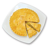
Pie Charts are Great at showing relative relationships between 3 or 4 slices, Look at the actual Pie at the top of this post. It clearly shows 3 slices, one is slightly greater than 3/4 of the Pie the other 2 are about 10 to 12 % (~1/8) each,
So the Big Slice is about 6 times the size of the 2 smaller slices
Thats All I need to know.
But don't start crowding the Pie with more than about 6 slices, the relativities disappear.
If I want to show that the 2 small slices are 10.8 and 10.95% of the pie, this is the wrong chart .
Now having said all the above, all charts can be abused.
So it comes down to what is the author trying to get across to his audience and as such Pie Chart as all charts have a place and a job to do.
Now Chandoo can you send me that Big Slice of Pie, it looks delicious.
@Jib... I disagree. The first and foremost reason pie chart fails is because human eye is poor when it comes to decoding angles. None of the above alternatives use angle as a measurement.
While I recommend and actually use bars / columns all the time, I dont think one should stick to only those. You need explore other alternatives and see what gives you biggest bang for buck.
@Hui... aww.. too bad we ate all of it. Why dont you fly to vizag and I shall treat you with one equally delicious and beautiful.
@Chandoo: I would argue that the larger part of the failure of pie charts to effectively display data is our inability to accurately compare areas.
In this respect, many of the options presented in this article actually compound the problem rather than solving it. The area covered by the objects is distorted and impossible to accurately compare, and as many stated in the comments it is unclear which part of the area is actually meant to be considered for each value.
[...] 10 Alternatives to Pie Charts [...]
[...] (top 3 charts produced with Google Charts API – via a useful blog post) (last one, composed manually with excel bubble charts) [...]
Hi,
How do I make # 3? Is there a sample workbook?
Hello,
How can I use a pie chart with grid lines that look like a bullseye where the center of the bullseye is high risk and the outer ring is low risk? I need four quads.
@Anthony
Have you tried a Stacked Donut chart
Set the inner circle to 0 size
or
You could try a Scatter Chart with a few tricks
Refer: https://www.dropbox.com/s/zxfs6pnd2lzvsen/5Circles.xlsx
If these don't help, can you post or email me a drawing of what your after ?
If anyone is stilling monitoring this thread, can you elaborate on how to do #2? I don't know how to set my x and y coordinates to be the same.
Thanks!
@Tony
Firstly, All posts are monitored everyday, so don't fear about ask questions of old posts
The setup of the data is simple
0 0 10
0 0 20
0 0 30
or
10 0 10
10 0 20
10 0 30
etc
The tricky part is that you can't select the whole area
you have to add each series as a seperate series one at a Time
So select the first Row
Insert, Charts, Bubble Chart
Then once the chart shows a single Bubble,
Right Click on the chart
Select Data
Add a new series
Using the second Row range for the X, Y and Z values
repeat for the other series
You have to have separate series for each set so that you can format each independently
Hi Hui,
Quick question, I can get the bottom aligned chart to work but I want the circles to represent a larger part of the graph. Right now the circles are fine, it is just in the middle of a graph with alot of white space around it. I tried tightening the axis to make it appear larger but that doesnt work. Do you have any suggestions?
Thanks,
Shawn
@Shawn
Select a Bubble
Right click and Format Data Series
Under Series Options, Change the Scale Bubble to to a different larger/smaller number
[…] I try to avoid pie and donut charts. But this combination works. I like the simplicity of the chart and the clear message. Although […]
How to create pie chart alternative using Point no.3? Have no idea. Please advice.
Regards
Anupam
I need an alternative to a pie chart. The director I'm working with likes them but I'm trying to ween him off of them. We are tracking feedback from seminars. My biggest problem is that we are now at 5 wedges (locations) and there is only a 14% difference between the largest and smallest wedge. We will be adding more this year. I really need another way for him to show this data. (He feels that information has value, I disagree but he's a director and I'm an admin.)
I am open to suggestions.
@JoAnn
I'd suggest a Pareto (Ranked Column) Chart
There are several posts here about them
I found a way to convince him to go on a pie-less diet. I added fake information in for the 6 seminars to be held this year. I created a pie chart and then a bar chart. I don't need a cumulative total so a pareto chart would just be more work with no additional value. Thank you for the suggestion tho - I wasn't sure anyone would see this since the original article is 6 years old.
The best alternative to the vast majority of pie charts is a just a regular old bar chart.
The bar chart gets a lot of flack for being "boring", which has never made any sense to me.
Nuts and bolts are boring too, but when you need two things held together...
I like bar charts. They aren't fancy (unless you choose to use a lot of chart junk, which I don't) but they get the message across quickly. The people I work with prefer hit-and-run data.
Feel so stupid, how do you manage no.1&?
The bubbles don't want to align at the bottom :'(
Is there a formula for Y - values?
Hi
I want have 2 pie charts to compare the % of data held within 5 teams...
Other than usung a pie..whats an alternative way to do it..
I dont want to be boring and try something elee