
In the 11th session of Chandoo.org podcast, lets puts on a magic show for your boss

What is in this session?
We all want to impress our bosses, create awesome experiences for our users and become enviable in workplace with our Excel skills. In this session, lets explore 5 very powerful, magical features of Excel that can help you create that jaw-dropping effect.
In this podcast, you will learn,
- Announcements
- Why magic
- 5 Excel Magic Tricks
- 1: Conditional formatting
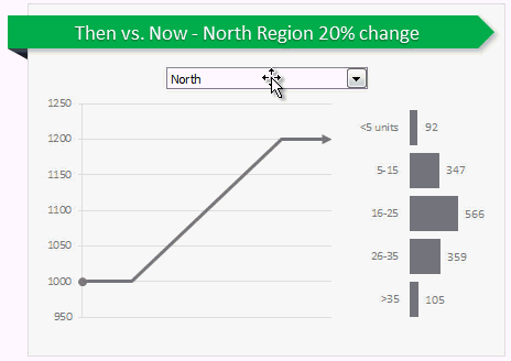
- 2: Form controls + Charts
- 3: Pivot tables + Slicers
- 4: Macros + Automation
- 5: Using right feature @ right time
- How to learn these magic tricks
- Conclusions
Go ahead and listen to the show
Podcast: Play in new window | Download
Subscribe: RSS
Links & Resources mentioned in this session:
Conditional Formatting
- Basics of conditional formatting
- Magical uses – example 1, example 2 & more
Form controls + Charts
- Introduction to form controls (or listen to the podcast)
- Magical uses – example 1, example 2 & more
Pivot Tables + Slicers
Macros & VBA
- Introduction to VBA
- Magical uses – example 1, example 2 & more
Transcript of this session:
Download this podcast transcript [PDF].
What are your favorite Excel magic tricks?
My favorites are conditional formatting, slicers, form controls + charts in that order.
What about you? What features of Excel are most impressive and mesmerizing? Please share your thoughts using comments.
Subscribe to Chandoo.org Podcast


10 Responses
Hi Chandoo.
Thank you very much for your effort to teach us so many things with simplicity. All your teachings have really helped me so far. Keep posting. God bless you.
Pintu
Absolute best Excel item for me is PivotTable – and I still don’t know all there is to know. But what a time saver; expecially for large data base.
1 – MS Query to pivot 2 workbooks via a 5 line UNION QUERY, which also exceeds the million line issue (I’ve currently managed 3.5 million lines and 20 workbooks – excellent for analysing researcher collected data in a dashboard with sliders and a dynamic graph created on the fly – Now that’s magic.
2 – Dynamic named range formula to create truly versatile pivots from variable column and row data EG NamedRange =$A$1:INDEX($1:$65535),COUNTA($A:$A),COUNTA($1:$1)). This formula, and variations of it to create columns and rows for Index/Match lookups, alters the data model dependant on the data from a data connection source on refresh. I replaced a heavy VBA model with a few formulas – NO VBA AT ALL – to achieve a far more versatile multi pivot table data model which is truly scalable as the customer’s requirements change – PURE MAGIC.
I learnt technique 1 from Contextures.com. I developed technique 2 from Chandoo’s recent article on volatile formulas.
Thanks Chandoo for your work
Hi Chandoo,
Great podcast, and very nicely presented. I love the way you combine technical knowledge with a kind of human intelligence. Great combination.
Near the end of the podcast, you talk about using the right feature at the right time to create a magic effect that can cause management and clients trust you in a special way. It reminds me of a British expression where they say he or she “is a safe pair of hands”. Just a few simple words, but it’s a great compliment.
Thanks for taking the time to publish a podcast.
Dave
hi chandoo,
thank you so much for you teaching. I am one of your very old reader/ student and learning lot about excel. You podcasting is out class it is a beautiful combination of knowledge, organization of program , simplecity, honesty , love to teach . So please keep posting and doing your work. I alwys love to see you articals or listen your podcasing every day
Hey Chandoo, another fantastic job!!! Congrats!
I’m your fan!!! God Bless you with much health to let you sharing your knowledge for many many years!!! When do you come to Brazil? I’m looking forward to your sessions in Brazil! All the best!
Dear Chandoo ..
I m a regular reader of chandoo.org and listener of your podcast. Really helped much as a learner of excel. Thanks a lot for sharing.
Dear chandoo…
YOU ARE AWESOME.
Regards,
Nayaksanju
I am interested in charts & Vlookup, Index & Match
If anything interesting please send mail
I have learnt How to tie photos from drop down list box from your excel magic tricks, Thanks a lot
VIJAY
I have learnt “How to tie photos from drop down list box” from your excel magic tricks, Thanks a lot
VIJAY