
Way back in November, I received this email from Tom, a senior researcher at the Center for Learning Innovation in Australia.
I’ve been developing & have published spreadsheet applications for teachers for some time now. In particular, I have animations, adventure scenarios etc that can be used to create games for the classroom. I need to promote these so teachers eventually try these and use them. … Perhaps you could post some of these on your site.
What a noble cause, I thought. So I wrote back to him and invited him to share his files along with a guest article. Tom acted quick and emailed me his article and Excel workbooks by Thanksgiving day. I was too lazy and got lost in the flow of things. But now, I am very very glad to feature his work.
There are so many valuable tricks, ideas and powerful concepts buried in his workbook. I encourage everyone to play with his file (you need to enable macros) so that you can learn a thing or two. If you are a teacher, feel free to use the files to make your classroom teaching even more awesome.
What can you do with a spreadsheet? by Tom Benjamin
The spreadsheet was the original ‘must-have app’ that started the PC revolution because it allowed non-programmers to create loops. It is often overlooked in an era of countless cute free online calculators and interactivities. But few of the latter are easily deconstructed and customised to fit specific classroom needs, let alone being dressed in period costume to become a historical set or adventure cockpit for a an edu-game.
Now that Excel has incorporated graphic tools and form controls it is no longer ‘the boring old uncle’ of software. Its appearance can be as exciting as whatever graphic image you import into it. Its interactivity is as exciting as the context you give it in terms of setting the quest or adventure.
The accompanying spreadsheets cover a range of classroom applications. As demo’s they are intended to give you ideas rather than being a ‘finished product’ resource –ie- you need to look at the formulae to see how it works then change the content to fit your own purpose. These are available as free Creative Commons resources so you may deconstruct and re-purpose to your heart’s content. The main classes of spreadsheet covered here are as follows:
Graphics: Sheets 1-6
The clip art, vector drawing tools and general formatting provisions in Excel allow it to be used as a PowerPoint slide. Without even using formulae, graphic images can be used to hide clues, and elements can be moved around the screen, such as peeking under the ‘rocks’ in the dungeon example. This basic use fits in well with interactive white boards (IWBs). Vector drawing offers capabilities beyond the bitmap imagery in much IWB software. One effective technique is to use the huge library of special fonts such as scientific, i-Ching, Zodiacal, Roman Numeral, Arabic, WebDings and other symbols. Thus, a clue or answer can come up as an image rather than a number.

Although PowerPoint is better-equipped to display animated scenes, videos, sound, and animated .gifs, Excel can display changing frames merely by clicking between sheets manually, allowing complex visual animation. Software is readily-available to de-construct videos, animations and complex simulation modelling output into individual frames. Simple animation can be created by putting such a sequence of images on separate worksheets. The presenter can then scroll through these rapidly either via a form control button or merely hitting the next worksheet tab. This works especially well for full-screen graphics.
Charts: Sheets 7 -24
Charts can be dressed up with graphic borders, colours, and image elements so that they are scarcely recognisable as graphs. The ‘rocket cockpit’ example shows how steering wheels, instrument control panels, and simulated instruments of all types can be created merely by surrounding them with graphic borders. In primary school these might merely be used as visual display items, for instance the flickering torches and spider web in the Dungeon example. Or these could be linked to a formula so that they only flickered or appeared when a wrong answer was given. Setting the mood for such games falls outside the spreadsheet realm but the graphic images used in an adventure game can be set as backgrounds or images in a spreadsheet. Thus, pictures of the various decks of the ship in a pirate adventure could become background images. The player would then work from sheet to sheet inputting words or numbers which would make something happen in the scene, such as the sail rising or the cannon shooting, all of which could take place within a chart by converting its bar graph or pie graph elements to picture backgrounds.
Slider formula controls: Sheets 7-24
In addition to text and numerical input, Excel allows sliders and spinners to control cells. These cells can then trigger events in the sheet. Especially useful for vivid graphical display are protractors made from pie charts as attached. Contour maps are versatile as they can create pictures using colours and image-fills. The attached examples show clues being generated by moving a slider.
More complex animations can be created by linking the picture-filled elements of a chart with ‘0-1’ ‘on-off-switch’ formulae. Examples are shown in the attachments. Again, these are limited only by their quality and imaginative use. Full-blown videos or animations created in other software can be exported to individual frames. Moving a slider can then call up the individual frames. A ‘virtual puppet’ and ‘news desk’ are shown as examples. It would be more commonly applied to illustrating a concept difficult to show with live-action such as the satellite fly-by. The latter could be linked to formulae showing the distance from Earth, velocity etc. These values can be taken from more sophisticated software rather than trying to calculate them with Excel formulae.

Again, the imagination of the presenter is key in that a quick visual simulation may not need to be exact to illustrate a classroom concept. It need only be as good as what might have formerly been portrayed by a sweep of the chalk on a blackboard. The big advantage of the spreadsheet over the chalkboard may be less its imagery than the fact that it can be saved, improved and re-used rather than wiped after the session.
Artificial intelligence and interactive: Sheets 24-27
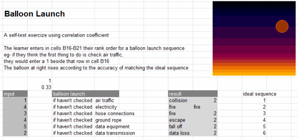
Human judgment of complex rating decisions can be simulated merely using in-built mathematical formulae without resorting to logical formulae, much less programming. Pearson correlations are a built-in function and other matching formulae are easily programmed. The attached example uses the Spearman Rank-Order formula to score the similarity of a launch sequence against an ‘ideal’ sequence-order. Research has consistently shown that such seemingly ‘simple’ formulae can reliably outperform even highly-trained professionals if given a good set of answer criteria.
The value of such artificial intelligence models in the classroom is that they can interact with the learner and that they can be seen to be fair and unbiased provided the criteria for judgment are made explicit to the learner. The Bidding Game and Balloon Launch Sequence examples demonstrate such uses. They are easy to create as they use built-in functions so are limited only by their imaginative use.
If we want our programme to really seem lifelike we can add language interaction. This is important if learners are supposed to be typing in queries like “how tall is…?” or “who is…?” but decide to play around and input irrelevant and irreverent comments. Excel has a range of logical ‘lookup’ expressions that can be combined with formulae to create responses.
The number of cells was a limitation in earlier spreadsheets but the 65536 rows now available allows for at least some limited language response. The random number function refreshes with each entry so that a more life-like interaction can be achieved by linking a rand() function to a cell such that the value changes to an integer drawing randomly from a set of response words/phrases. The final worksheet example ‘the crashing bore’ shows what can be done using commands to parse the input string, a look-up to identify key words, another lookup to match responses to those words, and a random function to prevent the same answers reappearing. More complex interaction could be achieved by constraining user input to specific questions like “how much”, “where is” etc, using weightings, and pattern-correlating against the input string. Graphics can make the ‘chatterbot’ answer-machine interaction seem more life-like or appropriate (like HAL9000 the computer from 2001: A Space Odyssey).
Download the Excel Files
Please click here to download the Excel Workbook for Teachers [this file is 9MB, so give it sometime to download]
Also, Tom made a simple Excel skills test. Click here to download and test your Excel skills.
Thank you Tom
A big thanks to Tom for sharing this valuable work with all of us. I have already learned some good tricks from his workbook (creating image slide-show thru charts+scroll-bar, running formulas on click of button, using contour charts etc.). I am sure you too will find some interesting areas of application or learn some valuable things by examining his workbook.
If you like this workbook, please say thanks to Tom.
Also, if you are teacher, please share your experience of using Excel in teaching effectively.


15 Responses to “A Huge Collection of Spreadsheets for Teachers [What Excel Can Do]”
Awesome !..Thanks Tom and Chandoo for sharing this .
Thanks Tom,its amazing what can be done with excel,I'm gonna share to my son.
You really made brillient collection of excel application possible.
I wrote the Excel skills test on an earlier version so expect many commands to change every time Microsoft changes Excel. They still work on Excel 2007 but it makes quite a challenge. So don't feel bad if you find it difficult. The purpose of the quiz is to give you ideas of how to hide clues for designing your own adventure quests. Thanks for the kind review.
Great Tom! The test was more fun in 2007 and now I'm more familiar with the format tools in excel 2007. Can't wait to share it with my friends.
Thanks Chandoo. I think the bright yellow circle in Tom's book was a nice hint for the Maldives...especially if you picked up those tourist bags!
Awesome !..
WOW! - awesome use of thinking outside the square.
Amazing use of Excel Tom.
Go Aussie!
Thanks Tom!
This is brilliant...! Thank you Tom!!
Thanks Tom.... its really fun with excel...teach can so wonderful...
Kudos to Chandoo for providing the sheet of Tom and many more things... as mentioned before.. I feel like am talking to you guys virtually... while I jump on my chair... hitting at every next adventure with Excel on this website.... Amazing great effort and work has gone behind the scenes... understandable to people who teach basic excel..
Awesome sheets buddy....................Great Work
Thanks a lot for sharing your brilliant work.
[...] Maths/Science – http://chandoo.org/wp/2011/02/03/spreadsheets-for-teachers/ [...]
Dear.
There are a set of debit values and a set ot credit values in a column. I want a vba code by whcich the debit value plus a single / multiple credit value is zero that needs to be marked .
finally i will come to know out of the avaibale debits which cannot be used the with avilable credits either single or multiple values.
If multiple matching sets are available let it take the 1st or the 2nd one its not an issue.
Column A Ref
-1000 A
-5000 B
-8000 C
800 A
100 A
100 A
2000 B
3000 B
13000
15000
Thanks in Advance
[...] Maths/Science - spreadsheets as ‘adventure cockpit’ [...]
Awesome!!!
Tx for sharing your ideas.