Sachin Tendulkar ODI Stats – an Excel Info-graphic Poster

Share

Facebook
Twitter
LinkedIn

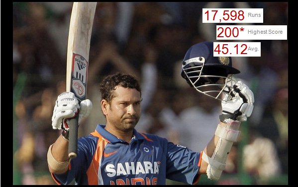
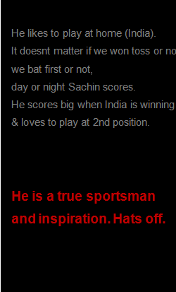
Sachin Tendulkar is undoubtedly the best cricketers to play One Day International Cricket. He is a source of inspiration and joy for me and many others. So, naturally I was jumping with joy when I heard that he scored the highest ever runs in a single match on 24th of Feb. He scored 200 runs (first ever double century in one day cricket), batted for all the 50 overs and remained not out. A true symbol of passion and excellence. [his cricinfo profile, commentary on 200 score]

But what has all this got to do with Excel? Well, some of you know that I am fan of Sachin. Last time he became the highest scorer in test cricket, we celebrated that with a dashboard of test cricket statistics. Similarly, now too, I have prepared an info-graphic poster on Sachin showcasing his achievements. See it below,

[if the below image is kind of messed up, click here to see it in full]


Behind the poster:

I have made this poster in Excel 2010 (it has sparklines, that is why). The data is from Cricinfo’s statsguru page.

Download the original poster excel file (you need Excel 2007 or above to play with this).

Also, if you want to see the entire poster as one image click here.

Congratulate Sachin

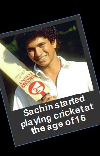
Sachin is a hero in my world. He has been inspiring me to do better for the last 20 years. I am sure some of you are inspired by his passion, commitment and excellence in the Sport of Cricket. Join me and congratulate him.

Previous Visualization Projects

From time to time, I indulge in some fun visualization projects where we push the limits of Excel to do something awesome. Some of the earlier attempts are,

Flu trends chart in Excel | History of Excel – a timeline | Visualizing Olympic Medals since 1900.

Facebook
Twitter
LinkedIn

Share this tip with your colleagues

Excel and Power BI tips - Chandoo.org Newsletter

Get FREE Excel + Power BI Tips

Simple, fun and useful emails, once per week.

Learn & be awesome.

Welcome to Chandoo.org

Thank you so much for visiting. My aim is to make you awesome in Excel & Power BI. I do this by sharing videos, tips, examples and downloads on this website. There are more than 1,000 pages with all things Excel, Power BI, Dashboards & VBA here. Go ahead and spend few minutes to be AWESOME.

Read my storyFREE Excel tips book

Overall I learned a lot and I thought you did a great job of explaining how to do things. This will definitely elevate my reporting in the future.
Rebekah S
Reporting Analyst
Excel formula list - 100+ examples and howto guide for you

From simple to complex, there is a formula for every occasion. Check out the list now.

Calendars, invoices, trackers and much more. All free, fun and fantastic.

Advanced Pivot Table tricks

Power Query, Data model, DAX, Filters, Slicers, Conditional formats and beautiful charts. It's all here.

Still on fence about Power BI? In this getting started guide, learn what is Power BI, how to get it and how to create your first report from scratch.

15 Responses to “A Gantt Chart Alternative – Gantt Box Chart”

  1. Kenjin says:

    That's a great idea.
    Maybe the planned End Date should be highlight more.
    I don't know how it would look like (nor how to do it yet), but what if instead of finishing the bold line to the best case End Date, it finishes to the realistic End Date?

  2. ross says:

    The idea is ok, I think other project management tools have this, already? Maybe not.

    Gantt charts in my view are about the signal most unless thing in the world, theres no way you can look at one thats more that a little complex and understand what it's telling you. I'm going to write a diatribe on project management at some point, its one of my pet areas I think!! 😉

    The issue I have with this chart Chandoo, is that Tasks need to be linked to each other, so they should inherit the uncertainty, which would mean the as you moved down chart the lines would be miles apart for later tasks, and you might have to add lots of lines for subsequent tasks to cover the various outcome of it's parents.

    Having said that, for the high level board summary, it's a nice way to go, it it appeals to the management 😉

    thanks Chandoo, great post.

    Ross

  3. Cyril Z. says:

    Whoooa !!! That's a very clever idea Chandoo. I really love it.
    I think i'll update my gantt project sheet with that idea soon (remember my template ?)
    @ross : you can link start date to the end date of the previous task in your data. The only problem I still se is to which end date (real ? planned ? best ?) in order to have average amount of information.

    If best end date, you'll tend to increase uncertainty at the end of chain, although if you link to real end date, uncertainty will be decreased too much, leading in both cases to wrong management direction.

    Maybe planned till the task is finished then real will do the job ?

  4. Vijesh says:

    Hey chandoo, this looks good and this would definite add value in production planning / scheduling. Uncertainity in finishing a task is very high in production scheduling and this could give an insight or a bird eye view of possible shipments we can have....

  5. PK says:

    I've always been frustrated by the limitations of gantt charts. Will definitely use this, I've always struggled with how to succinctly communicate the uncertainty of certain tasks without confusing stakeholders.

  6. Andy says:

    I like this, I think it's a very effective way of showing how a timeline can change and which parts of a project need close attention.
    @Cyril / @Ross: I would intially link the the start date to the planned end date of the previous task, with the chart updating when a task has been completed to reflect the true end date.

    Or what about giving a drop-down selection box to allow the user to see the chart based on planned/best-case/worst-case end dates?

  7. Eric says:

    Like the idea. Have found that Excel is more flexible than MS Project for graphical solutions. The "Best Case"\"Worst Case" metrics are theoretically appealing but once the project and\or phase commences their reliability diminishes. A chart like the above that showed Planned Start, Planned End, Replan End Start, Replan End Date, Number of Replans the Start and End Dates, and Actual would provide an active, actionable view of each task\phase. It would also highlight the areas which are riskiest.

  8. Bob says:

    It is always amazing how flexible excel can be.

    My question is how would the chart show a scenario where the date moved up? If a task is dropped or the duration of the task is significantly reduced by applying more people or machinery to the task, the dates will move up.

    The gantt chart has been around for a long time, but it is still quite useful to show progress.

    Cheers,
    B

  9. Shyam says:

    I like the idea but seems bit complicated in case of long projects involving numerous activity.

    Also, reading and explaining is required hence not feasible where plans are just send to audience for approval.

    Cheers
    SY

  10. Peter says:

    Great idea Chandoo,

    When I was reading this idea regarding delivery dates, another thought popped into my mind, how can you show the uncertainty with MONEY!!

    In this case, applies to cost management or even a normal budget, you think?

    Would Box Chart and Gannt Chart help to understand the best case, middle case and worst case when money is spend or planned with these three risks are involved?

    I imagine that this chart could help people who write their budgets get a better understanding of risks affecting their spending.

    Peter

  11. Matthew Galman says:

    Chandoo,

    I like it. How would you display an entry once it has been completed (actual)?

    Thank you,

    Matt

  12. Phil says:

    From what you have shown so far I think that this box Gantt chart is awesome! I think that this could be an extremely useful tool.

    I can't wait to learn how to make my own charts in Excel.

    Will the methods that you are going to teach us work in 2003 as well?

  13. [...] Firday, we proposed a new chart for showing project plans. I chose an ugly name for it and called it Gantt Box [...]

  14. TommyZ says:

    You need to read Eli Goldratt's Critical Chain. The uncertainty you are looking for should be accounted for in a project buffer. Not at each task level.

    Further you should spend time understanding Agile Development. This would have you plan only in 1-3week iterations. This allows you to embrace changes to work not yet started, and for your customer to re-direct your course at regular intervals (after each iteration) throughout your project. keyword search: Agile Scrum

    These items will show you that you are solving a tracking problem for something that you can entirely avoid!

  15. […] Chandoo.org’s  Gantt Box Chart. […]

Leave a Reply