
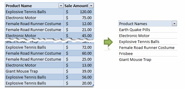
Removing duplicate data is like morning coffee for us, data analysts. Our day must start with it.
It is no wonder that I have written extensively about it (here: 1, 2, 3, 4, 5, 6, 7, 8).
But today I want to show you a technique I have been using to dynamically extract and sort all unique items from a last list of values using Pivot Tables & OFFSET formula.
This is how it goes…,
Step 1: Select your data & Create a pivot table
Just select any cell and insert a pivot table. Very simple right?
Step 2: Drag the field(s) to row label area of pivot
Like this.
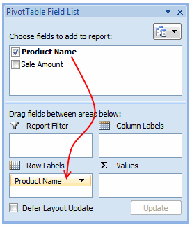
Make sure you have turned off grand totals and sub-totals as we just need the names. And sort the pivot table.
Step 3: Create a named range that refers to the pivot table values
Using OFFSET formula, we can create a named range that refers to pivot table values and grows or shrinks as the pivot is refreshed. Assuming the pivot table row values start in cell F6, write a formula like,
=OFFSET($F$6, 0,0,COUNTA($F:$F)-1,1) and map it to a name like lstProducts.
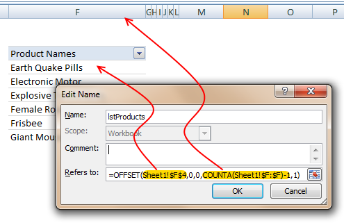
The formula gives us all the values in column F, starting F6. The COUNTA($F:$F)-1 ensures that we get only row labels and not the title (in this case Product Names).
Step 4: Use the named range in formulas etc. as you see fit
That is all. Nothing else.
Just make sure that you refresh the pivot table whenever source data changes.
Download example file with this technique
Click here to download an example file and play with it to understand how this works.
How do you deal with duplicate data?
In my work, I come across duplicate data all the time. I have been using pivot table based technique with great success. It is fast, reliable and easy to setup. The only glitch is that you need to refresh the pivot tables whenever source data changes. However, you can automate this by writing a simple macro.
What about you? How do you deal with duplicate data? Share your techniques, tips & ideas using comments.


31 Responses to “Remove duplicates & sort a list using Pivot Tables”
Good tip, Chandoo. It's worth pointing out that this approach might significantly bloat the size of your file, because ALL your data is duplicated within the pivot cache...which could be many many megabytes even if your pivot summary only has a few item.
So you might want to have your data stored in another workbook, and just point the pivottable to that workbook. But this will still pull all the data in the entire table through, even though you only want a distinct list of items. So you could just pull in the column you are interested in (i.e. your 'product name' column), and not all the data from the entire table. But even this will pull through many duplicate items, even though your pivot table will only be displaying a list of the distinct items.
So how about using a 'Select Distinct' SQL query from microsoft query (which is built right into excel) to jst returns a list of distinct (i.e. non-duplicate) names , and nothing else? This is pretty easy to set up using Microsoft Query when you know how...you just have to make sure that your raw data table is in a form that MS Query can see it. To do this with your sample file I just deleted rows one to three, so that the column headers were in the top row. Then I made sure that under the 'Options' button on the 'Query Wizard: Choose Columns' dialog box that the 'system tables' option was checked. Then when you choose the particular column you want, you just need to add the keyword ‘Distinct’ after the ‘Select’ keyword in the SQL query that Microsoft Query builds for you. Unfortunately the whole process is a bit complicated to explain here, but perhaps will make a good future post subject.
On the bloat that a pivot table adds, I posted a comment over at http://www.dailydoseofexcel.com/archives/2004/11/26/creating-a-simple-pivot-table/ recently that illustrates this. On my home pc, using excel 2007 I create d 3 complete columns (i.e. one million rows per column) of =rand() then converted them to values. When I saved the workbook, I got a file size of 50 MB. If I then created a pivot table on a second sheet from this data, but don’t explode it (i.e. didn’t put anything in the data or column/row areas) I got 83.6 MB for pivot and data. So it seems the pivot alone added 34 MB.
Note that if you then 'explode' the pivot table by dragging something to the data or column/row areas, then the file size can balloon disproportionately. For instance, when I put all three columns in the row area so that the pivot resembled the original data source, I got 163 MB for pivot and data, which is quite some increase.
When you copy the pivot table without the actual data, it is defnitetely smaller. It still keeps the original data within the pivottable.
@Jeff... excellent points. I didnt know pivot table increase the file size so much. For my data, I hardly notice the file size as most of them I work with few hundred or thousand rows.
I like the idea of using microsoft query, I heard about it before but never tried it. Let me explore it and write a short post explaining what it does here.
Indeed.
Chandoo, can you explain the logic behind the dynamic range for the pivot table? I just recently learned how to use a dynamic range for charts (offset([sales column],0,0,count($b$1:$b$25),1). Is there a difference in the execution?
FWIW, I use MS Query like every single day. It's like the dirty secret of excel. Hint: It's not just good at removing duplicates. A good deal of what you need to accomplish in your shaping phase can be accomplished with some quick SQL. Even if you've got some tagging that would otherwise be accomplished w/ a vlookup, some calculations that you always do , or filtering.....OH HELLZ YEAH.....when I have to do some hard core filtering, I do it in the query tool and then I gawn drank with all the extra time I have.
A few thoughts:
1. You don't have to write the select distinct statement yourself. View>Query properties>Unique only will set one up for you.
2. If you are going to try to write the SQL yourself - even for simple stuff - use NP++ or something. I'm not sayin, I'm just saying, software that was last updated in 1997 looks pretty rough these days.
3. You can use a quick named range for your source data. The query tool will recognize it.
4. Queries have some specialized properties once imported. Right click on the resulting imported data to see the fun.
5. WTF is SQL anyway? http://sqlzoo.net/
6. Truthfully, once you get good with with ms query tool, it becomes a short drop to the point where you're going to use Access or Firebird to do most of your shaping anyhow.
However, if somebody can tell me how to trigger a parameter query that references a drop down box w/ some VBA, I'll be a happy camper. That would be dashboard pimpyness.
And I agree with Chandoo. If you're accustomed to working with 20,000 rows of data minimum (which is about where I get started) file size matters less. jeff! It's like 2010 man! I can help you find a cable modem provider!!!
I should add:
Let's just say you work for a company where you don't have fancy pants excel 07 and instead are stuck in 03. One of 07's killer features is tables, something that's lacking in 03. The QT lets you achieve much of the same thing.
That said, working with the two are pretty similar: Where as in a table it's =[price]*[qty], in the query tool it's Ext Price: [price]*[qty]. The two have some natural synergy.
"Duplicate" can be fuzzy in much of the data I handle (education data). I usually have to use multiple criteria to flag possible dupes, then manually review. The better that multiple-criteria filtering/flagging can be, the fewer records I have to look at. My first pass of review is generally to use a countifs on the criteria in question to fill a dupecheck column. Anything more than 1 on the count indicates a possible dupe.
For example:
=COUNTIFS([ID],Table1[[#This Row],[ID]])
=COUNTIFS([ID],Table1[[#This Row],[ID]],[subject],Table1[[#This Row],[subject]])
If the end goal is that I'm going to be aggregating the data in some other sheet, and I need to ensure the lookup controls for possible dupes, I'll probably do something along the lines of either using that countifs field (and manual review) to setup a "use" or "clean" field as one of the criteria in my index() lookup. If I do the check/filter at the same time as a the lookup I'd use something like:
match(criteria1&criteria2&criteria3,range1&range2&range3,0) as the rownumber in my index. That "use" field could be one of the criteria.
What about if you just go to?
.
[Pivot Table Options] [Data] and Uncheck [Save source data with file].
.
Regards
SELECT DISTINCT is slow on large data.
Use GROUP BY
I use the Remove Duplicates feature in Excel 2001 and 2010. In Excel 2003 I sort then use a formula (cell below = cell above), the search box, and delete all TRUE values. Remove duplicates on Excel 2008 is similar to Excel 2003 except it doesn't have a Find All button in the Find dialog box.
I'll give Elias a vote. Uncheck the 'save data with table layout' will lower the kilobytes dramaticly.
I'll also use the 'refresh on open' when some data is added. Just close and reopen and the table is up to date without the bytes blow up.
Keep up those great posts
@Dan I...All very good points, Dan I. Some further thoughts in order:
1)I'd never played with the options under 'view' before. Thanks for that.
2) Notepad ++ rocks. Did you see the post over at http://msmvps.com/blogs/xldynamic/archive/2010/09/22/formulas-made-easy.aspx?utm_source=feedburner&utm_medium=feed&utm_campaign=Feed%3A+msmvps%2FtUAg+%28Excel+Do%2C+Dynamic+Does%29&utm_content=Google+Reader on how to set up Notepad++ so that you get code folding, keyword highlighting, and Intellisense for excel formulas?
3) I forgot about the named range option. I turned on the system tables option because MS Query doesn’t recognize excel 2007 tables, but named ranges would have been much better.
4) Good point.
5) That’s a very good link. Great tutorial.
6) On MS Query, and SQL in particular, it packs a very large punch in terms of data analysis. It’s certainly very good at doing stuff that would take many rows or columns of additional helper cells or some VBA massaging, and much easier for someone else (or yourself) to eyeball, troubleshoot, maintain etc at a later date
On filesize, when you are publishing data publicly, not everyone will have a cable modem or even access to cable or ADSL. In New Zealand where I live, which is a long, stringy country, maybe 20% of connections are still dial-up (mainly in rural areas where it's too far to economically run fiber) and a whole heap of people are on ADSL that is already quite slow the further you get from the exchange or local fiber cabinet. Plus there's some govt guidelines here about keeping file sizes small, if you’re publishing govt data.
@Sam...thanks for the tip.
Hey @Chandoo - I love your site. Quick question - what is the best way/tool you use to make the little "paper tear" graphic in your very first picture here. I would like to esepecially use in the case of doing a graph that has a jog in the series, for instance jumping from 0% to 60% on a bar chart in the Y, or I suppose X, axis.
Thanks!
@Preston... I use paint.net a free image editing program to create the paper cutting effect. It is a bit of manual work, you need to copy the same image in to 2 layers and then use lasso select tool to select zigzag shape.. But if you are familiar with paint.net or photoshop you can do this in like 5 minutes.
@Dan_l, Jeff, Tom, Elias, Gregory and Sam.. good discussion.
@DQ... In case the duplicate is fuzzy, you should check my fuzzy match UDF. It can do wonders for you when the data is not clean. http://chandoo.org/wp/2008/09/25/handling-spelling-mistakes-in-excel-fuzzy-search/
Thanks @Chandoo - Appreciate the tip on that! I have been attempting something similar with Snag-It, but can't get anything as precise as this. Again - I love Chandoo.org and point all my new colleagues to the expertise contained here. Happy trails!
Hello Chandoo,
To remove duplicates I usually sort the column values where duplicates are present and then use the formula in the adjacent cell, for ex. if the sorted list in cell A then in cell B i use the formula =A1=A2 it gives me true in case of duplicate and false in case of unique values. And then I remove all the values from column B where True is coming by autoflitering it.
It gives me the unique values real quick.
Thanks.
Thanks.
Abhishek, I found that this method does not work very ofter. What if two amounts really should be there? You will then take it out because your though they were duplicates
Jeff, I should have qualified my statement. "it's 2010 man, everybody has unlimited broadband (except kiwis)". My daughters godmother recent moved back to New Zealand from here in Chicago. Just the caps on her mobile plan give me headaches. But you guys have zorbing, so it's an ok trade off.
Another thing you can do - and I do this often times for some of my 'regular' reporting requirements.
You dump your source data out of your ERP system. Pop it open, name the range, save the file as all in a fashion you've predetermined in a template. Open the template, hit the refresh button, and whoooozah---instant report. It takes a little practice, but overall a great trick.
You can use much the same idea for regular sorting/filtering. SAP is pretty complex where I work, so I have numerous circumstances where I have to drop out 40,000 lines of data, only with a guaranteed filtering of 20,000 of them. So, I just use the above method----instead of outputting a report type worksheet, just a random sheet where where the filtered data can be dumped.
Maybe I'll set up a small example and share it on the forums for anybody who's curious.
Did you know: .dqy files can be launched with a double click?
I hadn't seen that NP++ post with the download. I'll give it a shot. I've had my own (less evolved) use of the language feature for excel, but frankly - it's just not very good.
Another cool thing in NP++ land: you can set up a really generic query..."select * from table where". Open it up and set it up to fire from the console on a hot key after you add some where criteria.
Jeff,
How did you get those xml files imported into NP+++. I can't seem to make it work.
actually, I got it to work. That's bad ass beyond belief.
What tool do you use to rip a picture in two( like in hte first picture )?
I'm still in the slow lane of Excel 2003, but just worth saying that for big lists PivotTables are limited to 8,000 unique items.
@Jelle-Jeroen Lamkamp - I also asked Chandoo that question earlier in the comments 😉 - His answer back was paint.net, a free tool online...
I can see that in the properties of the picture.
But I want to know how its done.....?
@Andy... I think if you have more than 8000 unique items, it is time you moved the list to Access. It is lot more robust and capable to handle data like that. You can set up a connection to get what you want in to excel.
@Jelle. You need to know a bit about how layers work to get this. See this to know how you can do this in Photoshop. The procedure is more or less similar in Paint.net. http://www.myjanee.com/tuts/torn/torn.htm
Chandoo, Which is the "handwriting font" that you use next to your pictures? They look great.
I created 30000 random text values in a column and then used advanced filter in Excel 2007 to create a unique distinct list. It took 5 seconds of processing and the result is a new list (29961 text values) without duplicates. Why not use advanced filter?
@Manu.. the font name is Segoe Print.
@Oscar: Of course, advanced filters also work, so is the "remove duplicates" button. But both of them are not dynamic, ie you need to do it again when your source values change. The above technique is quasi-dynamic as it requires only data > refresh.
In fact, I have mentioned the adv. filter technique too in this blog, here: http://chandoo.org/wp/2008/08/01/15-fun-things-with-excel/
@Chandoo: I should have been more clear. I commented above discussion. Thanks for a great excel blog!
[...] Dashboard in Excel using Slicers 2) Creating a Dynamic Chart using Pivot Table Report Filters 3) Remove Duplicates and Sort a list using Pivot Tables 4) More on Pivot Tables & Modeling Spread some love,It makes you awesome! [...]
I think it is better to take out duplicates in the actual source data. You ca nuse a countif, by numbering from first occurance to last. Then simply only show the 1's in your pivottable.
This makes the pivottable a bit cleaner for me
Chandoo, I tried to apply this to my data but nothing happened. I see it in my Name Manager. I also downloaded your sample but do not see how it is formulating the grouping. It's not applied in any of the fields in the field manager. So, how is it working? How is it applied to the pivot table?