
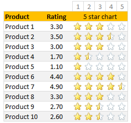
Whenever we talk about product ratings & customer satisfaction, 5 star ratings come to our mind. Today, let’s learn how to create a simple & elegant 5 star in-cell chart in Excel. Something like this:
A while ago, Hui showed us a fun way to create 5 star charts in Excel using bar charts with 5 star mask. I highly recommend reading that article if you want to create a regular chart version of this.
Tutorial for creating a 5 star chart
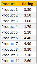
1. Meet the data
Here is our data. Very simple. First column has product names. Second column has customer rating – from 1 to 5.
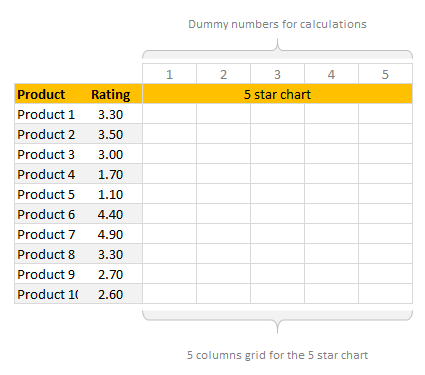
2. Set up 5 blank columns for the 5 star chart
Let’s create a 5 column grid right next to our data set. This is where the in-cell 5 star chart will go. At this stage our 5 star chart looks like this:
If you haven’t guessed yet, we will be using conditional formatting > star icons to get the 5 star chart.
3. Write formulas in the 5 column grid
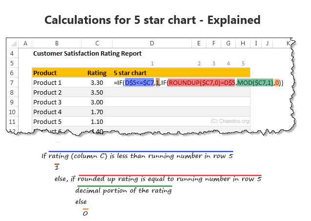
Now, we need to write formulas to fill up the 5 column grid. We need to formulas to return either 1, 0 or decimal values in the grid depending on the rating for that row.
So, for example, if a product has 3.30 rating, we want to print 1, 1, 1, 0.30 and 0 in 5 columns.
You can use any number of formulas to get this result. The simplest one will be IF formula.
Assuming column C (from C7) has product ratings & row 5 has running numbers 1 to 5 (from cell D5), we can use below formula to get what we want:
=IF(D$5<=$C7,1,IF(ROUNDUP($C7,0)=D$5,MOD($C7,1),0))
To understand the above formula , see this illustration.
If you like to avoid IF formulas, here is an alternative:
=MAX(($C7>=D$5)*1,MOD($C7,1))*(ROUNDUP($C7,0)>=D$5)
A challenge for you: Can you think of any other ways to write this formula?
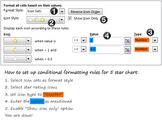
4. Apply conditional formatting to the 5 column grid
Select the 5 column grid and apply conditional formatting (Home > Conditional Formatting > New rule)
Set up the rule as shown below:
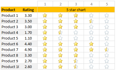
At this stage, our report looks like this:
5. Adjust column width and borders
Once the formatting is applied, just clean up the report by adjusting column width (set it to 24 px) and add horizontal borders only.
And our product rating report is ready.
Download in-cell 5 star chart template
Please click here to download the in-cell 5 star chart workbook. It also contains a variation of the 5 star chart made with data bars & 5 star mask. Check out both examples to understand how they work.
More in-cell chart tutorials & techniques
In-cell charts are a powerful & lightweight way to visualize your data. Check out below tutorials to one up your awesomeness.
 Create in-cell charts with markers for target / average
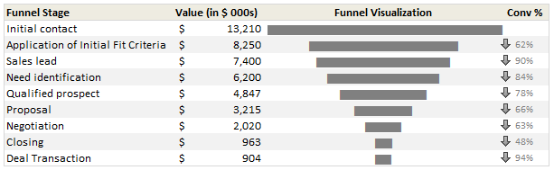
- In-cell sales funnel charts
- Suicides vs. Murders – story told with in-cell charts
- Another 5 star chart (plus show details on click)
- Exploring survey results in interactive dot-plot chart
How would you visualize customer ratings in Excel?
While 5 star charts are traditional, they dumb-down the data. Can you think of other fun ways to visualize customer / product rating data? Please share your thoughts & implementations in the comments.


23 Responses to “Learn Top 10 Excel Features”
What it looks like if excel without formula?? 🙂
It would be not excel it would just be fancy tables in which you could just use power point. (Chandoo) would Access be an alternative?
Awesome piece of work!!!
Great article.
Chandoo - my biggest interest in the article was the awesome word-graphic at the top - where did you go to get it done into a shape?
@Rich.. thank you. I used http://www.tagxedo.com/ to generate this word cloud. I took all the comments in the original post, pasted them in tagxedo website and set up the shape etc.
Awesome Chandoo.. You need always needs coffee to start up with. BTW , how did u created the Heart Shaped picture filled with High Repetitive text in it .. Please put it on your Next blog ...
Chandoo, good article. I’ve added a link to it from Connexion – our collection of the most useful and interesting spreadsheet-related articles from the web. See http://www.i-nth.com/resources/connexion
Hi,
Just one small question. Where the hell have been I in the past for not discovering this website sooner?
I've lost a job interview recently where even though I had the subject knowledge, I was not upto their mark in Excel.
Thank you for all the free tips, guidance and for creating this forum environment.
[PS: I've just been through the site for the 1st time, and have signed up for the newsletter. You can expect pretty stupid questions from me soon]
Hy Chandoo, you always inspire me with to explore something new in excel. This data structure table is only for excel 2007 or compatible to 2010. I recently installed latest excel version 2013 in my System and experience problems regarding operating according to previous one. I'm waiting your article relates to that excel version.
Thanks
Awesome article Mr. Chandoo and that is a awesome heart shaped pic you created. Great tips as well.
[...] Learn Top 10 Excel Features | Chandoo.org – Learn Microsoft Excel Online. [...]
Chandoo is awesome..
Thanks, i got better, And i always get 90.50 in my grade card but now i get 96.50 i improved because of the tutorials you gave, Thank You Very Much Chandoo Guy.
Hi chandoo, i am intersted in seeing the video or step by step done procedure of analysing the comments and presenting in the data percentage steps. I think this one would be first step in finding out how generally happens data calculation. Thank you.
As well i would like to know how to get that black shape art of your face which i see in chandoo. I am interested in making it for me.
Nice to see the features considered by Excel users to be most useful. It might be a good idea to also analyze StackOverflow Excel questions to see what keywords appear most often.
Here are my top 10 Excel Features (for advanced users):
http://www.analystcave.com/excel-10-top-excel-features/
Thanks a ton for this it totally helped with my homework ????
Very good effort
Thank you for this. Lots of learning in the links you've provided for this septuagenarian.
Pls send me new post
Dude, your humor ? ?
Loved your work.
Hello Sir,
I am Sanjeev Khakre and i from Indore City, India , I am your big follower and i have watch your videos and learnt a lots of excel trick or function and many more . thanks so much for all of your excellent support.
Your excel knowledge is real awesome.
Thanks
Sanjeev
Your work is excellent but pls willing to know more details about the features of microsoft excel
Chandoo Would Access be a better alternative than VB?