
Whenever we deal with large amounts of data, one of the goals for analysis is,
How is this data distributed?
This is where a Box plot can help. According to Wikipedia, a box plot is a convenient way of graphically depicting groups of numerical data through their five-number summaries: the smallest observation (sample minimum), lower quartile (Q1), median (Q2), upper quartile (Q3), and largest observation (sample maximum) [more]
Quartile?!? What is that like?
When we say $ 39,000 is the lower quartile of salaries paid in Acme inc. it means, 25% of people make less than or equal to $39,000
Like that Median (Q2) means half the samples are lower than median & the other are more than median.
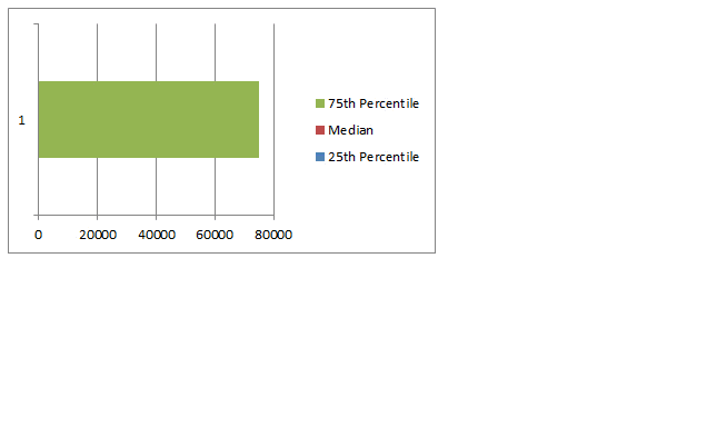
Example Box Plot
Here is an example box plot depicting salaries of all analysts in USA as per our recent Excel Salary Survey.
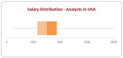
The box shows distribution of middle half of data (salaries) while the lines (called as whiskers) show minimum and maximum salaries.
As you can see, 50% of the analysts make between $46,000 to $75,000 while the min is $10k and max is $160k.
Why use Box plots?
Box & whisker plots are an excellent way to show distribution of your data without plotting all the values. They are easy to understand. We can use them whenever we have lots of data or dealing with samples drawn from larger population.
Creating Box plots in Excel – 9 step tutorial
Despite their utility, Excel has no built-in option to make a box plot. Of course you can make a 3D pie chart or stacked horizontal pyramid chart. Lets save them for your last day at work and understand how to create box plots in Excel.
Step 1: Calculate the number summaries
Assuming your data is in list use formulas MIN, MAX & PERCENTILE to calculate summaries like below:
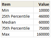
To calculate 25th percentile (Q1) use = PERCENTILE(list, 25%)
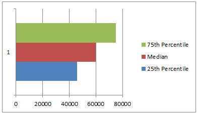
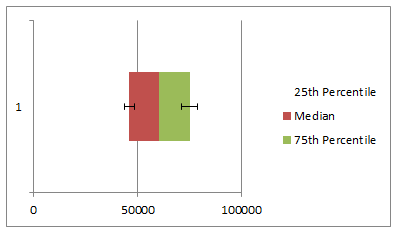
Step 2: Make a bar chart from Q1, Median & Q3
Just select the 25th percentile, median & 75th percentile values and create a bar chart.Make sure that your chart shows 3 different colored bars not 3 bars in one color.
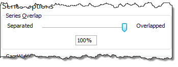
Step 3: Set series overlap to 100%
Select any bar, press CTRL+1 (right click > format series) and adjust series overlap to 100%
Step 4: Adjust series order so that you can see all the bars
If you cannot see all the bars, right click on chart, click on “Select data”.
Now, adjust the series order using arrow keys so that you can see all the bars. See this demo:
Step 5: Make 25th percentile (Q1) bar invisible
Select the bar corresponding to Q1 and fill it with white color. If you make it transparent, it will not work. So make it all white.
Step 6: Add error bars to Q1 & Q3 series
Just select Q1 (25th percentile) bar and add error bar (any type) from layout ribbon.
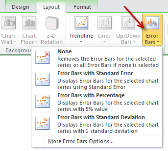
Repeat for Q3 series as well.
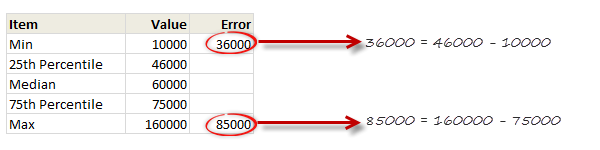
Step 7: Set up error values in your data
Add an extra column in your data area and use simple formulas to calculate error values, like below:
Step 8: Set up custom error values for Q1 & Q3
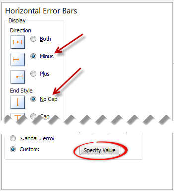
Select the error bar for Q1 (25th percentile) and,
- Press CTRL+1 to format them
- Enable only minus (negative) error bar with no cap.
- Select Custom as error amount and point to the calculated value.
Repeat for Q3, but choose positive error bar instead.
Step 9: Format the box plot to your taste
Remove any legend, axis, labels that you do not need. Change colors to suit your taste and mood. Make the whiskers subtle and knock off the grid lines. You are good to go.
Making Box plots interactive
Since box plots are very useful to understand distribution of values, we use them in dashboards etc. Naturally, you are interested to know how values are distributed for various things.
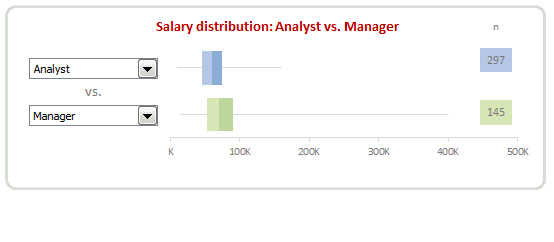
In this example, we may want to know how analyst salaries compare with manager salaries.
To make things complicated, we have 10 different job types, thus enabling 45 possible comparisons (10c2)
This is where interactive box plots can help. See this demo to understand:
Interactive Box plot in Excel – a Demo
How to make interactive box plot in Excel
Construction of box plot is same as mentioned above. The difference is in adding interactivity.
Step 1: Use combo box form controls to capture comparison criteria
Excuse the tongue twister. Using Developer ribbon > Insert > Form controls, add 2 combo box controls and point them to the list of job types.
Lets assume that these combo boxes are linked to cells D1, D2.
[Related: Introduction to Excel Form Controls]
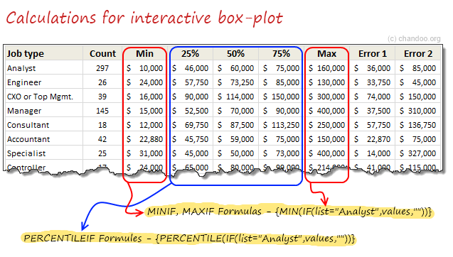
Step 2: Calculate 5 number summaries using MINIF, MAXIF and PERCENTILEIF formulas
Don’t rush to type the formulas yet. There is no such formula as MINIF (or MAXIF or PERCENTILEIF). Assuming your list of jobs are in joblist, write
=MIN(IF(joblist=”Analyst”, list_of_values,””))
and press CTRL+Shift+Enter
Using MAX(IF(…)) and PERCENTILE(IF(…)) you can calculate remaining 4 summaries.
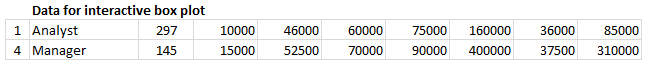
Step 3: Based on combo box selection, fetch any two sets of values
Using INDEX formula, we can fetch values corresponding to each combo box selection to a set of cells, like this:
Step 4: Connect these values to your box plots
That simple!
Step 5: Format and interact
Format the charts. Play with combo boxes to interactively compare one set of distribution with another. Show it to your boss or client and see them fall off a chair.
Download Box plot tutorial workbook
Click here to download the workbook containing these examples. Play with it. Check out various formulas and chart settings. Learn.
Do you use Box plots?
I love box plots. I have used them several times. Few examples are here: Excel age survey results, Gantt box chart and more.
In our Excel salary survey contest too, many people have used box plots to clearly compare compensation composition. Checkout the entries by Aditya, Allred, Anchalee, Anup, Bryan, Jeanmarc, Joerg, Kostas, Luke, Michael, Nathan, Sergey and Vishwanath. Especially Jeanmarc used interactive version of box plots to allow comparison on demand.
What about you? Do you use Box plots often? How do you prepare them? What is your experience like? Please share using comments.
Create Box plots often? Use Jon’s Add-in
If you need to create box plots often and find the above process tedious, then please consider getting a copy of Jon Peltier’s Box Plot add-in for Excel. It works like a charm and produces what you need. All in a few clicks. Click here to know more.
PS: Link to Jon’s add-in is an affiliate link. It means, when you buy it from Jon thru this link, I will get a few bucks too. I recommend it because I know it is awesome and perfect for box plots.


66 Responses to “Budget vs. Actual Charts – 14 Charting Ideas You can Use”
[...] Update: Check out the results at Budget vs. Actual Charts [...]
Hi there:
I'm interested in understanding exactly how contestants #'s 1, 8 got their surplus or shortfall to show up at the top of the bar (is this overlapped or stacked somehow) and change colour? I hope this makes sense. I've tried to find samples and I can see contestant 8 (cuboo) may have used something called graphomate but I can't use this.
I need to create a bar chart that shows budget, and actual variance whether it be a surplus or a shortfall and I would like make it look like option 1 or 8 above but haven't a clear idea how to do it...any help would be greatly appreciated!
Regards..Linwe
[...] heute können alle Beiträge auf “Pointy Haired Dilbert” gesichtet und bis zum 12.04. bewertet werden. Falls mein Vorschlag - Nr. 8 - gefällt, freue ich [...]
Danken Sie Excel friend!
#6 is the best here. Simple, no extraneous visual effects.
I was all set to vote for #9...until I noticed its lack of y-axis labels. So I have to go with #6 also.
I think #6,#9 is enough .
#9 is my favorite
Nice data/ink ratio 😉
I agree with Jon - #6 for me.
8 & 14
I go for # 9 (simple) and #14 (complete)
I go for cuboo #8
cheers
#6 for overview at a glance / top management
#8 for deeper analysis / those who need more detailed information
#14 although I think you only need the bottom panel and I then would stack the Center charts vertically to make Center comparisons easier.
#10 gets my vote.
If there is a second place, then #14
denise
Hi, if I was not wrong, Samples 3,4 and 5 were created using Tableau software and not Excel. For more information on Tableau you might want to visit http://www.tableausoftware.com/. It was initially designed by Prof. Pat Hanrahan and his PhD students. I am not their salesperson but I thought someone might want to know more about this particular technology.
Hi Tin Seong Kam:
Thanks - I have looked at Tableau before. I have also found the means to reproduce something similar to chart 8 without using graphomate, and also chart 7. I proposed chart 9 as well but the overlap is confusing to some.
I am really not too concerned about showing actual budget figures but the variance in $ and % is important for my particular use. That is why I gravitate to the charts that seem to easily tell us that we have a surplus or a shortfall.
Thanks!
Linwe
11, 6, 9 (presque pareil)
7 pour la clarté
cuboo #8 ist my favorite
best regards...
8
8 is fantastic
I prefer N#8 - N# 1,7 & 8 use the settings of Rolf Hichert...
6 : The GURU (read "Jon Peltier ") has spoken,
SOO easy on eyes!
Hi Chandoo,
I liked Cuboo's submission. So #8 gets my vote.
Regards,
Sumit
Number 8 by far. Even though it's not part of the data display, the comments feature sells me. Variance explanations are as important as the actual variances.
I visually prefer #8, but #3 is really easier to understand, even if it lacks a lot of information (inverting budget/actual), legend, etc...
[...] All in all there are several great entries suggesting a good variety to present budget vs. actual performance. Go check them out. [...]
[...] reshape, zoo by learnr A reader of a Pointy Haired Dilbert blog enquired about best ways to visualise budget vs. actual performance. In response PHD challenged his blog readers to contribute their visualisations made using Excel or [...]
anyone willing to post their xls for these? Some really excellent exmaples.
To avoid the summary execution of the person presenting these to an executive team these charts must handle overspending as well as underspending, be comprehensible in 5 seconds and show the key fact clearly. The key fact isn't budget or actual - it's the magnitude of the gap!
Therefore:
#14 for nailing the key fact and being able to handle overspending. The winner therefore.
#6 for nailing speed-reading and being able to handle overspending, but somewhat obscuring the key fact. Second place.
#8 for nailing information depth and aesthetics. Third place.
I really wanted #8 to win, but that's the technician's view not the end-user's.
[...] Todas as contribuições podem ser vistas no seguinte endereço: Budget vs. Actual Charts – 14 Options You can Use Posted on April 5th, 2009 http://chandoo.org/wp/2009/04/05/budget-vs-actual-charts/ [...]
Social comments and analytics for this post...
This post was mentioned on Twitter by NancyJHess: I like to explore fav tweets of those I follow. Here is one from DutchDriver http://twurl.nl/17eiap Creative visual charts: Budget vs Actual...
number 8
clean, full of info, qualitative as well as quantitative
Hi,
I Like 4 chart in above as per the following ratings:-
no 1# -> 14***
no 2# -> 7***
no 3 # -> 8**
no 4# -> 1.3**
I will be greateful if someone can send me the process of making all above 4 charts.
Virender
[...] Budget vs. Actual Values in Charts – 14 more options [...]
[...] Budget vs. Actual – 14 charting options [...]
Does anyone know what type of chart #6 is (chart name?)? Also, how do I create this is Excel 2007?
@Shazbot
I'd call it a Column and Bar chart, but don't get hungup on names
To make it try this:
Setup the chart as a Clustered Column Chart
Change the Series so there is 100% overlap, ie: One column is in front of the other
Change the Budget series to a line chart
Set the line color to none
Set the marker style to a Flat Line
Change the marker width to make it the same width as the bar
Change colors and other chart properties to suit
Does anyone have an idea on how to create chart #1?
Thanks
Caroline, please see the german page: http://www.hichert.com/de/software/exceldiagramme/55
there you can find the original example for nr1.
best regards,
stefan
Caroline
This is a Clustered Stacked Column Chart
Which has the column under the Shortfall/Excess colored the same as the Budget
Have a look here
http://chandoo.org/forums/topic/question-about-budget-v-actual
&
http://peltiertech.com/WordPress/clustered-stacked-column-charts/
Hi,
Is it possible to get the source files like the other visualisation challenge (on sales).
Thanks,
Vijay
Dear Chandoo,
I discovered your site by pure chance and I am really thrilled about it and I am learning a lot.
Is it possible to post the source file for this visualisation challenge?
Thanks,
Vijay
[...] Budget vs. Actual Charts in Excel [...]
Dear Chandoo,
How do I create Chart #10 (comparing Budget vs Actual Performaces) by cost center by quarter without the cumulative performance. Do you have an actual example that I could use?
Thanks,
Greg
HI
Does anyone can help me to a to create chart #7? I'm beginer in excel , I started to work two weeks ago and my boss ask me to follow the budget/actual until the end of the year.
SO I really need your help.
Thanks in advance
p.s Sorry for my english ( i'm french)
@OKI, Greg
I have made a mockup of #7 and #10
It is available at:
http://chandoo.org/wp/wp-content/uploads/2009/04/Bud-Act-visualizaion-challenge-7+10..xlsx
#10 is a straight, Pivot Chart/Table but the data has been rearranged to get it into the pivot table
#7 is 2 charts, being a simple Bar Chart and a Scatter Chart with 100% Error Bars
I have used Named Formulas for the two charts.
HELLO Hui
Thanks you very much for your hepl , i really appreciate
Have I nice week
Hi,
I was wondering how can you replicated chart 1.3? The bars looked like there overlapped on two different axis?
Tony
I think 1 & 3 are good.
Hi Chandoo,
Please can you provide a link of the excel sheet for 1. Chart "3 colors and everything is clear"
I would like to drill into the spreadsheet and learn the secrets as how the chart was made.
Many thanks,
Sawan
@Sawan
It is probably 12 seperate charts, I will assume snapped to the underlying cells to ensure they are the same size
The left 3 Charts have a vertical Axis
The bottom 4 Charts have a horizontal Axis
The remainder have no axis
The remaining text maynot be part of the charts but is probably cell content
Saludos,
Como puedo descargar estos maravillosos ejemplos para estudiarlos y analizarlos deseo aprender a realizar este tipo de graficas en Excel.
Gracias,
Dear Chandoo and Hui,
Please would you help me (step by step if possible) to create Chart #8?
Many thanks in advance!
Dear Chandoo,
I think chart #8 is really great. Would really appreciate if you can show basic step to create it.
Thanks 🙂
Hi all,
Is there any step by step tutorial to recreate the the chart #1 please?
Would really appreciate if someone could show me how it done.
Regards
Sawan
Can someone tell me how do you create chart number 2? Thanks!
Am I the only one that can not display any of the images? Would love to take a look at these. This is the ONLY page on the whole website I have had this issue with. 🙁
Dear All,
how can i create chart # 7? is there any link where i can subscribe to your website by paying a certain amount. i want to learn some good excel techniques.
please let me know.
Cant see the images 🙁
Where can I find the link to download some of the above charts?? these are extremely usefull chart and would like to utilize the same.
Waiting for the reply.
Thanks..
I am interested for # 1,6,7,8,9,10,11 its very exciting for me .
Hi,
Just wanted to check, is there any possibility that pivot table or drop down work in power point?
Regards
Satyapal
@Satyapal... you can only use static images or slide animations in Power Point. Not features like pivot tables or drop downs. However, you can embed the entire workbook (or sheet) in a presentation. When clicked this will just open Excel so your users can play with the data.
Is there any instalment kind of facility available for joining the online course of Rs.12000/-.
Regards
Ramesh N
Hi,
I badly want to replicate #10. Can someone help me.. I've checked google to help but I can't figure out how to add the total 🙁
Regards,
Tim